はじめに
授業のレポートとかでmatplotlibを使ってグラフを描くときがあるんですが、毎回やり方を忘れちゃうんですよね。
毎回ググるのが面倒臭いので、自分用にテンプレートを作ってみました。
グラフを描くスクリプト
# ライブラリのインポート
from matplotlib import pyplot as plt
import random

# 新しいウィンドウにグラフを作成
plt.figure(1)

# プロットするデータを用意
x = [i for i in range(1, 31)]  # x座標の値のリスト (1〜30)
y1 = [random.randint(0, 10) for i in range(1, 31)]  # y座標の値のリスト1
y2 = [random.randint(0, 10) for i in range(1, 31)]  # y座標の値のリスト2
y3 = [random.randint(0, 10) for i in range(1, 31)]  # y座標の値のリスト3

# グラフにデータをプロット
plt.plot(x, y1, label='curve1', color='red', linestyle='solid', linewidth=1.0)
plt.plot(x, y2, label='curve2', color='blue', linestyle='dashed', linewidth=1.5)
plt.plot(x, y3, label='curve3', color='green', linestyle='dotted', linewidth=2.0)

# 軸の調整
#plt.xscale('log')    # 対数目盛を使用
plt.xlim([10, 30])  # 軸の範囲を指定

# グラフに情報を表示
plt.xlabel('x')  # x軸のラベル
plt.ylabel('y')  # y軸のラベル
plt.legend(loc='lower right')  # 汎例
plt.grid(True)  # グリッド線

# グラフの描画を実行
plt.show()
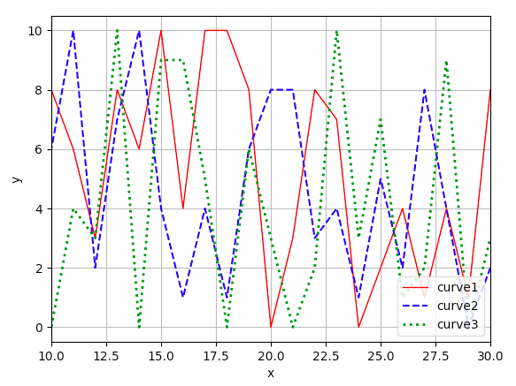
上のスクリプトを使ってみるとこんな感じに。(何じゃこりゃ)
おわりに
matplotlibって綺麗にグラフ描けるのは良いんですが、融通が効かなくって何か苦手です。ってなわけで結局Excelに頼りがちに…。
まあ慣れの問題なんですかねぇ(遠い目)