Markdocとは
MarkdocはStripeがOSS化したドキュメント作成のフレームワークで、markdown記法を使って柔軟にサイトを作成できます。
Stripeといえば分かりやすいドキュメントで個人的に好感を持ってるサービスですが、そのStripeがドキュメント作成用のフレームワークをOSSで公開したということで試してみました。
今回はStripeのGitHubにあるサンプルプロジェクトを参考にしながら、イジイジしてみます。
1. 下準備
まずはで新しいNext.jsのプロジェクトを作成します。
npx create-next-app@latest
Markdocのnextjs用のモジュールをインストールします
npm install @markdoc/next.js
ルートディレクトリにあるnext.config.jsにコードを追加します。optionの部分にはmarkdoc用のスキーマの場所やpropsの取得方法を定義できます。→docs
const withMarkdoc = require('@markdoc/next.js');

module.exports = withMarkdoc(/* options */)({
  pageExtensions: ['md', 'mdoc', 'js', 'jsx']
});
2. ファイルの構成
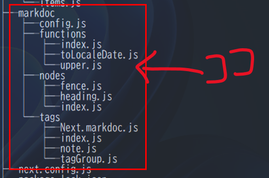
各ファイル構成は以下の通りにしました。設定ファイルはmarkdocというディレクトリを作りそこにすべて突っ込みます。
Next.jsでMarkdocを扱う場合はファイルの置き場所やファイル名にある程度制限があるようですので注意してください。
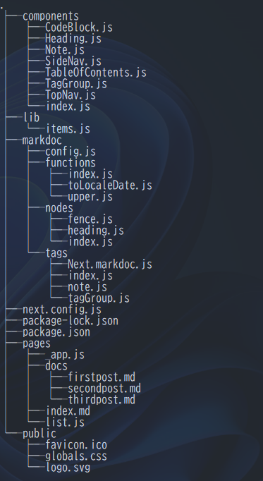
各ファイルの中身はGitHubに載せます。詳しくはそちらをご参照下さい。
3. トップページを表示する
markdownのヘッダーをもとにページのタイトルを設定できるように_app.jsをいじります。
import React from 'react';

import Head from 'next/head';
import Link from 'next/link';

import { TopNav } from '../components';

import '../public/globals.css';


const TITLE = 'The first docs of markdoc';
const DESCRIPTION = 'Here is a desctiption statement';
const PUBLISH_DATE = '';

export default function MyApp({ Component, pageProps }) {
  const { markdoc } = pageProps;

  let title = TITLE;
  let description = DESCRIPTION;
  let date = PUBLISH_DATE;
  let tags = {};

  // mdファイルのYAMLヘッダー部分の情報を収集
  if (markdoc) {
    if (markdoc.frontmatter.title) {
      title = markdoc.frontmatter.title;
    }
    if (markdoc.frontmatter.description) {
      description = markdoc.frontmatter.description;
    }
    if (markdoc.frontmatter.date) {
      date = markdoc.frontmatter.date;
    }
    if (markdoc.frontmatter.tags) {
      tags = markdoc.frontmatter.tags;
    }
  }

  return (
    <>
      <Head>
        <title>{title}</title>
        <meta name="viewport" content="width=device-width, initial-scale=1.0" />
        <meta name="referrer" content="strict-origin" />
        <meta name="title" content={title} />
        <meta name="description" content={description} />
        <meta name="date" content={date} />
        <link rel="shortcut icon" href="/favicon.ico" />
        <link rel="icon" href="/favicon.ico" />
      </Head>
      <TopNav>
        <Link href="/list">Show all contents</Link>
      </TopNav>
      <div className="page">
        <main className="flex column">
          <Component {...pageProps} />
        </main>
      </div>
      <style jsx>
        {`
          .page {
            position: fixed;
            top: var(--top-nav-height);
            display: flex;
            width: 100vw;
            flex-grow: 1;
          }
          main {
            overflow: auto;
            height: calc(100vh - var(--top-nav-height));
            flex-grow: 1;
            font-size: 16px;
            padding: 0 2rem 2rem;
          }
        `}
      </style>
    </>
  );
}
ページ上部でナビゲーションを使用しますのでコンポーネントを追加します。
import React from 'react';
import Link from 'next/link';

export function TopNav({children}) {
  return (
    <nav>
      <Link href="/" className="flex">
        Home
      </Link>
      <section>{children}</section>
      <style jsx>
        {`
          nav {
            top: 0;
            position: fixed;
            width: 100%;
            z-index: 100;
            display: flex;
            align-items: center;
            justify-content: space-between;
            gap: 1rem;
            padding: 1rem 2rem;
            border-bottom: 1px solid var(--border-color);
          }
          nav :global(a) {
            text-decoration: none;
          }
          section {
            display: flex;
            gap: 1rem;
            padding: 0;
          }
        `}
      </style>
    </nav>
  );
}
次にドキュメントの中身を作成します。markdownファイルを作成して正しくレンダリングされるか見てみましょう。
本文の$markdoc.frontmatter にはYAMLヘッダーの情報が入ってきます。markdown内からは以下のようにアクセスできます。→docs
---
title: Markdocをはじめよう
description: Here is the top page!
---

# {% $markdoc.frontmatter.title %}
{% $markdoc.frontmatter.description %}
ファイルを配置したらサーバーを起動してブラウザから開いてみます
npm run dev
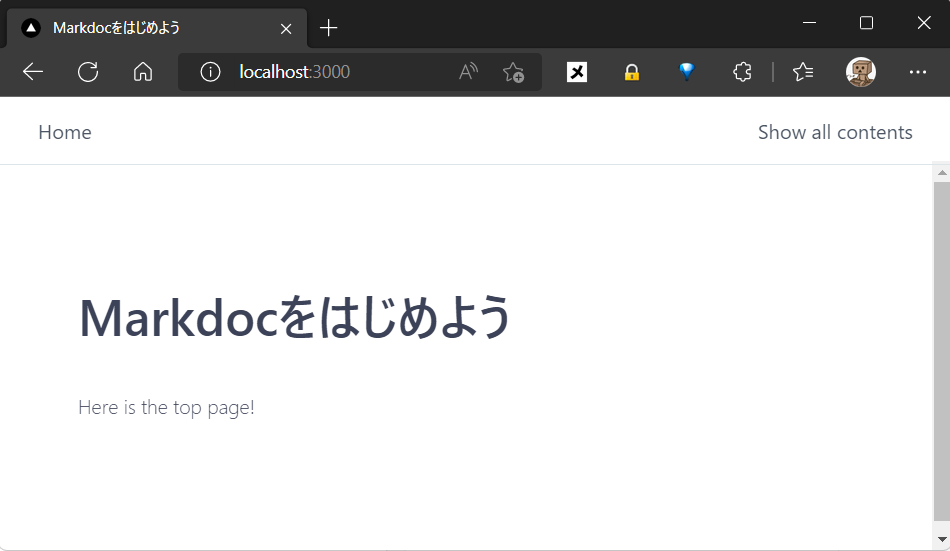
きちんと表示されました。titleにも情報が反映されてるので問題なさそうです。
4. Markdocの機能を試す
動きが確認できたので、ドキュメントに沿って色々試します。
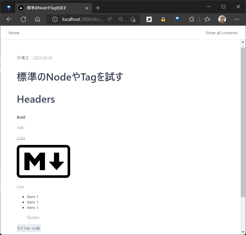
まずはMarkdocの標準のNodesを使ってみます。→docs
---
title: 標準のNodeやTagを試す
description: this is the first post
date: '2022-01-01'
tags:
- 'JavaScript'
- 'Markdoc'
---
投稿日:{% $markdoc.frontmatter.date %}
# {% $markdoc.frontmatter.title %}
# Header
**Bold**
_Italic_
[Links](/)

Lists
- Item 1
- Item 1
- Item 1
> 引用
`Inline code`
↓↓↓
次にTagを使ってみます。→docs
tableタグを使ってみましょう。
+ {% table %}
+ * タイトル {% align="center" %}
+ * 公開日 {% align="center" %}
+ * 説明 {% align="center" %}
+ ---
+ * {% $markdoc.frontmatter.title %}
+ * {% $markdoc.frontmatter.date %}
+ * {% $markdoc.frontmatter.description %}
+ {% /table %}
↓↓↓
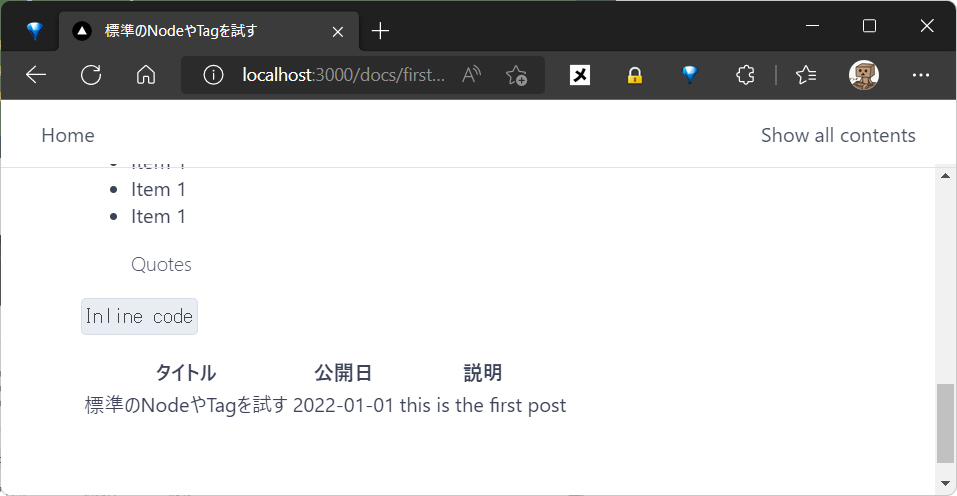
装飾なしのシンプルなテーブルになってしまいましたが、もちろんCSSを当てて見た目を整えることもできます。
5. 独自機能を追加する
独自の機能を作ってドキュメントの中で使うこともできます。
その場合はmarkdocディレクトリの中に定義ファイルを作成します。
config.js を作成
独自に定義した機能を Markdoc に読み込ませるためにconfigオブジェクトを置きます。Markdocが内部でこれを勝手に読み込んでくれるようです。→docs
tags, nodes, functions 各ディレクトリ内のentry point(index.js)を読み込んでconfigオブジェクトとしてexportします。
import tags from './tags';
import nodes from './nodes';
import functions from './functions';

export const config = {
  tags,
  nodes,
  functions,
  // add other stuff here
};
function を追加
投稿日の日付フォーマットを変更するファンクションを定義します。
// エラーハンドルとかしてません。すんません。
export const toLocaleDateJP= {
  transform(parameters) {
    const strDate = parameters[0];
    const arr = strDate.split("-");
    const date = new Date(arr[0], arr[1]-1, arr[2]);
    const option = { weekday: 'narrow', year: 'numeric', month: 'long', day: 'numeric' }
    return date.toLocaleDateString('ja-JP', option);
  }
};

export const toLocaleDateUS= {
  transform(parameters) {
    const strDate = parameters[0];
    const arr = strDate.split("-");
    const date = new Date(arr[0], arr[1] - 1, arr[2]);
    const option = { weekday: 'short', year: 'numeric', month: 'long', day: 'numeric' }
    return date.toLocaleDateString('en-US', option);
  }
};
---
title: 機能を拡張してみる
description: this is the second post
date: '2022-02-01'
tags:
  - 'JavaScript'
  - 'Markdoc'
---
投稿日: {% toLocaleDateJP($markdoc.frontmatter.date) %}
Published: {% toLocaleDateUS($markdoc.frontmatter.date) %}

# {% $markdoc.frontmatter.title %}
↓↓↓
http://localhost:3000/docs/secondpost
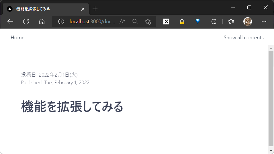
日付のフォーマットが変更されてます。いい感じですね!
Nodesを追加
Nodesはイマイチよくわかってないのですが、Built-InのNodesの定義をオーバーライドして独自のNodesを作るイメージのようです。→docs
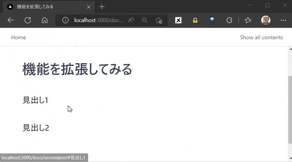
見出し用のHeaderのNodeを変更して、ページ内遷移ができるようにします。
import { Tag } from '@markdoc/markdoc';
import { Heading } from '../../components';

// 要素に付与するidを生成する
function generateID(children, attributes) {
  if (attributes.id && typeof attributes.id === 'string') {
    return attributes.id;
  }
  return children
    .filter((child) => typeof child === 'string')
    .join(' ')
    .replace(/[?]/g, '')
    .replace(/\s+/g, '-')
    .toLowerCase();
}

export const heading = {
  render: Heading,
  children: ['inline'],
  attributes: {
    id: { type: String },
    level: { type: Number, required: true, default: 1 },
    className: { type: String }
  },
  transform(node, config) {
    const attributes = node.transformAttributes(config);
    const children = node.transformChildren(config);
    const id = generateID(children, attributes);

    return new Tag(this.render, { ...attributes, id }, children);
  }
};
...
+ ## 見出し1
+ ## 見出し2
↓↓↓
Tagを追加
ドキュメントのなかで使うタグを自分で定義できます。→docs
Qiitaにある"note"のようなタグを作ってみました。
これ
import { Note } from '../../components/Note';

export const note = {
  render: Note,
  description: 'Display the enclosed content in a note box',
  children: ['paragraph', 'tag', 'list'],
  attributes: {
    type: {
      type: String,
      default: 'note', // typeを指定しない場合は 'note'
      matches: ['caution', 'check', 'note', 'warning'], // Noteボックスのタイプを指定できる
      errorLevel: 'critical',
      description:
        'Controls the design of the box. "caution", "check", "note", "warning"'
    },
    title: {
      type: String,
      description: 'The title displayed at the top of the box'
    }
  }
};
このTagをレンダリングするときに読み込むコンポーネントも定義してあげます。
import React from 'react';

import { FaInfoCircle, FaCheckCircle, FaExclamationTriangle } from 'react-icons/fa';

export const Note = ({ title, type, children }) => {
  let bgColor = '#e3f7df';
  let iconColor = '#55c500';
  if (type === 'caution') {
    bgColor = '#fdf9e2';
    iconColor = '#f7a535';
  }
  if (type === 'warning') {
    bgColor = '#feebee';
    iconColor = '#d60a34';
  }
  return (
    <div className="note">
      <div className="icon">
        {type === 'check' ? <FaCheckCircle /> : type === 'warning' ? <FaExclamationTriangle /> : <FaInfoCircle />}
      </div>
      <div className="message">
        <strong>{title}</strong>
        <span>{children}</span>
      </div>
      <style jsx>
        {`
          .note {
            display: flex;
            justify-content: flex-start;
            align-items: start;
            padding: 12px 16px;
            margin: 4px;
            background: ${bgColor};
            border-radius: 4px;
          }
          .note :global(p) {
            margin: 0;
          }
          .note > .message {
            display: flex;
            flex-direction: column;
          }
          .note > .icon {
            flex-basis: 28px;
            color: ${iconColor};
          }
        `}
      </style>
    </div>
  );
}
上のコンポーネントで React Icons というモジュールを使ってますのでインストールしてください。
npm install react-icons
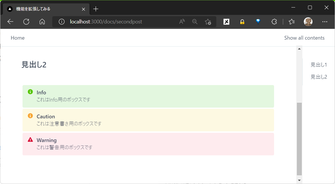
markdownにタグを追加します。
...

+ {% note title="Info"%}
+ これはInfo用のボックスです
+ {% /note %}

+ {% note title="Caution" type="caution"%}
+ これは注意書き用のボックスです
+ {% /note %}

+ {% note title="Warning" type="warning" %}
+ これは警告用のボックスです
+ {% /note %}
↓↓↓
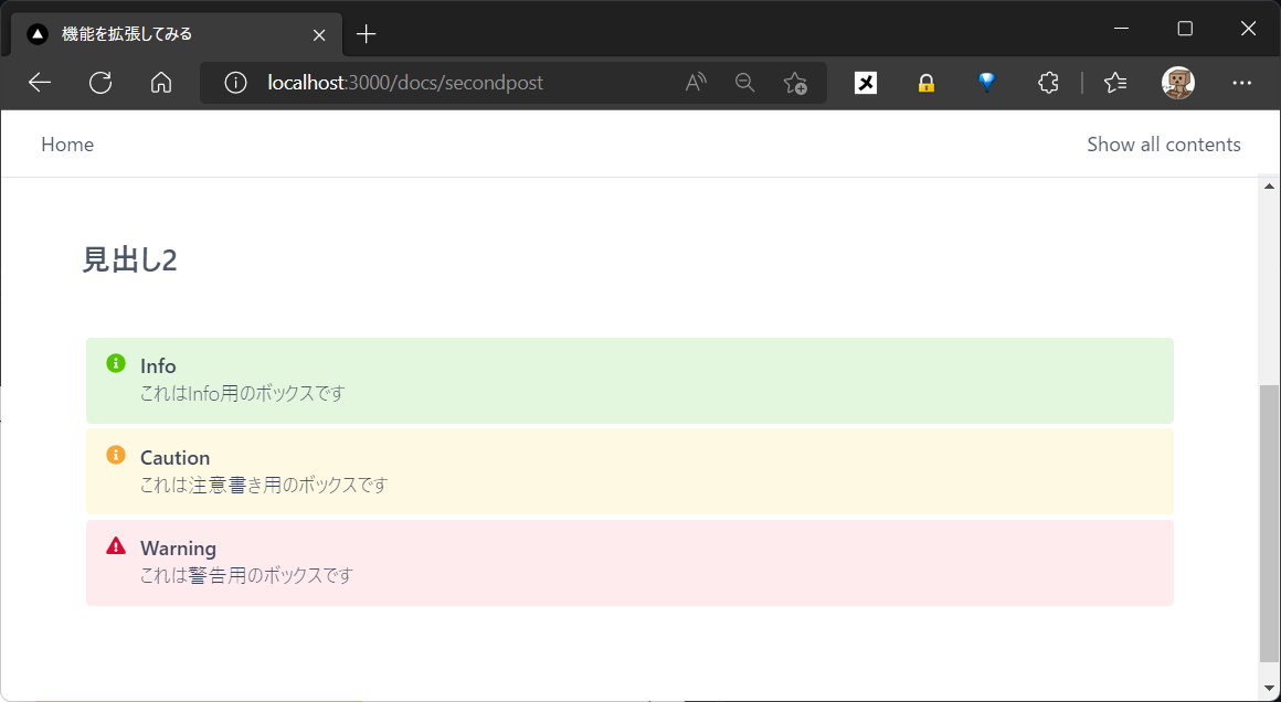
コンポーネントを自分でいじれるので装飾も自由自在です。
markdownからこのような柔軟な表現ができるのはとてもいいですね。
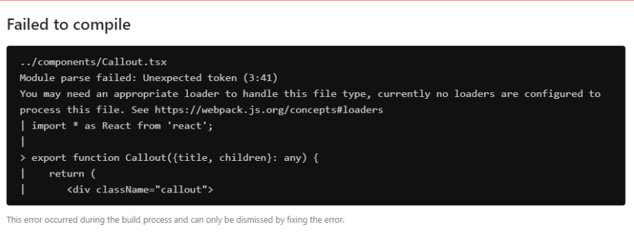
Windowsで開発をしていると独自タグの追加時にエラーになることがあるようなのでご注意ください。以下のエラーが出た場合はMarkdocのバージョンを最新にしてください。
https://github.com/markdoc/markdoc/issues/85
6. 見た目を整える
機能はひと通り試したので、よりドキュメントっぽくしていきたいと思います。
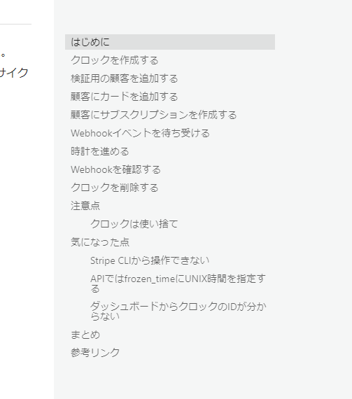
コンテンツテーブルを追加
記事の右側に記事内のヘッダー部分を集めたテーブルを追加します。Qiitaでもよく見かけるこういうやつです。
import React from 'react';

import Head from 'next/head';
import Link from 'next/link';

+ import { TableOfContents, TopNav } from '../components';

import '../public/globals.css';


const TITLE = 'The first docs of markdoc';
const DESCRIPTION = 'Here is a desctiption statement';
const PUBLISH_DATE = '';

+ function collectHeadings(node, sections = []) {
+   if (node) {
+     if (node.name === 'Heading') {
+       const title = node.children[0];
+       if (typeof title === 'string') {
+         sections.push({
+           ...node.attributes,
+           title
+         });
+       }
+     }
+     if (node.children) {
+       for (const child of node.children) {
+         collectHeadings(child, sections);
+       }
+     }
+   }
+   return sections;
+ }

export default function MyApp({ Component, pageProps }) {
  const { markdoc } = pageProps;

  let title = TITLE;
  let description = DESCRIPTION;
  let date = PUBLISH_DATE;
  let tags = {};
  if (markdoc) {
    if (markdoc.frontmatter.title) {
      title = markdoc.frontmatter.title;
    }
    if (markdoc.frontmatter.description) {
      description = markdoc.frontmatter.description;
    }
    if (markdoc.frontmatter.date) {
      date = markdoc.frontmatter.date;
    }
    if (markdoc.frontmatter.tags) {
      tags = markdoc.frontmatter.tags;
    }
  }

+ const toc = pageProps.markdoc?.content
+   ? collectHeadings(pageProps.markdoc.content)
+   : [];

  return (
    <>
      <Head>
        <title>{title}</title>
        <meta name="viewport" content="width=device-width, initial-scale=1.0" />
        <meta name="referrer" content="strict-origin" />
        <meta name="title" content={title} />
        <meta name="description" content={description} />
        <meta name="date" content={date} />
        <link rel="shortcut icon" href="/favicon.ico" />
        <link rel="icon" href="/favicon.ico" />
      </Head>
      <TopNav>
        <Link href="/list">Show all contents</Link>
      </TopNav>
      <div className="page">
        <main className="flex column">
          <Component {...pageProps} />
        </main>
+       <TableOfContents toc={toc} />
      </div>
 ...
    </>
  );
}
TableOfContentsのコンポーネントを追加します。
import React from 'react';
import Link from 'next/link';

export function TableOfContents({toc}) {
  const items = toc.filter(
    (item) => item.id && (item.level === 2 || item.level === 3)
  );

  if (items.length <= 1) {
    return null;
  }

  return (
    <nav className="toc">
      <ul className="flex column">
        {items.map((item) => {
          const href = `#${item.id}`;
          const active =
            typeof window !== 'undefined' && window.location.hash === href;
          return (
            <li
              key={item.title}
              className={[
                active ? 'active' : undefined,
                item.level === 3 ? 'padded' : undefined,
              ]
                .filter(Boolean)
                .join(' ')}
            >
              <Link href={href} passHref>
                <a>{item.title}</a>
              </Link>
            </li>
          );
        })}
      </ul>
      <style jsx>
        {`
          nav {
            position: sticky;
            top: calc(2.5rem + var(--top-nav-height));
            max-height: calc(100vh - var(--top-nav-height));
            flex: 0 0 auto;
            align-self: flex-start;
            margin-bottom: 1rem;
            padding: 0.5rem 0 0;
            border-left: 1px solid var(--border-color);
          }
          ul {
            margin: 0;
            padding: 0 1.5rem;
          }
          li {
            list-style-type: none;
            margin: 0 0 1rem;
          }
          li a {
            text-decoration: none;
          }
          li a:hover,
          li.active a {
            text-decoration: underline;
          }
          li.padded {
            padding-left: 1rem;
          }
        `}
      </style>
    </nav>
  );
}
↓↓↓
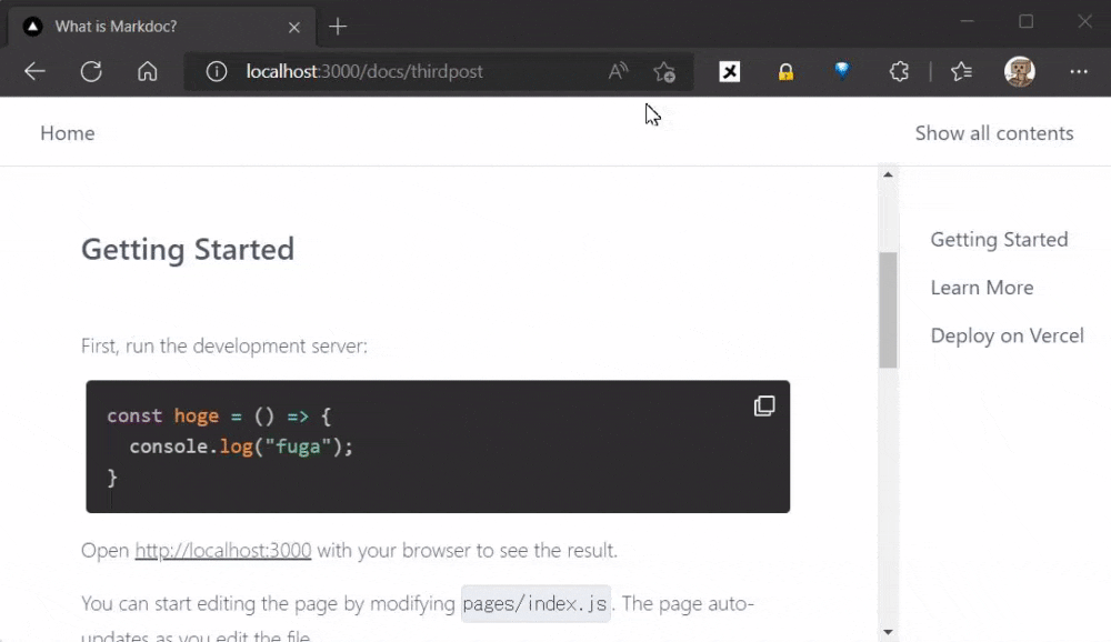
コードブロックを見やすくする
ソースコードを表示するコードブロックを変更します。シンタックスハイライトやコピーボタンの機能を追加してみます。
fence のNodesの定義を上書きする
import { CodeBlock } from "../../components";

export const fence = {
  render: CodeBlock,
  attributes: {
    content: {type: String},
    language: {
      type: String,
      description:
        'The programming language of the code block. Place it after the backticks.',
    },
  },
};
CodeBlockコンポーネントを追加する
import React from 'react';

import Prism from 'prismjs';
import 'prismjs/components/prism-bash.min';
import 'prismjs/components/prism-javascript.min';
import 'prismjs/themes/prism-tomorrow.css';
import 'prismjs/plugins/inline-color/prism-inline-color.min';
import { CopyToClipboard } from "react-copy-to-clipboard";
import { FaRegClone } from "react-icons/fa";

export function CodeBlock({children, language}) {

  const [isCopied, setIsCopied] = React.useState(false);

  const onCopyClicked = () => {
    setIsCopied(true);
    setTimeout(() => {
      setIsCopied(false);
    }, 4000);
  };

  const ref = React.useRef(null);

  React.useEffect(() => {
    if (ref.current) Prism.highlightElement(ref.current, false);
  }, [children]);

  return (
    <div className="code" aria-live="polite">
      <CopyToClipboard text={children}>
        <button onClick={onCopyClicked} className="copy-button">
          <span>{isCopied ? "copied!" : <FaRegClone />}</span>
        </button>
      </CopyToClipboard>
      <pre
        ref={ref}
        className={`language-${language}`}
      >
        {children}
      </pre>
      <style jsx>
        {`
          .copy-button {
            position: absolute;
            right: 0px;
            border: 0px;
            background: transparent;
            color: #f2f2f2;
            padding: 12px;
            font-size: 1em;
            cursor: pointer;
          }

          .code {
            position: relative;
            margin: 4px;
          }

          /* Override Prism styles */
          .code :global(pre[class*='language-']) {
            text-shadow: none;
            border-radius: 4px;
          }

        `}
      </style>
    </div>
  );
}
上のコンポーネントで Prismjs と react-copy-to-clipboard というモジュールを使ってますのでインストールします。
npm install prismjs react-copy-to-clipboard
↓↓↓
まとめ
以上、Markdocのご紹介でした。ドキュメントサイトや技術ブログとかで活躍しそうな感じですね。
記事では紹介できなかった機能などもありますので、気になった方は是非使ってみて下さい。
今回使ったソースコードはGitHubに置いてあります。間違ってるところなどあるかもなので、見つけたらそっと教えてください。最後まで読んで頂きありがとうございました。
参考記事など