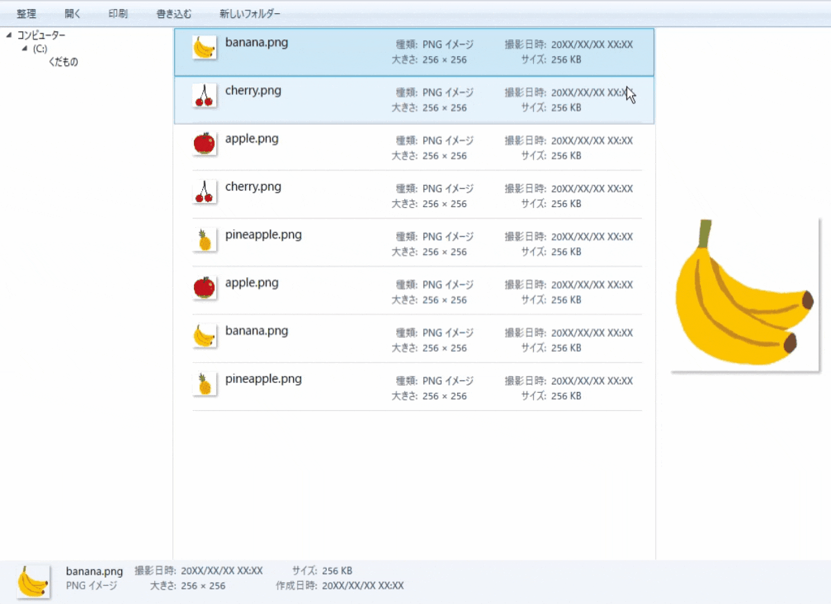
こんな感じのサンプルが作れます!
参考記事
今回はITmediaさん連載記事のwpfチュートリアルをアレンジしています!
基本的にはサイトに書いてある内容そのままです.
記事の内容として古くなっている部分,わかりにくい部分を補う形で説明します.
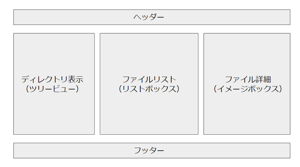
画面の構成
windows7のエクスプローラーをwpfアプリで再現しようと考えた時に,画面の構成は以下のように分解しました.
データのコレクション用処理
using System;
using System.Collections.Generic;
using System.Linq;
using System.Text;
using System.Threading.Tasks;
using System.Collections.ObjectModel;
using System.ComponentModel;


namespace Windows7_Explorer_WPF_Tutorial
{
    public class MainViewModel : INotifyPropertyChanged
    {
        public MainViewModel()
        {
            ObservableCollection<File> files = new ObservableCollection<File>();

            files.Add(new File() { Name = "apple.png", ImageSize = "256 × 256", Type = "PNG イメージ", Size = "256 KB", CreateDate = "20XX/XX/XX XX:XX" });
            ~略~

            Files = files;
            SelectedFile = files[0];
        }

        public ObservableCollection<File> Files { get; set; }
        private File selectedFile;
        public File SelectedFile
        {
            get
            {
                return selectedFile;
            }
            set
            {
                selectedFile = value;
                NotifyPropertyChanged("SelectedFile");
            }
        }

        #region INotifyPropertyChanged
        public event PropertyChangedEventHandler PropertyChanged;

        private void NotifyPropertyChanged(String info)
        {
            if (PropertyChanged != null)
            {
                PropertyChanged(this, new PropertyChangedEventArgs(info));
            }
        }
        #endregion
    }
}
namespace Windows7_Explorer_WPF_Tutorial
{
    public class File
    {
        public string Name { get; set; }
        public string Type { get; set; }
        public string Size { get; set; }
        public string ImageSize { get; set; }
        public string CreateDate { get; set; }
    }
}
ヘッダー部分
    <Border Grid.Row="0" BorderThickness="0,0,0,1.5" BorderBrush="#FFA0AFC3">
    <StackPanel Orientation="Horizontal">
        <StackPanel.Background>
            <LinearGradientBrush EndPoint="0.5,1" StartPoint="0.5,0">
                <GradientStop Color="#FFFAFCFD" Offset="0" />
                <GradientStop Color="#FFE4EFFB" Offset="1" />
                <GradientStop Color="#FFDCE6F4" Offset="0.5" />
                <GradientStop Color="#FFE6F0FA" Offset="0.499" />
            </LinearGradientBrush>
        </StackPanel.Background>
        <StackPanel.Resources>
            <Style x:Key="ButtonStyle" TargetType="Button">
                <Setter Property="Margin" Value="18,0,12,0" />
                <Setter Property="Foreground" Value="#FF1E395B" />
                <Setter Property="Background" Value="{x:Null}" />
                <Setter Property="BorderBrush" Value="{x:Null}" />
            </Style>
        </StackPanel.Resources>
        <Button Content="整理" Style="{StaticResource ButtonStyle}"/>
        <Button Content="開く" Style="{StaticResource ButtonStyle}"/>
        <Button Content="印刷" Style="{StaticResource ButtonStyle}"/>
        <Button Content="書き込む" Style="{StaticResource ButtonStyle}"/>
        <Button Content="新しいフォルダー" Style="{StaticResource ButtonStyle}"/>
    </StackPanel>
    </Border>
ディレクトリ表示部分
今回はツリービューを使っています.
また,「ディレクトリ表示部分」と「ファイルリスト」のエリアを分割するためにGridSplitter要素を用いています.
    <TreeView  Grid.Column="0" BorderThickness="0,0,0,0" Margin="0,0,1,0" ScrollViewer.HorizontalScrollBarVisibility="Disabled">
        <TreeViewItem Header="コンピューター" IsExpanded="True">
            <TreeViewItem Header="(C:)" IsExpanded="True">
                <TreeViewItem Header="くだもの"/>
            </TreeViewItem>
        </TreeViewItem>
    </TreeView>
    <GridSplitter Grid.Column="0" HorizontalAlignment="Right" Width="1" Background="#FFD6E5F5" IsTabStop="False"/>
ファイルリスト部分
はじめに,要素のスタイル表示を加工します.
親のGride要素に,Grid.Resourceを要素として定義することで,全体にスタイルを適用します.
このスタイルは,フッター部分でも再利用します.
        <Grid.Resources>
            <Style TargetType="TextBlock" x:Key="label1">
                <Setter Property="Margin" Value="4,4,2,-2"/>
                <Setter Property="Foreground" Value="#FF5A6779" />
                <Setter Property="Width" Value="60" />
                <Setter Property="TextAlignment" Value="Right" />
            </Style>
            <Style TargetType="TextBlock" x:Key="label2">
                <Setter Property="Margin" Value="4,4,2,-2"/>
                <Setter Property="Foreground" Value="#FF1E395B"/>
            </Style>
            <Style TargetType="ListBoxItem">
                <Setter Property="HorizontalContentAlignment" Value="Stretch" />
            </Style>
        </Grid.Resources>
ファイル全体のリスト表示をするために,ListBoxを用いています.
リストボックスの中にImageBoxとStackPanelを格納しています.
さらに,リストボックス内の配置をGridで要素分けして配置します.
 <ListBox  Grid.Column="1" BorderThickness="0,0,0,0" Margin="0,0,1,0" ItemsSource="{Binding Files}" SelectedValue="{Binding SelectedFile, Mode=TwoWay}">
        <ListBox.ItemTemplate>
            <DataTemplate>
                <Border BorderThickness="0,0,0,1" BorderBrush="#FFDCDCDC" Margin="17,0,10,0">
                    <Grid Height="53" HorizontalAlignment="Stretch">

                        <Grid.ColumnDefinitions>
                            <ColumnDefinition Width="Auto" />
                            <ColumnDefinition Width="180"/>
                            <ColumnDefinition />
                            <ColumnDefinition Width="180" />
                        </Grid.ColumnDefinitions>
                        <Border Background="White" Margin="0,7,0,18" VerticalAlignment="Center" HorizontalAlignment="Center">
                            <Border.Effect>
                                <DropShadowEffect Color="Gray" Direction="-45" Opacity="0.5" ShadowDepth="2" />
                            </Border.Effect>
                            <Image Source="{Binding Name}" Width="29" />
                        </Border>
                        <TextBlock Grid.Column="1" Text="{Binding Name}" FontSize="14.6666666666667" Margin="11,4" />
                        <StackPanel Grid.Column="2" Margin="0,5" HorizontalAlignment="Left" >
                            <StackPanel Orientation="Horizontal">
                                <TextBlock Text="種類:" Style="{StaticResource label1}" />
                                <TextBlock Text="{Binding Type}" Style="{StaticResource label2}" />
                            </StackPanel>
                            <StackPanel Orientation="Horizontal">
                                <TextBlock Text="大きさ:" Style="{StaticResource label1}" />
                                <TextBlock Text="{Binding ImageSize}" Style="{StaticResource label2}" />
                            </StackPanel>
                        </StackPanel>
                        <StackPanel Grid.Column="3" Margin="0,5">
                            <StackPanel Orientation="Horizontal">
                                <TextBlock Text="撮影日時:" Style="{StaticResource label1}" />
                                <TextBlock Text="{Binding CreateDate}" Style="{StaticResource label2}" />
                            </StackPanel>
                            <StackPanel Orientation="Horizontal">
                                <TextBlock Text="サイズ:" Style="{StaticResource label1}" />
                                <TextBlock Text="{Binding Size}" Style="{StaticResource label2}" />
                            </StackPanel>
                        </StackPanel>
                    </Grid>
                </Border>
            </DataTemplate>
        </ListBox.ItemTemplate>
    </ListBox>
    <GridSplitter Grid.Column="1" HorizontalAlignment="Right" Width="1" Background="#FFD6E5F5" IsTabStop="False"/>
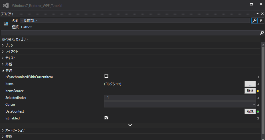
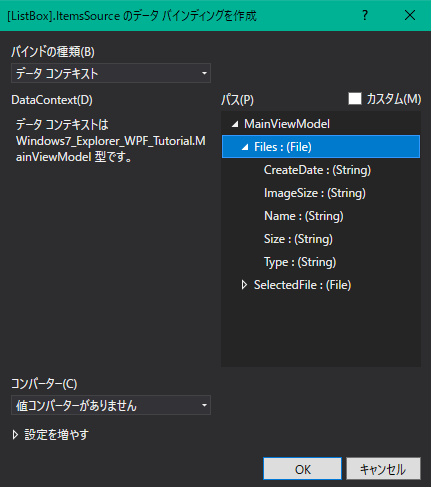
データバインディングはxamlファイルに直接記述することで定義もできますが,視覚的に設定することもできます.
例えば,ListBoxのItemSourceにバインディングソースにFilesクラスを設定してみます.
ItemsSource="{Binding Files}"
ListBoxを選択した後,ItemSourceを編集するために,新規ボタンとなりの「□」ボタンをクリックします.
プロパティウィンドウが表示された後,データバインディングの作成ボタンを押します.
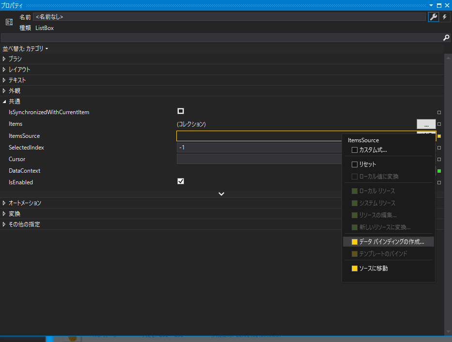
さらに,データバインディング編集用ウィンドウが開けば,パスにFilesクラスを指定します.
リストボックスの子要素として,テキストボックスやイメージボックスを入れ込んでいます.
さらに,スタックパネルのオリエンテーションを,Horizontal(水平)方向に設定しています.
< StackPanel Orientation="Horizontal" >
StackPanelを列として重ね合わせるので,Vertical(垂直)方向に設定してみた様子です.
< StackPanel Orientation="Vertical" >
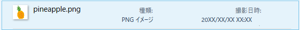
スタックパネルのオリエンテーションを,Vertical(垂直)方向に設定すると,Marginの影響で崩れてしまいます.
ファイル詳細部分
画像を単体で表示します.
画像にエフェクトをつけるために,Border要素で囲みます.
Border.effect属性にDropShadowEffectクラスを渡して,画像に影を生成します.
    <Border Grid.Column="2"  Margin="16" Background="White" VerticalAlignment="Center" HorizontalAlignment="Center" >
        <Border.Effect>
            <DropShadowEffect Color="#FFAFAFAF" Direction="-45" Opacity="0.5" ShadowDepth="4" />
        </Border.Effect>
        <Image Source="{Binding SelectedFile.Name}"/>
    </Border>
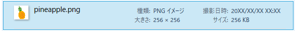
フッター部分
フッター部分でも,画像部分とテキスト表示部分とに列を分けています.
ファイルリストエリアでも,StackPanelを配置しましたが,その際に列を意識しなければなりませんでした.
ここでは,WrapPanelを用いてStackPanelを表示しています.
要素がWrappanelの領域の範囲を超えると,自動的に要素を次の(列.行)に送ることができます.
    <Grid Grid.Row="2" Background="#FFF1F5FB" DataContext="{Binding SelectedFile}">
        <Grid.ColumnDefinitions>
            <ColumnDefinition Width="Auto"/>
            <ColumnDefinition Width="292*"/>
        </Grid.ColumnDefinitions>
        <Border Grid.Column="0" Margin="20, 6, 20 ,7"  Background="#FFF1F5FB" VerticalAlignment="Center" HorizontalAlignment="Center">
            <Border.Effect>
                <DropShadowEffect Color="Gray" Direction="-45" Opacity="0.5" ShadowDepth="2" />
            </Border.Effect>
            <Image MinWidth="40" MaxWidth="238" Source="{Binding Name}" />
        </Border>
        <WrapPanel Grid.Column="1" Orientation="Vertical">
            <TextBlock Margin="0,4,0,0" FontSize="13.33333333" Text="{Binding Name}"/>
            <TextBlock Foreground="#FF5A6779" Text="{Binding Type}"/>
            <StackPanel Orientation="Horizontal">
                <TextBlock Text="撮影日時:" Style="{StaticResource label1}"/>
                <TextBlock Text="{Binding CreateDate}" Style="{StaticResource label2}"/>
            </StackPanel>
            <StackPanel Orientation="Horizontal">
                <TextBlock Text="大きさ:" Style="{StaticResource label1}"/>
                <TextBlock Text="{Binding ImageSize}" Style="{StaticResource label2}"/>
            </StackPanel>
            <StackPanel Orientation="Horizontal">
                <TextBlock Text="サイズ:" Style="{StaticResource label1}"/>
                <TextBlock Text="{Binding Size}" Style="{StaticResource label2}"/>
            </StackPanel>
            <StackPanel Orientation="Horizontal">
                <TextBlock Text="作成日時:" Style="{StaticResource label1}"/>
                <TextBlock Text="{Binding CreateDate}" Style="{StaticResource label2}"/>
            </StackPanel>
        </WrapPanel >
    </Grid>
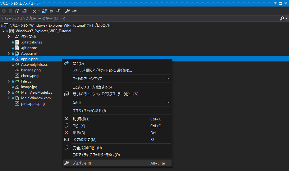
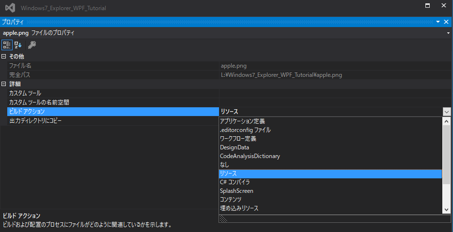
プロジェクトに画像を読み込ませる.
「プロジェクト」→「既存の項目の追加(ショートカット:Shift+Alt+A)」でプロジェクトに画像等のリソースを追加できます.
画像が正しく読み込まれない時は,ビルドアクションを変更してください.
ビルドアクションの項目を「埋め込みリソース」か,「リソース」に設定することで,画像が読み込まれるようになります.
おわりに
表面的なUIの実装だけで,まだボタンやツリービュー押下ジの処理を組んでいません.
今後は,処理部分も組んでみようと思います.