目次
(1) 環境構築編
(2) アプリ構築・設定編
(3) アプリ実装編 part1(この記事)
(4) アプリ実装編 part2
(5) ユニットテスト編
一連のソースは GitHub で公開しています。
前置き
第2回 の記事では、第1回 で作成した Vue.js、TypeScript、Pug、SCSS を組み込んだプロジェクトで kintone カスタマイズの開発が行えるところまで進み、@kintone/dts-gen を利用した型定義ファイルの取得、ローカルでビルドしたファイルの更新を検知して即座にアプリ側に反映させる Live Server の設定などについてお話ししました。
今回は実際にカスタマイズの実装を進めていきたいと思います。
全然関係ない話ですが、今更ながら kintone Advent Calendar (part1) (part2) 参加したかったです。
来年こそは!!
前提
以下の環境で作業しています。
- macOS Catalina
- Homebrew 2.1.16
- Node.js 13.1.0
- VisualStudio Code 1.40.1
(1) 環境構築編の記事で、以下をセットアップしました。
- Vue.js 4.0.5
- TypeScript 3.5.3
- vue-cli-plugin-pug 1.0.7
他、プロジェクト作成時の流れで Sass / SCSS や ESLint、Prettier、Jest などがセットアップされています。
(2) アプリ構築・設定編 の記事で、kintone 側で用意している雛形アプリ「案件管理」を使って新規アプリを構築し、型定義ファイルの生成まで行いました。
今回のゴール
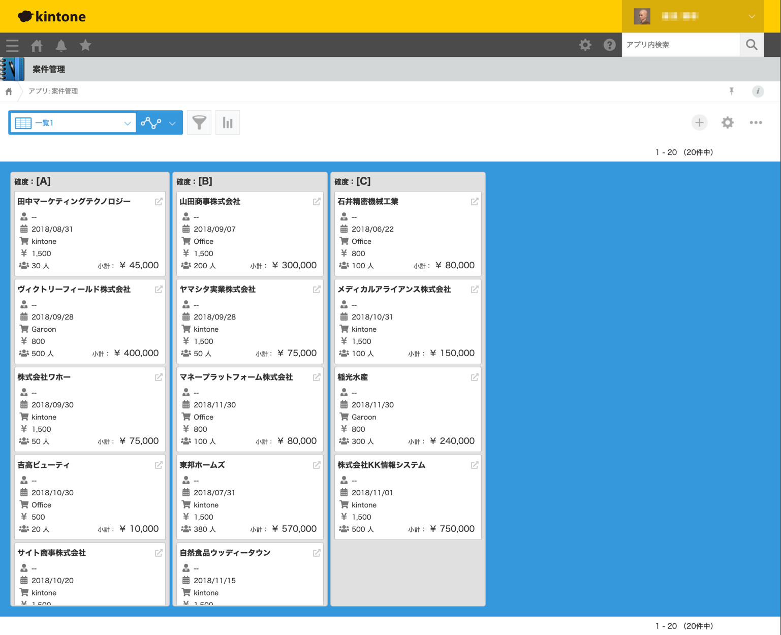
今回は、案件管理ファイルにカスタマイズを組み込んで見栄えのいいものにしましょう。
Trelloみたいに案件を特定条件でグルーピングし、ドラッグ&ドロップで簡単にグループ間を移動可能なものを目指します。
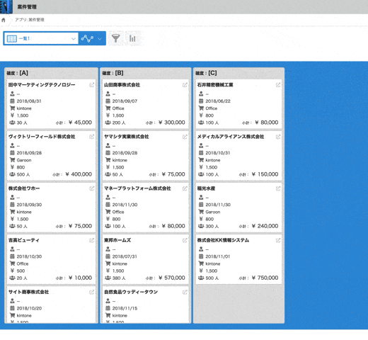
最終的な仕上がりは以下のような感じで。
以下の順で説明していきます。
- Font Awesome を準備する
- コンポーネントの定義と実装(ボード・リスト・カード)
- ドラッグ&ドロップでのリスト間の移動
(3) アプリ実装編
Font Awesome を準備する
アプリの見栄えを 1 段上げるために、アイコンでいい感じに修飾していきましょう。
アイコンフォントにはいろいろ種類がありますが、専用のライブラリが用意されており Vue.js への導入も簡単な Font Awesome を使います。
Vue.js 上での使い方は 公式のリポジトリ や こちらの記事 を参照してください。
ざっと説明すると、
$ yarn add @fortawesome/fontawesome-svg-core
$ yarn add @fortawesome/free-solid-svg-icons
$ yarn add @fortawesome/vue-fontawesome
として、App.vue で以下のようにすると簡単です。
import { library } from "@fortawesome/fontawesome-svg-core";
import { fas } from "@fortawesome/free-solid-svg-icons";
import { FontAwesomeIcon } from "@fortawesome/vue-fontawesome";
library.add(fas);
Vue.component('font-awesome-icon', FontAwesomeIcon);
こうしておくと、App 以下のコンポーネント全てで Font Awesome アイコンを利用できるようになります。
<template lang="pug">
  .card
    font-awesome-icon.card-icon(icon="coffee")
    .card-title カプチーノ
</template>
こんな感じに表示されます。かわいいですね!

コンポーネントの定義と実装(ボード・リスト・カード)
Vue.js では、と言うか昨今のフロントエンドではいわゆるコンポーネント指向と言う事で、画面の構成要素を コンポーネント に分割して疎結合性を高める事で責務の分割を図る設計思想が大前提です。
そして多くの場合、コンポーネントには親子関係があり、あるコンポーネントを含むコンポーネントの総体でアプリを構築すると言うアプローチで臨むわけです。
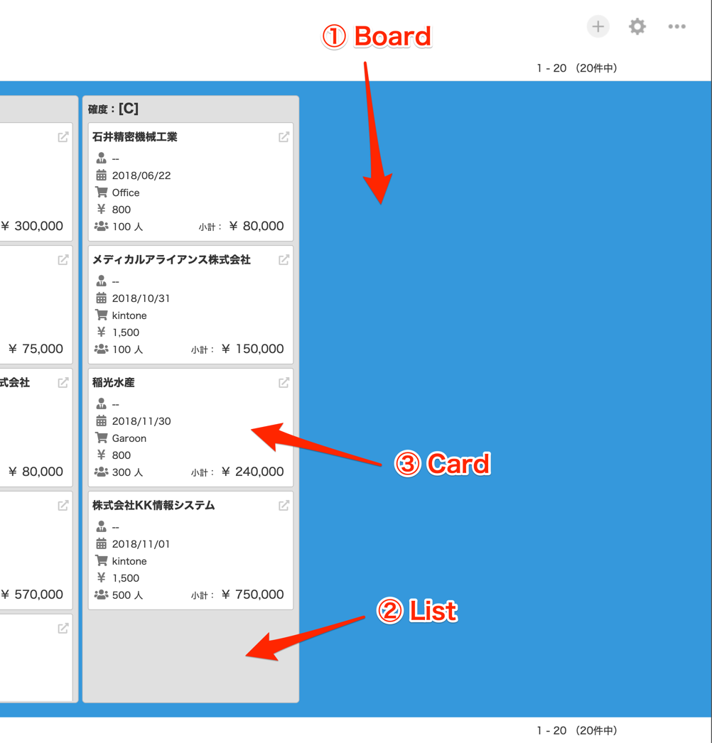
今回実装するアプリも、
- アプリ全体のコンテナとなる Board コンポーネント
- Board コンポーネントに格納され、確度によりグルーピングされたレコードを格納する List コンポーネント
- List コンポーネントに格納され、個々のレコードを実体とする Card コンポーネント
と言う親子関係を持っています。
以下、ポイントとなる部分を程よく抜粋して説明します。
App.vue
アプリの骨子となるコンポーネントです。
<template lang="pug">
  #app
    Board.board(:records="records")
</template>

<script lang="ts">
// デコレーター
import { Component, Vue } from "vue-property-decorator";

// FontAwesome
(省略)

// コンポーネント
import Board from "./components/Board.vue"
@Component({
  components: {
    Board
  }
})

// クラス本体
export default class App extends Vue {
  // [データ] 表示対象のレコード
  recordData: leadManagement.types.SavedFields[] = [];

  // [算出プロパティ] 表示対象のレコード
  get records() {
    return this.recordData;
  }
  set records(value) {
    this.recordData = value;
  }

  // マウント時処理
  mounted() {
    // アプリ部分の高さをウィンドウサイズに合わせる
    const el: HTMLElement = this.$el as HTMLElement;
    const rect = el.getBoundingClientRect();
    const height = rect.top + 36; // 36 は .contents-bottommenu-gaia の高さ
    el.style.height = `calc(100vh - ${height}px)`
  }
}
</script>

<style scoped lang="scss">
# app {
  display: grid;
  grid-template-rows: 1fr;
  position: relative;

  .board {
    grid-row: 1;
  }
}
</style>
Board コンポーネント をマウントするコンテナです。
グリッドレイアウトを使い、ウィンドウの縦幅いっぱいを利用するようにしています。(本来のグリッドの目的とは違う気がしますが)
カスタマイズビューでは最下段にレコード数が表示されますが、この高さ分(36px)を減算しています。
将来的に kintone のデザイン変更があった際に影響が懸念されるところですので、あまり行儀はよろしくありません。
このコンポーネントは main.ts から呼ばれますが、そちらから渡された(Vm.set() された) records を(算出プロパティを挟んでいるものの)そのまま次の Board コンポーネントへ引き渡しています。
いわゆるバケツリレーです。
Board コンポーネント
Board コンポーネントは複数のリストを並べるコンテナです。
<template lang="pug">
  .board
    List.list(
      v-for="g in listGroups"
      :key="g"
      :group="g"
      :data-group="g"
      :records="getGroupRecords(g)"
    )
</template>

<script lang="ts">
// デコレーター
import { Component, Prop, Vue } from "vue-property-decorator";

// コンポーネント
import List from "./List.vue"
@Component({
  components: {
    List
  }
})

// クラス本体
export default class Board extends Vue {
  // 表示対象のレコード
  @Prop({ default: [] })
  records!: leadManagement.types.SavedFields[];

  // リストの配列(確度でグルーピング)
  get listGroups(): string[] {
    let groups: string[] = [ "A", "B", "C" ];
    return groups;
  }

  // グループ(確度)のレコードを抽出して返す
  getGroupRecords(g: string): leadManagement.types.SavedFields[] {
    return this.records.filter(r => r.確度.value === g);
  }
}
</script>

<style lang="scss" scoped>
.board {
  background-color: #3498db;
  display: flex;
  justify-content: flex-start;
  overflow-x: auto;
  padding: 20px;
}
</style>
ここで初めて @Prop と言うデコレータが出て来ました。
これにより App コンポーネントから受け取ったプロパティを定義する処理を非常にシンプルに書くことができます。
リストは決め打ちで確度 [ "A", "B", "C" ] の 3 つを作成します。
プロパティで受け取ったレコードを参照して作れば良いんじゃ?と言う考えもあるかもですが、それだと該当するレコードがひとつもない確度のリストがなくなってしまうので。
受け取ったレコードを 確度 の値でフィルタをかけて List コンポーネント に引き渡します。
レコードにフィルタをかける処理が getGroupRecords() メソッドです。
List コンポーネント
個々のレコードを表す Card コンポーネント を確度でグルーピングして表示するコンポーネントです。
<template lang="pug">
  .list
    .list-title
      span.list-title-label 確度:
      span.list-title-value {{listTitle}}
    .list-body
      Card(
        v-for="r in records"
        :key="r.$id.value"
        :record="r"
        :data-record-id="r.$id.value"
      )
</template>

<script lang="ts">
// デコレーター
import { Component, Prop, Vue } from "vue-property-decorator";

// コンポーネント
import Card from "./Card.vue"
@Component({
  components: {
    Card
  }
})

// クラス本体
export default class List extends Vue {
  // リストのタイトル(グループ名)
  @Prop({ default: '' })
  group!: string;

  // 表示対象のレコード
  @Prop({ default: [] })
  records!: leadManagement.types.SavedFields[];

  // リストタイトル
  get listTitle(): string {
    return `[${this.group}]`;
  }
}
</script>

<style lang="scss" scoped>
.list {
  background-color: #e0e0e0;
  border: 1px solid #c0c0c0;
  border-radius: 5px;
  display: grid;
  grid-template-rows: 30px 1fr;
  margin-right: 5px;
  min-width: 300px;
  padding: 2px;

  .list-title {
    font-weight: bold;
    grid-row: 1;
    line-height: 30px;
    margin-bottom: 3px;
    padding-left: 5px;

    .list-title-label {
      font-size: 14px;
    }

    .list-title-value {
      font-size: 18px;
    }
  }

  .list-body {
    grid-row: 2;
    overflow-y: auto;
    padding: 5px;
  }
}
</style>
受け取ったレコードの配列でループし、 Card コンポーネント に引き渡しています。
(特に解説はしませんが)この辺りからスタイリングがだいぶ細かくなって来ています。
Card コンポーネント
個々のレコードを実体として持つコンポーネントです。
<template lang="pug">
  .card
    .card-title
      span {{recordTitleValue}}
      a.label-icon.record-icon(
        :href="externalLink"
        target="_blank"
      )
        font-awesome-icon(icon="external-link-alt")
    .card-body
      .card-line.line-charge
        .card-line-inner
          font-awesome-icon.label-icon(icon="user-tie")
          .value {{chargeValue}}
      .card-line.line-period
        .card-line-inner
          font-awesome-icon.label-icon(icon="calendar-alt")
          .value {{periodValue}}
      .card-line.line-product-name
        .card-line-inner
          font-awesome-icon.label-icon(icon="shopping-cart")
          .value {{productValue}}
      .card-line.line-unit
        .card-line-inner
          font-awesome-icon.label-icon(icon="yen-sign")
          .value {{unitValue}}
      .card-line.line-user-count-subtotal
        .card-line-inner.line-user-count
          font-awesome-icon.label-icon(icon="users")
          .value {{userCountValue}}
        .card-line-inner.line-subtotal
          .label 小計
          .value {{subtotalValue}}
</template>

<script lang="ts">
// デコレーター
import { Component, Prop, Vue } from "vue-property-decorator";

// コンポーネント
@Component

// クラス本体
export default class List extends Vue {
  // 表示対象のレコード
  @Prop()
  record!: leadManagement.types.SavedFields;

  // 会社名(カードのタイトル)
  get recordTitleValue(): string {
    return this.record.会社名.value;
  }

  // 案件担当者
  get chargeValue(): string {
    if (!this.record.案件担当者名.value.length) {
      return "--"
    }
    return this.record.案件担当者名.value.map(v => v.name).join(', ');
  }

  // 見込み時期
  get periodValue(): string {
    if (!this.record.見込み時期.value) {
      return "--"
    }
    return this.record.見込み時期.value.replace(/-/g, '/');
  }

  // 製品名
  get productValue(): string {
    return this.record.製品名.value;
  }

  // 単価
  get unitValue(): string {
    return this.record.単価.value ? `${Number(this.record.単価.value).toLocaleString()}` : '--';
  }
  // ユーザー数
  get userCountValue(): string {
    return this.record.ユーザー数.value ? `${Number(this.record.ユーザー数.value).toLocaleString()} 人` : '--';
  }

  // 小計
  get subtotalValue(): string {
    return this.record.小計.value ? `¥ ${Number(this.record.小計.value).toLocaleString()}` : '--';
  }

  // レコードのリンク先
  get externalLink(): string {
    return `/k/${kintone.app.getId()}/show#record=${this.record.$id.value}`;
  }
}
</script>

<style lang="scss" scoped>
.card {
  background-color: #fff;
  border: 1px solid #c0c0c0;
  border-radius: 3px;
  font-size: 12px;
  margin-bottom: 5px;
  padding: 5px;

  &:hover {
    box-shadow: 0 0 10px rgb(#000, 0.4);
    cursor: pointer;
  }

  .card-title {
    display: flex;
    font-size: 15px;
    font-weight: bold;
    justify-content: space-between;
    line-height: 30px;

    .record-icon {
      color: #ccc;
      margin-left: 10px;
      :hover {
        color: #217dbb;
        cursor: pointer;
      }
    }
  }

  .card-body {
    padding: 3px;

    .card-line {
      display: flex;
      line-height: 24px;
      justify-content: space-between;

      .label, .label-icon, .value {
        display: inline-block;
        line-height: 20px;
        padding-right: 5px;
      }

      .label {
        font-size: 12px;
        text-align: right;
        width: 80px;

        &::after {
          content: ":";
        }
      }

      .label-icon {
        color: #777;
        font-size: 16px;
        text-align: center;
        width: 20px;
      }

      .value {
        font-size: 13px;
      }

      .line-subtotal {
        .value {
          font-size: 16px;
        }
      }
    }
  }
}
</style>
ユーザーにとって最も重要な情報となるため、コード量も多いです。
ラベルをテキストではなくアイコンフォントを利用するなどスタイリングも工夫しています。
右上の外部リンクアイコンには当該レコードの詳細画面に別ウィンドウでジャンプするためのリンクを設定しています。
ドラッグ&ドロップでのリスト間の移動
カードをリスト間で移動できるようにしたいと思います。
実装例も多い Vue.Draggable を利用します。
以下のような記事が参考になるでしょう。
Vue.Draggable を追加する
ライブラリを追加します。
$ yarn add vuedraggable
これだけだとコンパイラさんに「型定義よこせ!!」とどやされますので、こちらの issue を参考に、以下のようにして解決します。
プロジェクトのルートに @types/vuedraggable/index.d.ts と言うパスでファイルを作ります。
declare module "vuedraggable" {
  import Vue, { ComponentOptions } from "vue";

  export interface DraggedContext<T> {
    index: number;
    futureIndex: number;
    element: T;
  }

  export interface DropContext<T> {
    index: number;
    component: Vue;
    element: T;
  }

  export interface Rectangle {
    top: number;
    right: number;
    bottom: number;
    left: number;
    width: number;
    height: number;
  }

  export interface MoveEvent<T> {
    originalEvent: DragEvent;
    dragged: Element;
    draggedContext: DraggedContext<T>;
    draggedRect: Rectangle;
    related: Element;
    relatedContext: DropContext<T>;
    relatedRect: Rectangle;
    from: Element;
    to: Element;
    willInsertAfter: boolean;
    isTrusted: boolean;
  }

  export interface DropEvent {
    from: Element;
    item: Element;
    newDraggableIndex: number;
    newIndex: number;
    oldDraggableIndex: number;
    oldIndex: number;
    originalEvent: DragEvent;
    path: Element[];
    srcElement: Element;
    target: Element;
    to: Element;
    type: string;
  }

  const draggableComponent: ComponentOptions<Vue>;

  export default draggableComponent;
}
上述の issue で示されているものに少し手を入れています。
(DropEvent インターフェイスを追加している)
で、tsconfig.json に以下の記述を追加します。
  "include": [
+    "@types/**/*.ts",
    "src/**/*.ts",
    "src/**/*.tsx",
    "src/**/*.vue",
    "tests/**/*.ts",
    "tests/**/*.tsx"
  ],
これでコンパイラさんのご機嫌を取り戻す事ができます。
ドラッグ機能を実装する
List コンポーネント に実装を加えます。
まず template です。
<template lang="pug">
  .list
    .list-title
      span.list-title-label 確度:
      span.list-title-value {{listTitle}}
    .list-body
      Draggable.draggable(
        :group="'list'"
        :data-group="group"
      )
        Card(
          v-for="r in records"
          :key="r.$id.value"
          :record="r"
        )
</template>
次は script です。
Draggable コンポーネントと DropEvent インターフェイスを読み込んでおきます。
<script lang="ts">
// デコレーター
import { Component, Prop, Vue } from "vue-property-decorator";

// コンポーネント
import Card from "./Card.vue";
import Draggable, { DropEvent } from "vuedraggable";
@Component({
  components: {
    Card,
    Draggable
  }
})

(省略)
</script>
最後に、.draggable クラスにスタイルを当てておきます。
(リスト全体でドラッグを受け入れられるようにする)
<style lang="scss" scoped>
.list {
  (省略)

  .list-body {
    (省略)

    .draggable {
      height: 100%;
    }
  }
}
</style>
.list-body の直下に Card を置いていましたが、その間に Draggable コンポーネントを挟みます。
そして group 属性で 'list' を与えてやります。
この group が共通するもの同士で、中身をドラッグ&ドロップする事ができるようになる=リストを跨いでカードを移動する事ができるようになります。
この属性を与えないと、リスト内で上下に移動させる事しかできません。
これだけでこんな感じに動くようになります。
ただし、これだけでは見た目上カードが動いたように見えるだけで、ブラウザをリロードしてしまえばカードは元の位置に戻ってしまいます。
カードを動かしたらバックグラウンドで kintone にレコードが保存されるようにすれば、その問題は解決できるわけですよね。
そこは・・・次回!!
次回は
というわけで、今回は Vue.js のコンポーネントを駆使してレコードをいい感じにリスト&カード形式で表示する部分を実装しました。
前回のラストで「次は kintone JS SDK の話にも触れていければと思います。」なんて言いましたが、今回も触れられませんでした・・・。
けど次回こそは!!