◎概要
教師なし機械学習のクラスター分析を用いて、都道府県ごとの「直近1週間の人口10万人あたりの感染者数」を5つのクラスターに分類して(期間ごと)、その分類結果を考察する。
◎目的
教師なし機械学習の勉強のため。
ちょっとしたデータをすぐにクラスター分析できるようになっておきたい。
○ Python実行環境
- Colaboratory
○ ソースコード
GoogleDriveをmount
画像保存先をGoogleDriveに
from google.colab import drive
drive.mount('/content/drive')
%cd /content/drive/My Drive/Colab Notebooks
Package Install
必要なパッケージをインストール
!pip install japanize_matplotlib
import pandas as pd
import math
import numpy as np
import matplotlib.pyplot as plt
import japanize_matplotlib
from sklearn.cluster import KMeans
from sklearn.preprocessing import  StandardScaler
import datetime
データ取得&整形
NHKのHPからCSVをDLしてきて、使いやすいようにデータを整形
"""
データ取得
"""
def data_get (start, end):
  df = pd.read_csv('nhk_news_covid19_prefectures_daily_data.csv')
  df.columns.values
  rows = []
  date_list = df.query('都道府県コード == 1')['日付'].values.tolist()
  start_date = date_list.index(start)
  end_date = date_list.index(end) + 1
  print('start_date', start_date)
  print('end_date', end_date)
  labels = date_list[start_date:end_date]
  labels.insert(0, '都道府県名')
  for pref_code in range(1,48):
    cols = []
    data1 = df.query(f'都道府県コード == {pref_code}')['都道府県名'].values.tolist()[0]
    cols.insert(0,data1)
    data2 = df.query(f'都道府県コード == {pref_code}')['各地の直近1週間の人口10万人あたりの感染者数'].values.tolist()[start_date:end_date]
    cols.extend(0.0 if math.isnan(d) else d for d in data2)
    rows.append(cols)
  df_result = pd.DataFrame(rows, columns=labels)
  x_data = df_result.drop(labels=['都道府県名'], axis=1).values
  x_labels = df_result.drop(labels=['都道府県名'], axis=1).columns.values
  return df_result, x_data, x_labels
クラスタリング
教師なし学習で分類
"""
K-平均法
"""
def k_means(df, x_data, n_clusters):
  scaler = StandardScaler()
  x_scaled = scaler.fit_transform(x_data)
  kmeans = KMeans(n_clusters=n_clusters, random_state=0)
  kmeans.fit(x_scaled)
  cluster = kmeans.predict(x_scaled)
  df_cluster = df.copy()
  df_cluster['cluster'] = cluster
  return cluster, df_cluster
グラフ表示&画像保存
クラスタリングした結果をグラフにプロットして、結果を画像として保存
"""
グラフ表示
"""
def plot_view(cluster, df_cluster, graph_title, x_labels):
  data_labels = [datetime.datetime.strptime(l, '%Y/%m/%d') for l in x_labels]
  data_length = len(np.unique(cluster))
  cols_index = 2
  rows_index = math.ceil(data_length / cols_index)
  data_count = 0
  scale = 0.65
  fig = plt.figure(figsize=(cols_index*16*scale, rows_index*9*scale))
  plt.suptitle(graph_title, size='30')
  for row_i in range(rows_index):
    for col_i in range(cols_index):
      if data_count < data_length:
        ax = fig.add_subplot(rows_index, cols_index, data_count+1)
        for v in df_cluster.query(f'cluster == {data_count}').values.tolist():
          ax.plot(data_labels, v[1:len(v)-1], label=v[0])
          ax.set_title(f'cluster{data_count}')
          ax.legend(bbox_to_anchor=(0, 1), loc='upper left', ncol=3, borderaxespad=0.5)
      else:
        break
      data_count += 1
  fig.savefig(f'{graph_title}.png')
○ 実行
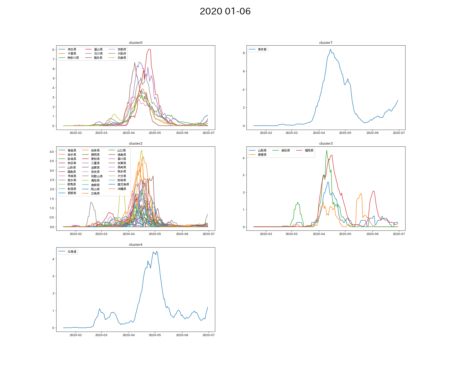
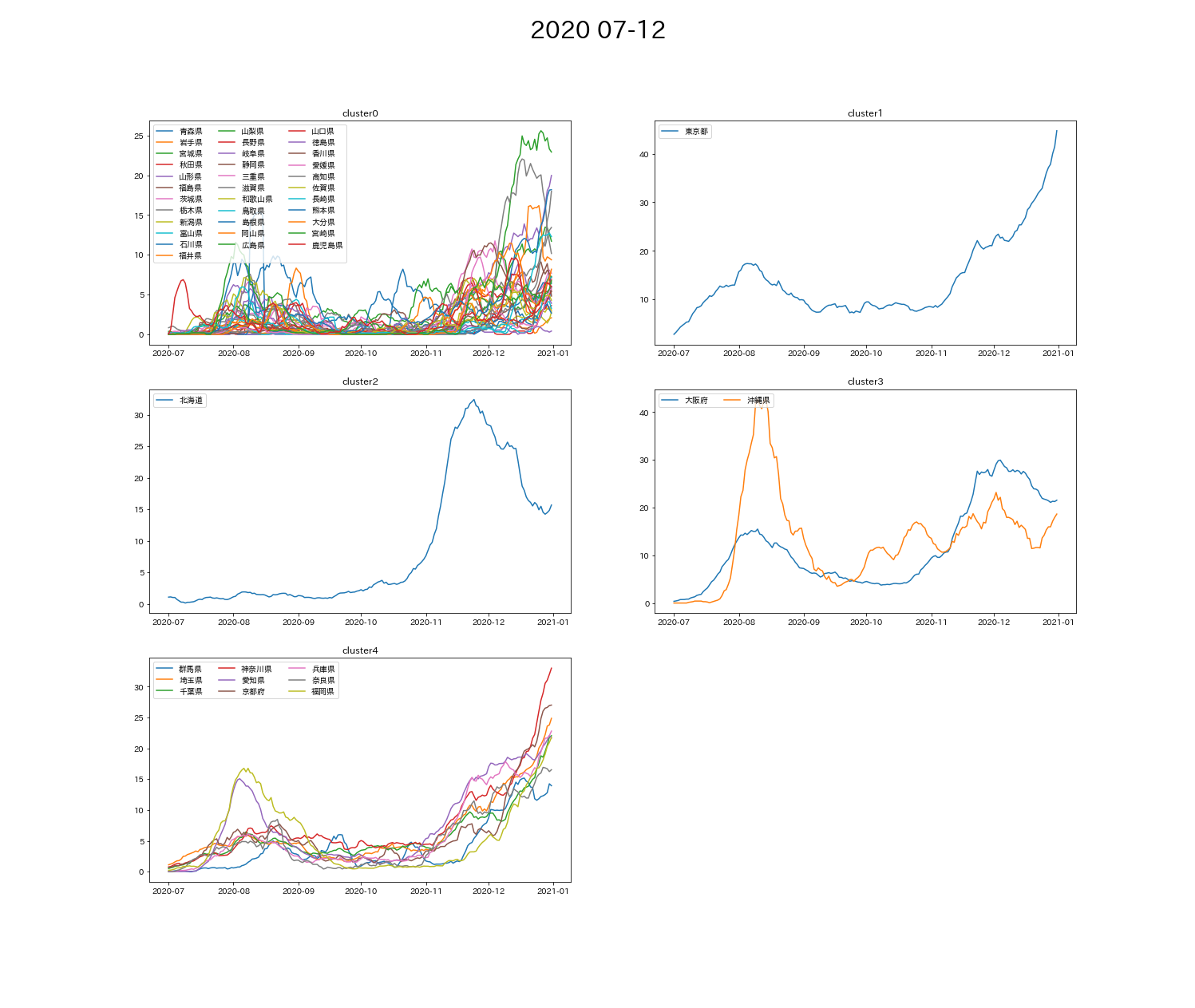
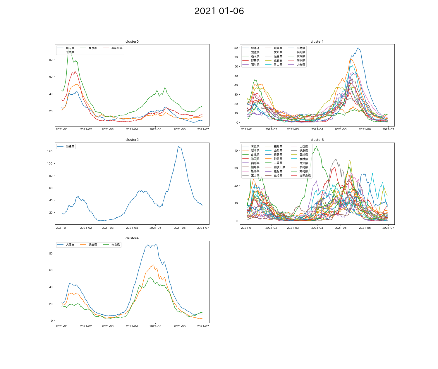
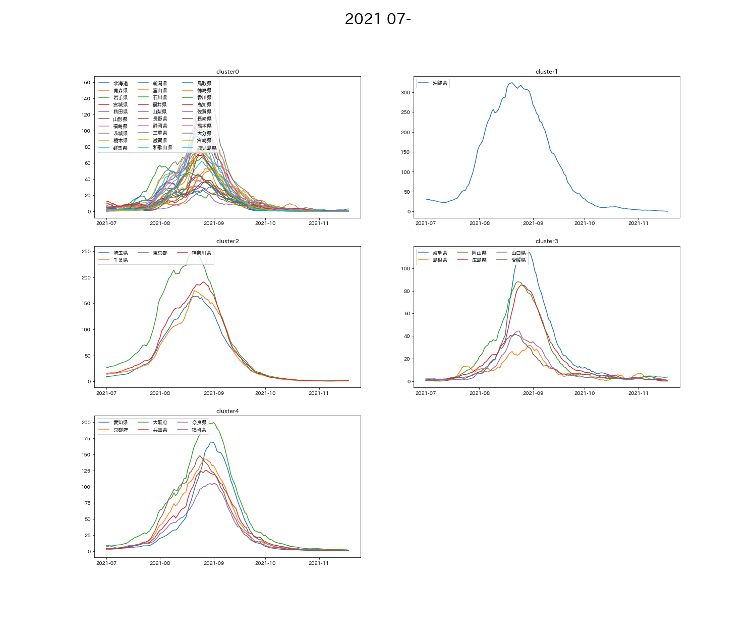
2020/1/18 - 2021/11/18の間のデータを半年ごとに5つに分類して、各結果を画像として保存
df, x_data, x_labels = data_get('2020/1/18', '2020/6/30')
cluster, df_cluster = k_means(df=df, x_data=x_data, n_clusters=5)
plot_view(cluster=cluster, df_cluster=df_cluster, graph_title='2020 01-06', x_labels=x_labels)

df, x_data, x_labels = data_get('2020/7/1', '2020/12/31')
cluster, df_cluster = k_means(df=df, x_data=x_data, n_clusters=5)
plot_view(cluster=cluster, df_cluster=df_cluster, graph_title='2020 07-12', x_labels=x_labels)

df, x_data, x_labels = data_get('2021/1/1', '2021/6/30')
cluster, df_cluster = k_means(df=df, x_data=x_data, n_clusters=5)
plot_view(cluster=cluster, df_cluster=df_cluster, graph_title='2021 01-06', x_labels=x_labels)

df, x_data, x_labels = data_get('2021/7/1', '2021/11/18')
cluster, df_cluster = k_means(df=df, x_data=x_data, n_clusters=5)
plot_view(cluster=cluster, df_cluster=df_cluster, graph_title='2021 07-', x_labels=x_labels)
○ 結果
➀第1波 4-5月
➁第2波 8月
➂第3波 1月・第4波 4-5月
➃第5波 8-9月
結果から考察
- 東京・北海道・大阪・沖縄の4つの都道府県は、他の都道府県に比べて少し特殊な分類になることが多い。
- 2021~ 1都3県が同じクラスタに分かれている。足並みをそろえた結果か?
- ➂の分類結果が顕著だが、比較的近い地域でクラスタ分類されている。(cluster0が関東・cluster3が関西)
- ➂の分類から、
cluster0(関東)は第3波>第4波
cluster4(関西)は第3波<第4波
となっていて、cluster4グループに比べてcluster0グループは、第4波の感染者の増減を抑えられている。 - 最近に近づくにつれて、グループごとの波の特色がなくなってきている。
○ 参考
https://www.youtube.com/watch?v=okpRV08-svw
https://qiita.com/HidKamiya/items/c3cc11438d1f67f655cb
○ データの利用
「新型コロナ関連の情報提供:NHK」