凡例の表示、曲線の選択
ax.legend()にオプションを何も含めない場合。
import matplotlib.pyplot as plt
import numpy as np

x = np.linspace(-3, 3, 101)
y1 = np.sin(x * np.pi)
y2 = np.cos(x * 2 * np.pi) * 0.5

fig = plt.figure()
ax = fig.add_subplot(111)

# labelオプションで凡例に用いる曲線名を指定
ax.plot(x, y1, c="r", label="$\mathrm{sin}(x)$")
ax.plot(x, y2, c="b", label="$0.5 \mathrm{cos}(2x)$")
ax.grid(axis='both')

# 凡例の表示
ax.legend()
上と全く同じ図を、ax.get_legend_handles_labels()で獲得した曲線情報、ラベル情報を用いて描画すると下記のようになる。
ax.plot(x, y1, c="r", label="$\mathrm{sin}(x)$")
ax.plot(x, y2, c="b", label="$0.5 \mathrm{cos}(2x)$")
ax.grid(axis='both')

# handsにはlabelが指定された曲線オブジェクトのリスト、
# labsには対応するlabelのリストが入る
hans, labs = ax.get_legend_handles_labels()

# 凡例の表示
ax.legend(handles=hans, labels=labs)
ax.get_legend_handles_labels()で獲得した曲線情報、ラベル情報は下記のようにも指定できる。
handlesの中で、ax.plot()によるl1やl2はリスト型なので、+演算子で結合する。ax.scatter()だとリスト型ではないので、[s1, s2]のように結合する。
l1 = ax.plot(x, y1, c="r")
l2 = ax.plot(x, y2, c="b")
ax.grid(axis='both')

# 凡例の表示
# 今回の場合、handlesは省略可。
ax.legend(handles=l1+l2, labels=["$\mathrm{sin}(x)$", "$0.5 \mathrm{cos}(2x)$"])
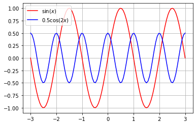
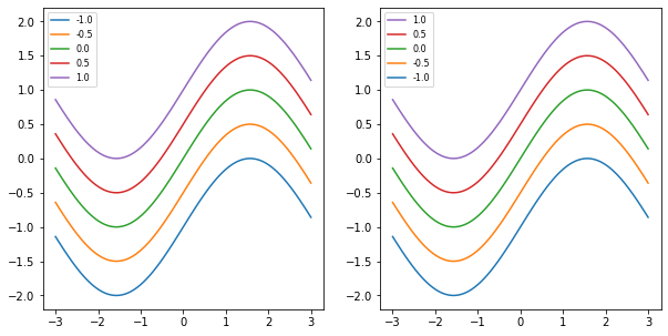
例えば、凡例の順序を逆転させたい場合は下記のようにする。
x = np.linspace(-3,3,101)

fig = plt.figure(figsize=(10,5))
# 左図
ax1 = fig.add_subplot(121)
# 右図
ax2 = fig.add_subplot(122)
for i in np.linspace(-1,1,5):
    ax1.plot(x, np.sin(x)+i, label=str(i))
    ax2.plot(x, np.sin(x)+i, label=str(i))

# 凡例情報の取得
hans, labs = ax1.get_legend_handles_labels()
# 左図凡例の表示
ax1.legend(handles=hans, labels=labs, fontsize=8)
# 右図凡例の表示(順序反転)
ax2.legend(handles=hans[::-1], labels=labs[::-1], fontsize=8)
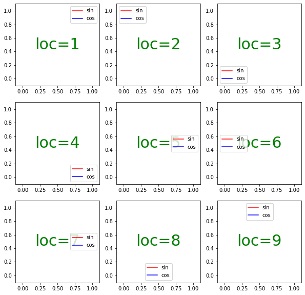
凡例のレイアウト
locオプション
1から9までの数字に対してaxis内の位置が定義される。該当する文字列でも指定可能("upper right", "upper left"など)。
fig = plt.figure(figsize=(10,10))
for i in range(1,9+1):
    ax = fig.add_subplot(330+i)

    # 描画に必要なリストを空にしたとしても、
    # 曲線のスタイルは定義され、凡例にも反映される。
    ax.plot([], [], c="r", label="sin")
    ax.plot([], [], c="b", label="cos")
    # 緑文字の追加(axisの中央に配置)
    ax.text(0.5, 0.5, "loc={}".format(i),
            c="g", fontsize=30,
            horizontalalignment="center",
            verticalalignment="center", )
    # locを指定した凡例の描画
    ax.legend(loc=i)
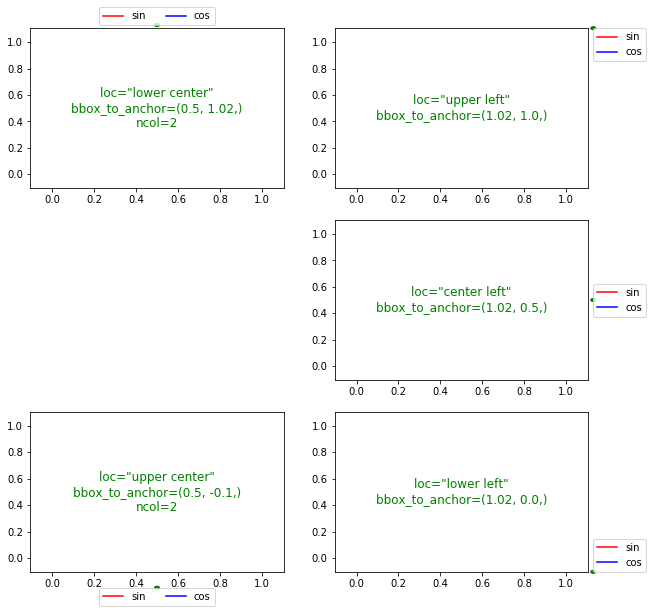
axis外への描画(bbox_to_anchor)、列数の変更(ncol)
わかりやすいように、bbox_to_anchorで指定した座標に緑色のマーカーを追加した。
fig = plt.figure(figsize=(10,10))

# 左上
ax = fig.add_subplot(321)
ax.plot([], [], c="r", label="sin")
ax.plot([], [], c="b", label="cos")
# axisの上部に凡例を描画
# 凡例ウィンドウの中央下に基準点
# 基準点の座標は、水平方向はaxis中央、上下方向はaxisの上辺より少し上
# ncolで2列表示を適用
ax.legend(loc="lower center", bbox_to_anchor=(0.5, 1.02,), borderaxespad=0, ncol=2)
# bbox_to_anchorの位置に緑色のマーカーの追加
# clip_on=Falseでaxis外への描画を許容
# transform=ax.transAxesで、axisの左下右上座標が(0,0)(1,1)になる系を適用。
circle = plt.Circle((0.5, 1.02,), 0.01, color='g', clip_on=False, transform=ax.transAxes)
ax.add_artist(circle)

# 右上
ax = fig.add_subplot(322)
ax.plot([], [], c="r", label="sin")
ax.plot([], [], c="b", label="cos")
# axisの右上に凡例を描画
# 凡例ウィンドウの左上に基準点
# 基準点の座標は、水平方向はaxisの右辺より少し右、上下方向はaxisの上辺
ax.legend(loc="upper left", bbox_to_anchor=(1.02, 1.0,), borderaxespad=0)
circle = plt.Circle((1.02, 1.0,), 0.01, color='g', clip_on=False, transform=ax.transAxes)
ax.add_artist(circle)

# 右中
ax = fig.add_subplot(324)
ax.plot([], [], c="r", label="sin")
ax.plot([], [], c="b", label="cos")
# axisの右中に凡例を描画
# 凡例ウィンドウの左中に基準点
# 基準点の座標は、水平方向はaxisの右辺より少し右、上下方向はaxisの中央
ax.legend(loc="center left", bbox_to_anchor=(1.02, 0.5,), borderaxespad=0)
circle = plt.Circle((1.02, 0.5,), 0.01, color='g', clip_on=False, transform=ax.transAxes)
ax.add_artist(circle)

# 左下
ax = fig.add_subplot(325)
ax.plot([], [], c="r", label="sin")
ax.plot([], [], c="b", label="cos")
# axisの下部に凡例を描画
# 凡例ウィンドウの中央上に基準点
# 基準点の座標は、水平方向はaxisの中央、上下方向はaxisの下辺より多めに下
ax.legend(loc="upper center", bbox_to_anchor=(0.5, -0.1,), borderaxespad=0, ncol=2)
circle = plt.Circle((0.5, -0.1,), 0.01, color='g', clip_on=False, transform=ax.transAxes)
ax.add_artist(circle)

# 右下
ax = fig.add_subplot(326)
ax.plot([], [], c="r", label="sin")
ax.plot([], [], c="b", label="cos")
# axisの右下に凡例を描画
# 凡例ウィンドウの左下に基準点
# 基準点の座標は、水平方向はaxisの右辺より少し右、上下方向はaxisの下辺
# ncolで2列表示を適用
ax.legend(loc="lower left", bbox_to_anchor=(1.02, 0.0,), borderaxespad=0)
circle = plt.Circle((1.02, 0.0,), 0.01, color='g', clip_on=False, transform=ax.transAxes)
ax.add_artist(circle)
上のコードでborderaxespad=0としていたのをborderaxespad=1とすると下の図のようになる。この数字は、font-sizeで指定されたポイント数を1とした相対値で定義される。
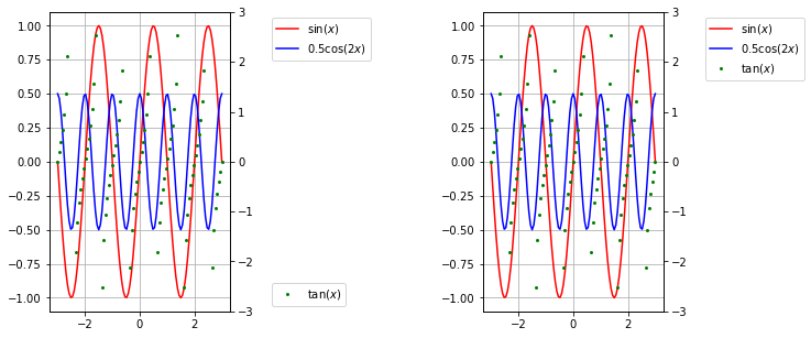
2軸グラフの凡例
上記2つを組み合わせる。
x = np.linspace(-3,3,101)
y1 = np.sin(x * np.pi)
y2 = np.cos(x * 2 * np.pi) * 0.5
z  = np.tan(x * np.pi)

fig = plt.figure(figsize=(10,5))

# 左図
# それぞれの軸の凡例を独立して描画
ax = fig.add_subplot(131)
ax.plot(x, y1, c="r", label="$\mathrm{sin}(x)$")
ax.plot(x, y2, c="b", label="$0.5 \mathrm{cos}(2x)$")
ax.grid(axis='both')
# 第1軸のグラフについて凡例の表示
ax.legend(loc="upper left", bbox_to_anchor=(1.2, 1.0))
# 第2軸
ax2 = ax.twinx()
ax2.plot(x, z, "g", marker="o", lw=0, ms=2, label = '$\mathrm{tan}(x)$')
ax2.set_ylim(-3,3)
# 第2軸のグラフについて凡例の表示
ax2.legend(loc="lower left", bbox_to_anchor=(1.2, 0.0))

# 右図
# 2つの軸の凡例を統合する
ax = fig.add_subplot(133)
ax.plot(x, y1, c="r", label="$\mathrm{sin}(x)$")
ax.plot(x, y2, c="b", label="$0.5 \mathrm{cos}(2x)$")
ax.grid(axis='both')
# 第1軸の凡例情報保持
hans1, labs1 = ax.get_legend_handles_labels()
# 第2軸
ax2 = ax.twinx()
ax2.plot(x, z, "g", marker="o", lw=0, ms=2, label = '$\mathrm{tan}(x)$')
ax2.set_ylim(-3,3)
# 第2軸の凡例情報保持
hans2, labs2 = ax2.get_legend_handles_labels()
# 凡例の表示
ax.legend(hans1+hans2, labs1+labs2, loc="upper left", bbox_to_anchor=(1.2, 1.0))