CSS animation day14 となりました。
本日は、Gooey Effect を使って、涙を表現したいと思います。
Gooey effect ってなに?という方は、こちら をご参照ください。
1. 完成版

2. 参考文献
3. 分解してみる
❶.
まず、Gooey Effect をいじって、どんな表現方法があるか研究します。
<!DOCTYPE html>
<html lang="ja">
  <head>
    <meta charset="UTF-8" />
    <link rel="stylesheet" href="css/styles.css" />
  </head>
  <body>
    <div class="container">
      <div class="gooey">
        <div class="circle"></div>
        <div class="circle"></div>
     <div class="circle"></div>
        <div class="circle"></div>
      </div>
    </div>
  </body>
</html>
body {
  margin: 0;
  padding: 0;
  width: 100%;
  height: 100vh;
}

.container {
  width: 100%;
  height: 100vh;
  display: flex;
  align-items: center;
  justify-content: center;
}

/gooey effect blur& contrast zone の高さを200pxにする
.gooey {
  position: relative;
  width: 1000px;
  height: 200px;
  margin: 0 auto;
  filter: blur(10px) contrast(5);
  background: #000;
}

.circle {
  position: absolute;
  top: 0;
  bottom: 0;
  width: 120px;
  height: 120px;
  margin: auto;
  background: #8080ff;
  border-radius: 50%;
  opacity: 1;
}

.circle:first-child {
  left: 15%;
  top: -40%;
}

.circle:nth-child(2) {
  left: 35%;
  top: -60%;
}

.circle:nth-child(3) {
  left: 55%;
  top: -80%;
}

.circle:nth-child(4) {
  left: 75%;
  top: -100%;
}
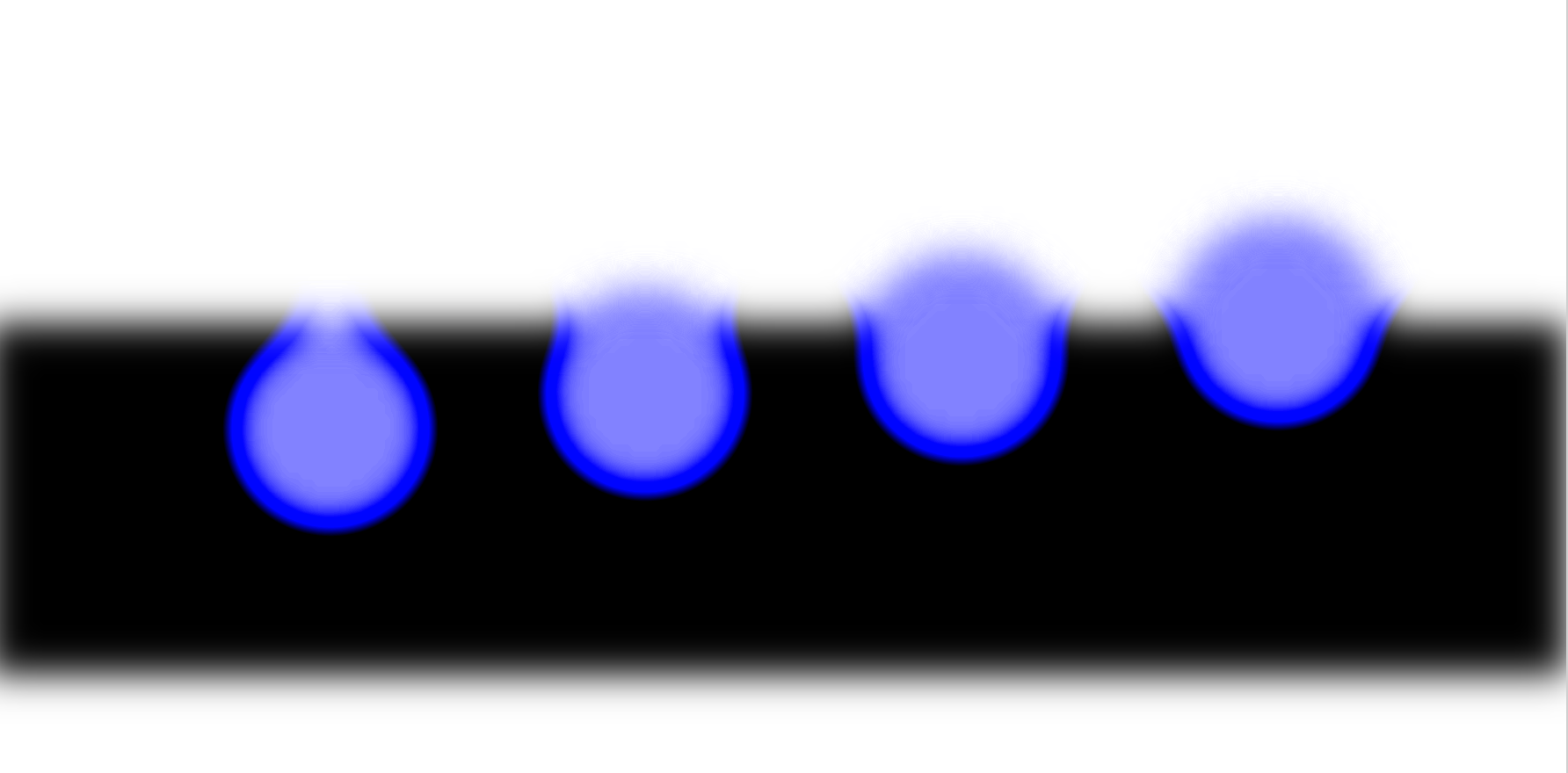
黒いぼやけが、blur/contrast zoneです。
4つの涙を、y軸の位置をずらして、配置しております。
一番左と、左から2番目が、涙の表現として使えそうです。
❷.
アニメーションを研究する
/gooey effect blur& contrast zone の高さを1000pxにする
.gooey {
  position: relative;
  width: 1000px;
  height: 1000px;
  margin: 0 auto;
  filter: blur(10px) contrast(5);
  background: #000;
}

.circle:first-child:hover {
  animation: move1 1s linear;
}

.circle:nth-child(2):hover {
  animation: move1 1s ease-in;
}

.circle:nth-child(3):hover {
  animation: move1 1s ease-out;
}

.circle:nth-child(4):hover {
  animation: move1 1s ease-in-out;
}

@keyframes move1 {
  0% {
    transform: translateX(0px);
  }
  20% {
    transform: translateY(100px);
  }
  50% {
    transform: translateY(200px);
  }
  80% {
    transform: translateY(300px);
  }
  100% {
    transform: translateY(400px);
  }
}
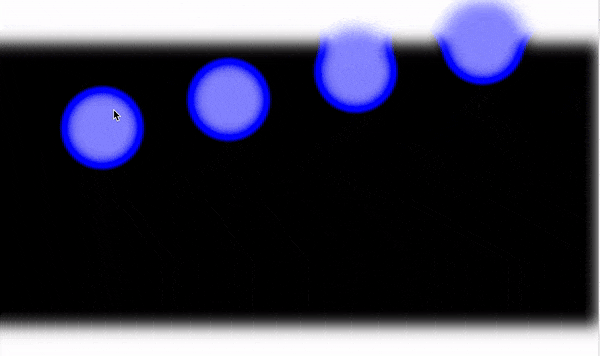
animation-timing-function を変えました。
左から、linear, ease, ease-in, ease-out です。
落下の表現は、linear が一番良さそうです。
では、keyframe でどんなアニメーションをつけたら良いでしょうか?
いじります。
.circle:first-child:hover {
  animation: move1 1s linear infinite;
}

.circle:nth-child(2):hover {
  animation: move2 1s linear infinite;
}

.circle:nth-child(3):hover {
  animation: move3 1s linear infinite;
}

.circle:nth-child(4):hover {
  animation: move4 1s linear infinite;
}

@keyframes move1 {
  0% {
    transform: translateX(0px);
  }
  20% {
    transform: translateY(100px) scale(0.6, 0.6);
  }
  50% {
    transform: translateY(200px) scale(0.6, 0.6);
  }
  80% {
    transform: translateY(300px) scale(0.6, 0.6);
  }
  100% {
    transform: translateY(400px) scale(0.6, 0.6);
  }
}

@keyframes move2 {
  0% {
    transform: translateX(0px);
  }
  20% {
    transform: translate(10px, 100px) scale(0.6, 0.6);
  }
  50% {
    transform: translate(20px, 200px) scale(0.6, 0.6);
  }
  80% {
    transform: translate(10px, 300px) scale(0.6, 0.6);
  }
  100% {
    transform: translateY(400px) scale(0.6, 0.6);
  }
}

@keyframes move3 {
  0% {
    transform: translateX(0px);
  }
  20% {
    transform: translateY(100px) scale(0.6, 0.6) rotateX(20deg);
  }
  50% {
    transform: translateY(200px) scale(0.6, 0.6) rotateX(40deg);
  }
  80% {
    transform: translateY(300px) scale(0.6, 0.6) rotateX(60deg);
  }
  100% {
    transform: translateY(400px) rotateX(90deg);
  }
}

@keyframes move4 {
  0% {
    transform: translateX(0px);
  }
  20% {
    transform: translateY(100px) scale(0.6, 0.6) rotateY(20deg);
  }
  50% {
    transform: translateY(200px) scale(0.6, 0.6) rotateY(40deg);
  }
  80% {
    transform: translateY(300px) scale(0.6, 0.6) rotateY(60deg);
  }
  100% {
    transform: translateY(400px) rotateY(90deg);
  }
}
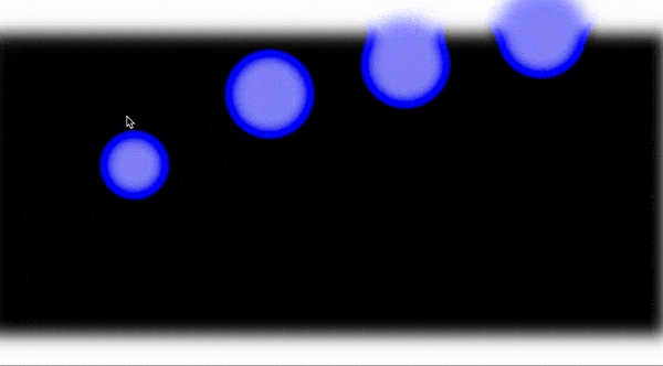
左から順に、
1: Y軸方向へ、サイズを小さくしながら、動く
2: 1: + X軸方向にちょっと動く
3: rotate X する
4: rotate Y する。
1, 4 は自然な流れで、違和感がありません、採用とします。
❸.
最後に、Gooey effect を駆使して、アニメーションのはじめに涙たまりを表現して完成です。
body {
  margin: 0;
  padding: 0;
  background: url("../img/face.png");
  background-size: cover;
  background-position-y: -300px;
  width: 100%;
  height: 100vh;
}

.container {
  width: 100%;
  height: 100vh;
  display: flex;
  align-items: center;
  justify-content: center;
}

.gooey {
  position: relative;
  width: 1000px;
  height: 200px;
  margin: 0 auto;
  filter: blur(10px) contrast(5);
  background: #fff;
}

.circle {
  position: absolute;
  top: 0;
  bottom: 0;
  width: 120px;
  height: 120px;
  margin: auto;
  background: #8080ff;
  border-radius: 50%;
  opacity: 1;
}

.circle:first-child {
  left: 20%;
  top: -80%;
  width: 100px;
  height: 60px;
}

.circle:nth-child(2) {
  left: 26%;
  top: -80%;
  width: 100px;
  height: 60px;
}

.circle:first-child:hover {
  animation: move1 1s linear 0.2s infinite;
}

.circle:nth-child(2):hover {
  animation: move2 1.5s linear 0.2s infinite;
}

@keyframes move1 {
  0% {
    transform: translateX(0px);
  }
  20% {
    transform: translate(-20px, 50px) scale(1.2, 2) rotateY(20deg);
  }
  50% {
    transform: translate(-20px, 100px) scale(0.6, 1.1) rotateY(30deg);
  }
  80% {
    transform: translate(-20px, 150px) scale(0.6, 1.1) rotateY(50deg);
  }
  100% {
    transform: translate(-20px, 200px) scale(0.6, 1.1) rotateY(90deg);
  }
}

@keyframes move2 {
  0% {
    transform: translateX(0px);
  }
  20% {
    transform: translate(20px, 30px) scale(1.2 0.5);
  }
  50% {
    transform: translateY(100px) scale(0.6, 0.6) rotateY(20deg);
  }
  80% {
    transform: translateY(150px) scale(0.6, 0.6) rotateY(50deg);
  }
  100% {
    transform: translateY(200px) scale(0.6, 0.6) rotateY(90deg);
  }
}
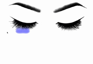
See the Pen crying face by hiroya iizuka (@hiroyaiizuka) on CodePen.
CodePen では、上記の通り、うまく表現できませんでした。原因としては
この記事の最初で申し上げた通り、背景が白でないと、このgooey effectはうまく使えず、背景画像との関係で、変な感じになってしまいます。
SVG を使えば、この悩みが解決するとのことで、明日は、Gooey EffectをSVGで表現します。それでは、また明日〜