CSS animation day13 となりました。
本日は、水滴のような表現 (Gooey Effect)についてです。
1. 完成版

See the Pen Gooey Effect by hiroya iizuka (@hiroyaiizuka) on CodePen.
2. Gooey Effect とは?
スライムのような水銀のようなものがヌメッと動くような表現です。
表現の仕方については、ポイントが3つあります。
1 背景に Blur をかけて、境界をぼやけさせる

2 contrast をつけて、そのぼやけた輪郭のコントラストをつける

何が起きたかというと、
背景の境界が強制的にぼやけてしまう所に放り込まれた円たちは、なされるがままに、その輪郭はぼやけてしまいます。しかし、ここでコントラストという救世主によって、円の輪郭は明瞭化し白黒はっきりなりますが、境界が曖昧だったところまで、ついでにはっきりしちゃった感じです。
こちら のブログによると、CSS では背景を一色に限定しなければならなく、SVG アニメーションの方が、汎用性があって、おすすめとのことでした。
3. 参考文献
Engineer Blog
CSS Tricks
UNORTHODOX WORKBOOK
4. 分解してみる
❶.
それでは、やっていきましょう。
<!DOCTYPE html>
<html lang="ja">
  <head>
    <meta charset="UTF-8" />
    <link rel="stylesheet" href="css/styles.css" />
  </head>
  <body>
    <div class="container">
      <div class="gooey">
        <div class="circle"></div>
        <div class="circle"></div>
      </div>
    </div>
  </body>
</html>
body {
  margin: 0;
  padding: 0;
}

.container {
  width: 100%;
  height: 100vh;
  align-items: center;
  justify-content: center;
  display: flex;
}

.gooey {
  position: relative;
  width: 500px;
  height: 500px;
  margin: 0 auto;
  filter: blur(10px) contrast(5);
  background: blue;
}
下準備ですが、
display: flex で水平方向に並列に並べます。
alignItems: centerで上下中央に、justify-content: center で左右中央にします。flexboxについて、詳細は こちら をご参照ください。

そして、背景にgooey effect のための設定をします。
blur と contrastをつけました。
❷.
では、丸を2つ作りましょう。
.circle {
  position: absolute;
  top: 0;
  bottom: 0;
  width: 120px;
  height: 120px;
  margin: auto;
  background: #fff;
  border-radius: 50%;
}

.circle:first-child {
  right: 50%;
}

.circle:nth-child(2) {
  left: 50%;
}

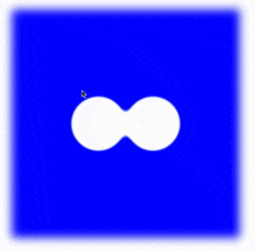
いい感じで、繋がってますね。
最後にHover で動きをつけます。
❸.
.circle:first-child:hover {
  animation: move 1s ease;
}

@keyframes move {
  0% {
    transform: translateX(0px);
  }
  10% {
    transform: translateX(50px);
  }
  30% {
    transform: translate(20px, -80px) scale(1.3, 1.3);
  }
  50% {
    transform: translate(20px, 50px);
  }
  60% {
    transform: translate(20px, 0px);
  }
  80% {
    transform: translate(-20px, 0px);
  }
  100% {
    transform: translate(0px, 0px);
  }
}
なお、animation-timing function では、アニメーションの開始と終了が滑らかになる、ease がかなり相性が良いと感じました。
明日は、このGooey Effect を応用して、涙を作ります。
ではまた!