はじめに
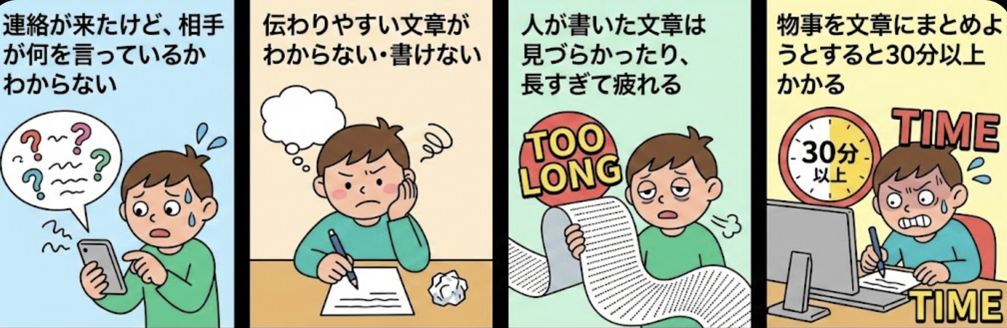
いきなりですが、あなたは、業務をするうえで以下のようなことで疲弊した経験はないでしょうか?
- 連絡が来たけど、相手が何を言っているかわからない
- 伝わりやすい文章がわからない・書けない
- 人が書いた文章は見づらかったり、長すぎて疲れる
- 物事を文章にまとめようとすると30分以上かかる
実は、この問題はAI時代だからこそ深刻化しています。
今、AIを使うのは当たり前で、文章を生成、情報を整理するのもAIに頼る人が大多数です。AIは瞬時に膨大な情報を処理できるので、確かに便利です。
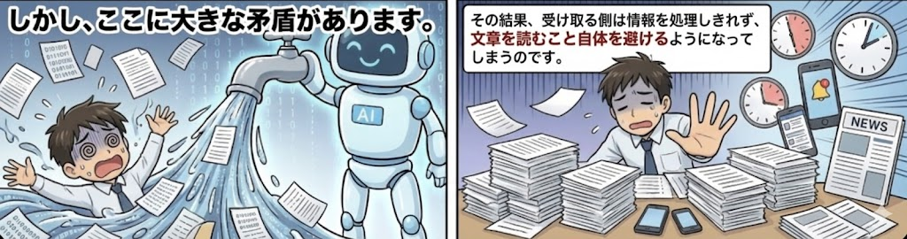
しかし、ここに大きな矛盾があります。
AIが生成する情報量が増えれば増えるほど、人間の認知能力を超えた情報の洪水が生まれます。
その結果、受け取る側は情報を処理しきれず、文章を読むこと自体を避けるようになってしまうのです。
加えて、そもそもAIに限らず世界の変化は速くなっており、日々、膨大な情報を処理しなければならなくなっており、この状況に追い打ちをかけているのが現代です。
『忙しい人に読んでもらえる文章術』によれば、情報過多かつAIなどテクノロジーが進歩した現代で、文章力はますます求められるスキルになっていると言われています。

矛盾していますが、データはこれを裏付けています。
同書の調査では、労働者の約半数はメールを未読で削除し、読んだとしてもメールの40%、テキストメッセージの20%は流し読みされることがわかっています。
つまり、AIやテクノロジーが情報を増やすほど、人間は文章を読まなくなるという逆説的な状況が生まれているのです。

理由は、人間の認知には限界があり、注意を向けられるリソースも限られているからです。
では、一体どうしたら 「伝わらない」 という状況を解決できるのでしょうか。
本記事では、その方法をお伝えしようと思います。
「伝わらない」を一発で消す方法
答えは、至ってシンプル、「図解でコミュニケーションすること」 です。

同書の調査では、労働者の約半数はメールを未読で削除し、読んだとしてもメールの40%、テキストメッセージの20%は流し読みされることがわかっています。
上記のようなデータもあり、文章力も求められる現代においては、私は、文章だけ でコミュニケーションするのは時代遅れだと感じています。
図解の効果を体感してみる
文章と図解の違いを実際に体験してみましょう。以下のサイトを使って、図解コミュニケーションの効果を体感できます。
このサイトはAI用と人間用で表示を切り替えることができます。
AI用はMarkdown形式で、テキスト情報の表示が主であるのに対し、人間用の表示は画像などを用いて見やすくされているのがわかると思います。
AI用のページ

人間用のページ
ここからも、図や画像があったほうが文章のみよりも遥かに見やすく理解しやすいことがわかるのではないでしょうか。
加えて、いくら上手に伝わりやすい文章を書いたとしても、読んでもらえなかったり、流し読みされたり、理解されなかったりする理由もなんとなく体感できたのではと思います。
「何」を書くかより「どこに」「どう」書くか
先ほどのparallel.aiの例で、図や画像の方が見やすいということを体感していただけたと思います。
実は、この「見やすさ」はWebサイトのUIだけでなく、文章を書く際にも同じことが言えます。
つまり、読んでもらえるわかりやすい文章においては、ある程度のデザイン性が必要ということです。
事実、『忙しい人に読んでもらえる文章術』では、「何」を書くかより「どこに」「どう」書くかというデザイン性が文章を作るうえでも重要であることが述べられています。

このデザインの重要性を示す実証データがあります。
2020年にニューヨークで行われた調査では、裁判所への出頭を命じる呼び出し書の新旧デザインを比較しました。17ヶ月間にわたって、32万4,000人近い住民が2種類のうちどちらかを受け取りました。
結果は驚くべきものでした。新しいデザインの呼び出し書を受け取った住民の「出頭しない率」は、従来の呼び出し書を受け取った住民と比べて13%低くなったのです。
研究者たちは、デザインの改良により約2万3,000件の逮捕状を発行せずに済んだと推論しています。
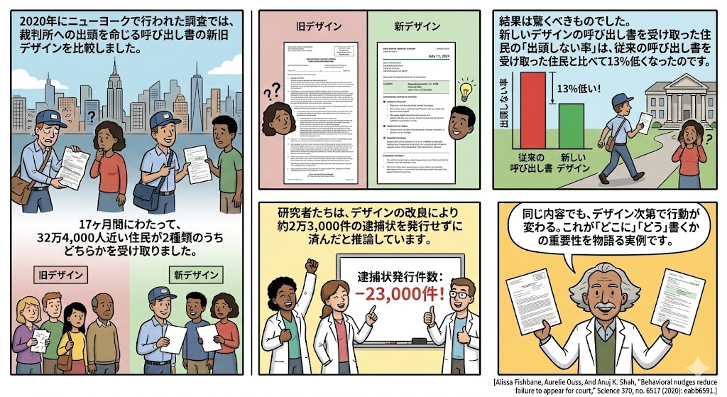
同じ内容でも、デザイン次第で行動が変わる。これが「どこに」「どう」書くかの重要性を物語る実例です。
とはいえ、毎回図解を作るのは面倒くさいというのが正直なところだと思います。

しかし、今回の方法は、誰でも簡単にサクッと図解でコミュニケーションする方法なので、ほとんど面倒ではありません。
図解コミュニケーションの実践方法
手順はたった2つだけです。
- AI Agentに依頼
- 生成された画像を共有
AI Agentに依頼についてはより具体的な方法を解説します。
AI Agentに依頼
ここの手順は以下のとおりです。
前提として、以下のツールを使用していることを想定しています。
- Claude Code / Cursor
- Playwright MCP
- Custom Slash Commandを入力 / promptを入力
- 引数に元の文章・ファイルを貼る
Custom Slash Command
Custom Slash Commandの場合、以下の画像のように、たったこれだけで図解ができます。

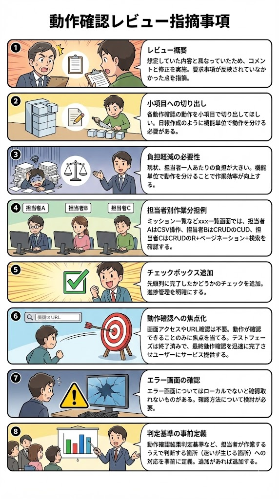
レビューしました
以下、指摘事項と私が修正した内容です

- 各動作確認の動作を小項目で切り出してほしい
  - 日報作成のように機能単位で動作を分ける
    - 現状、担当者一人あたりの負担が大きいです
      - 例えば、ミッション一覧などxxx一覧画面においては、以下にしたほうが作業効率は上がるはずです
        - 担当者AはCSVダウンロード・アップロードのみ確認する
        - 担当者Bは、CRUDのCUDを確認する
        - 担当者CはCRUDのR + ページネーション + 検索を確認する
- 先頭列に完了したかどうかのチェックを追加
- 画面アクセスできるかどうかや、URLの確認は不要
  - あくまで動作が確認できることのみに焦点を当ててください
  - これはテストではなく(テストフェーズはすでに終わった)、最終の動作確認で、可能な限り速く済ませ、ユーザーにサービス提供するフェーズです
- エラー画面についてはローカルでないと確認取れないものがありますが、どうしますか?
- 動作確認結果判定基準など、担当者が作業するうえで、判断する箇所(迷いが生じる箇所)への対応を事前に定義
  - 追加があれば追加してください
こちらで生成された図解は以下のとおりです。

実際のコマンドは以下になります。
visuzlize command
---
allowed-tools: Read, Write, Bash, TodoWrite, mcp__playwright__browser_navigate, mcp__playwright__browser_take_screenshot, mcp__playwright__browser_wait_for, mcp__playwright__browser_resize, mcp__playwright__browser_close, Glob
description: Convert documents to infographic images (PNG/JPG/PDF) for easy sharing
---
# /visualize - Document to Infographic Converter
## Overview
Transform documents into visually appealing infographic images that can be shared on chat applications like Slack, Teams, or Discord. Supports both quick summaries and detailed multi-section documents.
## Usage
```bash
/visualize <input-file> [options]
```
## Arguments
- `input-file`: Path to the document to visualize (required)
- Supported formats: `.md`, `.txt`, `.pdf`
## Options
| Option | Short | Description | Default |
|--------|-------|-------------|---------|
| `--output` | `-o` | Output file path | `{input}-infographic.png` |
| `--format` | `-f` | Output format (png/jpg/pdf) | `png` |
| `--theme` | `-t` | Visual theme | `business` |
| `--size` | `-s` | Image size preset | `chat` |
| `--max-points` | `-m` | Maximum key points to extract | `6` |
| `--lang` | `-l` | Output language (ja/en) | `ja` |
| `--title` | | Custom title (overrides auto-extraction) | auto |
| `--style` | | Output style (summary/visual/detailed) | `summary` |
| `--audience` | `-a` | Target audience (executive/team/technical) | `team` |
| `--diagram` | `-d` | Include Mermaid diagrams (summary/detailed) | `false` |
| `--icons` | | Show icons for key points | `true` |
| `--sections` | | Number of sections (detailed style) | `auto` |
| `--visual-type` | `-vt` | Visual format (diagram/cards/comic/auto) | `auto` |
| `--panels` | `-p` | Panel count for comic format (2-6) | `3` |
### Themes
| Theme | Description | Best For |
|-------|-------------|----------|
| `business` | Professional blue tones, clean layout | Work presentations |
| `modern` | Vibrant colors, gradient backgrounds | Marketing materials |
| `tech` | Dark accents, monospace fonts | Technical documentation |
| `minimal` | White space, simple typography | Clean summaries |
| `dark` | Dark background, high contrast | Screen-friendly viewing |
### Size Presets
| Preset | Dimensions | Best For |
|--------|------------|----------|
| `chat` | 1200x630px | Slack, Teams, Discord sharing |
| `slide` | 1920x1080px | Presentations |
| `a4` | 2480x3508px | Print (A4 portrait) |
| `square` | 1080x1080px | Social media |
### Output Styles
| Style | Description | Use Case | Understanding Level |
|-------|-------------|----------|---------------------|
| `summary` | Single page, concise overview | Quick sharing, chat previews | Surface (what exists) |
| `visual` | Diagram + context explanation | Understanding documents | **Deep (why & how)** |
| `detailed` | Multi-section document with TOC | Formal reports | Comprehensive (everything) |
### Visual Types (`--visual-type`, visual style only)
| Type | Description | Best For |
|------|-------------|----------|
| `diagram` | Mermaid diagram + context explanation | Flows, processes, API, data structures |
| `cards` | Card-based layout with "why" explanations | Feature lists, comparisons, categories |
| `comic` | Panel-based storytelling layout | User journeys, tutorials, before/after |
| `auto` | Auto-select based on content analysis | **Default** |
### Panel Options (`--panels`, comic type only)
| Panels | Layout | Best For |
|--------|--------|----------|
| `2` | Side-by-side (50%-50%) | Before/After comparisons |
| `3` | Three columns (33%-33%-33%) | Introduction → Development → Conclusion |
| `4` | 2x2 grid | Step-by-step tutorials (起承転結) |
| `5-6` | 3x2 grid | Longer procedures |
### Target Audience
| Audience | Tone | Content Focus |
|----------|------|---------------|
| `executive` | High-level, minimal jargon | Business impact, KPIs, ROI |
| `team` | Balanced, practical | Action items, timelines, deliverables |
| `technical` | Detailed, technical depth | Architecture, implementation, APIs |
## Examples
```bash
# Basic usage - convert PDF to infographic
/visualize ./docs/report.pdf
# Specify theme and size
/visualize ./notes.md --theme modern --size slide
# Output as JPEG with custom filename
/visualize ./spec.txt -o ./output/summary.jpg -f jpg
# Japanese output with custom title
/visualize ./meeting.md --lang ja --title "会議サマリー"
# Technical documentation style
/visualize ./api-docs.md --theme tech --max-points 8
# Detailed multi-section infographic
/visualize ./spec.md --style detailed --sections 4
# Executive summary for leadership
/visualize ./quarterly-report.pdf --audience executive --style summary
# Visual style - auto-select format
/visualize ./architecture.md --style visual
# Visual style - explicit diagram format
/visualize ./api-flow.md --style visual --visual-type diagram
# Visual style - cards format
/visualize ./features.md --style visual --visual-type cards
# Visual style - comic format (3 panels, default)
/visualize ./user-journey.md --style visual --visual-type comic
# Visual style - comic format (4 panels)
/visualize ./tutorial.md --style visual --visual-type comic --panels 4
# Visual style - Before/After comparison (2 panels)
/visualize ./improvement.md --style visual --visual-type comic --panels 2
# Technical documentation with diagrams (detailed)
/visualize ./api-spec.md --audience technical --diagram --style detailed
# Team-friendly document with diagrams
/visualize ./process.md --diagram --theme modern --size slide
# PDF output for formal report
/visualize ./project-plan.md --style detailed --format pdf --audience team
```
## Processing Workflow
When you receive this command, follow these steps:
### Step 1: Read and Analyze Document
1. Use the `Read` tool to read the input file
2. Analyze the document structure and content
3. Identify the main topic/title
4. Determine appropriate diagram types (if `--diagram` is set)
### Step 2: Extract Key Points Based on Audience
Extract information adapted to the target audience:
#### For `executive` audience:
- **Focus**: Business impact, ROI, strategic implications
- **Metrics**: KPIs, percentages, financial figures
- **Language**: Non-technical, decision-focused
- **Structure**: Bottom-line first, then supporting evidence
#### For `team` audience:
- **Focus**: Actionable items, responsibilities, timelines
- **Metrics**: Progress indicators, milestones
- **Language**: Balanced technical/business terms
- **Structure**: Context → Details → Action items
#### For `technical` audience:
- **Focus**: Implementation details, architecture, APIs
- **Metrics**: Performance stats, technical specifications
- **Language**: Technical terminology, code references
- **Structure**: Overview → Technical deep-dive → Integration notes
### Step 3: Generate Mermaid Diagrams (if --diagram)
Analyze content to auto-select appropriate diagram type:
| Content Pattern | Diagram Type | Example |
|-----------------|--------------|---------|
| Process/workflow description | `flowchart` | Step-by-step procedures |
| Time-based data | `gantt` | Project timelines |
| Data structure | `erDiagram` | Database schemas |
| System communication | `sequence` | API interactions |
| Class/component structure | `classDiagram` | Architecture overview |
#### Mermaid Generation Template
```javascript
// Flowchart example
const flowchartTemplate = `
flowchart TD
A[{START_NODE}] --> B[{STEP_1}]
B --> C[{STEP_2}]
C --> D[{END_NODE}]
`;
// Sequence diagram example
const sequenceTemplate = `
sequenceDiagram
participant A as {ACTOR_1}
participant B as {ACTOR_2}
A->>B: {ACTION_1}
B-->>A: {RESPONSE}
`;
// Gantt chart example
const ganttTemplate = `
gantt
title {TITLE}
dateFormat YYYY-MM-DD
section {SECTION_1}
{TASK_1} :a1, {START}, {DURATION}
`;
```
### Step 4: Select Icon for Each Point (if --icons)
| Category | SVG Icon | Fallback | Usage |
|----------|----------|----------|-------|
| Success/Complete | CheckCircle2 | ✓ | Achievements, completed items |
| Warning/Caution | AlertTriangle | ⚠ | Risks, concerns |
| Information | Info | ℹ | General information |
| Important | Star | ⭐ | Key highlights |
| Time | Clock | 🕐 | Deadlines, schedules |
| Person | User | 👤 | Team members, stakeholders |
| Settings | Settings | ⚙ | Configuration, setup |
| Data | BarChart2 | 📊 | Statistics, metrics |
| Document | FileText | 📄 | References, documentation |
| Communication | MessageCircle | 💬 | Discussions, feedback |
### Step 4.5: SVG Icon Library (Lucide Icons)
Use these SVG icons inline in HTML templates. All icons use `stroke="currentColor"` for theme color adaptation:
```javascript
const svgIcons = {
success: `<svg xmlns="http://www.w3.org/2000/svg" width="24" height="24" viewBox="0 0 24 24" fill="none" stroke="currentColor" stroke-width="2" stroke-linecap="round" stroke-linejoin="round"><circle cx="12" cy="12" r="10"/><path d="m9 12 2 2 4-4"/></svg>`,
warning: `<svg xmlns="http://www.w3.org/2000/svg" width="24" height="24" viewBox="0 0 24 24" fill="none" stroke="currentColor" stroke-width="2" stroke-linecap="round" stroke-linejoin="round"><path d="m21.73 18-8-14a2 2 0 0 0-3.48 0l-8 14A2 2 0 0 0 4 21h16a2 2 0 0 0 1.73-3"/><path d="M12 9v4"/><path d="M12 17h.01"/></svg>`,
info: `<svg xmlns="http://www.w3.org/2000/svg" width="24" height="24" viewBox="0 0 24 24" fill="none" stroke="currentColor" stroke-width="2" stroke-linecap="round" stroke-linejoin="round"><circle cx="12" cy="12" r="10"/><path d="M12 16v-4"/><path d="M12 8h.01"/></svg>`,
star: `<svg xmlns="http://www.w3.org/2000/svg" width="24" height="24" viewBox="0 0 24 24" fill="none" stroke="currentColor" stroke-width="2" stroke-linecap="round" stroke-linejoin="round"><polygon points="12 2 15.09 8.26 22 9.27 17 14.14 18.18 21.02 12 17.77 5.82 21.02 7 14.14 2 9.27 8.91 8.26 12 2"/></svg>`,
clock: `<svg xmlns="http://www.w3.org/2000/svg" width="24" height="24" viewBox="0 0 24 24" fill="none" stroke="currentColor" stroke-width="2" stroke-linecap="round" stroke-linejoin="round"><circle cx="12" cy="12" r="10"/><polyline points="12 6 12 12 16 14"/></svg>`,
user: `<svg xmlns="http://www.w3.org/2000/svg" width="24" height="24" viewBox="0 0 24 24" fill="none" stroke="currentColor" stroke-width="2" stroke-linecap="round" stroke-linejoin="round"><circle cx="12" cy="8" r="5"/><path d="M20 21a8 8 0 0 0-16 0"/></svg>`,
settings: `<svg xmlns="http://www.w3.org/2000/svg" width="24" height="24" viewBox="0 0 24 24" fill="none" stroke="currentColor" stroke-width="2" stroke-linecap="round" stroke-linejoin="round"><path d="M12.22 2h-.44a2 2 0 0 0-2 2v.18a2 2 0 0 1-1 1.73l-.43.25a2 2 0 0 1-2 0l-.15-.08a2 2 0 0 0-2.73.73l-.22.38a2 2 0 0 0 .73 2.73l.15.1a2 2 0 0 1 1 1.72v.51a2 2 0 0 1-1 1.74l-.15.09a2 2 0 0 0-.73 2.73l.22.38a2 2 0 0 0 2.73.73l.15-.08a2 2 0 0 1 2 0l.43.25a2 2 0 0 1 1 1.73V20a2 2 0 0 0 2 2h.44a2 2 0 0 0 2-2v-.18a2 2 0 0 1 1-1.73l.43-.25a2 2 0 0 1 2 0l.15.08a2 2 0 0 0 2.73-.73l.22-.39a2 2 0 0 0-.73-2.73l-.15-.08a2 2 0 0 1-1-1.74v-.5a2 2 0 0 1 1-1.74l.15-.09a2 2 0 0 0 .73-2.73l-.22-.38a2 2 0 0 0-2.73-.73l-.15.08a2 2 0 0 1-2 0l-.43-.25a2 2 0 0 1-1-1.73V4a2 2 0 0 0-2-2z"/><circle cx="12" cy="12" r="3"/></svg>`,
chart: `<svg xmlns="http://www.w3.org/2000/svg" width="24" height="24" viewBox="0 0 24 24" fill="none" stroke="currentColor" stroke-width="2" stroke-linecap="round" stroke-linejoin="round"><line x1="18" x2="18" y1="20" y2="10"/><line x1="12" x2="12" y1="20" y2="4"/><line x1="6" x2="6" y1="20" y2="14"/></svg>`,
document: `<svg xmlns="http://www.w3.org/2000/svg" width="24" height="24" viewBox="0 0 24 24" fill="none" stroke="currentColor" stroke-width="2" stroke-linecap="round" stroke-linejoin="round"><path d="M15 2H6a2 2 0 0 0-2 2v16a2 2 0 0 0 2 2h12a2 2 0 0 0 2-2V7Z"/><path d="M14 2v4a2 2 0 0 0 2 2h4"/><path d="M10 9H8"/><path d="M16 13H8"/><path d="M16 17H8"/></svg>`,
message: `<svg xmlns="http://www.w3.org/2000/svg" width="24" height="24" viewBox="0 0 24 24" fill="none" stroke="currentColor" stroke-width="2" stroke-linecap="round" stroke-linejoin="round"><path d="M7.9 20A9 9 0 1 0 4 16.1L2 22Z"/></svg>`
};
// Icon category to SVG key mapping
const iconMap = {
'success': 'success',
'warning': 'warning',
'info': 'info',
'important': 'star',
'time': 'clock',
'person': 'user',
'settings': 'settings',
'data': 'chart',
'document': 'document',
'communication': 'message'
};
// Fallback emojis (used when SVG fails to load)
const fallbackEmojis = {
success: '✓',
warning: '⚠',
info: 'ℹ',
star: '⭐',
clock: '🕐',
user: '👤',
settings: '⚙',
chart: '📊',
document: '📄',
message: '💬'
};
```
### Step 4.6: Illustration Library (unDraw CDN)
Use unDraw illustrations for larger visual elements based on content domain:
```javascript
const illustrations = {
technical: 'https://raw.githubusercontent.com/nickytonline/undraw/main/static/svg/undraw_programming_2svr.svg',
business: 'https://raw.githubusercontent.com/nickytonline/undraw/main/static/svg/undraw_business_plan_5i9d.svg',
security: 'https://raw.githubusercontent.com/nickytonline/undraw/main/static/svg/undraw_security_on_re_e491.svg',
analytics: 'https://raw.githubusercontent.com/nickytonline/undraw/main/static/svg/undraw_data_trends_b0wg.svg',
team: 'https://raw.githubusercontent.com/nickytonline/undraw/main/static/svg/undraw_team_spirit_hrr4.svg',
success: 'https://raw.githubusercontent.com/nickytonline/undraw/main/static/svg/undraw_celebration_0jvk.svg',
process: 'https://raw.githubusercontent.com/nickytonline/undraw/main/static/svg/undraw_process_e90d.svg',
default: 'https://raw.githubusercontent.com/nickytonline/undraw/main/static/svg/undraw_content_team_3epn.svg'
};
// Keyword-based illustration selection
function selectIllustration(content) {
const keywordMap = {
technical: ['api', 'code', 'programming', 'architecture', 'database', 'system', 'developer'],
business: ['revenue', 'profit', 'roi', 'kpi', 'strategy', 'market', 'sales'],
security: ['security', 'auth', 'protect', 'encrypt', 'vulnerability', 'access'],
analytics: ['data', 'analytics', 'chart', 'metric', 'trend', 'statistics', 'report'],
team: ['team', 'collaboration', 'member', 'stakeholder', 'organization', 'meeting'],
success: ['complete', 'achieve', 'success', 'milestone', 'launch', 'celebrate'],
process: ['workflow', 'process', 'flow', 'step', 'procedure', 'pipeline']
};
const lowerContent = content.toLowerCase();
for (const [domain, words] of Object.entries(keywordMap)) {
if (words.some(word => lowerContent.includes(word))) {
return illustrations[domain];
}
}
return illustrations.default;
}
```
### Step 5: Generate HTML Based on Style
#### Summary Style (`--style summary`)
Single-page layout with concise overview. **Presentation-optimized text sizes (min 24px):**
```html
<!DOCTYPE html>
<html>
<head>
<meta charset="UTF-8">
<style>
* { margin: 0; padding: 0; box-sizing: border-box; }
.infographic {
width: {WIDTH}px;
height: {HEIGHT}px;
background: {BACKGROUND};
font-family: {FONT_FAMILY};
padding: 50px;
display: flex;
flex-direction: column;
}
.header {
text-align: center;
margin-bottom: 40px;
}
.title {
font-size: 64px;
font-weight: 700;
color: {PRIMARY};
margin-bottom: 16px;
}
.subtitle {
font-size: 36px;
color: {TEXT};
opacity: 0.8;
}
.content {
flex: 1;
display: grid;
grid-template-columns: repeat(auto-fit, minmax(350px, 1fr));
gap: 30px;
align-content: start;
}
.point-card {
background: {SURFACE};
border-radius: 20px;
padding: 32px;
box-shadow: 0 4px 12px rgba(0,0,0,0.1);
border-left: 6px solid {ACCENT};
display: flex;
flex-direction: column;
}
/* SVG Icon Container */
.svg-icon {
display: inline-flex;
align-items: center;
justify-content: center;
width: 56px;
height: 56px;
margin-bottom: 16px;
color: {ACCENT};
}
.svg-icon svg {
width: 100%;
height: 100%;
}
/* Fallback emoji style */
.emoji-fallback {
font-size: 48px;
margin-bottom: 16px;
}
.point-number {
width: 48px;
height: 48px;
background: {PRIMARY};
color: white;
border-radius: 50%;
display: flex;
align-items: center;
justify-content: center;
font-weight: 700;
font-size: 24px;
margin-bottom: 16px;
}
.point-title {
font-size: 28px;
font-weight: 600;
color: {TEXT};
margin-bottom: 12px;
}
.point-description {
font-size: 24px;
color: {TEXT};
opacity: 0.85;
line-height: 1.6;
}
.metric {
font-size: 36px;
font-weight: 700;
color: {ACCENT};
margin-top: 16px;
}
.footer {
margin-top: auto;
padding-top: 24px;
display: flex;
justify-content: space-between;
font-size: 20px;
color: {TEXT};
opacity: 0.6;
}
</style>
</head>
<body>
<div class="infographic">
<header class="header">
<h1 class="title">{TITLE}</h1>
<p class="subtitle">{SUBTITLE}</p>
</header>
<main class="content">
<!-- Repeat for each key point -->
<div class="point-card">
<div class="svg-icon" data-fallback="{FALLBACK_EMOJI}">
{SVG_ICON}
</div>
<div class="point-number">{NUMBER}</div>
<h3 class="point-title">{POINT_TITLE}</h3>
<p class="point-description">{POINT_DESCRIPTION}</p>
<div class="metric">{METRIC}</div>
</div>
</main>
<footer class="footer">
<span>Source: {SOURCE_NAME}</span>
<span>Generated: {DATE}</span>
</footer>
</div>
<script>
// SVG fallback handler
document.querySelectorAll('.svg-icon').forEach(el => {
if (!el.querySelector('svg') || el.innerHTML.trim() === '') {
const fallback = el.getAttribute('data-fallback');
if (fallback) {
el.classList.add('emoji-fallback');
el.innerHTML = fallback;
}
}
});
</script>
</body>
</html>
```
#### Visual Style (`--style visual`)
**Understanding-focused layout with diagram + context explanation. Presentation-optimized text sizes (min 24px):**
The visual style focuses on helping readers understand "why" and "how", not just "what exists". It features:
- **Main diagram**: Visualizes structure, flow, or relationships
- **Context explanation**: 2-3 sentences explaining the diagram (not bullet points)
- **Key point cards**: Supplementary highlights
- **Illustration**: Domain-specific unDraw illustration
```html
<!DOCTYPE html>
<html>
<head>
<meta charset="UTF-8">
<script src="https://cdn.jsdelivr.net/npm/mermaid/dist/mermaid.min.js"></script>
<style>
* { margin: 0; padding: 0; box-sizing: border-box; }
.visual-infographic {
width: {WIDTH}px;
min-height: {HEIGHT}px;
background: {BACKGROUND};
font-family: {FONT_FAMILY};
padding: 40px;
}
.header {
margin-bottom: 30px;
}
.title {
font-size: 64px;
font-weight: 700;
color: {PRIMARY};
margin-bottom: 16px;
}
.overview {
font-size: 28px;
color: {TEXT};
opacity: 0.85;
line-height: 1.6;
}
.main-content {
display: flex;
gap: 30px;
margin-bottom: 30px;
}
.diagram-container {
flex: 2;
background: {SURFACE};
border-radius: 16px;
padding: 30px;
box-shadow: 0 4px 12px rgba(0,0,0,0.08);
}
.diagram-area {
background: white;
border-radius: 12px;
padding: 24px;
display: flex;
align-items: center;
justify-content: center;
min-height: 300px;
}
.illustration-container {
flex: 1;
display: flex;
align-items: center;
justify-content: center;
padding: 20px;
}
.illustration-container img {
max-width: 100%;
max-height: 300px;
height: auto;
}
.illustration-fallback {
background: linear-gradient(135deg, {PRIMARY}15, {ACCENT}15);
border-radius: 16px;
padding: 40px;
font-size: 72px;
text-align: center;
display: flex;
align-items: center;
justify-content: center;
min-height: 200px;
}
.context-explanation {
background: linear-gradient(135deg, {PRIMARY}08, {ACCENT}08);
border-left: 6px solid {ACCENT};
border-radius: 0 16px 16px 0;
padding: 28px;
margin-bottom: 30px;
}
.context-text {
font-size: 24px;
color: {TEXT};
line-height: 1.8;
}
.key-points {
display: grid;
grid-template-columns: repeat(auto-fit, minmax(280px, 1fr));
gap: 25px;
}
.point-card {
background: {SURFACE};
border-radius: 14px;
padding: 24px;
box-shadow: 0 3px 10px rgba(0,0,0,0.06);
}
.point-header {
display: flex;
align-items: center;
gap: 12px;
margin-bottom: 12px;
}
.svg-icon {
display: inline-flex;
align-items: center;
justify-content: center;
width: 40px;
height: 40px;
color: {ACCENT};
}
.svg-icon svg {
width: 100%;
height: 100%;
}
.emoji-fallback {
font-size: 36px;
}
.point-title {
font-size: 28px;
font-weight: 600;
color: {PRIMARY};
}
.point-description {
font-size: 24px;
color: {TEXT};
opacity: 0.85;
line-height: 1.6;
}
.footer {
margin-top: 30px;
padding-top: 20px;
border-top: 2px solid rgba(0,0,0,0.1);
display: flex;
justify-content: space-between;
font-size: 20px;
color: {TEXT};
opacity: 0.6;
}
</style>
</head>
<body>
<div class="visual-infographic">
<header class="header">
<h1 class="title">{TITLE}</h1>
<p class="overview">{OVERVIEW_TEXT}</p>
</header>
<div class="main-content">
<div class="diagram-container">
<div class="diagram-area">
<div class="mermaid">
{MERMAID_CODE}
</div>
</div>
</div>
<div class="illustration-container">
<img src="{ILLUSTRATION_URL}"
alt="{ILLUSTRATION_ALT}"
onerror="this.parentElement.innerHTML='<div class=\'illustration-fallback\'>📊</div>'" />
</div>
</div>
<div class="context-explanation">
<p class="context-text">{CONTEXT_EXPLANATION}</p>
</div>
<div class="key-points">
<div class="point-card">
<div class="point-header">
<span class="svg-icon" data-fallback="{FALLBACK_1}">{SVG_ICON_1}</span>
<span class="point-title">{POINT_TITLE_1}</span>
</div>
<p class="point-description">{POINT_DESC_1}</p>
</div>
<div class="point-card">
<div class="point-header">
<span class="svg-icon" data-fallback="{FALLBACK_2}">{SVG_ICON_2}</span>
<span class="point-title">{POINT_TITLE_2}</span>
</div>
<p class="point-description">{POINT_DESC_2}</p>
</div>
<div class="point-card">
<div class="point-header">
<span class="svg-icon" data-fallback="{FALLBACK_3}">{SVG_ICON_3}</span>
<span class="point-title">{POINT_TITLE_3}</span>
</div>
<p class="point-description">{POINT_DESC_3}</p>
</div>
</div>
<footer class="footer">
<span>Source: {SOURCE_NAME}</span>
<span>Generated: {DATE}</span>
</footer>
</div>
<script>
mermaid.initialize({ startOnLoad: true, theme: 'default' });
// SVG fallback handler
document.querySelectorAll('.svg-icon').forEach(el => {
if (!el.querySelector('svg') || el.innerHTML.trim() === '') {
const fallback = el.getAttribute('data-fallback');
if (fallback) {
el.classList.add('emoji-fallback');
el.innerHTML = fallback;
}
}
});
</script>
</body>
</html>
```
**Visual Style Generation Logic:**
1. **Extract visualizable structure**: Identify flows, relationships, or hierarchies from the document
2. **Select diagram type**: Choose the most appropriate Mermaid diagram based on content
3. **Generate context explanation**: Create 2-3 sentences explaining "why" and "how" (not bullet points)
4. **Create key point cards**: Extract 3-4 supplementary highlights
**Key differences from summary:**
- summary: Extracts bullet points ("what exists")
- visual: **Identifies structure/flow** → **Generates contextual explanation** ("why & how")
#### Visual Style - Cards Format (`--visual-type cards`)
Card-based layout with deeper explanations than summary. **Presentation-optimized (min 24px). Auto-switches to vertical layout for 5+ cards:**
```html
<!DOCTYPE html>
<html>
<head>
<meta charset="UTF-8">
<style>
* { margin: 0; padding: 0; box-sizing: border-box; }
.visual-cards {
width: {WIDTH}px;
min-height: {HEIGHT}px;
background: {BACKGROUND};
font-family: {FONT_FAMILY};
padding: 40px;
display: flex;
flex-direction: column;
}
.header {
text-align: center;
margin-bottom: 35px;
}
.title {
font-size: 64px;
font-weight: 700;
color: {PRIMARY};
margin-bottom: 16px;
}
.overview {
font-size: 28px;
color: {TEXT};
opacity: 0.85;
line-height: 1.6;
}
/* Horizontal grid layout (4 cards or less) */
.cards-grid-horizontal {
flex: 1;
display: grid;
grid-template-columns: repeat(auto-fit, minmax(320px, 1fr));
gap: 30px;
align-content: start;
}
/* Vertical layout (5+ cards) */
.cards-grid-vertical {
flex: 1;
display: flex;
flex-direction: column;
gap: 24px;
}
.cards-grid-vertical .visual-card {
flex-direction: row;
align-items: flex-start;
gap: 24px;
}
.cards-grid-vertical .card-icon-container {
flex-shrink: 0;
}
.cards-grid-vertical .card-content {
flex: 1;
}
.visual-card {
background: {SURFACE};
border-radius: 16px;
padding: 28px;
box-shadow: 0 4px 12px rgba(0,0,0,0.08);
display: flex;
flex-direction: column;
}
.card-icon-container {
margin-bottom: 16px;
}
.svg-icon {
display: inline-flex;
align-items: center;
justify-content: center;
width: 56px;
height: 56px;
color: {ACCENT};
}
.svg-icon svg {
width: 100%;
height: 100%;
}
.emoji-fallback {
font-size: 48px;
}
.card-title {
font-size: 28px;
font-weight: 600;
color: {PRIMARY};
margin-bottom: 12px;
}
.card-description {
font-size: 24px;
color: {TEXT};
line-height: 1.6;
margin-bottom: 16px;
}
.card-why {
font-size: 24px;
color: {ACCENT};
font-style: italic;
padding-top: 14px;
border-top: 2px solid rgba(0,0,0,0.1);
margin-top: auto;
}
.footer {
margin-top: 30px;
padding-top: 20px;
border-top: 2px solid rgba(0,0,0,0.1);
display: flex;
justify-content: space-between;
font-size: 20px;
color: {TEXT};
opacity: 0.6;
}
</style>
</head>
<body>
<div class="visual-cards">
<header class="header">
<h1 class="title">{TITLE}</h1>
<p class="overview">{OVERVIEW_TEXT}</p>
</header>
<!-- Use cards-grid-horizontal for 4 or fewer cards, cards-grid-vertical for 5+ -->
<div class="{CARDS_LAYOUT_CLASS}">
<!-- Repeat for each card (3-6 cards) -->
<div class="visual-card">
<div class="card-icon-container">
<div class="svg-icon" data-fallback="{FALLBACK_EMOJI}">
{SVG_ICON}
</div>
</div>
<div class="card-content">
<h3 class="card-title">{CARD_TITLE}</h3>
<p class="card-description">{CARD_DESCRIPTION}</p>
<p class="card-why">Why: {WHY_IMPORTANT}</p>
</div>
</div>
</div>
<footer class="footer">
<span>Source: {SOURCE_NAME}</span>
<span>Generated: {DATE}</span>
</footer>
</div>
<script>
// SVG fallback handler
document.querySelectorAll('.svg-icon').forEach(el => {
if (!el.querySelector('svg') || el.innerHTML.trim() === '') {
const fallback = el.getAttribute('data-fallback');
if (fallback) {
el.classList.add('emoji-fallback');
el.innerHTML = fallback;
}
}
});
</script>
</body>
</html>
```
**Cards Layout Selection Logic:**
```javascript
// Select layout based on card count
const cardsLayoutClass = cards.length >= 5 ? 'cards-grid-vertical' : 'cards-grid-horizontal';
```
**Cards Format Generation Logic:**
1. Extract 3-6 key points from the document
2. Select layout: horizontal grid (4 or fewer) or vertical list (5+)
3. For each point, generate:
- SVG Icon (based on category, with emoji fallback)
- Title (short, descriptive)
- Description (what it is)
- **Why Important** (deeper explanation - this is what differentiates from summary)
#### Visual Style - Comic Format (`--visual-type comic`)
Panel-based storytelling layout with configurable panel count. **Presentation-optimized (min 24px). Auto-switches to vertical layout for 5+ panels:**
```html
<!DOCTYPE html>
<html>
<head>
<meta charset="UTF-8">
<style>
* { margin: 0; padding: 0; box-sizing: border-box; }
.visual-comic {
width: {WIDTH}px;
min-height: {HEIGHT}px;
background: {BACKGROUND};
font-family: {FONT_FAMILY};
padding: 40px;
display: flex;
flex-direction: column;
}
.header {
text-align: center;
margin-bottom: 30px;
}
.title {
font-size: 64px;
font-weight: 700;
color: {PRIMARY};
}
/* Horizontal grid layouts (2-4 panels) */
.panels-container {
flex: 1;
display: grid;
gap: 25px;
}
.panels-2 { grid-template-columns: 1fr 1fr; }
.panels-3 { grid-template-columns: 1fr 1fr 1fr; }
.panels-4 { grid-template-columns: 1fr 1fr; grid-template-rows: 1fr 1fr; }
/* Vertical layout (5+ panels) */
.panels-vertical {
flex: 1;
display: flex;
flex-direction: column;
gap: 20px;
}
.panels-vertical .panel {
flex-direction: row;
min-height: 150px;
}
.panels-vertical .panel-visual {
width: 200px;
flex-shrink: 0;
min-height: auto;
}
.panels-vertical .panel-content {
flex: 1;
border-top: none;
border-left: 3px solid rgba(0,0,0,0.1);
display: flex;
flex-direction: column;
justify-content: center;
}
.panel {
background: {SURFACE};
border-radius: 16px;
border: 4px solid {PRIMARY};
overflow: hidden;
display: flex;
flex-direction: column;
position: relative;
}
.panel-number {
position: absolute;
top: 12px;
left: 12px;
width: 40px;
height: 40px;
background: {PRIMARY};
color: white;
border-radius: 50%;
display: flex;
align-items: center;
justify-content: center;
font-weight: 700;
font-size: 24px;
z-index: 1;
}
.panel-visual {
flex: 1;
background: linear-gradient(135deg, {SURFACE} 0%, {BACKGROUND} 100%);
display: flex;
align-items: center;
justify-content: center;
padding: 30px;
min-height: 180px;
}
.illustration-container {
max-width: 180px;
max-height: 150px;
}
.illustration-container img {
width: 100%;
height: auto;
}
.illustration-fallback {
font-size: 72px;
text-align: center;
}
.panel-content {
padding: 20px;
background: {SURFACE};
border-top: 3px solid rgba(0,0,0,0.1);
}
.panel-title {
font-size: 28px;
font-weight: 600;
color: {PRIMARY};
margin-bottom: 8px;
}
.panel-text {
font-size: 24px;
color: {TEXT};
line-height: 1.5;
}
.footer {
margin-top: 25px;
padding-top: 20px;
border-top: 2px solid rgba(0,0,0,0.1);
display: flex;
justify-content: space-between;
font-size: 20px;
color: {TEXT};
opacity: 0.6;
}
</style>
</head>
<body>
<div class="visual-comic">
<header class="header">
<h1 class="title">{TITLE}</h1>
</header>
<!-- Use panels-{N} for 2-4 panels, panels-vertical for 5+ -->
<div class="panels-container {PANELS_LAYOUT_CLASS}">
<!-- Repeat for each panel -->
<div class="panel">
<div class="panel-number">{N}</div>
<div class="panel-visual">
<div class="illustration-container">
<img src="{PANEL_ILLUSTRATION_URL}"
alt="{PANEL_ALT}"
onerror="this.parentElement.innerHTML='<div class=\'illustration-fallback\'>{FALLBACK_EMOJI}</div>'" />
</div>
</div>
<div class="panel-content">
<h4 class="panel-title">{PANEL_TITLE}</h4>
<p class="panel-text">{PANEL_TEXT}</p>
</div>
</div>
</div>
<footer class="footer">
<span>Source: {SOURCE_NAME}</span>
<span>Generated: {DATE}</span>
</footer>
</div>
</body>
</html>
```
**Panels Layout Selection Logic:**
```javascript
// Select layout based on panel count
const panelsLayoutClass = panelCount >= 5 ? 'panels-vertical' : `panels-${panelCount}`;
```
**Comic Format Generation Logic:**
1. Analyze document for story/process structure
2. Select layout: grid (2-4 panels) or vertical (5+)
3. Divide content into {PANEL_COUNT} sequential parts:
- 2 panels: Before/After or Problem/Solution
- 3 panels: Introduction → Development → Conclusion
- 4 panels: 起 (Introduction) → 承 (Development) → 転 (Turn) → 結 (Conclusion)
- 5-6 panels: Extended step-by-step process (vertical layout)
4. For each panel:
- Select domain-appropriate illustration from unDraw CDN
- Create short title (28px)
- Write concise explanation (24px)
#### Visual Type Auto-Selection Logic
When `--visual-type auto` (default), analyze document content to select the best format:
| Content Pattern | Selected Type | Keywords/Indicators |
|-----------------|---------------|---------------------|
| Flow/Process | `diagram` | flow, process, step, API, pipeline, workflow |
| Data Structure | `diagram` | schema, model, database, relationship, architecture |
| Feature List | `cards` | features, benefits, advantages, capabilities, options |
| Comparison | `cards` | compare, vs, difference, pros/cons |
| Story/Journey | `comic` | story, journey, experience, before/after, transformation |
| Tutorial | `comic` | tutorial, how to, guide, steps |
| Mixed/Unknown | `cards` | (fallback when unclear) |
#### Detailed Style (`--style detailed`)
Multi-section layout with comprehensive coverage:
```html
<!DOCTYPE html>
<html>
<head>
<meta charset="UTF-8">
<script src="https://cdn.jsdelivr.net/npm/mermaid/dist/mermaid.min.js"></script>
<style>
* { margin: 0; padding: 0; box-sizing: border-box; }
body {
font-family: {FONT_FAMILY};
background: {BACKGROUND};
color: {TEXT};
}
.page {
width: {WIDTH}px;
min-height: {HEIGHT}px;
padding: 60px;
background: {SURFACE};
margin-bottom: 20px;
page-break-after: always;
position: relative;
}
/* SVG Icon Styles */
.svg-icon {
display: inline-flex;
align-items: center;
justify-content: center;
width: 48px;
height: 48px;
}
.svg-icon svg {
width: 100%;
height: 100%;
stroke: {ACCENT};
fill: none;
}
.svg-icon--lg { width: 64px; height: 64px; }
.svg-icon--xl { width: 96px; height: 96px; }
/* Cover Page */
.cover {
display: flex;
flex-direction: column;
justify-content: center;
align-items: center;
text-align: center;
height: {HEIGHT}px;
}
.cover-illustration {
width: 100%;
max-width: 350px;
margin-bottom: 40px;
}
.cover-illustration img {
width: 100%;
height: auto;
max-height: 300px;
object-fit: contain;
}
.illustration-fallback {
background: linear-gradient(135deg, {PRIMARY}10, {ACCENT}10);
border-radius: 20px;
padding: 50px;
font-size: 80px;
text-align: center;
}
.cover-title {
font-size: 72px;
font-weight: 700;
color: {PRIMARY};
margin-bottom: 24px;
line-height: 1.2;
}
.cover-subtitle {
font-size: 36px;
color: {TEXT};
opacity: 0.8;
margin-bottom: 40px;
}
.cover-meta {
font-size: 24px;
color: {TEXT};
opacity: 0.6;
}
/* Table of Contents */
.toc {
padding: 50px;
}
.toc-title {
font-size: 48px;
font-weight: 700;
color: {PRIMARY};
margin-bottom: 40px;
border-bottom: 4px solid {ACCENT};
padding-bottom: 20px;
}
.toc-item {
display: flex;
justify-content: space-between;
align-items: center;
padding: 20px 0;
border-bottom: 1px solid rgba(0,0,0,0.1);
font-size: 24px;
}
.toc-number {
color: {ACCENT};
font-weight: 600;
margin-right: 20px;
}
/* Section Pages */
.section-header {
margin-bottom: 50px;
display: flex;
align-items: flex-start;
gap: 30px;
}
.section-illustration {
width: 200px;
flex-shrink: 0;
}
.section-illustration img {
width: 100%;
height: auto;
max-height: 180px;
object-fit: contain;
}
.section-header-content {
flex: 1;
}
.section-number {
font-size: 24px;
color: {ACCENT};
font-weight: 600;
margin-bottom: 12px;
}
.section-title {
font-size: 48px;
font-weight: 700;
color: {PRIMARY};
margin-bottom: 16px;
line-height: 1.2;
}
.section-subtitle {
font-size: 24px;
color: {TEXT};
opacity: 0.7;
line-height: 1.5;
}
.section-content {
display: grid;
grid-template-columns: repeat(2, 1fr);
gap: 30px;
}
.content-card {
background: {BACKGROUND};
border-radius: 20px;
padding: 35px;
box-shadow: 0 6px 16px rgba(0,0,0,0.08);
}
.card-icon {
margin-bottom: 20px;
}
.card-icon .svg-icon {
width: 56px;
height: 56px;
}
.card-title {
font-size: 28px;
font-weight: 600;
color: {TEXT};
margin-bottom: 16px;
}
.card-description {
font-size: 24px;
color: {TEXT};
opacity: 0.8;
line-height: 1.6;
}
/* Diagram Container */
.diagram-container {
grid-column: span 2;
background: white;
border-radius: 20px;
padding: 40px;
text-align: center;
}
.mermaid {
margin: 25px auto;
}
/* Conclusion Page */
.conclusion {
padding: 50px;
}
.conclusion-title {
font-size: 48px;
font-weight: 700;
color: {PRIMARY};
margin-bottom: 40px;
}
.summary-box {
background: linear-gradient(135deg, {PRIMARY}15, {ACCENT}15);
border-radius: 20px;
padding: 40px;
margin-bottom: 40px;
font-size: 24px;
line-height: 1.6;
}
.next-steps-title {
font-size: 28px;
font-weight: 600;
margin-bottom: 25px;
color: {PRIMARY};
}
.next-steps {
display: grid;
grid-template-columns: repeat(3, 1fr);
gap: 25px;
}
.step-card {
background: {BACKGROUND};
border-radius: 16px;
padding: 30px;
text-align: center;
}
.step-number {
width: 50px;
height: 50px;
background: {PRIMARY};
color: white;
border-radius: 50%;
display: flex;
align-items: center;
justify-content: center;
font-weight: 700;
font-size: 24px;
margin: 0 auto 20px;
}
.step-text {
font-size: 24px;
line-height: 1.5;
}
/* Footer */
.page-footer {
position: absolute;
bottom: 30px;
left: 60px;
right: 60px;
display: flex;
justify-content: space-between;
font-size: 20px;
color: {TEXT};
opacity: 0.5;
}
</style>
</head>
<body>
<!-- Cover Page -->
<div class="page cover">
<div class="cover-illustration">
<img src="{COVER_ILLUSTRATION_URL}"
alt="{TITLE}"
onerror="this.parentElement.innerHTML='<div class=\'illustration-fallback\'>{COVER_FALLBACK_EMOJI}</div>'" />
</div>
<h1 class="cover-title">{TITLE}</h1>
<p class="cover-subtitle">{SUBTITLE}</p>
<p class="cover-meta">{DATE} | {AUTHOR}</p>
</div>
<!-- Table of Contents -->
<div class="page toc">
<h2 class="toc-title">Table of Contents</h2>
<!-- Repeat for each section -->
<div class="toc-item">
<span><span class="toc-number">1.</span> {SECTION_TITLE}</span>
<span>{PAGE_NUMBER}</span>
</div>
</div>
<!-- Section Pages -->
<div class="page">
<div class="section-header">
<div class="section-illustration">
<img src="{SECTION_ILLUSTRATION_URL}"
alt="{SECTION_TITLE}"
onerror="this.parentElement.innerHTML='<div class=\'illustration-fallback\' style=\'padding:30px;font-size:48px\'>{SECTION_FALLBACK_EMOJI}</div>'" />
</div>
<div class="section-header-content">
<p class="section-number">Section {N}</p>
<h2 class="section-title">{SECTION_TITLE}</h2>
<p class="section-subtitle">{SECTION_DESCRIPTION}</p>
</div>
</div>
<div class="section-content">
<!-- Content cards with SVG icons -->
<div class="content-card">
<div class="card-icon">
<div class="svg-icon" data-fallback="{FALLBACK_EMOJI}">
{SVG_ICON}
</div>
</div>
<h3 class="card-title">{CARD_TITLE}</h3>
<p class="card-description">{CARD_DESCRIPTION}</p>
</div>
<!-- Optional: Mermaid diagram -->
<div class="diagram-container">
<div class="mermaid">
{MERMAID_CODE}
</div>
</div>
</div>
<div class="page-footer">
<span>{TITLE}</span>
<span>Page {N}</span>
</div>
</div>
<!-- Conclusion Page -->
<div class="page conclusion">
<h2 class="conclusion-title">まとめ / Conclusion</h2>
<div class="summary-box">
<p>{SUMMARY_TEXT}</p>
</div>
<h3 class="next-steps-title">Next Steps</h3>
<div class="next-steps">
<div class="step-card">
<div class="step-number">1</div>
<p class="step-text">{NEXT_STEP_1}</p>
</div>
<div class="step-card">
<div class="step-number">2</div>
<p class="step-text">{NEXT_STEP_2}</p>
</div>
<div class="step-card">
<div class="step-number">3</div>
<p class="step-text">{NEXT_STEP_3}</p>
</div>
</div>
<div class="page-footer">
<span>Source: {SOURCE_NAME}</span>
<span>Generated: {DATE}</span>
</div>
</div>
<script>
mermaid.initialize({ startOnLoad: true, theme: 'default' });
</script>
</body>
</html>
```
**Detailed Style Generation Logic:**
1. Analyze document structure for sections
2. Select domain-appropriate cover illustration from unDraw CDN
3. For each section:
- Select section-specific illustration
- Use Lucide SVG icons for cards
- All text minimum 24px (descriptions 24px, titles 28px+)
4. Generate Table of Contents from section structure
5. Create conclusion with summary and next steps
### Step 6: Theme Configurations
```javascript
const themes = {
business: {
primary: '#2563eb',
secondary: '#1e40af',
background: '#f8fafc',
surface: '#ffffff',
text: '#1e293b',
accent: '#3b82f6',
fontFamily: "'Segoe UI', 'Hiragino Sans', sans-serif"
},
modern: {
primary: '#8b5cf6',
secondary: '#7c3aed',
background: 'linear-gradient(135deg, #667eea 0%, #764ba2 100%)',
surface: 'rgba(255,255,255,0.95)',
text: '#1e1b4b',
accent: '#a78bfa',
fontFamily: "'Poppins', 'Hiragino Sans', sans-serif"
},
tech: {
primary: '#10b981',
secondary: '#059669',
background: '#0f172a',
surface: '#1e293b',
text: '#f1f5f9',
accent: '#34d399',
fontFamily: "'JetBrains Mono', 'Source Han Code JP', monospace"
},
minimal: {
primary: '#374151',
secondary: '#1f2937',
background: '#ffffff',
surface: '#f9fafb',
text: '#111827',
accent: '#6b7280',
fontFamily: "'Inter', 'Hiragino Sans', sans-serif"
},
dark: {
primary: '#f59e0b',
secondary: '#d97706',
background: '#18181b',
surface: '#27272a',
text: '#fafafa',
accent: '#fbbf24',
fontFamily: "'SF Pro Display', 'Hiragino Sans', sans-serif"
}
};
const sizes = {
chat: { width: 1200, height: 630 },
slide: { width: 1920, height: 1080 },
a4: { width: 2480, height: 3508 },
square: { width: 1080, height: 1080 }
};
```
### Step 7: Render with Playwright
1. Save the HTML to a temporary file
2. Use Playwright MCP to capture the infographic:
```javascript
// Navigate to HTML
await mcp__playwright__browser_navigate({ url: htmlFilePath });
// Set viewport size
await mcp__playwright__browser_resize({
width: sizes[sizePreset].width,
height: sizes[sizePreset].height
});
// Wait for Mermaid rendering (if diagrams included)
await mcp__playwright__browser_wait_for({ time: 2 });
// Take screenshot
await mcp__playwright__browser_take_screenshot({
filename: outputPath,
type: format === 'jpg' ? 'jpeg' : 'png',
fullPage: style === 'detailed' // Full page for detailed style
});
```
### Step 8: Output and Cleanup
1. Confirm the output file was created
2. Report the output path to the user
3. Clean up any temporary files (HTML)
## Detailed Style Structure
```
┌─────────────────────────────────────┐
│ [Cover Page] │
│ Title + Subtitle │
│ Date + Author │
└─────────────────────────────────────┘
↓
┌─────────────────────────────────────┐
│ [Table of Contents] │
│ 1. Overview │
│ 2. Background │
│ 3. Details │
│ 4. Conclusion │
└─────────────────────────────────────┘
↓
┌─────────────────────────────────────┐
│ [Section 1: Overview] │
│ • Key points │
│ • Highlights │
│ 📊 [Optional Diagram] │
└─────────────────────────────────────┘
↓
┌─────────────────────────────────────┐
│ [Section 2-N: Detail Sections] │
│ • Topic details │
│ • Charts/Icons │
└─────────────────────────────────────┘
↓
┌─────────────────────────────────────┐
│ [Conclusion] │
│ • Summary │
│ • Next Steps │
└─────────────────────────────────────┘
```
## Error Handling
### Unsupported File Format
```
Supported formats: .md, .txt, .pdf
Provided: {extension}
```
### File Not Found
```
File not found: {path}
Please check the file path and try again.
```
### Playwright Error
```
Failed to capture screenshot.
Ensure Playwright MCP is properly configured.
```
### Mermaid Rendering Error
```
Warning: Mermaid diagram failed to render.
Generating infographic without diagram.
```
## Output Format
When complete, report to the user:
```
Infographic generated successfully!
Output: {output_path}
Size: {width}x{height}px
Format: {format}
Theme: {theme}
Style: {style}
Audience: {audience}
Key points extracted: {count}
Diagrams included: {yes/no}
Sections: {count} (detailed only)
```
## Limitations
- Maximum recommended document size: ~10,000 words (longer documents will be summarized)
- Complex tables and charts are simplified to text descriptions
- Fonts depend on system availability
- PDF parsing may not preserve all formatting
- Mermaid diagrams require internet connection for CDN
- Detailed style works best with `slide` or `a4` size presets
prompt
promptで実行する場合、以下のようにします。
注意としては、promptの場合、上記とまったく同じ図解は生成されない可能性があるということです
※ PlanモードやClaude CodeであればAIが「どんな図解にしたいか」を質問してくれる可能性はあります
以下を図解したhtmlファイルを作って、Playwright MCPでスクリーンショットを取得して

レビューしました
以下、指摘事項と私が修正した内容です

- 各動作確認の動作を小項目で切り出してほしい
  - 日報作成のように機能単位で動作を分ける
    - 現状、担当者一人あたりの負担が大きいです
      - 例えば、ミッション一覧などxxx一覧画面においては、以下にしたほうが作業効率は上がるはずです
        - 担当者AはCSVダウンロード・アップロードのみ確認する
        - 担当者Bは、CRUDのCUDを確認する
        - 担当者CはCRUDのR + ページネーション + 検索を確認する
- 先頭列に完了したかどうかのチェックを追加
- 画面アクセスできるかどうかや、URLの確認は不要
  - あくまで動作が確認できることのみに焦点を当ててください
  - これはテストではなく(テストフェーズはすでに終わった)、最終の動作確認で、可能な限り速く済ませ、ユーザーにサービス提供するフェーズです
- エラー画面についてはローカルでないと確認取れないものがありますが、どうしますか?
- 動作確認結果判定基準など、担当者が作業するうえで、判断する箇所(迷いが生じる箇所)への対応を事前に定義
  - 追加があれば追加してください
図解をよりわかりやすくする方法
ここまででも、図解としては良さそうなレベルですが、よりわかりやすくする方法があります。
それが Nano-Bananaを使うというものです。
やり方は簡単です。
- 生成された図解をアップロード
- promptを入力
これで生成された図解は以下のようになりました。
Nano-Bananaを使用することで、元の図解からより格段に理解しやすさが増したことが確認できます。
ちなみにpromptは以下のとおりです。
Cartoonize the provided image and turn it into a colored comic with clear panel layouts and expressive characters.

Keep the meaning accurate and easy to understand.

Absolutely keep all text in Japanese.
【応用編】Gemini CLIからNano-banana で図解を生成する方法
最後に、Gemini CLIからNano-bananaを使用して図解を生成する方法を共有します。
これまでの手順では一度、他のAIツールを挟んでから、Nano-bananaを使用する必要がありました。
しかし、Gemini CLIとそのExtensionsのgemini-cli-extensions/nanobananaを使用することで、Gemini CLIから図解を生成することができます。
やり方はシンプルです。
- Gemini CLIをインストール
- Gemini CLI ExtensionsのnanobananaをGemini CLIにインストール
-
こちらを参照しAPI KEYを取得する
- もしくは、Google AI StudioからAPI KEYを取得
- Extensions の nanobanana の
/generate <prompt>で画像を生成する
手順4については、自分でCustom slash commandsを作ることもできます
私はMacを使用しているので、以下にcommandをtomlファイルで作成して使用するようにしています。
/Users/username/.gemini/extensions/nanobanana/commands
ただ、API KEYを使用するため課金が発生することに注意が必要ですので、その点に注意してください。
現状、私の場合はGemini CLIを使わない方法で実施しています。
※ 本記事、執筆中はAPI KEYを設定し、こちらの方法を試しました
まとめ
図解コミュニケーションで得られる3つのメリット
ここまで、AI Agentを使った図解コミュニケーションの実践方法を紹介してきました。
改めて、この方法を実践することで得られるメリットを整理すると、以下の3つがあります。
1. 伝わりやすさの向上
ニューヨークの調査でも示されたように、デザイン次第で行動が変わるのは事実です。図解を使うことで、文章だけでは伝わりにくい情報も、一瞬で理解してもらえます。
2. 時間の短縮
従来、図解を作るには時間がかかっていました。しかし、AI Agentを使えば数分で図解が完成します。文章を書く時間とほぼ同じか、それ以下で図解コミュニケーションが可能になりました。
3. 読んでもらえる確率の向上
冒頭で紹介したデータの通り、労働者の約半数はメールを未読で削除し、読んだとしても40%は流し読みされます。しかし、図解を使うことで、読んでもらえる確率が格段に上がります。
今すぐ実践してみてください
「伝わらない」という問題は、図解でコミュニケーションすることで解決できます。
今回紹介した方法は、誰でも簡単に実践できるものです。特別なスキルは必要ありません。AI Agentに依頼するだけです。
まずは、今日から1つ、図解でコミュニケーションしてみてください。
きっと、その効果を実感できるはずです。
参考文献