はじめに
前回作成したLightGBMによる「4週間後の順位予測モデル」に続き、今回はベイジアンネットワークを用いて、Spotifyの週間チャートの裏側にある因果構造を分析しました。
前モデル作成時に重要度が高かった特徴量の内、上位5要素とrankの依存関係を可視化することを目的とします。
・Windows11
・Jupyter Notebook
目次
前処理
離散化
ネットワーク構造の学習と可視化
条件付き確率
おわりに
前処理
分析には、ベイジアンネットワークを扱うためにpgmpyと、可視化のためのgraphvizを使用しました。その他使用ライブラリは以下。
import pandas as pd
import lightgbm as lgb
from sklearn.model_selection import train_test_split
from sklearn.metrics import mean_squared_error
from sklearn.metrics import mean_absolute_error
from sklearn.metrics import r2_score
import matplotlib.pyplot as plt
import seaborn as sns
import japanize_matplotlib
import numpy as np
import os
import re
分析に用いるのは下記の特徴量です
| ID | 説明 |
|---|---|
previous_rank |
前週の順位 |
weeks_on_chart |
チャート滞在週数 |
streams |
週別再生回数 |
rank_change_1w |
1週間での順位変動 |
peak_rank |
最高順位 |
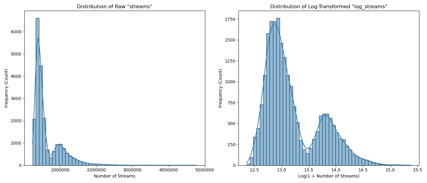
streamsについては、ツリーモデル作成時にはそのまま用いましたが、今回は対数化してlog_streamsとして取り扱います。
output_dir = 'outputs'
os.makedirs(output_dir, exist_ok=True)

# Load dataset
df = pd.read_csv('feature_engineered_data.csv') #used for LightGBM

# --- Log Transformation for 'streams' ---
df['log_streams'] = np.log1p(df['streams'])

# --- Visualize Distributions (Before & After Log Transformation) ---
fig, axes = plt.subplots(1, 2, figsize=(14, 6))

# Plot 'streams' distribution
sns.histplot(df['streams'], ax=axes[0], kde=True, bins=50)
axes[0].set_title('Distribution of Raw "streams"')
axes[0].set_xlabel('Number of Streams')
axes[0].set_ylabel('Frequency (Count)')
axes[0].ticklabel_format(style='plain', axis='x') # Avoid scientific notation

# Plot 'log_streams' distribution
sns.histplot(df['log_streams'], ax=axes[1], kde=True, bins=50)
axes[1].set_title('Distribution of Log-Transformed "log_streams"')
axes[1].set_xlabel('Log(1 + Number of Streams)')
axes[1].set_ylabel('Frequency (Count)')

plt.tight_layout()
plt.show()
離散化
まず初めに各特徴量を4つのカテゴリーに分割(離散化)しました。
# Select features for analysis
cols_for_bn = [
    'rank',
    'previous_rank',
    'weeks_on_chart',
    'log_streams',
    'rank_change_1w',
    'peak_rank'
]
df_bn = df[cols_for_bn].copy()

# binning
for col in df_bn.columns:
    df_bn[col] = pd.qcut(df_bn[col], q=4, labels=False, duplicates='drop')

# Drop rows with NaN values
df_bn.dropna(inplace=True)
ネットワーク構造の学習と可視化
データから特徴量同士の関係性をpgmpyに学習させます。
手法はHill Climb Search (BicScore)で試しました。
ただ、単純に学習させると「今週の順位が、先週の順位の原因」といった、時間の流れに逆行した関係性を見つけてしまうことがあります。
そこで、「時間は過去から未来にしか流れない」というルールをブラックリスト化しました。
# Create a blacklist to enforce causality.
blacklist = [
    ('rank', 'previous_rank'),
    ('rank', 'log_streams'),
    ('rank', 'weeks_on_chart'),
    ('rank', 'peak_rank'),
    ('rank_change_1w', 'previous_rank'),
    ('rank_change_1w', 'rank')
]
続いて学習・可視化です。
# Initialize the HillClimbSearch algorithm
hc = HillClimbSearch(data=df_bn)
best_model_structure = hc.estimate(
    scoring_method=BicScore(data=df_bn),
    black_list=blacklist
)

# Get the learned network structure
edges = best_model_structure.edges()

# Create a BayesianNetwork model
model = BayesianNetwork(edges)

# Fit
model.fit(data=df_bn, estimator=MaximumLikelihoodEstimator)

## 4. Visualizing the Network Structure
# Initialize a new directed graph
dot = Digraph(comment='Spotify Chart Bayesian Network')
dot.attr('node', shape='ellipse', style='filled', color='skyblue', fontname='Arial')
dot.attr('edge', fontname='Arial')

# Add nodes and edges to the graph
nodes = set([item for t in edges for item in t])
for node in nodes:
    dot.node(node)
for edge in edges:
    dot.edge(edge[0], edge[1])

display(dot)
得られたSpotify週間チャートの因果構造がこちらです。
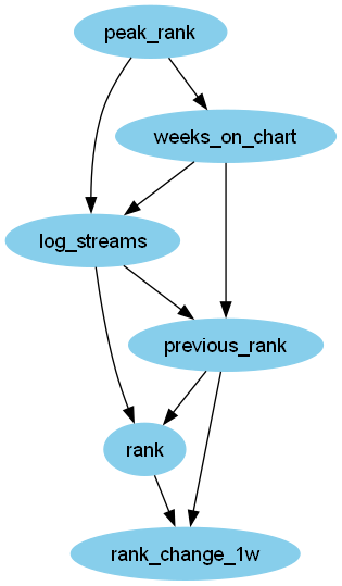
過去の実績であるpeak_rankとweeks_on_chartがその週の再生回数を支えているという現実的な因果関係が示されています。
条件付き確率
ここでは、モデルの中心的な関係性である P(rank | previous_rank, log_streams) を少し掘り下げてみます。
def display_cpt_as_dataframe(cpt):
    child_node = cpt.variables[0]
    child_states = cpt.state_names[child_node]

    if len(cpt.variables) == 1:
        df_cpt = pd.DataFrame(cpt.values, index=child_states, columns=['P'])
        display(df_cpt)
    else:
        values = cpt.values.flatten()
        parent_names = cpt.variables[1:]
        parent_states_product = pd.MultiIndex.from_product(
            [cpt.state_names[p] for p in parent_names],
            names=parent_names
        )

        df_cpt = pd.DataFrame(
            values.reshape(len(child_states), -1),
            index=child_states,
            columns=parent_states_product
        )

        display(df_cpt)

# Iterate through all nodes in the model and display their CPTs as tables
for node_name in model.nodes:
    cpt = model.get_cpds(node_name)
    display_cpt_as_dataframe(cpt)

cpt_rank = model.get_cpds('rank')
if len(cpt_rank.variables) > 1:
    values = cpt_rank.values.flatten()
    parent_names = cpt_rank.variables[1:]
    parent_states = pd.MultiIndex.from_product(
        [cpt_rank.state_names[p] for p in parent_names],
        names=parent_names
    )
    child_states = cpt_rank.state_names[cpt_rank.variables[0]]

    df_cpt_rank = pd.DataFrame(values.reshape(len(child_states), -1), index=child_states, columns=parent_states)

    plt.figure(figsize=(14, 7))
    sns.heatmap(
        df_cpt_rank,
        annot=True,
        cmap='Blues',
        fmt='.2f',
        linewidths=.5
    )
    plt.title(f"CPT Heatmap for '{cpt_rank.variables[0]}' (P({cpt_rank.variables[0]} | {', '.join(parent_names)}))", fontsize=16)
    plt.xlabel("Parent Node States (Causes)", fontsize=12)
    plt.ylabel(f"State of '{cpt_rank.variables[0]}' (Effect)", fontsize=12)
    plt.tight_layout()
    plt.show()
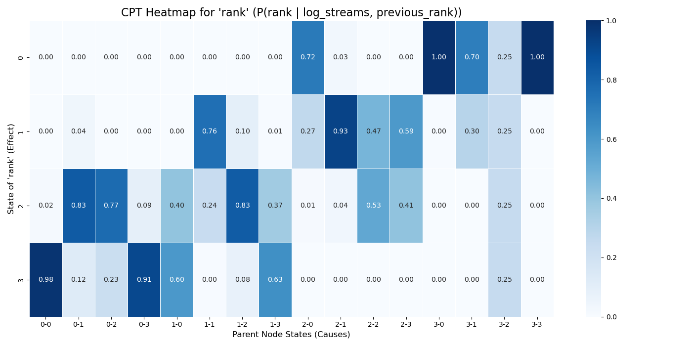
このヒートマップは、previous_rankとlog_streamsの状態を条件としたときの、rankの事後確率分布を可視化したものです。
| 横軸 | log_streams |
previous_rank |
|---|---|---|
| 0-0 | 0(最少) | 0(最高:1位~50位) |
| 0-3 | 0(最少) | 3(最低:151位~200位) |
| 3-0 | 3(最多) | 0(最高:1位~50位) |
| 3-3 | 3(最多) | 3(最低:151位~200位) |
rankを決定づける支配的な要因はlog_streamsであり、previous_rankが順位に直接与える影響は小さいことが示されています。
おわりに
LightGBMモデル作成時の特徴量重要度はprevious_rank>streamsでしたが、因果関係の文脈ではrankに直接影響を与えている本当の要素は再生回数であることが示唆されました。
プレイヤーの寄与量だけでなく、各プレイヤーがどのような働きをしているかを可視化できる興味深い分析でした。
ご覧いただきありがとうございました。
今回使用した全コードはこちらです。