目次
- はじめに
- 大数の法則の実装
- 中心極限定理の実装
- 終わりに
- 参考文献・記事
はじめに
(※2022/5/22:内容を修正しました)
以前Qiitaに投稿した記事「Rで大数の法則と中心極限定理の違いを直感的に理解する」では、大数の法則と中心極限定理の違いを初学者にもわかりやすく直感的に理解することを目指した記事でした。実装はRで行いました。
本記事では、Pythonで大数の法則と中心極限定理を実装してみます。
実行環境については、Google Colaboratory上で実装と実行を行いました。
大数の法則の実装
import numpy as np
import pandas as pd
import matplotlib.pyplot as plt
import random

def loln (num1):
  dice = [random.randint(1, 6) for p in range(0, num1)]
  result = []
  for i in range(1, 7):
    result.append(dice.count(i))
  return result

#figure()でグラフを表示する領域をつくり,figというオブジェクトにする.
fig = plt.figure(figsize=[10,7])

#add_subplot()でグラフを描画する領域を追加する.引数は行,列,場所
ax1 = fig.add_subplot(2, 2, 1)
ax2 = fig.add_subplot(2, 2, 2)
ax3 = fig.add_subplot(2, 2, 3)
ax4 = fig.add_subplot(2, 2, 4)

#ラベルの設定
l1, l2, l3, l4 = 'n=10', 'n=100', '1000', 'n=10000'
labels = ['1', '2', '3', '4', '5', '6']
left = [1, 2, 3, 4, 5, 6]

#描画
ax1.bar(left, height = loln(10),  width=0.5, label=l1, alpha=0.5, ec='black')
ax2.bar(left, height = loln(100),  width=0.5, label=l2, alpha=0.5,  ec='black')
ax3.bar(left, height = loln(1000),  width=0.5, label=l3, alpha=0.5, ec='black')
ax4.bar(left, height = loln(10000),  width=0.5, label=l4, alpha=0.5,  ec='black')

#レイアウトの設定
ax1.legend(loc = 'upper right')
ax2.legend(loc = 'upper right')
ax3.legend(loc = 'upper right')
ax4.legend(loc = 'upper right')
fig.tight_layout
plt.show()
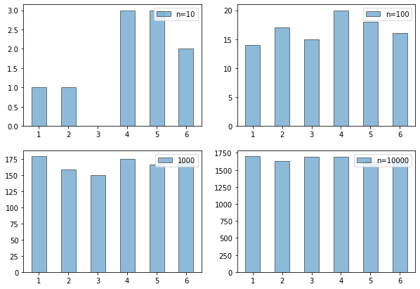
実装結果は以下のようになりました。
中心極限定理の実装
import numpy as np
import pandas as pd
import matplotlib.pyplot as plt
import random

def clt (num1, num2):
  result = []
  for i in range(0, num1):
    dice = [random.randint(1, 6) for p in range(0, num2)]
    total = sum(dice)
    result.append(total)
  return result

#figure()でグラフを表示する領域をつくり,figというオブジェクトにする.
fig = plt.figure(figsize=[10,7])

#add_subplot()でグラフを描画する領域を追加する.引数は行,列,場所
ax1 = fig.add_subplot(3, 1, 1)
ax2 = fig.add_subplot(3, 1, 2)
ax3 = fig.add_subplot(3, 1, 3)
#ax4 = fig.add_subplot(2, 2, 4)

#ラベルの設定
l1, l2, l3, l4 = 'n=2', 'n=5', 'n=10'

#ヒストグラムの描画
ax1.hist(clt(100000, 2), bins='auto', density=True, histtype='barstacked', ec='black', label=l1)
ax2.hist(clt(100000, 5), bins='auto', density=True, histtype='barstacked', ec='black', label=l2)
ax3.hist(clt(100000, 10), bins='auto', density=True, histtype='barstacked', ec='black', label=l3)

#レイアウトの設定
ax1.legend(loc = 'upper right')
ax2.legend(loc = 'upper right')
ax3.legend(loc = 'upper right')
fig.tight_layout
plt.show()
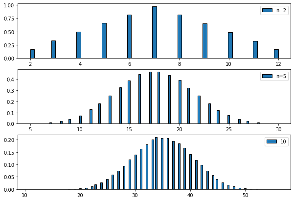
実装結果は以下のようになりました。
終わりに
以上のように、大数の法則と中心極限定理について、Pythonでの実装を行ってみました。拙いコードであったかもしれませんが、最後までお読みいただきありがとうございました。
本記事が皆様の理解の一助になれば幸いです。
参考文献・記事
[1]「Pythonでリスト(配列)に要素を追加するappend, extend, insert」https://note.nkmk.me/python-list-append-extend-insert/
[2]「【matplotlib基礎】複数のグラフを並べて表示する」https://qiita.com/trami/items/bd54f22ee4449421f2bc