はじめに
【随時更新】Kaggle テーブルデータコンペで使う EDA・特徴量エンジニアリングのスニペット集におけるスニペットを主に利用して、 Kaggle の Titanic データ を利用して基本的なデータの可視化を行います。
前提
import numpy as np
import pandas as pd
import pandas_profiling as pdp
import matplotlib.pyplot as plt
import seaborn as sns
import warnings

warnings.filterwarnings('ignore')
cmap = plt.get_cmap("tab10")
plt.style.use('fivethirtyeight')
%matplotlib inline

pd.set_option('display.max_rows', None)
pd.set_option('display.max_columns', None)
pd.set_option("display.max_colwidth", 10000)
target_col = "Survived"
data_dir = "/kaggle/input/titanic/"
フォルダの確認
!ls -GFlash /kaggle/input/titanic/
total 100K
4.0K drwxr-xr-x 2 nobody 4.0K Jan  7  2020 ./
4.0K drwxr-xr-x 5 root   4.0K Jul 12 00:15 ../
4.0K -rw-r--r-- 1 nobody 3.2K Jan  7  2020 gender_submission.csv
 28K -rw-r--r-- 1 nobody  28K Jan  7  2020 test.csv
 60K -rw-r--r-- 1 nobody  60K Jan  7  2020 train.csv
データを読みこむ
train = pd.read_csv(data_dir + "train.csv")
test = pd.read_csv(data_dir + "test.csv")
submit = pd.read_csv(data_dir + "gender_submission.csv")
データを確認
train.head()

レコード数、カラム数の確認
print("{} rows and {} features in train set".format(train.shape[0], train.shape[1]))
print("{} rows and {} features in test set".format(test.shape[0], test.shape[1]))
print("{} rows and {} features in submit set".format(submit.shape[0], submit.shape[1]))
891 rows and 12 features in train set
418 rows and 11 features in test set
418 rows and 2 features in submit set
カラムごとの欠損数を確認
カラムごとにどのくらい欠損があるか確認する。
train.isnull().sum()
PassengerId      0
Survived         0
Pclass           0
Name             0
Sex              0
Age            177
SibSp            0
Parch            0
Ticket           0
Fare             0
Cabin          687
Embarked         2
dtype: int64
欠損値の可視化
欠損に規則性があるか確認する。
plt.figure(figsize=(18,9))
sns.heatmap(train.isnull(), cbar=False)

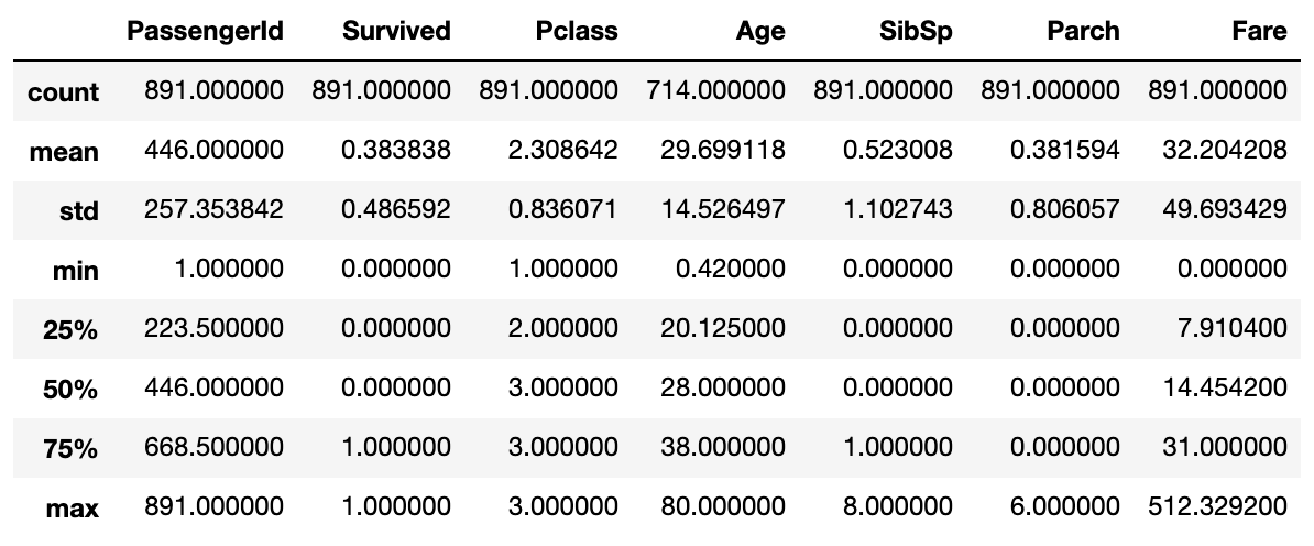
各カラムの要約統計量の確認
各カラムごとに平均や標準偏差、最大値、最小値、最頻値などの要約統計量を確認してデータをざっと理解する。
train.describe()
データの件数 (頻度) を集計
ターゲットの割合を確認
sns.countplot(x=target_col, data=train)

カテゴリ値の割合を確認
col = "Pclass"
sns.countplot(x=col, data=train)

ターゲットの値ごとのあるカラムの割合を確認
col = "Pclass"
sns.countplot(x=col, hue=target_col, data=train)

col = "Sex"
sns.countplot(x=col, hue=target_col, data=train)

ヒストグラム
縦軸は度数、横軸は階級で、データの分布状況を可視化する。
ビンの大きさが異なれば異なったデータの特徴を示すためいくつか試す。
col = "Age"
train[col].plot(kind="hist", bins=10, title='Distribution of {}'.format(col))

col = "Fare"
train[col].plot(kind="hist", bins=50, title='Distribution of {}'.format(col))

カテゴリごとのヒストグラム
f, ax = plt.subplots(1, 3, figsize=(15, 4))
sns.distplot(train[train['Pclass']==1]["Fare"], ax=ax[0])
ax[0].set_title('Fares in Pclass 1')
sns.distplot(train[train['Pclass']==2]["Fare"], ax=ax[1])
ax[1].set_title('Fares in Pclass 2')
sns.distplot(train[train['Pclass']==3]["Fare"], ax=ax[2])
ax[2].set_title('Fares in Pclass 3')
plt.show()

ターゲットのカテゴリごとのカラムのヒストグラム
col = "Age"
fig, ax = plt.subplots(1, 2, figsize=(15, 6))
train[train[target_col]==1][col].plot(kind="hist", bins=50, title='{} - {} 1'.format(col, target_col), color=cmap(0), ax=ax[0])
train[train[target_col]==0][col].plot(kind="hist", bins=50, title='{} - {} 0'.format(col, target_col), color=cmap(1), ax=ax[1])
plt.show()

ターゲットの値ごとのあるカラムのヒストグラム(重ねる場合)
col = "Age"
train[train[target_col]==1][col].plot(kind="hist", bins=50, alpha=0.3, color=cmap(0))
train[train[target_col]==0][col].plot(kind="hist", bins=50, alpha=0.3, color=cmap(1))
plt.title("histgram for {}".format(col))
plt.xlabel(col)
plt.show()

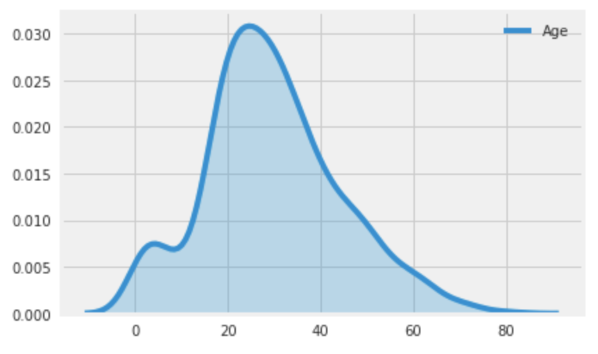
カーネル密度推定
ざっくりいうとヒストグラムを曲線化したもの。Xに対するYを取得できる。
sns.kdeplot(label="Age", data=train["Age"], shade=True)
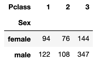
クロス集計
カテゴリデータのカテゴリごとの出現回数を算出する。
pd.crosstab(train["Sex"], train["Pclass"])
pd.crosstab([train["Sex"], train["Survived"]], train["Pclass"])

ピボットテーブル
カテゴリごとの量的データの平均
pd.pivot_table(index="Pclass", columns="Sex", data=train[["Age", "Fare", "Survived", "Pclass", "Sex"]])

カテゴリごとの量的データの最小値
pd.pivot_table(index="Pclass", columns="Sex", data=train[["Age", "Fare", "Pclass", "Sex"]], aggfunc=np.min)

散布図
2つのカラムの関係性を確認する。
散布図
sns.scatterplot(x="Age", y="Fare", data=train)

散布図(カテゴリごとに色分け)
sns.scatterplot(x="Age", y="Fare", hue=target_col, data=train)

散布図行列
sns.pairplot(data=train[["Fare", "Survived", "Age", "Pclass"]], hue="Survived", dropna=True)

箱ひげ図
データのばらつきを視覚化する。
カテゴリごとの箱ひげ図
カテゴリごとにデータのばらつきを確認する。
sns.boxplot(x='Pclass', y='Age', data=train)

ストリップチャート
データをドットで表した図。2つのデータに一方がカテゴリカルな場合に利用する。
sns.stripplot(x="Survived", y="Fare", data=train)

sns.stripplot(x='Pclass', y='Age', data=train)

ヒートマップ
カラムごとの相関係数のヒートマップ
sns.heatmap(train.corr(), annot=True)
