はじめに
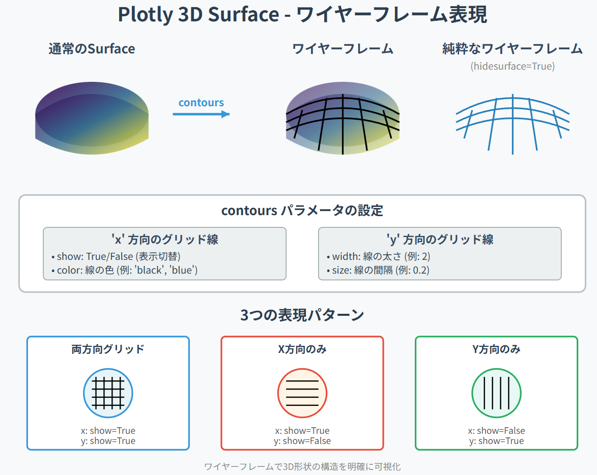
Surface(3D曲面)は、通常は滑らかな色面で表示されますが、
ワイヤーフレーム表示 にすると"形状の構造"が直感的に見えるようになります。
等高線・メッシュ・地形モデル・シミュレーションの確認など、用途は非常に広いです。
今回は、PlotlyでSurfaceのワイヤーフレーム(格子線)を描く方法を整理します。
この記事でできること
- Surfaceを「ワイヤーフレーム」風に描画する
- 面と線の組み合わせで3D形状を明確にする
- 地表モデル・関数形状・高さマップなどに応用
- Colabでそのまま動くコード付き
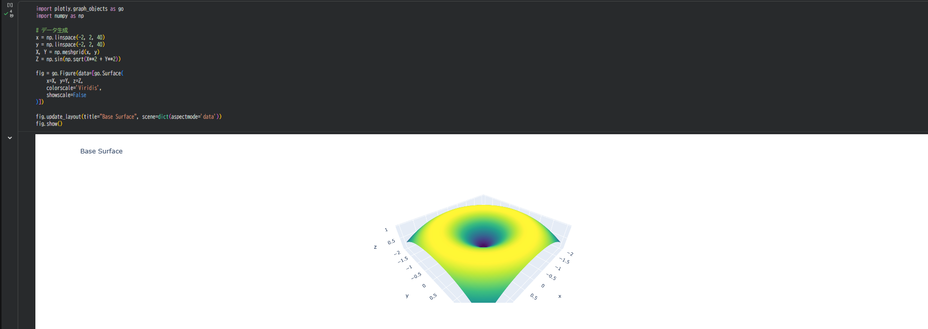
1. 基本となるSurfaceを描く
まずは通常の3D Surfaceを表示します。
import plotly.graph_objects as go
import numpy as np

# データ生成
x = np.linspace(-2, 2, 40)
y = np.linspace(-2, 2, 40)
X, Y = np.meshgrid(x, y)
Z = np.sin(np.sqrt(X**2 + Y**2))

fig = go.Figure(data=[go.Surface(
    x=X, y=Y, z=Z,
    colorscale='Viridis',
    showscale=False
)])

fig.update_layout(title="Base Surface", scene=dict(aspectmode='data'))
fig.show()
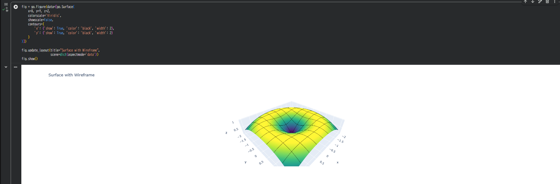
2. 標準機能でワイヤーフレームを表示する
Plotlyのgo.Surfaceには、ワイヤーフレーム機能が用意されています。
contoursパラメータを使用することで、簡単にワイヤーフレームを描画できます。
2-1. 基本的なワイヤーフレーム
fig = go.Figure(data=[go.Surface(
    x=X, y=Y, z=Z,
    colorscale='Viridis',
    showscale=False,
    contours={
        'x': {'show': True, 'color': 'black', 'width': 2},
        'y': {'show': True, 'color': 'black', 'width': 2}
    }
)])

fig.update_layout(title="Surface with Wireframe",
                  scene=dict(aspectmode='data'))
fig.show()
X方向とY方向の両方にグリッド線が描画され、メッシュ構造が明確になります。
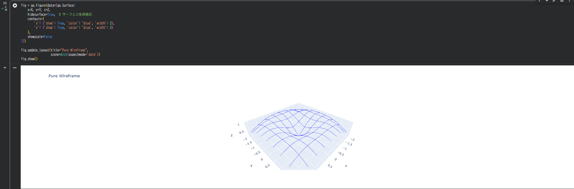
2-2. 純粋なワイヤーフレーム(面を非表示)
fig = go.Figure(data=[go.Surface(
    x=X, y=Y, z=Z,
    hidesurface=True,  # サーフェスを非表示
    contours={
        'x': {'show': True, 'color': 'blue', 'width': 2},
        'y': {'show': True, 'color': 'blue', 'width': 2}
    },
    showscale=False
)])

fig.update_layout(title="Pure Wireframe",
                  scene=dict(aspectmode='data'))
fig.show()
hidesurface=Trueを指定することで、線だけの純粋なワイヤーフレームになります。
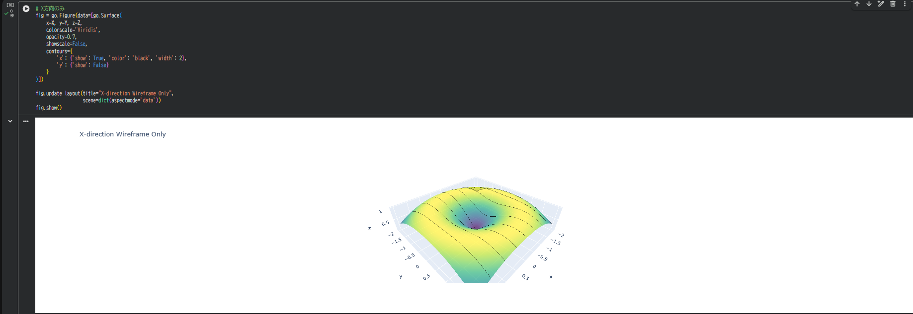
2-3. 片方向だけのワイヤーフレーム
# X方向のみ
fig = go.Figure(data=[go.Surface(
    x=X, y=Y, z=Z,
    colorscale='Viridis',
    opacity=0.7,
    showscale=False,
    contours={
        'x': {'show': True, 'color': 'black', 'width': 2},
        'y': {'show': False}
    }
)])

fig.update_layout(title="X-direction Wireframe Only",
                  scene=dict(aspectmode='data'))
fig.show()
必要に応じて、片方向だけのグリッド線も表示できます。
3. グリッド線の詳細設定
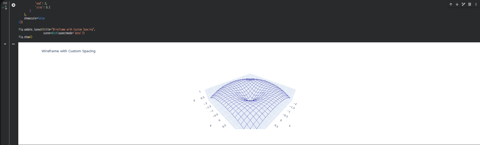
3-1. 線の間隔を調整
fig = go.Figure(data=[go.Surface(
    x=X, y=Y, z=Z,
    hidesurface=True,
    contours={
        'x': {
            'show': True,
            'color': 'darkblue',
            'width': 2,
            'start': -2,
            'end': 2,
            'size': 0.2  # グリッド線の間隔
        },
        'y': {
            'show': True,
            'color': 'darkblue',
            'width': 2,
            'start': -2,
            'end': 2,
            'size': 0.2
        }
    },
    showscale=False
)])

fig.update_layout(title="Wireframe with Custom Spacing",
                  scene=dict(aspectmode='data'))
fig.show()
sizeパラメータでグリッド線の密度を調整できます。
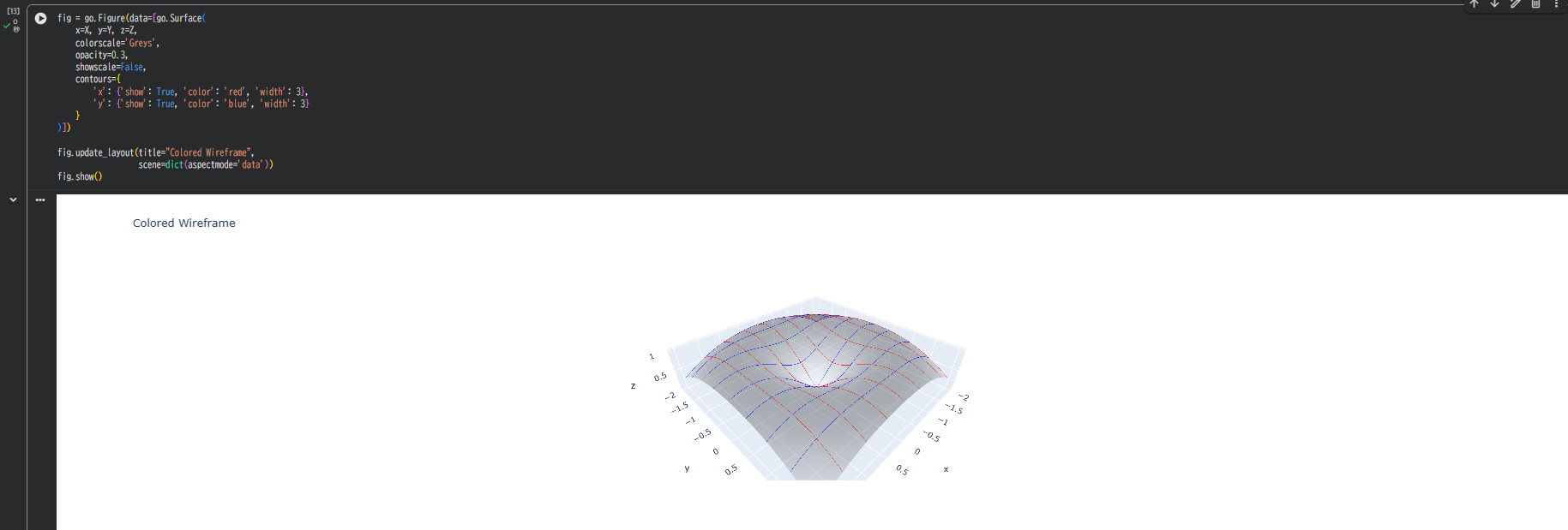
3-2. 色や太さのカスタマイズ
fig = go.Figure(data=[go.Surface(
    x=X, y=Y, z=Z,
    colorscale='Greys',
    opacity=0.3,
    showscale=False,
    contours={
        'x': {'show': True, 'color': 'red', 'width': 3},
        'y': {'show': True, 'color': 'blue', 'width': 3}
    }
)])

fig.update_layout(title="Colored Wireframe",
                  scene=dict(aspectmode='data'))
fig.show()
X方向とY方向で異なる色を指定することも可能です。
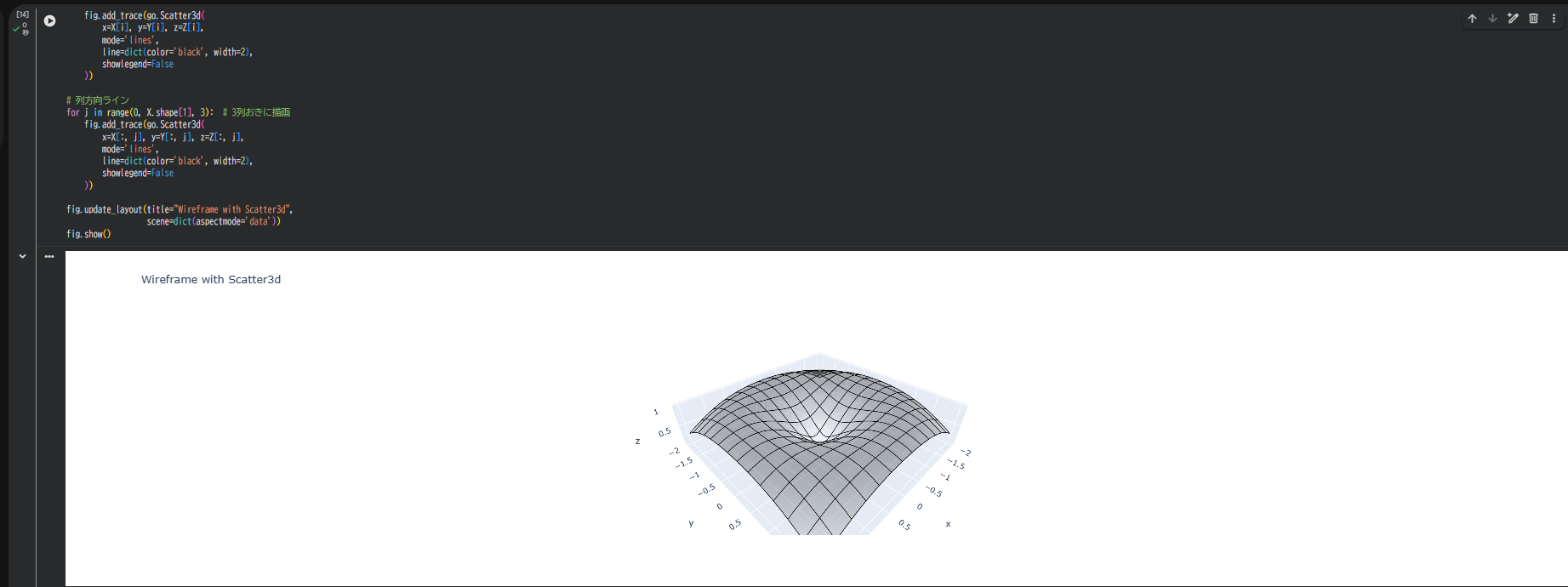
4. 別の方法:Scatter3dを使ったワイヤーフレーム
公式機能以外に、Scatter3dを重ねる方法もあります。
より細かい制御が必要な場合に有効です。
fig = go.Figure()

# 面(薄く表示)
fig.add_trace(go.Surface(
    x=X, y=Y, z=Z,
    colorscale='Greys',
    opacity=0.3,
    showscale=False
))

# 行方向ライン
for i in range(0, X.shape[0], 3):  # 3行おきに描画
    fig.add_trace(go.Scatter3d(
        x=X[i], y=Y[i], z=Z[i],
        mode='lines',
        line=dict(color='black', width=2),
        showlegend=False
    ))

# 列方向ライン
for j in range(0, X.shape[1], 3):  # 3列おきに描画
    fig.add_trace(go.Scatter3d(
        x=X[:, j], y=Y[:, j], z=Z[:, j],
        mode='lines',
        line=dict(color='black', width=2),
        showlegend=False
    ))

fig.update_layout(title="Wireframe with Scatter3d",
                  scene=dict(aspectmode='data'))
fig.show()
この方法は、特定の行・列だけを選択して描画したい場合に便利です。
5. 背景や軸の調整(見やすさUP)
fig.update_layout(
    scene=dict(
        xaxis=dict(backgroundcolor='rgb(245,245,245)', gridcolor='white'),
        yaxis=dict(backgroundcolor='rgb(245,245,245)', gridcolor='white'),
        zaxis=dict(backgroundcolor='rgb(250,250,250)', gridcolor='white'),
        aspectmode='data'
    )
)
まとめ
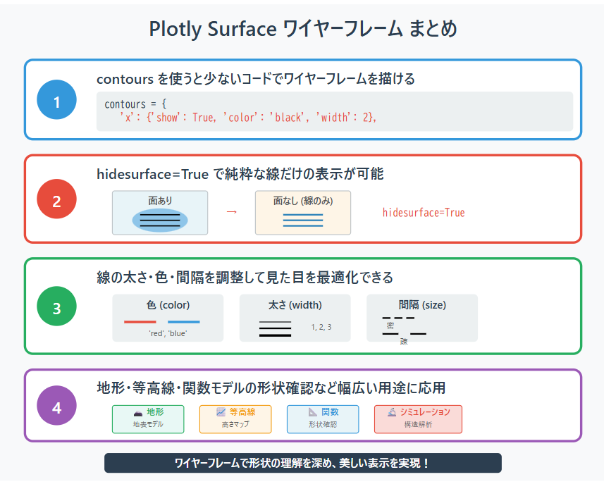
contours を使うと、少ないコードでワイヤーフレームを描ける。
hidesurface=True を指定すれば、純粋な線だけの表示も可能。
線の太さ・色・幅を調整することで見た目を最適化できる。
地形や等高線、関数モデルの形状確認など幅広い用途に応用しやすい。
ワイヤーフレームは形状の理解にとても便利で、美しい表示を作れるのが魅力です。
参考情報