はじめに

3D散布図は群ごとの差を直感的に比較するのに便利。
クラスタリング結果や特徴量セットの違い、時系列の前後比較なども、同じ3D空間に重ねるだけで理解しやすくなる。
Plotly なら Scatter3d を複数追加するだけで描け、色や透明度の調整で見やすさも向上する。
この記事でできること
- 複数の点群を 1つの 3D シーンに重ねて表示
- グループ別に色・透明度・サイズを変えて比較
- 特定の群だけ強調表示(opacity & legend)
- Colabでそのまま実行可能
基本:点群Aと点群Bを同じシーンに重ねる
import plotly.graph_objects as go
import numpy as np

np.random.seed(0)

# 点群A(中心0付近)
x1, y1, z1 = np.random.randn(3, 200)

# 点群B(中心2付近)
x2, y2, z2 = np.random.randn(3, 200) + 2

fig = go.Figure()

# 点群A
fig.add_trace(go.Scatter3d(
    x=x1, y=y1, z=z1,
    mode='markers',
    marker=dict(size=4, color='blue', opacity=0.6),
    name='Group A'
))

# 点群B
fig.add_trace(go.Scatter3d(
    x=x2, y=y2, z=z2,
    mode='markers',
    marker=dict(size=4, color='red', opacity=0.6),
    name='Group B'
))

fig.update_layout(
    title="Multiple 3D Scatter in One Scene",
    scene=dict(aspectmode='data')
)

fig.show()
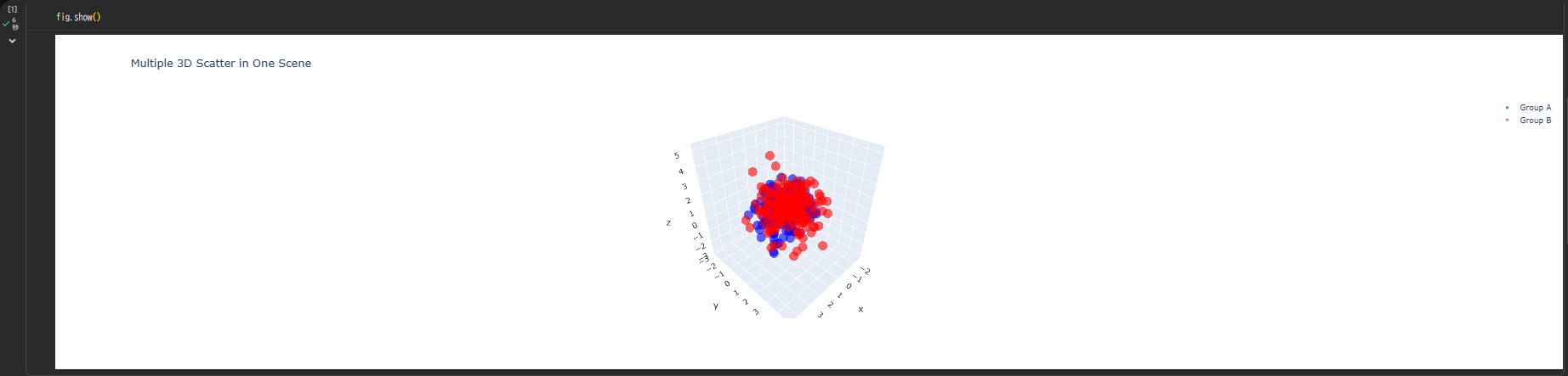
ポイント:
- Group A=青
- Group B=赤
- 凡例でON/OFF切り替え可能
透明度を変えて"重なり"を見やすくする
2つの群が近い領域にあるとき、opacity が重要。
# 上記のfigに対して透明度を調整
fig.update_traces(marker=dict(opacity=0.35))
透けることで「どの部分で重なりが強いか」が自然に見えてくる。
群ごとにサイズを変えて強調する
特定のグループを強調したいときは size で差をつける。
# 上記のfigに対してGroup Bのサイズを変更
fig.data[1].marker.size = 7   # Group Bだけ大きく
群ごとにカラーマップを使う
高さ(Z値など)に応じて色分けしつつ、グループ間比較もしたい場合。
fig = go.Figure()

fig.add_trace(go.Scatter3d(
    x=x1, y=y1, z=z1,
    mode='markers',
    marker=dict(size=4, color=z1, colorscale='Blues', opacity=0.6),
    name='Group A'
))

fig.add_trace(go.Scatter3d(
    x=x2, y=y2, z=z2,
    mode='markers',
    marker=dict(size=4, color=z2, colorscale='Reds', opacity=0.6),
    name='Group B'
))

fig.update_layout(scene=dict(aspectmode='data'))
fig.show()
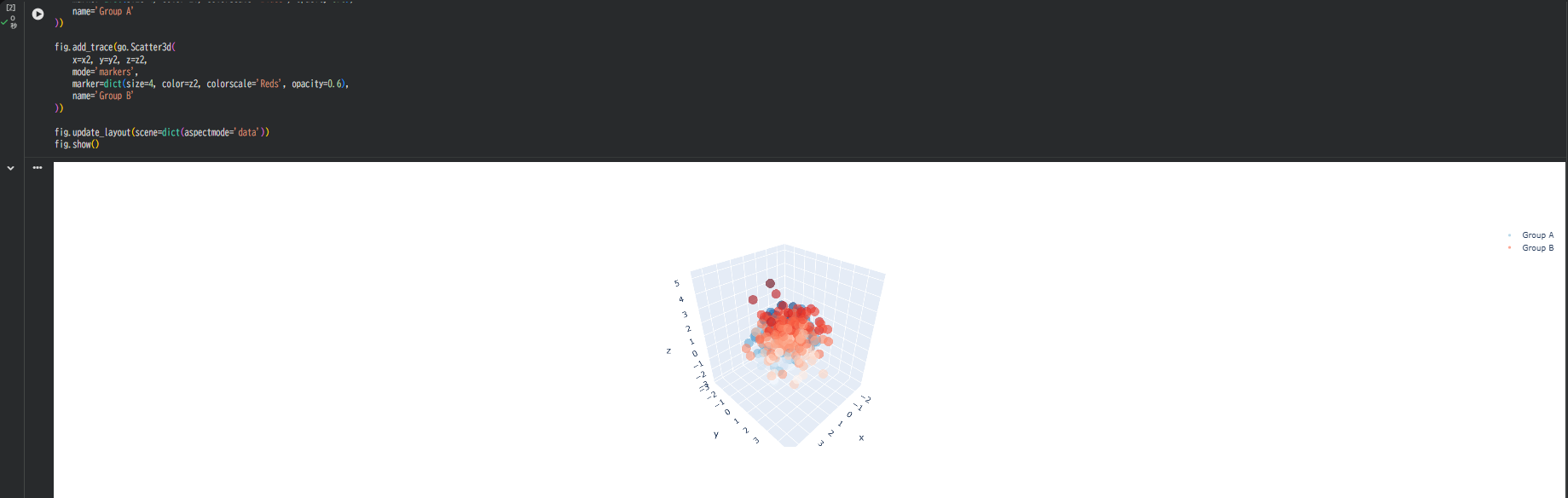
効果:
- A=青ベースのカラースケール
- B=赤ベースのカラースケール
- 群内の高さ変化もわかる構図になる
軸・背景を調整してさらに比較しやすくする
fig.update_layout(
    scene=dict(
        xaxis=dict(backgroundcolor='rgb(240,240,240)'),
        yaxis=dict(backgroundcolor='rgb(240,240,240)'),
        zaxis=dict(backgroundcolor='rgb(250,250,250)'),
        aspectmode='data'
    )
)
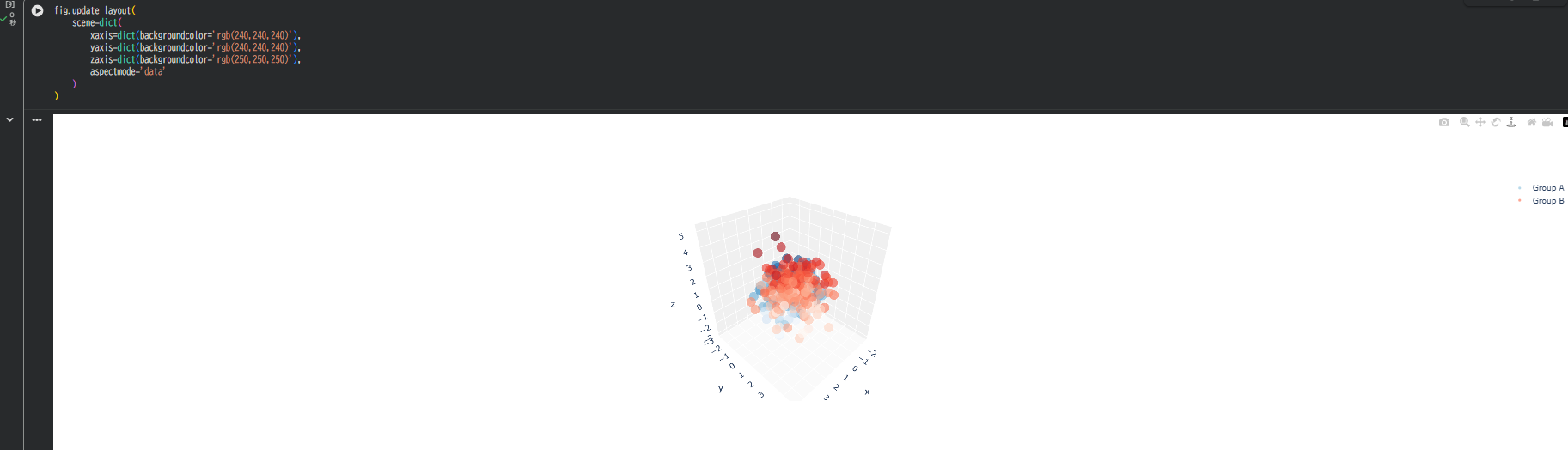
ポイント:
- 背景がグレーだと点の色が映える
- aspectmode='data' は必須(分布の形が歪まない)
Group C を追加して 3群比較も簡単
# 点群C(中心を(1, -2, 1)付近に設定)
x3 = np.random.randn(200) + 1
y3 = np.random.randn(200) - 2
z3 = np.random.randn(200) + 1

fig.add_trace(go.Scatter3d(
    x=x3, y=y3, z=z3,
    mode='markers',
    marker=dict(size=4, color='green', opacity=0.6),
    name='Group C'
))

A・B・C の三次元的な位置関係がはっきり分かる
"外れ値群" を別レイヤーとして重ねる
異常点だけ別色にしたい場合:
# Group Aのz値が2.0以上の点を外れ値として抽出
mask_outlier = (z1 > 2.0)
fig.add_trace(go.Scatter3d(
    x=x1[mask_outlier],
    y=y1[mask_outlier],
    z=z1[mask_outlier],
    mode='markers',
    marker=dict(size=7, color='yellow', opacity=1.0, symbol='diamond'),
    name='Outliers'
))
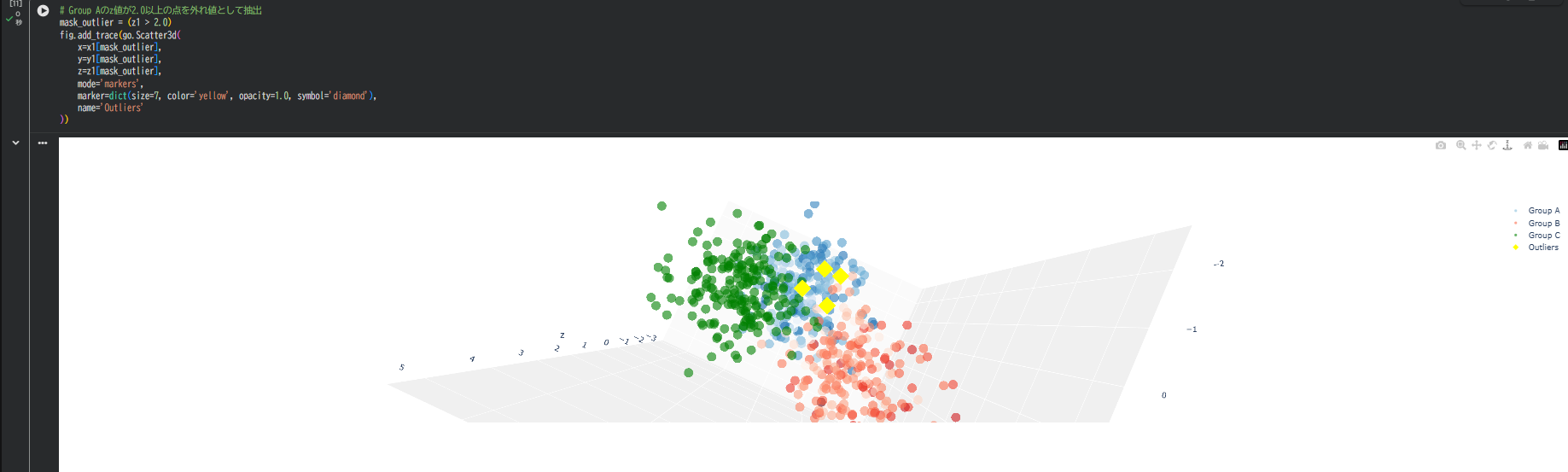
重要点だけ強調し、通常点との関係が明確になる
トラブルシュート
色が混ざって見える → opacityを0.3〜0.5に調整
点数が多くて重い → 1万点超はサンプリングやボクセル化を検討
グループ間距離を数値化したい → 中心点(mean)を別トレースで表示
まとめ
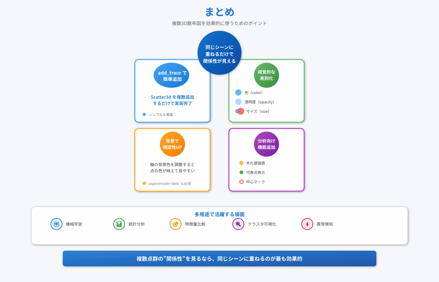
- 複数の Scatter3d を追加するだけで同じシーンに点群を重ねられる
- 透明度・色・サイズで「差」を見せると比較しやすい
- 背景調整で視認性アップ
- 外れ値・代表点・クラスタ中心を追加すると分析向き
複数点群の"関係性"を見るなら、同じシーンに重ねるのが最も効果的。
機械学習、統計分析、特徴量比較、クラスタ可視化などで活用できそうである。