はじめに
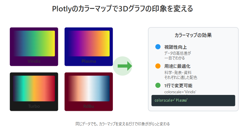
同じ3Dグラフでも、カラーマップ(色のグラデーション)を変えるだけで印象ががらっと変わります。
Plotlyではカラーマップを1行で変更でき、科学的・芸術的・資料向けと用途に応じて最適な配色が選べます。
目的
- Plotlyで3Dグラフの**色の表現(カラーマップ)**を自在に変える
- データの特徴を強調したり、資料映えする見た目を作る
-
colorscaleオプションの基本と実用例を理解する
実装例
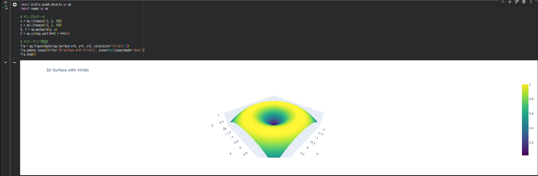
import plotly.graph_objects as go
import numpy as np

# サンプルデータ
x = np.linspace(-2, 2, 100)
y = np.linspace(-2, 2, 100)
X, Y = np.meshgrid(x, y)
Z = np.sin(np.sqrt(X**2 + Y**2))

# カラーマップ指定
fig = go.Figure(data=[go.Surface(x=X, y=Y, z=Z, colorscale='Viridis')])
fig.update_layout(title='3D Surface with Viridis', scene=dict(aspectmode='data'))
fig.show()
これが基本構成。colorscale='Viridis'の部分を変えるだけで印象が変わります。
よく使うカラーマップ一覧
| 名前 | 特徴 | 印象 |
|---|---|---|
| Viridis | 視認性・科学系向け | デフォルト・落ち着いた配色 |
| Plasma | 鮮やか・高コントラスト | 発表スライド向け |
| Cividis | 色覚バリアフリー | 公開資料に最適 |
| Turbo | Google系カラーマップ | 目を引く鮮やかさ |
| RdBu | 正負の差を表現 | 温度・偏差の可視化 |
| Greys | モノクロ調 | 背景や資料用の下地 |
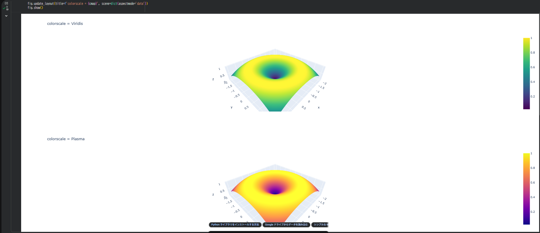
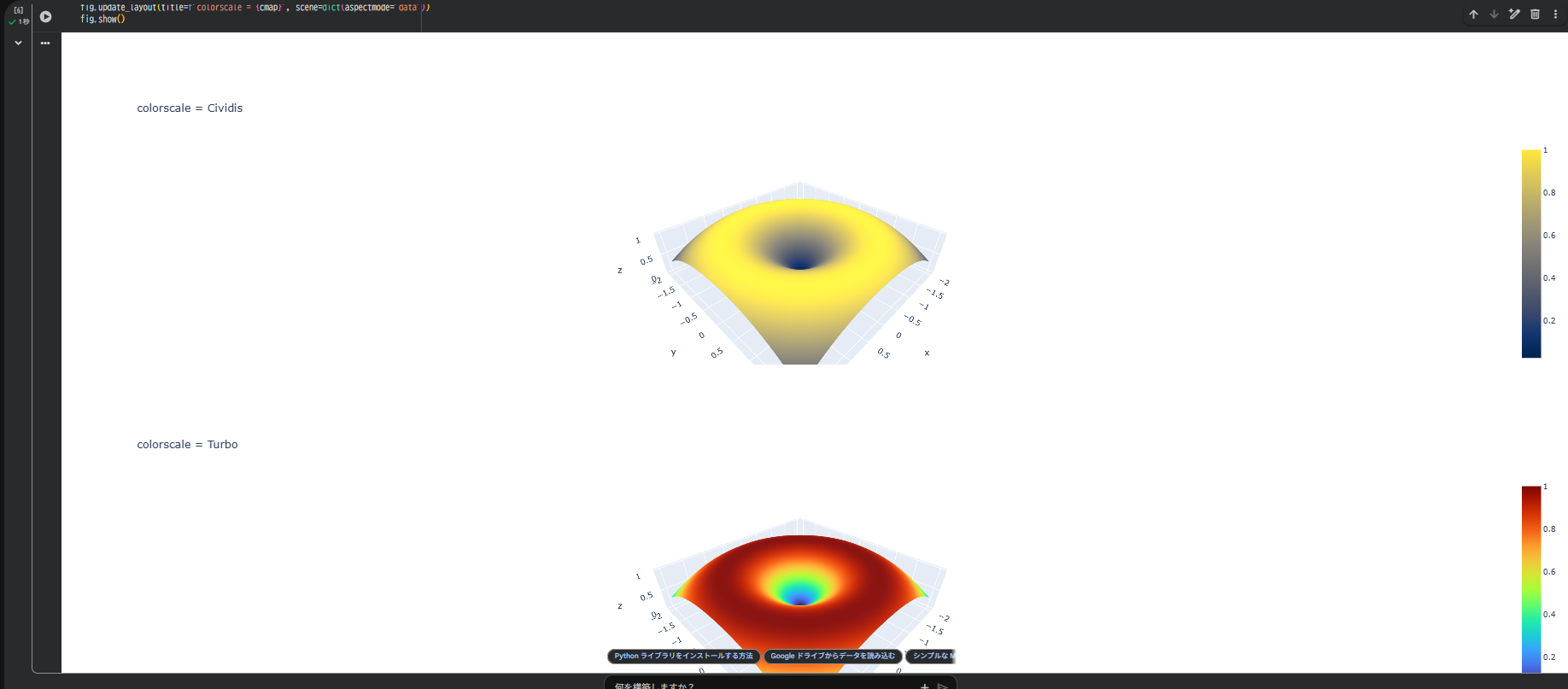
カラーマップを変えて比較
for cmap in ['Viridis', 'Plasma', 'Cividis', 'Turbo']:
    fig = go.Figure(data=[go.Surface(x=X, y=Y, z=Z, colorscale=cmap)])
    fig.update_layout(title=f'colorscale = {cmap}', scene=dict(aspectmode='data'))
    fig.show()
Colabで順に実行すると、各カラーマップの印象が直感的にわかります。
同じデータでも、印象が変わることを体感できます。
データ値で強調したい範囲を設定
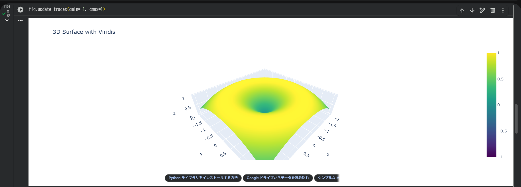
色の範囲を固定する
fig.update_traces(cmin=-1, cmax=1)
値が常に同じ色範囲にマッピングされるので、比較に有効。
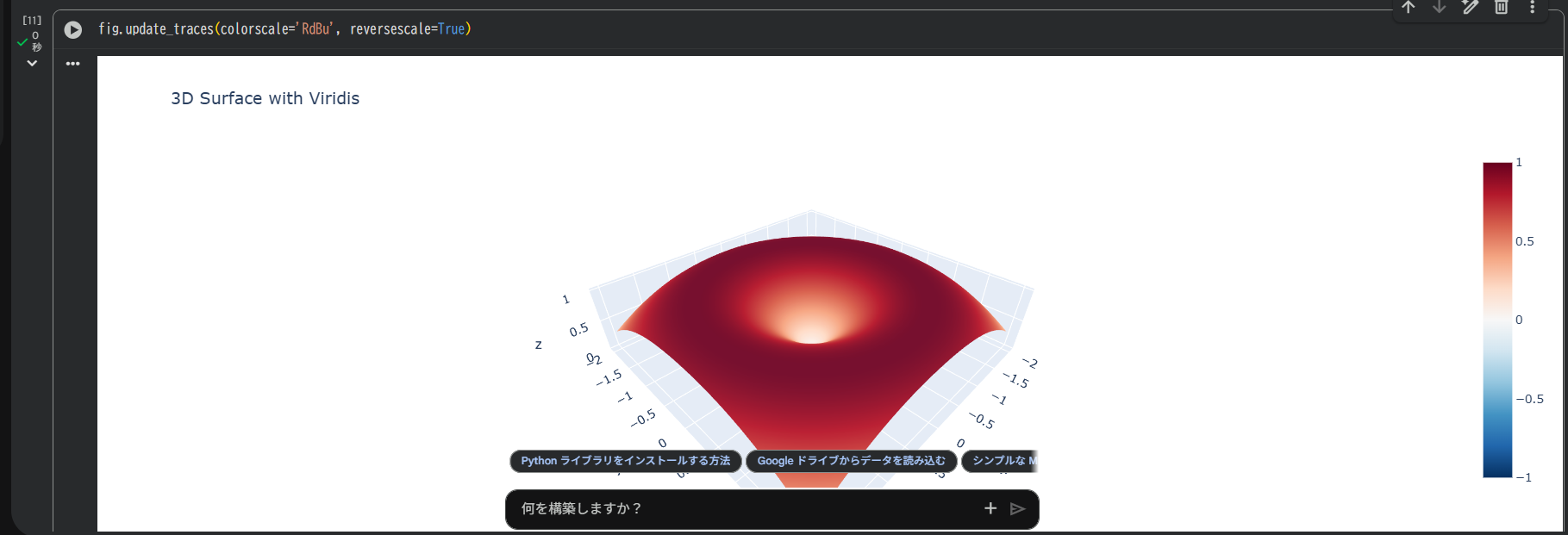
特定の範囲を強調する
fig.update_traces(colorscale='RdBu', reversescale=True)
reversescale=Trueで上下反転。高低を逆転表示できます。
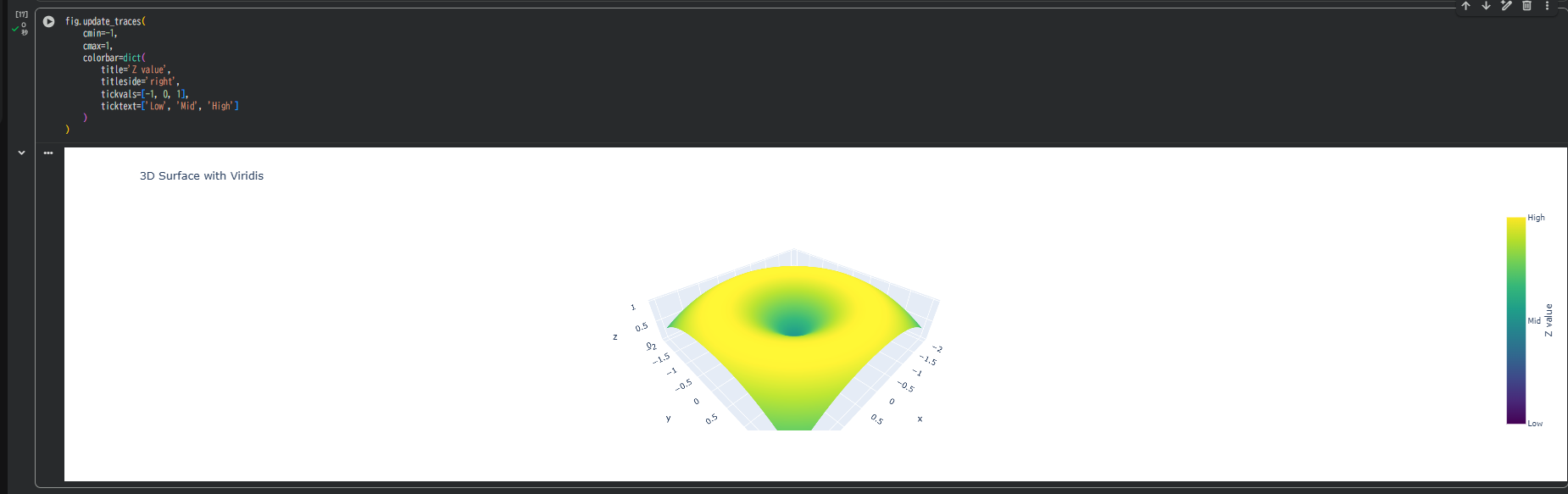
カラーバー(凡例)をカスタマイズ
fig.update_traces(
    cmin=-1,
    cmax=1,
    colorbar=dict(
        title='Z value',
        titleside='right',
        tickvals=[-1, 0, 1],
        ticktext=['Low', 'Mid', 'High']
    )
)
| 項目 | 内容 |
|---|---|
| title | カラーバーのタイトル |
| tickvals / ticktext | 目盛りと表示ラベル |
| titleside | タイトルの位置 (right or top) |
カラーバーを明示すると、第三者にも意味が伝わりやすくなります。
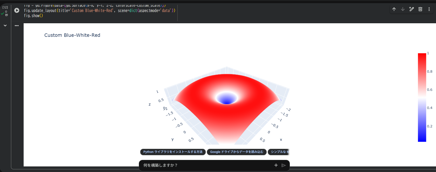
オリジナルのカラーマップを作る
custom_scale = [
    [0, 'blue'],
    [0.5, 'white'],
    [1, 'red']
]

fig = go.Figure(data=[go.Surface(x=X, y=Y, z=Z, colorscale=custom_scale)])
fig.update_layout(title='Custom Blue-White-Red', scene=dict(aspectmode='data'))
fig.show()
0〜1の範囲で「どの値で何色にするか」を定義できます。
自社ブランドカラーや論文図表の配色統一にも使えます。
他の3Dグラフにも適用できる
# 3D散布図でも使用可
fig = go.Figure(data=[go.Scatter3d(
    x=x, y=y, z=Z.flatten(),
    mode='markers',
    marker=dict(size=4, color=Z.flatten(), colorscale='Plasma')
)])
fig.show()
Surfaceだけでなく、Scatter3dやLine3dにも同じcolorscale指定が使えます。
トラブルシュート
| 症状 | 対処 |
|---|---|
| 色が単色になる | z値が定数になっていないか確認 |
| カラーバーが表示されない | showscale=True を指定 |
| 配色がきつい | opacityやreversescaleで調整可能 |
まとめ
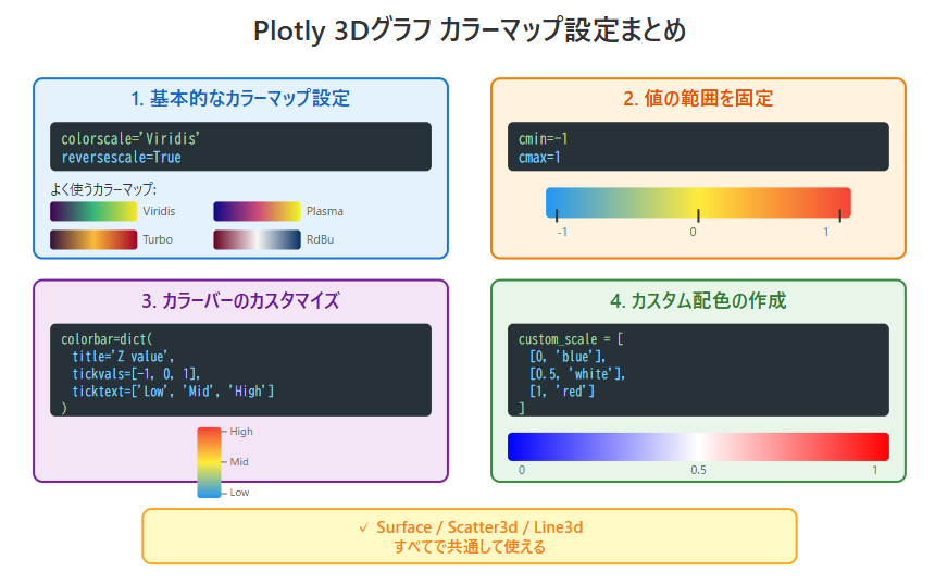
カラーマップの設定では、colorscale='Viridis' などで配色を変更でき、reversescale=True で反転も可能です。
また、cmin・cmax を指定して値の範囲を固定したり、カスタム配色やカラーバーを編集することもできます。
これらの設定は Surface・Scatter・Line すべてで共通して使えます。
適切な色を選ぶことで、データの構造や意味をより鮮明に伝える3Dグラフを作れます。
参考情報