はじめに

前回の「3D散布図」に続き、今回は 3D折れ線グラフ(line3d)を解説します。
時系列データや軌跡を立体的に"つなげて見る"ための基本構文を紹介します。
3D空間を動的に観察することで、データの変化を直感的に理解できます。
前回の記事:
目的
- Plotlyで 3Dの折れ線グラフ(line3d) を描く
- 点のつながり(時系列や軌道)を立体的に表現する
- 散布図(scatter3d)との違いを理解する
最小構成(Colabでも動く)
import plotly.graph_objects as go
import numpy as np

# サンプルデータ(美しい螺旋カーブ)
t = np.linspace(0, 4*np.pi, 300)
x = np.cos(t) * (1 + 0.3*t)  # 外側に広がる螺旋
y = np.sin(t) * (1 + 0.3*t)
z = t

# グラデーションで色が変わる折れ線グラフ
fig = go.Figure(data=[go.Scatter3d(
    x=x, y=y, z=z,
    mode='lines',
    line=dict(
        color=t,  # 時間に応じて色が変化
        colorscale='Turbo',  # 鮮やかなグラデーション
        width=8,
        colorbar=dict(title="時間")
    )
)])

fig.update_layout(
    title="3D Line Plot: 美しい螺旋軌道",
    scene=dict(
        aspectmode='data',
        camera=dict(eye=dict(x=1.5, y=1.5, z=1.2))
    ),
    height=600
)
fig.show()
ポイント:
- マウスで回転・ズーム・ドラッグ可
- 3軸を使って"時間の流れ"を直感的に確認できます


line3dの基本構造
| 引数 | 役割 |
|---|---|
x, y, z |
折れ線の各点の座標 |
mode='lines' |
折れ線モード(点の場合はmarkers) |
line.color |
線の色 |
line.width |
線の太さ |
line.dash |
線種(solid, dash, dot, など) |
Stepアップ:色や線で"意味"を持たせる
① 線色をデータ値で変化させる
fig = go.Figure(data=[go.Scatter3d(
    x=x, y=y, z=z,
    mode='lines',
    line=dict(
        color=z,                 # Z値を色にマップ
        colorscale='Viridis',
        width=6
    )
)])
fig.show()
→ 高さや時間に応じて線の色が変わり、データの流れが視覚的に分かります。

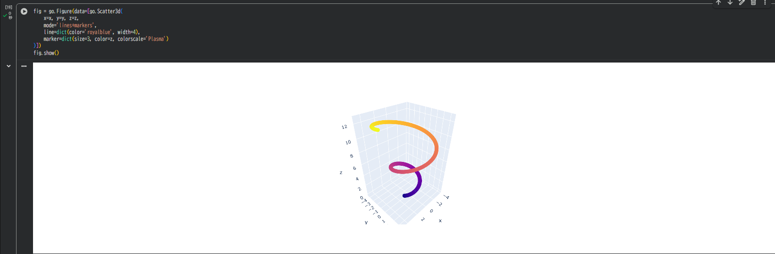
② 点+線を組み合わせる
fig = go.Figure(data=[go.Scatter3d(
    x=x, y=y, z=z,
    mode='lines+markers',
    line=dict(color='royalblue', width=4),
    marker=dict(size=3, color=z, colorscale='Plasma')
)])
fig.show()
→ 軌跡と同時に、各点を目立たせたいときに便利。
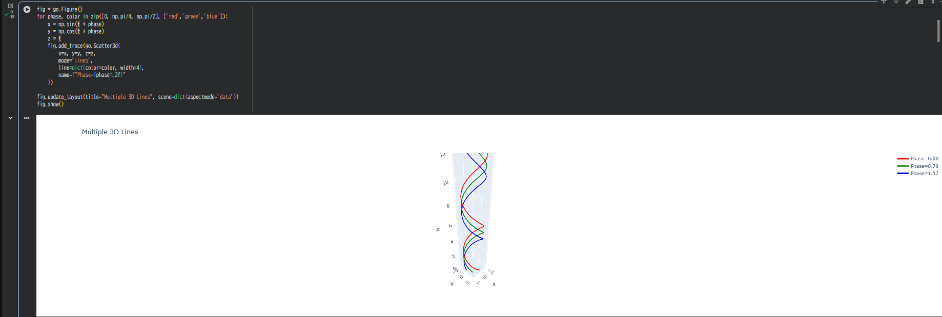
応用例:複数線を重ねる
fig = go.Figure()
for phase, color in zip([0, np.pi/4, np.pi/2], ['red','green','blue']):
    x = np.sin(t + phase)
    y = np.cos(t + phase)
    z = t
    fig.add_trace(go.Scatter3d(
        x=x, y=y, z=z,
        mode='lines',
        line=dict(color=color, width=4),
        name=f"Phase={phase:.2f}"
    ))

fig.update_layout(title="Multiple 3D Lines", scene=dict(aspectmode='data'))
fig.show()
→ 3つの位相差をもつ螺旋を同時に表示。グラフの凡例からON/OFF切替も可能。
ユースケース
3D折れ線グラフは、データの「流れ」や「軌跡」を立体的にとらえるのに向いています。
たとえば、時系列データの変化を時間軸に沿ってつなげたり、物理シミュレーションの軌道を再現したりできます。
また、機械学習の学習過程や特徴量の推移、数学関数のパラメトリック曲線の形状確認などにも活用できます。
軸・背景のカスタマイズ
fig.update_layout(
    scene=dict(
        xaxis_title='X Axis',
        yaxis_title='Y Axis',
        zaxis_title='Z Axis',
        xaxis=dict(backgroundcolor='rgb(240,240,240)'),
        yaxis=dict(backgroundcolor='rgb(240,240,240)'),
        zaxis=dict(backgroundcolor='rgb(240,240,240)')
    ),
    title='3D Line Plot with Custom Axes'
)
背景色を統一すると、線が浮き上がるように見えます。

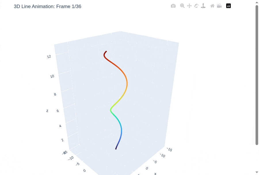
アニメーションで動かす(おまけ)
# Plotly 3D折れ線グラフのアニメーション(Selenium + GIF出力版)

import plotly.graph_objects as go
import numpy as np
from PIL import Image
import io
from selenium import webdriver
from selenium.webdriver.chrome.options import Options
import time
import os

# Chrome設定
chrome_options = Options()
chrome_options.add_argument('--headless')
chrome_options.add_argument('--no-sandbox')
chrome_options.add_argument('--disable-dev-shm-usage')
chrome_options.add_argument('--window-size=900,800')

driver = webdriver.Chrome(options=chrome_options)

# サンプルデータ(美しい螺旋カーブ)
t = np.linspace(0, 4*np.pi, 300)
x_base = np.cos(t) * (1 + 0.3*t)
y_base = np.sin(t) * (1 + 0.3*t)
z_base = t

frames_images = []
n_frames = 36  # 36フレーム(10度ずつ回転)

for i in range(n_frames):
    angle = i * 2 * np.pi / n_frames

    # カメラ位置を回転(データは固定)
    camera_x = 1.5 * np.cos(angle) - 1.5 * np.sin(angle)
    camera_y = 1.5 * np.sin(angle) + 1.5 * np.cos(angle)
    camera_z = 1.2

    # 各フレームのグラフを作成(データは固定)
    fig = go.Figure(data=[go.Scatter3d(
        x=x_base, y=y_base, z=z_base,
        mode='lines',
        line=dict(
            color=t,
            colorscale='Turbo',
            width=8
        )
    )])

    fig.update_layout(
        scene=dict(
            aspectmode='data',
            camera=dict(eye=dict(x=camera_x, y=camera_y, z=camera_z)),
            xaxis=dict(range=[-15, 15]),
            yaxis=dict(range=[-15, 15]),
            zaxis=dict(range=[0, 13])
        ),
        title=f"3D Line Animation: Frame {i+1}/{n_frames}",
        width=800,
        height=700,
        margin=dict(l=0, r=0, t=40, b=40),
        showlegend=False
    )

    # HTMLとして保存して画像化
    temp_file = f'temp_frame_{i}.html'
    fig.write_html(temp_file)

    # Colabの場合はfile:///content/、ローカルの場合は絶対パスを使用
    file_path = os.path.abspath(temp_file)
    driver.get(f'file://{file_path}')
    time.sleep(1.5)

    png = driver.get_screenshot_as_png()
    img = Image.open(io.BytesIO(png))
    frames_images.append(img)

    if (i + 1) % 6 == 0:
        print(f"フレーム {i+1}/{n_frames} 作成完了")

driver.quit()

# 一時ファイルを削除
for i in range(n_frames):
    temp_file = f'temp_frame_{i}.html'
    if os.path.exists(temp_file):
        os.remove(temp_file)

# GIFとして保存
output_filename = 'line3d_animation.gif'
frames_images[0].save(
    output_filename,
    save_all=True,
    append_images=frames_images[1:],
    duration=100,
    loop=0
)

print(f"GIF保存完了: {output_filename}")

# Google Colabでダウンロード(Colab環境の場合)
try:
    from google.colab import files
    files.download(output_filename)
    print("ダウンロード開始")
except ImportError:
    print(f"ローカル環境で実行中。{output_filename} を確認してください。")
トラブルシュート
| 症状 | 対処 |
|---|---|
| 折れ線が途切れる | NaNやNoneがデータ中にある可能性。除外して再実行。 |
| 色が反映されない |
line.color の指定を確認。色マップは colorscale。 |
| Colabで止まる | 点数が多い場合は len(t) < 1000 で軽くする。 |
まとめ

3D折れ線グラフの基本構文は go.Scatter3d(mode='lines') です。
lines+markers を使えば、線の軌跡に加えてデータ点も同時に表示できます。
色や線幅、線種を変えることで、4次元的な情報も直感的に表現できます。
さらに、複数の線を重ねたりアニメーションを加えたり、軸を調整したりすることで応用の幅が広がります。
点を「つなぐ」と、データが動き出す。
時系列や軌道の流れを"空間として"見ることで、数値が物語に変わります。