今回は、ChakraUI(V3系)を使ってサイドメニューを作っていきます。
使用した技術のバージョン
| 技術スタック | バージョン |
|---|---|
react |
~19.1.1 |
chakra-ui/react |
^3.29.0 |
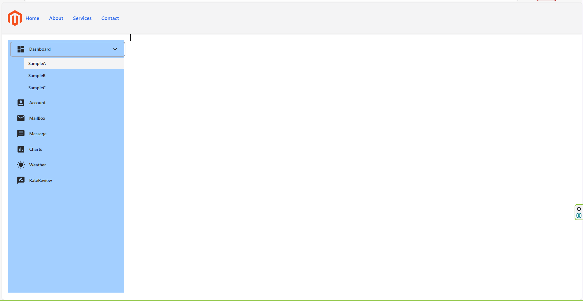
完成イメージ

今回は下記の記事を参考にして作ってみました。
ディレクトリ構造
└── ReactApp/
    ├── src/
    │   ├── main.tsx
    │   ├── App.tsx
    │   └── chakraComponents/
    │       └── ui/
    │           ├── header.tsx
    │           └── SideMenu.tsx
    └── (後略)
さっそく実装
まずは、main.tsxの実装です。
main.tsx
import React from 'react';
import ReactDOM from 'react-dom/client';
import { ChakraProvider, defaultSystem } from '@chakra-ui/react';
import { QueryClient, QueryClientProvider } from '@tanstack/react-query';
import App from './App';

const queryClient = new QueryClient();

ReactDOM.createRoot(document.getElementById('root')!).render(
  <React.StrictMode>
    <ChakraProvider value={defaultSystem}>
      <QueryClientProvider client={queryClient}>
        <App />
      </QueryClientProvider>
    </ChakraProvider>
  </React.StrictMode>,
);
つづいてApp.tsxです。
App.tsx
// App.tsx
import React from 'react';
import { MenuHeader } from './chakraComponents/ui/header';
import { SideMenu } from './chakraComponents/ui/SideMenu';
import { ChakraProvider, Box, Flex, defaultSystem } from '@chakra-ui/react';

const App: React.FC = () => {
  return (
    <React.StrictMode>
      <ChakraProvider value={defaultSystem}>
        <Flex w="100vw" h="100wh">
          <MenuHeader />
          <Box mt="100px">
            <Flex>
              <SideMenu />
              <Box w="70vw"></Box>
            </Flex>
          </Box>
        </Flex>
      </ChakraProvider>
    </React.StrictMode>
  );
};

export default App;
つづいて、header.tsxです。
header.tsx
import { Flex, Image, Link } from '@chakra-ui/react';

const links = [
  { name: 'Home', href: '#home' },
  { name: 'About', href: '#about' },
  { name: 'Services', href: '#services' },
  { name: 'Contact', href: '#contact' },
];

export const MenuHeader = () => {
  return (
    <Flex
      as="header"
      position="fixed"
      bg="gray.100"
      top={0}
      width="full"
      height="100px"
      shadow="sm"
      py={4}
      px={2}
    >
      <Image src="./mazent.svg" />
      <Flex gap="4" justify="flex-end">
        {links.map((link) => (
          <Link
            key={link.name}
            href={link.href}
            fontWeight="medium"
            color="blue.600"
            _hover={{
              color: 'blue.500',
              textDecoration: 'underline',
            }}
            transition="color 0.2s ease"
            mr="4"
          >
            {link.name}
          </Link>
        ))}
      </Flex>
    </Flex>
  );
};
さいごに、SideMenu.tsxです。
SideMenu.tsx
import { useState, useRef } from 'react';
import { Box, Button, Icon } from '@chakra-ui/react';
import {
  MdMessage,
  MdDashboard,
  MdEmail,
  MdAccountBox,
  MdInsertChart,
  MdWbSunny,
  MdRateReview,
  MdKeyboardArrowRight,
  MdKeyboardArrowDown,
} from 'react-icons/md';

export const SideMenu = () => {
  const [openMenu, setOpenMenu] = useState<string | null>(null);
  const contentRefs = useRef<Record<string, HTMLDivElement | null>>({});

  const sideMenuItems = [
    {
      name: 'Dashboard',
      icon: MdDashboard,
      children: [{ name: 'SampleA' }, { name: 'SampleB' }, { name: 'SampleC' }],
    },
    { name: 'Account', icon: MdAccountBox },
    { name: 'MailBox', icon: MdEmail },
    { name: 'Message', icon: MdMessage },
    { name: 'Charts', icon: MdInsertChart },
    { name: 'Weather', icon: MdWbSunny },
    { name: 'RateReview', icon: MdRateReview },
  ];

  const toggleMenu = (name: string) => {
    setOpenMenu(openMenu === name ? null : name);
  };

  return (
    <Box w="20vw" m="20px" h="85vh" backgroundColor="blue.300">
      {sideMenuItems.map((item) => {
        const isOpen = openMenu === item.name;
        const ref = (el: HTMLDivElement | null) => (contentRefs.current[item.name] = el);

        const contentHeight = contentRefs.current[item.name]?.scrollHeight ?? 0;

        return (
          <Box key={item.name} mt="10px" ml="10px">
            <Button
              variant="ghost"
              w="100%"
              justifyContent="space-between" // 左右にアイコンを分ける
              onClick={() => item.children && toggleMenu(item.name)}
              _hover={{ bg: 'gray.100' }}
            >
              <Box display="flex" alignItems="center">
                <Icon as={item.icon} w={7} h={7} mr="13px" />
                {item.name}
              </Box>

              {/* 開閉アイコン */}
              {item.children && (
                <Icon as={isOpen ? MdKeyboardArrowDown : MdKeyboardArrowRight} w={6} h={6} />
              )}
            </Button>

            {/* サブメニュー */}
            {item.children && (
              <Box
                ml="40px"
                mt="5px"
                overflow="hidden"
                maxH={isOpen ? `${contentHeight}px` : '0px'}
                opacity={isOpen ? 1 : 0}
                transition="max-height 0.3s ease-out, opacity 0.25s ease"
              >
                <Box ref={ref}>
                  {item.children.map((child) => (
                    <Button
                      key={child.name}
                      variant="ghost"
                      size="sm"
                      justifyContent="flex-start"
                      w="100%"
                      mt="3px"
                    >
                      {child.name}
                    </Button>
                  ))}
                </Box>
              </Box>
            )}
          </Box>
        );
      })}
    </Box>
  );
};
以上です。
下記に、実装のポイントをまとめます。
👆SideMenu.tsxのポイント
1.自前でCollapseを実装
⇒自作することで、ReactやChakraのバージョンに依存しないのでおすすめです。
sample.tsx
//(略)
{item.children && (
  <Box
    ml="40px"
    mt="5px"
    overflow="hidden"
    maxH={openMenu === item.name ? "200px" : "0px"}
    transition="max-height 0.3s ease-out"
  >
    {item.children.map((child) => (
      <Button
        key={child.name}
        variant="ghost"
        size="sm"
        justifyContent="flex-start"
        w="100%"
      >
        {child.name}
      </Button>
    ))}
  </Box>
)}
サンプルの全体像⇩
sample.tsx
import { useState } from "react";
import { Box, Button, Icon } from "@chakra-ui/react";
import {
  MdMessage,
  MdDashboard,
  MdEmail,
  MdAccountBox,
  MdInsertChart,
  MdWbSunny,
  MdRateReview,
} from "react-icons/md";

export const SideMenu = () => {
  const [openMenu, setOpenMenu] = useState<string | null>(null);

  const sideMenuItems = [
    {
      name: "Dashboard",
      icon: MdDashboard,
      children: [
        { name: "SampleA" },
        { name: "SampleB" },
      ],
    },
    { name: "Account", icon: MdAccountBox },
    { name: "MailBox", icon: MdEmail },
    { name: "Message", icon: MdMessage },
    { name: "Charts", icon: MdInsertChart },
    { name: "Weather", icon: MdWbSunny },
    { name: "RateReview", icon: MdRateReview },
  ];

  const toggleMenu = (name: string) => {
    setOpenMenu(openMenu === name ? null : name);
  };

  return (
    <Box w="20vw" m="20px">
      {sideMenuItems.map((item) => (
        <Box key={item.name} mt="10px" ml="10px">
          <Button
            variant="ghost"
            w="100%"
            justifyContent="flex-start"
            onClick={() => item.children && toggleMenu(item.name)}
          >
            <Icon as={item.icon} w={7} h={7} mr="13px" />
            {item.name}
          </Button>

          {/* ▼ サブメニュー(自前Collapse) */}
          {item.children && (
            <Box
              ml="40px"
              mt="5px"
              overflow="hidden"
              transition="max-height 0.3s ease-out"
              maxH={openMenu === item.name ? "200px" : "0px"}
            >
              {item.children.map((child) => (
                <Button
                  key={child.name}
                  variant="ghost"
                  size="sm"
                  justifyContent="flex-start"
                  w="100%"
                  mt="3px"
                >
                  {child.name}
                </Button>
              ))}
            </Box>
          )}
        </Box>
      ))}
    </Box>
  );
};
2.サブコンポーネント数の増減に対応
1.maxH="200px" はサブメニューが多いと途中で切れる場合があります。
→ より汎用的にするには、ref を使って実際の高さを測る方法もあります。
2.transition="max-height 0.3s ease-out, opacity 0.2s ease" のようにして、透明度フェードも同時に加えると滑らかになります。
3.開いているメニューを色で強調したい場合は:
sample.tsx
bg={openMenu === item.name ? "gray.100" : "transparent"}
全体のコード⇩
sample.tsx
import { useState, useRef, useEffect } from "react";
import { Box, Button, Icon } from "@chakra-ui/react";
import {
  MdMessage,
  MdDashboard,
  MdEmail,
  MdAccountBox,
  MdInsertChart,
  MdWbSunny,
  MdRateReview,
} from "react-icons/md";

export const SideMenu = () => {
  const [openMenu, setOpenMenu] = useState<string | null>(null);
  const contentRefs = useRef<Record<string, HTMLDivElement | null>>({});

  const sideMenuItems = [
    {
      name: "Dashboard",
      icon: MdDashboard,
      children: [
        { name: "SampleA" },
        { name: "SampleB" },
        { name: "SampleC" },
      ],
    },
    { name: "Account", icon: MdAccountBox },
    { name: "MailBox", icon: MdEmail },
    { name: "Message", icon: MdMessage },
    { name: "Charts", icon: MdInsertChart },
    { name: "Weather", icon: MdWbSunny },
    { name: "RateReview", icon: MdRateReview },
  ];

  const toggleMenu = (name: string) => {
    setOpenMenu(openMenu === name ? null : name);
  };

  return (
    <Box w="20vw" m="20px">
      {sideMenuItems.map((item) => {
        const isOpen = openMenu === item.name;
        const ref = (el: HTMLDivElement | null) => (contentRefs.current[item.name] = el);

        // 実際の高さを取得
        const contentHeight =
          contentRefs.current[item.name]?.scrollHeight ?? 0;

        return (
          <Box key={item.name} mt="10px" ml="10px">
            <Button
              variant="ghost"
              w="100%"
              justifyContent="flex-start"
              onClick={() => item.children && toggleMenu(item.name)}
            >
              <Icon as={item.icon} w={7} h={7} mr="13px" />
              {item.name}
            </Button>

            {/* ▼ サブメニュー(refで高さを測って自然に開閉) */}
            {item.children && (
              <Box
                ml="40px"
                mt="5px"
                overflow="hidden"
                maxH={isOpen ? `${contentHeight}px` : "0px"}
                opacity={isOpen ? 1 : 0}
                transition="max-height 0.3s ease-out, opacity 0.25s ease"
              >
                <Box ref={ref}>
                  {item.children.map((child) => (
                    <Button
                      key={child.name}
                      variant="ghost"
                      size="sm"
                      justifyContent="flex-start"
                      w="100%"
                      mt="3px"
                    >
                      {child.name}
                    </Button>
                  ))}
                </Box>
              </Box>
            )}
          </Box>
        );
      })}
    </Box>
  );
};
💡 改良ポイント解説
1.ref で scrollHeight を取得 各サブメニューの実際の高さを取得し、max-height に反映。サブ項目が増えても自然に開閉。
2.opacity トランジション追加 transition="max-height 0.3s ease-out, opacity 0.25s ease" でフェードも同時適用。
3.overflow="hidden" はみ出し防止&スムーズなトランジション。
4.isOpen 判定 状態によって高さと透明度を動的に変更。
3.react-icons だけで「▶ / ▼」の開閉アイコンを追加 する形で改良
React(最新ver)とChakra(最新ver)のバージョンの相性が悪かったため、react-iconsを採用した。
sample.tsx
import { useState, useRef } from "react";
import { Box, Button, Icon } from "@chakra-ui/react";
import {
  MdMessage,
  MdDashboard,
  MdEmail,
  MdAccountBox,
  MdInsertChart,
  MdWbSunny,
  MdRateReview,
  MdKeyboardArrowRight,
  MdKeyboardArrowDown,
} from "react-icons/md";

export const SideMenu = () => {
  const [openMenu, setOpenMenu] = useState<string | null>(null);
  const contentRefs = useRef<Record<string, HTMLDivElement | null>>({});

  const sideMenuItems = [
    {
      name: "Dashboard",
      icon: MdDashboard,
      children: [
        { name: "SampleA" },
        { name: "SampleB" },
        { name: "SampleC" },
      ],
    },
    { name: "Account", icon: MdAccountBox },
    { name: "MailBox", icon: MdEmail },
    { name: "Message", icon: MdMessage },
    { name: "Charts", icon: MdInsertChart },
    { name: "Weather", icon: MdWbSunny },
    { name: "RateReview", icon: MdRateReview },
  ];

  const toggleMenu = (name: string) => {
    setOpenMenu(openMenu === name ? null : name);
  };

  return (
    <Box w="20vw" m="20px">
      {sideMenuItems.map((item) => {
        const isOpen = openMenu === item.name;
        const ref = (el: HTMLDivElement | null) => (contentRefs.current[item.name] = el);

        const contentHeight = contentRefs.current[item.name]?.scrollHeight ?? 0;

        return (
          <Box key={item.name} mt="10px" ml="10px">
            <Button
              variant="ghost"
              w="100%"
              justifyContent="space-between" // 左右にアイコンを分ける
              onClick={() => item.children && toggleMenu(item.name)}
              _hover={{ bg: "gray.100" }}
            >
              <Box display="flex" alignItems="center">
                <Icon as={item.icon} w={7} h={7} mr="13px" />
                {item.name}
              </Box>

              {/* 開閉アイコン */}
              {item.children && (
                <Icon
                  as={isOpen ? MdKeyboardArrowDown : MdKeyboardArrowRight}
                  w={6}
                  h={6}
                />
              )}
            </Button>

            {/* サブメニュー */}
            {item.children && (
              <Box
                ml="40px"
                mt="5px"
                overflow="hidden"
                maxH={isOpen ? `${contentHeight}px` : "0px"}
                opacity={isOpen ? 1 : 0}
                transition="max-height 0.3s ease-out, opacity 0.25s ease"
              >
                <Box ref={ref}>
                  {item.children.map((child) => (
                    <Button
                      key={child.name}
                      variant="ghost"
                      size="sm"
                      justifyContent="flex-start"
                      w="100%"
                      mt="3px"
                    >
                      {child.name}
                    </Button>
                  ))}
                </Box>
              </Box>
            )}
          </Box>
        );
      })}
    </Box>
  );
};
サイト