今まで時系列のplotはしても分析らしい分析に触れる機会がなかったが、セミナーで習ったことを振り返りついでになぞる。
原理の部分は次回
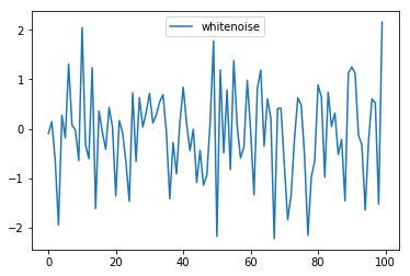
ホワイトノイズ(不規則なノイズ)の生成
import pandas as pd
import numpy as np
from matplotlib import pyplot as plt
%matplotlib inline
import statsmodels.api as sm

a = np.random.normal(0, 1, 100)
df_whitenoise = pd.DataFrame(a, columns = ["whitenoise"])
df_whitenoise.head()
df_whitenoise.plot()
whitenoise
0 -0.096781
1 0.140867
2 -0.624550
3 -1.946654
4 0.274500
ランダムウォークの生成
ホワイトノイズの値の累積和(前回の値と足し算)することで、ランダムな時系列変化があるようなグラフを作る
df_randomwalk = df_whitenoise.assign(whitenoise = np.cumsum(df_whitenoise.whitenoise))
plt.plot(df_randomwalk)
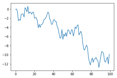
下がっていくような傾向があるように見えるが、実際は無意味に動いているだけ。
投資などの予想が難しいのはこのため。
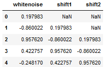
値をズラすshift(periods=1)
値をズラしたデータを作ることで自己相関の計算がしやすくなる。
df_whitenoise["shift1"] = df_whitenoise["whitenoise"].shift(periods=1)
df_whitenoise["shift2"] = df_whitenoise["whitenoise"].shift(periods=2)
df_whitenoise.head()
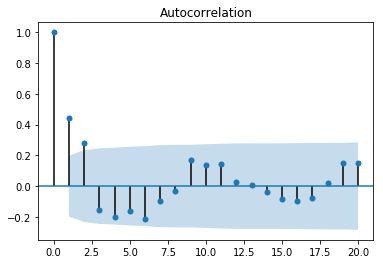
自己相関を見るACF
自己相関関数は、k時間単位離れた時系列の観測値間の相関(ytとyt-k)を表す
sm.graphics.tsa.plot_acf(df_whitenoise.whitenoise, alpha=0.05,lags=20)
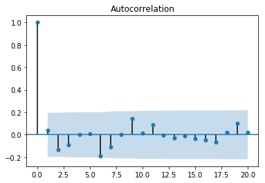
最初のスパイクが優位に検知されている。
その後のスパイクは有意水準95%の範囲内に収まっている。
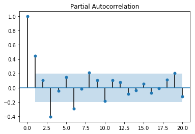
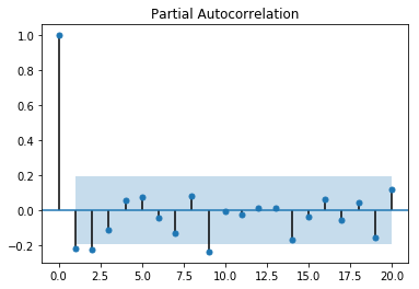
偏自己相関PCAF
偏自己相関関数は、遅れが短いその他のすべての項(yt-1、yt-2、...、yt-k-1)の存在を考慮して調整した後に計算される、k時間単位離れた時系列の観測値間の相関(ytとyt-k)を表す
sm.graphics.tsa.plot_pacf(df_whitenoise.whitenoise, alpha=0.05,lags=20)

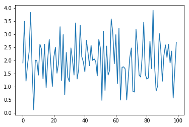
移動平均過程 MA
時系列はすべての時刻で同じ分布からデータが出てくるわけではない。
時刻が異なれば、分布も異なる。
過去の値を加えていくことで現在の分布を表している。
df_whitenoise["ma"] = df_whitenoise["whitenoise"] + df_whitenoise["shift1"]*0.5 + df_whitenoise["shift2"]*0.8 + 1
df_whitenoise = df_whitenoise.dropna()
plt.plot(df_whitenoise[["ma"]])
sm.graphics.tsa.plot_acf(df_whitenoise[["ma"]], lags=20)
sm.graphics.tsa.plot_pacf(df_whitenoise[["ma"]], lags=20)
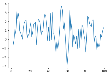
自己回帰過程 AR
過去のデータから影響を受ける。
定数部は確定できない影響を説明している。
df_whitenoise["ar"] = 0
df_whitenoise["shift1"] = 0
df_whitenoise["shift2"] = 0

for i in range(100):
    df_whitenoise.iloc[i, 1] = df_whitenoise.iloc[i, 0] + 0.8*df_whitenoise.iloc[i, 2] + 0.3*df_whitenoise.iloc[i, 3] + 2
    df_whitenoise.iloc[i, 2] = df_whitenoise.iloc[i-1, 1]
    df_whitenoise.iloc[i, 3] = df_whitenoise.iloc[i-2, 1]

plt.plot(df_whitenoise[["ar"]])
sm.graphics.tsa.plot_acf(df_whitenoise[["ar"]], lags=20)
sm.graphics.tsa.plot_pacf(df_whitenoise[["ar"]], lags=20)
ACF

PACF
#UKgasで時系列予想
(同志社大のデータサイエンス研究室のHPでRでおなじようなことをやっている)
UKgasはRからcsvを作っておく
gas_csv <- data.frame(UKgas)

year <- seq(1960,1986,1)
mon <- c(1,4,7,10)
day <- c(1)

limit <- (nrow(gas_csv)/4)
time <- NULL

for (i in 1:limit){
N1<- paste0(year[i],"/",mon[1],"/",day)
N2<- paste0(year[i],"/",mon[2],"/",day)
N3<- paste0(year[i],"/",mon[3],"/",day)
N4<- paste0(year[i],"/",mon[4],"/",day)
time <- c(time,N1,N2,N3,N4)
}

write.csv(data.frame(time=time, UKgas=gas_csv), "UKgas.csv" ,row.names=F)
パイソンに戻る
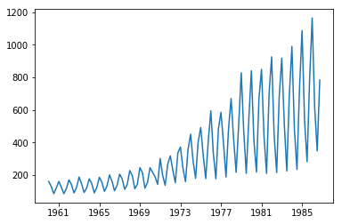
とりあえずプロット
df = pd.read_csv("UKgas.csv", index_col=0)
df.index = pd.to_datetime(df.index)
plt.plot(df)
Rでやるならこんな感じ
UKGAS <- data.frame(time=time, UKgas=gas_csv)
ts.plot(UKGAS[,2])
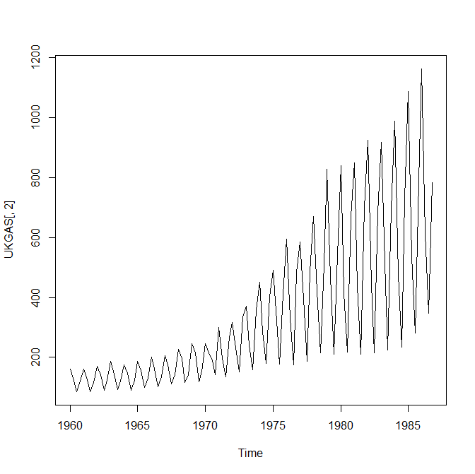
ガスは四半期で周期的に動いているのがわかる(ギザギザしている)
冬は消費量が多く夏は少ない。
増え方も大きい。
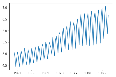
対数をとって差分(足し引き)のカタチにしてわかりやすくする。
df["UKgas"] = np.log(df["UKgas"])
plt.plot(df)
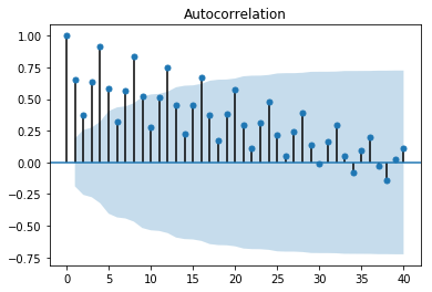
sm.graphics.tsa.plot_acf(df, lags=40)
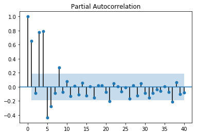
sm.graphics.tsa.plot_pacf(df, lags=40)
ACF
四半期の周期性がわかる
PACF
最初の方のスパイクが反応している
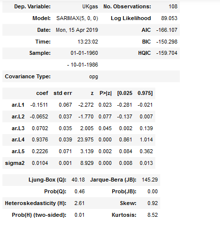
fit = sm.tsa.SARIMAX(df, order=(5,0,0), seasonal_order=(0,0,0,4),
enforce_invertibility=False,
enforce_stationarity=False).fit()
fit.summary()
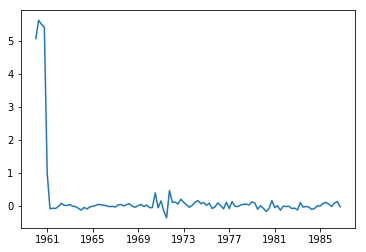
plt.plot(fit.resid)
SARIMAXを調整してAICやBICが小さくなるようなモデルを見つける。
誤差を見ると最初は反応しているが、あとは小さい値。
1969~1977年に誤差が発生している
predictで予想値を二年分出す
pred = fit.predict('1986-10-01', '1988-10-01')
plt.plot(df)
plt.plot(pred, "r")
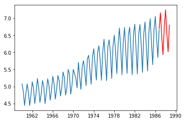
対数処理をnp.expで戻す
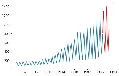
予測値が見えました。
上昇傾向にありそうです。
周期性も再現できていそうです。