もうこの記事は書くかどうか悩みましたが、備忘録として書いておきます。
今回は、以下の参考からの受け売りで、R使って感染数当たり死亡率と人口当たり死亡率の各国比較グラフを描くという内容です。
なお、この記事はR言語はじめて触った初心者であり、また利用するデータの信ぴょう性もチェックしていないので、結果や記事については自己責任でご判断ください。
【参考】
①コロナウィルスデータを解析してみよう : R言語入門(1/2)
②コロナウィルスデータを解析してみよう : R言語入門(2/2)
結果は以下のとおりの絵が出てきました。
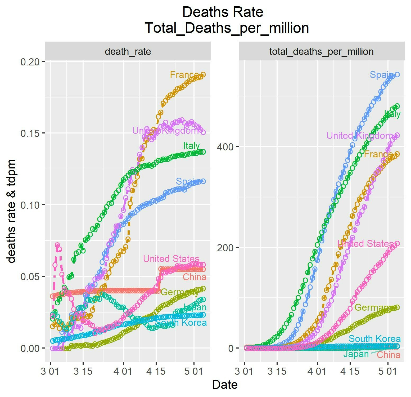
これを見ると、やはり日本の感染症対策は断凸素晴らしいですね!!
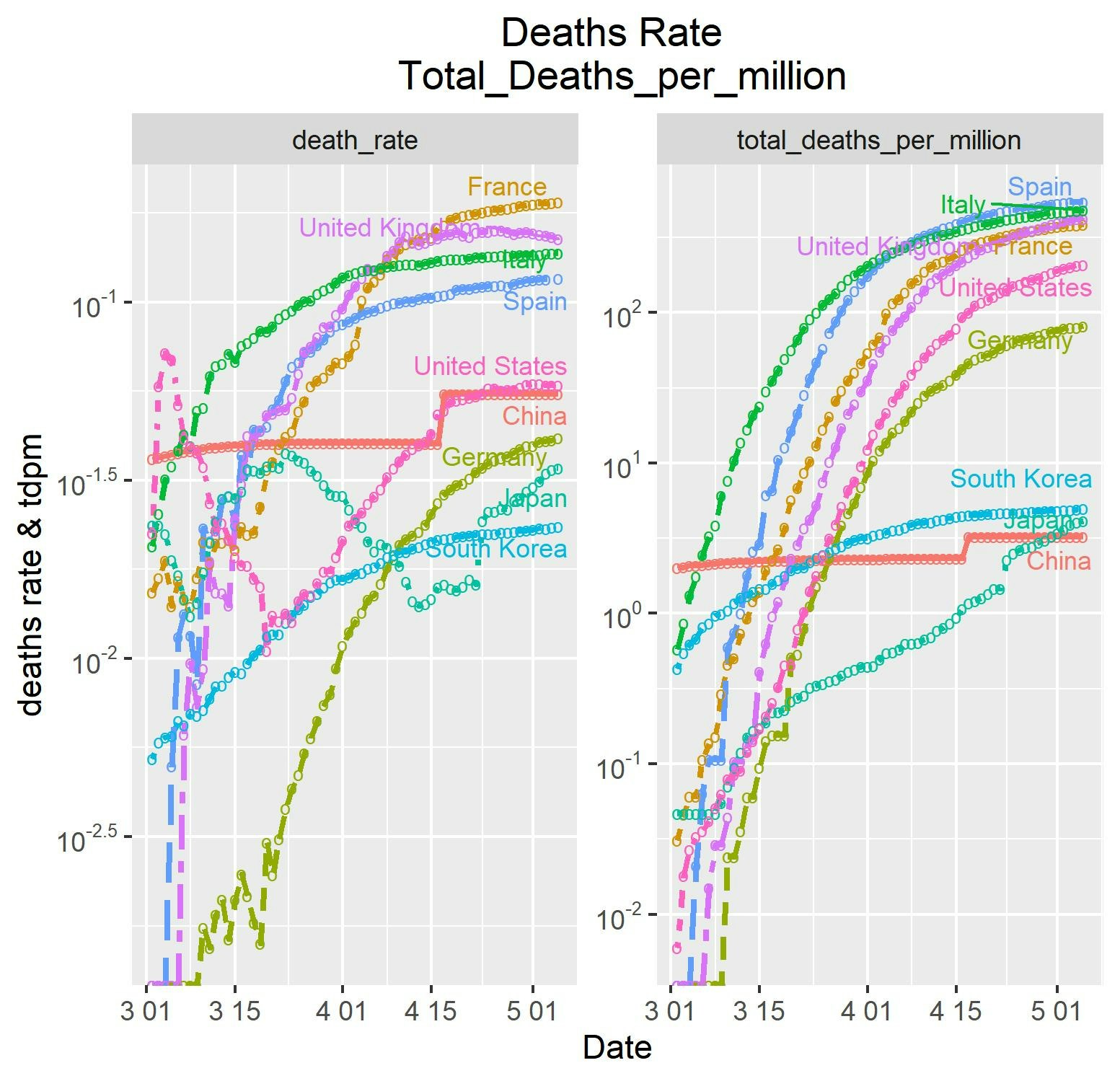
日本があんまり見えないという声があるので、片対数で見ると以下のように、日本の素晴らしさがさらに際立ちました。
※お勉強なのでy-軸の見出しを無駄に入れています
コード解説
昨日、初めてRのコード見たのですが解説します。
参考②サイトの気持ちで二つのデータをマージして合成画像を描画するというテーマです。
その結果、上記の画像が得られました。
library(ggrepel)
c_tdpm               <- subset(coviddata, location %in% countries, select = c("date","location","total_deaths_per_million"))
c_sr                 <- subset(coviddata, location %in% countries, select = c("date","location","death_rate"))
colnames(c_sr)       <- c("Date","Country","data")
colnames(c_tdpm)     <- c("Date","Country","data")
c_sr$datatype        <- "death_rate"
c_tdpm$datatype      <- "total_deaths_per_million"
c_tdpm_sr            <- rbind(c_sr, c_tdpm)
ここまででデータの準備をしています。
coveddataからsubsetとしてtdpmとsrのデータのみを切り取って、c_tdpmとc_srに入力しています。
※なぜcがたくさんついているのかは不明です。columnsの略な気がします。しかしsrは...
c_sr$datatype が、plotの見出しになります。
最後の行で二つのデータを結合しています。
因みに結合のされ方はおまけのとおり後ろにくっつくです。
いよいよ、以下でプロットしています。
Rではどうやら条件をだらだら追加していくスタイルです。
以下でだいたい絵が描けます。
g1 <- ggplot(c_tdpm_sr, aes(x=Date,  y=data,
                            color=Country, linetype=Country,size=1)) +
  geom_line(size=1) + geom_point(shape="o",size=3)+
y軸を片対数にしています。上記のグラフは単に上のy=log(data)で計算して描画した結果ですが、以下のとおりにすると軸の表示が通常の$10^{-2}$のようなべき表示になります。
【参考】
GGPLOT LOG SCALE TRANSFORMATION
  scale_y_log10(breaks = trans_breaks("log10", function(x) 10^x),
                labels = trans_format("log10", math_format(10^.x))) +
以下でタイトル、軸見出しを指定しています。
  labs(title="Deaths Rate \n Total_Deaths_per_million",
       x="Date", y = "deaths rate & tdpm") +
以下で凡例を曲線の右端(Dateが最大の位置)に表示しています。
ラベル、描画位置、不明(重なった時の透過率?)、大きさを指定します。
【参考】
ggplot2で複数系列の折れ線グラフにラベルを付ける
  geom_text_repel(
    data = subset(c_tdpm_sr, Date == max(Date)),
    aes(label = Country),
    nudge_x = 100,
    segment.alpha = 0.5,
    size = 3
  )+
上記の凡例表示のために、legend.position = "none"としています。
また、titleの中央表示のためにplot.title = element_text(hjust = 0.5)としています。
【参考】
Center the title in ggplot
そして二つのグラフを縦に並べるか横に並べるかでncol = 2を入れています。
1なら縦、2だと横に並びます。
※並べるカラムの数指定
  theme(legend.position = "none",plot.title = element_text(hjust = 0.5))+
  facet_wrap(~datatype,
             ncol = 2,
             scales = "free"
  )
最後に描画して、ファイルに格納します。
plot(g1)
ggsave("log_tdpm_sr_plot.jpg")
こうして、以下のような片対数グラフが得られました。
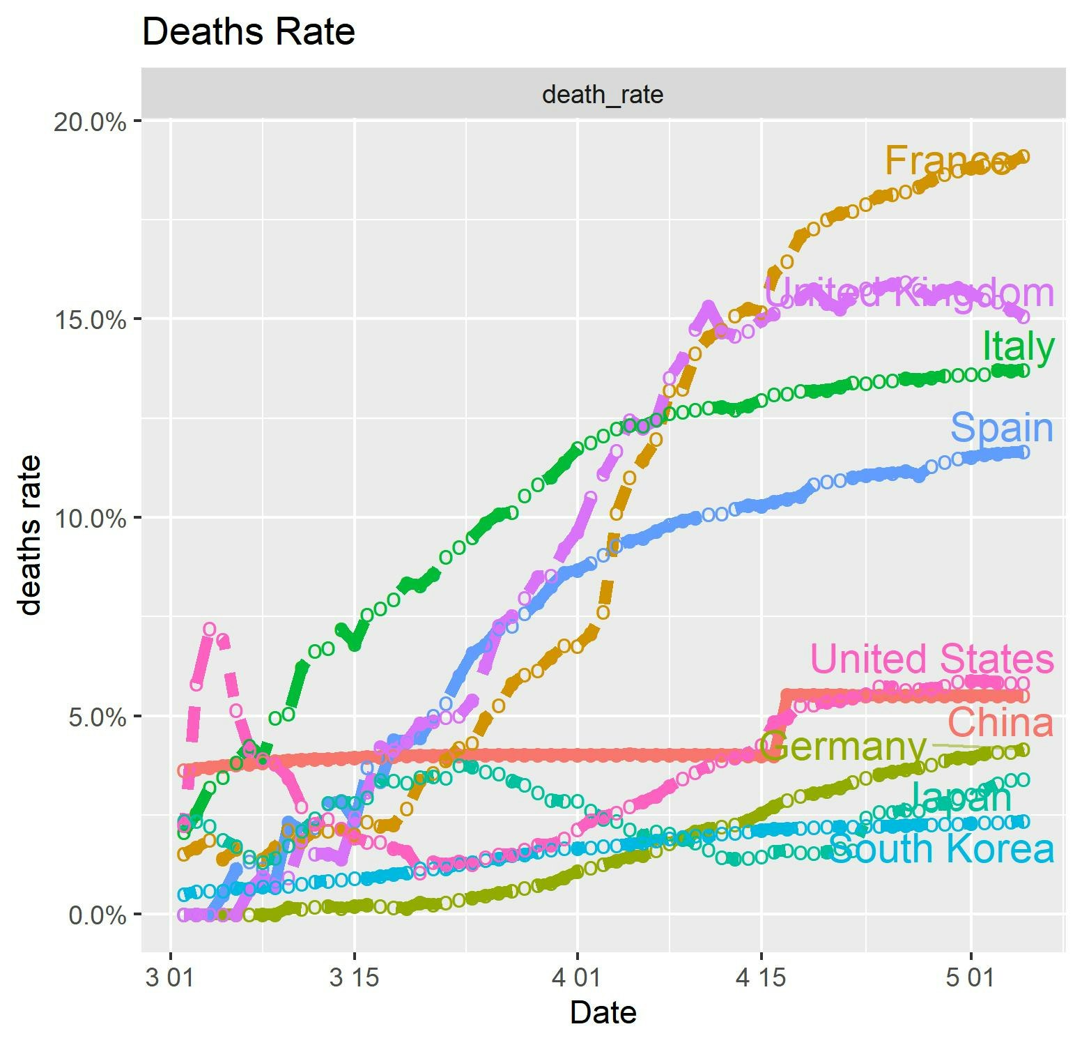
そして、縦軸を%表示するには、片対数のおまじないを以下に変更します。
scale_y_continuous(labels = scales::percent)+
ということで、以下の%表示のグラフが得られました。(title中央表示していませんが、。。)
それにしても欧州の死亡率は酷いです。
【参考】
How can I change the Y-axis figures into percentages in a barplot?
まとめ
・Rを使って死亡数、死亡率を各国比べてみた
・日本は最高に素晴らしいと評価できる
・Rでグラフを一通り描けそうである
・Rで普通の計算やってみよう
Error log
以下参考①をやっていてのエラー3点について、回避を書いておきます。
まずディレクトリの指定で躓きました
> setwd(D:\R_data)
 エラー:  想定外の入力です  in "setwd(D:\"
> getwd()
[1] "C:/Users/user/Documents"
> setwd("C:/R_data")
というエラーでした。
めでたく以下で自前データが読み込めました。
> coviddata <- read.csv("502.csv", header = T, stringsAsFactors = F)
> head(coviddata)
  Prefecture Region cases day_cases    X hospital    X.1 recovered    X.2
1     三重県   三重    45         0 0.25       25 55.60%        19 42.20%
2     京都府   京都   328         5 1.27      149 45.40%       168 51.20%
3     佐賀県   佐賀    42         0 0.52       35 83.30%         7 16.70%
4     兵庫県   兵庫   654         4  1.2      550 84.10%        86 13.10%
5     北海道 北海道   823        33 1.57      546 66.30%       248 30.10%
6     千葉県   千葉   823         7 1.31      693 84.20%       105 12.80%
  deaths   X.3
1      1 2.20%
2     11 3.40%
3      0 0.00%
4     18 2.80%
5     29 3.50%
6     25 3.00%
当該プログラムを動かすとggplot2が無かったのでインストール
> library(ggplot2)
 library(ggplot2) でエラー:
   ‘ggplot2’ という名前のパッケージはありません
> install.packages("ggplot2")
関数 "geom_text_repel"が無かったのでインストール
> source('~/.active-rstudio-document')
 geom_text_repel(data = subset(c_tdpm_sr, c_tdpm_sr == max(c_tdpm_sr)),  でエラー:
   関数 "geom_text_repel" を見つけることができませんでした
> install.packages("ggrepel")
結合のされ方
> head(c_tdpm)
           Date Country  data                 datatype
2739 2020-03-02   China 2.025 total_deaths_per_million
2740 2020-03-03   China 2.047 total_deaths_per_million
> head(c_sr)
           Date Country       data   datatype
2739 2020-03-02   China 0.03636409 death_rate
2740 2020-03-03   China 0.03670525 death_rate
まさしく後ろに結合される。
> head(c_tdpm_sr)
           Date Country       data   datatype
2739 2020-03-02   China 0.03636409 death_rate
2740 2020-03-03   China 0.03670525 death_rate
...
> tail(c_tdpm_sr)
             Date       Country    data                 datatype
145441 2020-04-30 United States 184.186 total_deaths_per_million
145451 2020-05-01 United States 190.349 total_deaths_per_million