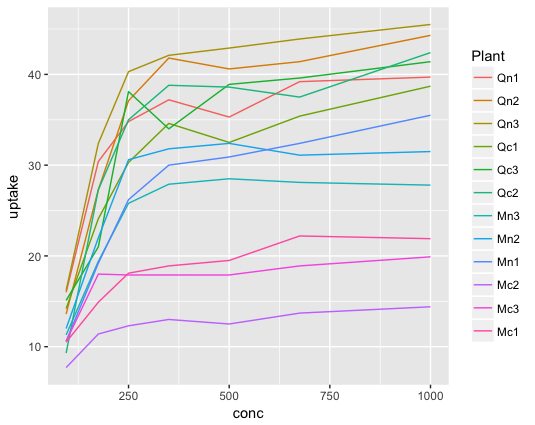
系列が沢山ある折れ線グラフをそのままプロットすると凡例との対応が分かりにくくなる。
library(ggplot2)
ggplot(CO2, aes(x = conc, y = uptake, color = Plant)) +
  geom_line()
geom_text()を使う
ggplot(CO2, aes(x = conc, y = uptake, color = Plant)) +
  geom_line() +
  geom_text(
    data = subset(CO2, conc == max(conc)),
    aes(label = Plant),
    nudge_x = 50
  ) +
  theme(legend.position = "none")
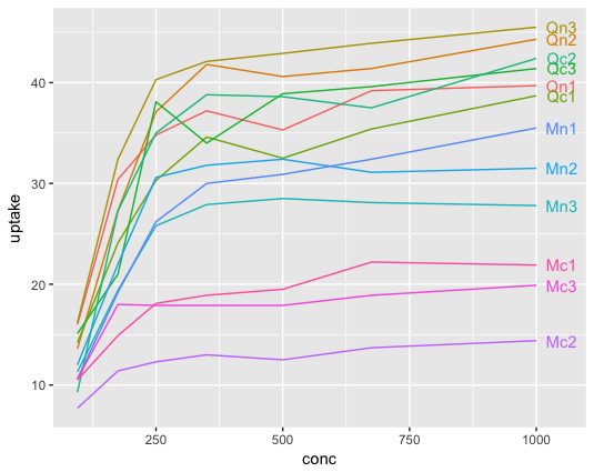
subsetでx軸右端のデータを抽出し、nudge_xで少しプロット位置をずらすのとtheme(legend.position = "none")で凡例を消しておくのがポイント。ただしこの方法だとテキスト同士は重なる可能性がある。
geom_text_repel()を使う
library(ggrepel)

ggplot(CO2, aes(x = conc, y = uptake, color = Plant)) +
  geom_line() +
  geom_text_repel(
    data = subset(CO2, conc == max(conc)),
    aes(label = Plant),
    nudge_x = 100,
    segment.alpha = 0.5,
    size = 3
  ) +
  lims(x = c(min(CO2$conc), max(CO2$conc)*1.1)) +
  theme(legend.position = "none")
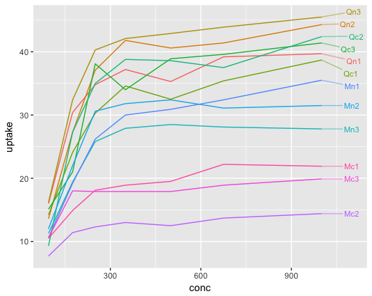
{ggrepel}パッケージのgeom_text_repel()はテキストが重ならないように自動的に調整してくれる。
geom_text_repel()はほぼgeom_text()と同じように使えるように作られているが、注意点がいくつかある。
-
nudge_xでプロット位置を元のプロット範囲外までずらしても、プロット範囲が自動的に拡張されない。- 従って、
lims()でx軸のプロット範囲を拡張しておく必要がある。
- 従って、
- segment(テキストから伸びる線)がデフォルトでは
geom_line()の線と区別できないので、折れ線グラフの一部とみなされてしまう危険性がある。- 従って、
segment.alpha=やsegment.size=、arrow=等で外観を変えておいた方が良い。
- 従って、
余談
この内容はこの図が描きたくて調べた。

が、割とどうでもいい部分で話が長くなるのでこの図の説明は有機質資材からの窒素放出量を予測したい - もうカツ丼はいいよなに書いた。