LoginSignup
16
19

More than 5 years have passed since last update.

PythonだけどPixieDust を使ってお手軽なVisualization

Last updated at Posted at 2017-03-28

Python でもお手軽に視覚化

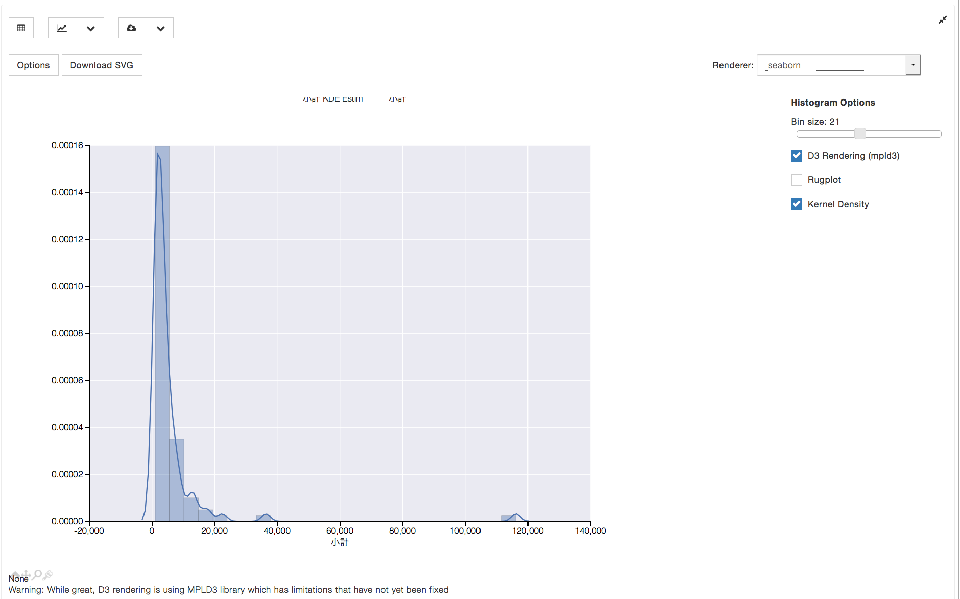
Python環境でグラフ書くのに、matplotlib&seabornで色々書くのもなかなか楽しい?けれども、PixieDustでお手軽に視覚化してみた。
( 以下、IBM Data Science Experience で使用)

from pixiedust.display import *
display (df_data_1)

こんなコードを入力しただけで、インタラクティブなグラフコンポーネントが表示されたw

テーブル出力

Screen Shot 2017-03-28 at 20.16.35.png

ヒストグラム

日本語のラベルもスンナリw
Screen Shot 2017-03-28 at 20.19.28.png

円グラフ

Screen Shot 2017-03-28 at 20.25.31.png

その他、Google Mapへのプロットもできるようなので、Brunel visualizationと一緒に今度試してみようと思うw

[参考リンク] http://datascience.ibm.com/docs/content/analyze-data/Home.html

16
19
0

Register as a new user and use Qiita more conveniently

  1. You get articles that match your needs
  2. You can efficiently read back useful information
  3. You can use dark theme
What you can do with signing up
16
19