コンポーネント
コンポーネントとは、見た目(テンプレート)とロジック(振る舞い)をひとまとめにし、再利用可能な UI 部品として切り出した単位のこと。Angular アプリケーションは多数のコンポーネントの集合によって構成されており、画面の一部または機能単位を構造的に分離することができる。これにより、以下のような利点がある。
- プロジェクトに構造が与えられ、開発・保守が容易になる
- 機能や画面単位で責務が明確に分けられ、理解しやすくなる
- 同じ UI コンポーネントを複数画面間で再利用できる
必要な3つの要素
| 要素 | 説明 |
|---|---|
| TypeScript クラス | ロジック(例: ユーザー入力の処理、データ取得)を定義する。profile-photo.ts に該当。 |
| テンプレート(HTML) | UI の構造や見た目を定義する。DOM にレンダリングされる内容を記述。profile-photo.html に該当。 |
| セレクター | HTML テンプレート内でコンポーネントを使うためのタグ名。profile-photo.ts の selector に該当。 |
@Component({
    selector: 'profile-photo',
    templateUrl: 'profile-photo.html',
    styleUrl: 'profile-photo.css',
})
export class ProfilePhoto { }
<img src="profile-photo.jpg" alt="Your profile photo">
img { border-radius: 50%; }
templateUrl / styleUrls を使わず、template / styles プロパティを使ってインライン記述も可能。
@Component({
    selector: 'profile-photo',
    template: `<img src="profile-photo.jpg" alt="Your profile photo">`,
    styles: [`img { border-radius: 50%; }`],
})
export class ProfilePhoto { }
スタイリング
コンポーネントは専用の CSS スタイルを持つことができ、見た目をコンポーネント単位で管理できる。前述のとおり、外部ファイルとインラインで記述することができる。
@Component({
    selector: 'profile-photo',
    template: `<img src="profile-photo.jpg" alt="Your profile photo">`,
    styles: [`img { border-radius: 50%; }`],
})
export class ProfilePhoto { }

@Component({
    selector: 'profile-photo',
    templateUrl: 'profile-photo.html',
    styleUrls: ['profile-photo.css'],
})
export class ProfilePhoto { }
Sass、less、stylus などの CSS プリプロセッサにも対応している。
スタイルのスコープ
コンポーネントスタイルはスコープ付きで、他のコンポーネントに影響しないよう管理できる。この仕組みはビューカプセル化(View Encapsulation) と呼ばれ、以下の3つのモードがある。
Emulated(デフォルト)
Angular が自動的に CSS セレクタや属性を付与してコンポーネントごとにスタイルを分離する。他コンポーネントにスタイルが漏れないが、グローバル CSS の影響は受ける。
カスタム疑似クラス ::ng-deep をサポートしており、この擬似クラスをCSSルールに適用すると、そのルールのカプセル化が無効になり、実質的にグローバルスタイルになる。しかし、非推奨となっている。
ShadowDom
Web標準のShadow DOM(シャドウDOM)技術を使ってスタイルのカプセル化を実現する。
None
スタイル分離を行わない。そのコンポーネント用に記述したスタイルはグローバル CSS と同じ扱いとなり、全体に影響する。
import { ViewEncapsulation } from '@angular/core';

@Component({
    ...,
    encapsulation: ViewEncapsulation.ShadowDom,
})
入力プロパティ
シグナルベース
input 関数を用いることで、コンポーネントが親から値を受け取ることができる。親は、プロパティバインディング構文[] を使って値を渡す。
import {Component, input} from '@angular/core';
@Component({/*...*/})
export class CustomSlider {
    value = input(0);
}
<custom-slider [value]="50" />
input 関数は InputSignal を返す。そのため、シグナルを呼び出すことで値を読み取ることができる。
import {Component, input} from '@angular/core';
@Component({/*...*/})
export class CustomSlider {
    value = input(0);
    label = computed(() => `The slider's value is ${this.value()}`);
}
必須入力
input.required を用いることで、入力が常に値を持つことを強制できる。
@Component({/*...*/})
export class CustomSlider {
    value = input.required<number>();
}
入力変換
入力が設定されるときにその値を変更する transform 関数を指定できる。
@Component({
    selector: 'custom-slider',
    /*...*/
})
export class CustomSlider {
    label = input('', {transform: trimString});
}
function trimString(value: string | undefined): string {
    return value?.trim() ?? '';
}
入力エイリアス
alias オプションを指定して、テンプレートでの入力の名前を変更できる。
@Component({/*...*/})
export class CustomSlider {
    value = input(0, {alias: 'sliderValue'});
}
<custom-slider [sliderValue]="50" />
モデル入力
子コンポーネントが新しい値を親コンポーネントに伝搬できるようにする特殊な入力。親はプロパティバインディング構文[] とイベントバインディング構文() を組み合わせたもの[()]使って値を渡す。この構文を非公式にバナナインボックスという。
@Component({ /* ... */})
export class CustomSlider {
    value = model(0);
    increment() {
        this.value.update(oldValue => oldValue + 10);
    }
}
@Component({
    /* ... */
    template: `<custom-slider [(value)]="volume" />`,
})
export class MediaControls {
    volume = signal(0);
}
暗黙的な change イベント
Angular はモデルに対応する出力を自動的に作成する。出力の名前は、モデルの名前に Change が付いたもの。これを購読することもできる。
@Directive({ /* ... */ })
export class CustomCheckbox {
    // テンプレートで `(checkedChange)="handler()"` を使用して購読できる
    checked = model(false);
}
デコレーターベース
プロパティに @Input デコレーターを追加することで、コンポーネントが親から値を受け取ることができる。親は、プロパティバインディング構文[] を使って値を渡す。
@Component({...})
export class CustomSlider {
    @Input() value = 0;
}
<custom-slider [value]="50" />
signal ベースが推奨されるが、デコレーターベースもサポートされている。
必須入力
required オプションを指定することで、入力が常に値を持つことを強制できる。
@Component({...})
export class CustomSlider {
    @Input({required: true}) value = 0;
}
入力変換
入力が設定されるときにその値を変更する transform 関数を指定できる。
@Component({
    selector: 'custom-slider',
    ...
})
export class CustomSlider {
    @Input({transform: trimString}) label = '';
}
function trimString(value: string | undefined) { return value?.trim() ?? ''; }
入力エイリアス
alias オプションを指定して、テンプレートでの入力の名前を変更できる。
@Component({...})
export class CustomSlider {
    @Input({alias: 'sliderValue'}) value = 0;
}
<custom-slider [sliderValue]="50" />
カスタムイベント
シグナルベース
output 関数を用いることで、子コンポーネントが親へイベントを通知することができる。親は、イベントバインディング構文() を使って子コンポーネントのイベントを受け取る。
@Component({/*...*/})
export class ExpandablePanel {
    panelClosed = output<void>();
}
<expandable-panel (panelClosed)="savePanelState()" />
output 関数は OutputEmitterRef を返すため、emit メソッドを呼び出すことで、イベントを発生させることができる。
this.panelClosed.emit();
イベントデータの送出
emit を呼び出す際に、イベントデータを渡すことができる。テンプレートでイベントリスナーを定義する場合、$event 変数からイベントデータにアクセスできる。
this.valueChanged.emit(7);
this.thumbDropped.emit({
    pointerX: 123,
    pointerY: 456,
})
<custom-slider (valueChanged)="logValue($event)" />
出力エイリアス
alias オプションを指定して、テンプレートでの出力の名前を変更できる。
@Component({/*...*/})
export class CustomSlider {
    changed = output({alias: 'valueChanged'});
}
<custom-slider (valueChanged)="saveVolume()" />
プログラムによる出力の購読
コンポーネントを動的に作成する場合は、コンポーネントインスタンスから出力イベントを購読できる。
const someComponentRef: ComponentRef<SomeComponent> = viewContainerRef.createComponent(/*...*/);
someComponentRef.instance.someEventProperty.subscribe(eventData => {
    console.log(eventData);
});
デコレーターベース
EventEmitter プロパティに @Output デコレーターを追加することで、カスタムイベントを定義できる。
@Component({/*...*/})
export class ExpandablePanel {
    @Output() panelClosed = new EventEmitter<void>();
}
signal ベースが推奨されるが、デコレーターベースもサポートされている。
出力エイリアス
テンプレートでの出力の名前を変更できる。
@Component({/*...*/})
export class CustomSlider {
    @Output('valueChanged') changed = new EventEmitter<number>();
}
<custom-slider (valueChanged)="saveVolume()" />
ng-content によるコンテンツ投影
<ng-content> 要素はコンテンツを配置する場所を示すプレースホルダーとして使用することができ、コンポーネントを使う側が記述した子要素が、<ng-content> の位置に差し込まれて表示される。
// コンポーネントソース
@Component({
    selector: 'custom-card',
    template: `
        <div class="card-shadow">
            <ng-content />
        </div>
    `,
})
export class CustomCard {/* ... */}
<!-- コンポーネントの利用 -->
<custom-card>
  <p>これは投影されたコンテンツです</p>
</custom-card>
<!-- レンダリングされたDOM -->
<custom-card>
  <div class="card-shadow">
    <p>これは投影されたコンテンツです</p>
  </div>
</custom-card>
Angularは、このように渡されるコンポーネントの子要素を、そのコンポーネントのコンテンツと呼ぶ。
React の children と同じ
複数の ng-content
複数の <ng-content> にも対応しており、select 属性を使うと、特定のコンテンツ要素を特定の場所に表示できる。
<!-- コンポーネントテンプレート -->
<div class="card-shadow">
    <ng-content select="card-title"></ng-content>
    <div class="card-divider"></div>
    <ng-content select="card-body"></ng-content>
</div>
<!-- コンポーネントの利用 -->
<custom-card>
    <card-title>こんにちは</card-title>
    <card-body>例へようこそ</card-body>
</custom-card>
<!-- レンダリングされたDOM -->
<custom-card>
    <div class="card-shadow">
        <card-title>こんにちは</card-title>
        <div class="card-divider"></div>
        <card-body>例へようこそ</card-body>
    </div>
</custom-card>
select 属性を持つ <ng-content> を1つ以上、 select 属性を持たない <ng-content> を1つ含める場合、 後者は select 属性に一致しなかったすべての要素をキャプチャする。
フォールバックコンテンツ
<ng-content> に一致するコンテンツがない場合、フォールバックコンテンツを表示することができる。
<!-- コンポーネントテンプレート -->
<div class="card-shadow">
    <ng-content select="card-title">Default Title</ng-content>
    <div class="card-divider"></div>
    <ng-content select="card-body">Default Body</ng-content>
</div>
<!-- コンポーネントの利用 -->
<custom-card>
    <card-title>Hello</card-title>
    <!-- No card-body provided -->
</custom-card>
<!-- レンダリングされたDOM -->
<custom-card>
    <div class="card-shadow">
        <card-title>Hello</card-title>
        <div class="card-divider"></div>
        Default Body
    </div>
</custom-card>
ホスト要素
ホスト要素とは、コンポーネントのテンプレートが実際にレンダリングされる HTML 要素のこと。
// コンポーネントソース
@Component({
    selector: 'profile-photo',
    template: `
        <img src="profile-photo.jpg" alt="Your profile photo" />
    `,
})
export class ProfilePhoto {}
<!-- コンポーネントの使用 -->
<h3>Your profile photo</h3>
<profile-photo />
<button>Upload a new profile photo</button>
<!-- レンダリングされたDOM -->
<h3>Your profile photo</h3>
<profile-photo>
    <img src="profile-photo.jpg" alt="Your profile photo" />
</profile-photo>
<button>Upload a new profile photo</button>
上記の例では、<profile-photo> はProfilePhotoコンポーネントのホスト要素。
バインディング
コンポーネントは、ホスト要素にプロパティ、属性、イベントをバインドできる。 これは、@Component デコレーターの host プロパティで定義できる。
@Component({
    ...,
    host: {
        'role': 'slider',
        '[attr.aria-valuenow]': 'value',
        '[class.active]': 'isActive()',
        '[tabIndex]': 'disabled ? -1 : 0',
        '(keydown)': 'updateValue($event)',
    },
})
export class CustomSlider {
    value: number = 0;
    disabled: boolean = false;
    isActive = signal(false);
    updateValue(event: KeyboardEvent) { /* ... */ }
    /* ... */
}
クラスのプロパティやメソッドに @HostBinding デコレーターを追加することで、ホスト要素のプロパティと属性をバインドできる。
@Component({
    /* ... */
})
export class CustomSlider {
    @HostBinding('attr.aria-valuenow')
    value: number = 0;

    @HostBinding('tabIndex')
    getTabIndex() {
        return this.disabled ? -1 : 0;
    }
    /* ... */
}
また、@HostListener デコレーターを使用すると、ホスト要素にイベントリスナーを追加できる。デコレーターは、イベント名とオプションの引数の配列を受け取る。
export class CustomSlider {
    @HostListener('keydown', ['$event'])
    updateValue(event: KeyboardEvent) {
        /* ... */
    }
}
@HostBinding と @HostListener は下位互換性のためにあり、host プロパティの使用を優先すべき。
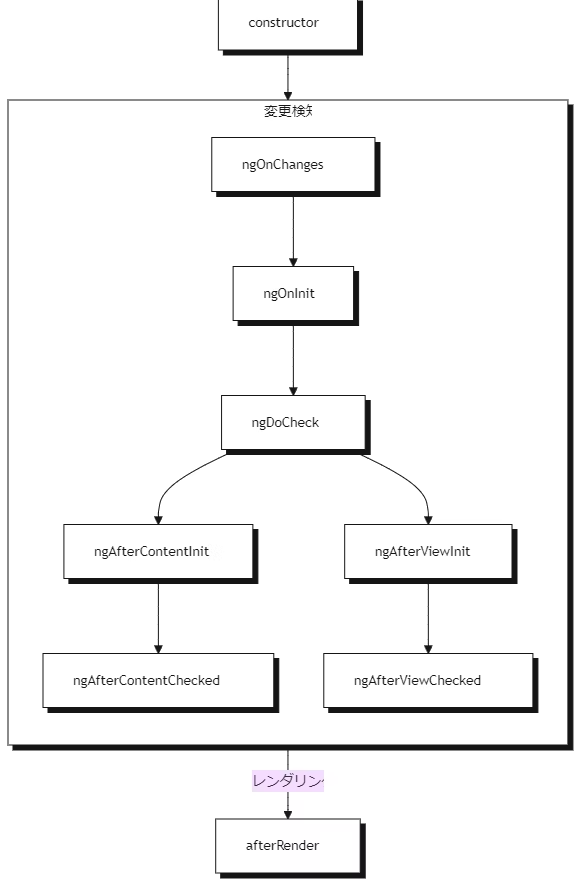
ライフサイクル
コンポーネントのライフサイクルとは、コンポーネントが画面に表示されてから消えるまでに通る流れのこと。Angular はこの流れの中で、表示・更新・削除などのタイミングに応じて特定の処理を実行できるようにしている。このときに使えるのが「ライフサイクルメソッド」と呼ばれる関数で、各タイミングにあわせて自分のコードを差し込めるようになっている。
| フェーズ | ライフサイクルメソッド | 概要 | 用途 |
|---|---|---|---|
| 作成 | constructor |
JavaScriptの標準コンストラクタ。クラスがインスタンス化された直後に1回だけ呼ばれる。Angularの依存性注入もここで行われる。ただし、Angularのライフサイクルの一部ではない。 | 依存性の注入や、最小限の初期プロパティ設定。状態初期化(※DOMやデータ取得は不可)。 |
| 変更検知 | ngOnInit |
初期化処理を書く場所。コンポーネントへの入力値が使えるようになった後に1回だけ呼ばれる。 | 初期データ取得API呼び出しや、フォーム/プロパティの初期値セット。 |
ngOnChanges |
コンポーネントへの入力値が変わるたびに呼ばれる。親コンポーネントから渡された値の変化を検知できる。 | 親から渡されたデータ変更の検知・値のバリデート・副作用処理。 | |
ngDoCheck |
コンポーネントの変更検出が走るたびに呼ばれる。独自の変更検出ロジックを入れたいときに使う。ただし、パフォーマンスに影響を与えるため、使用は避けるべき。 | 複雑な比較や、パフォーマンスを犠牲にしても独自ロジックが必要な場合のみ。 | |
ngAfterContentInit |
ng-contentで投げ込まれた投影内容が初期化された直後に1回呼ばれる。 |
動的に挿入されたコンテンツの初回処理・初期化。 | |
ngAfterContentChecked |
ng-contentによる投影内容の変更検出後、毎回呼ばれる。 |
コンテンツ投影部分の状態更新など。使いすぎ注意。 | |
ngAfterViewInit |
ビュー(テンプレート)とすべての子コンポーネント初期化直後に1回呼ばれる。 |
ViewChildやElementRefを用いたDOMアクセス・外部ライブラリ連携。 |
|
ngAfterViewChecked |
ビュー(テンプレート)の変更検知後に毎回呼ばれる。 | ビュー状態の同期や監視。パフォーマンスへ注意。 | |
| レンダリング | afterNextRender |
※Angular標準には存在しない。独自拡張または他フレームワークで使われることあり。 | - |
afterEveryRender |
※Angular標準には存在しない。 | - | |
| 破棄 | ngOnDestroy |
コンポーネントが破棄される直前に1回呼ばれる。 | サブスクリプションやタイマーの解除・リソース解放・イベントリスナー解除など。 |
ライフサイクルインターフェース
各ライフサイクルメソッド用のインターフェースが提供されており、実装することで漏れがないことを保証できる。
@Component({
    /* ... */
})
export class UserProfile implements OnInit {
    ngOnInit() {
        /* ... */
    }
}
初期化の実行順序
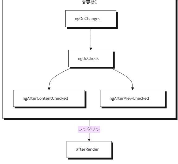
更新の実行順序
クエリ
クエリとは、コンポーネントやディレクティブの中から、特定の子要素(DOM 要素や子コンポーネント)を取得するための仕組み。
直接 DOM を操作すると Angular の変更検知と競合する可能性がある。そのため、ほとんどの場合でクエリを使用して、子コンポーネント、ディレクティブ、DOM要素などの参照を取得する。
シグナルベース
ビュークエリ
ビュークエリは、コンポーネントのビュー(コンポーネント自身のテンプレートで定義された要素)内の要素から取得する。viewChild 関数を使用すると、単一の子要素を取得し、シグナルを返す。
@Component({
    selector: 'custom-card-header',
    /*...*/
})
export class CustomCardHeader {
    text: string;
}
@Component({
    selector: 'custom-card',
    template: '<custom-card-header>Visit sunny California!</custom-card-header>',
})
export class CustomCard {
    header = viewChild(CustomCardHeader);
    headerText = computed(() => this.header()?.text);
}
子要素を見つけられない場合、その値は undefined になる。これは、ターゲット要素が @if によって非表示になっている場合に発生する可能性がある。
viewChildren 関数を使用すると複数の子要素を取得できる。
@Component({
    selector: 'custom-card-action',
    /*...*/
})
export class CustomCardAction {
    text: string;
}
@Component({
    selector: 'custom-card',
    template: `
        <custom-card-action>Save</custom-card-action>
        <custom-card-action>Cancel</custom-card-action>
    `,
})
export class CustomCard {
    actions = viewChildren(CustomCardAction);
    actionsTexts = computed(() => this.actions().map(action => action.text);
}
コンテンツクエリ
コンテンツクエリは、コンポーネントのコンテンツ(コンポーネントが使用されているテンプレート内でコンポーネントの中にネストされた要素)内の要素から取得する。contentChild 関数を使用すると、単一の要素を取得し、シグナルを返す。
@Component({
    selector: 'custom-toggle',
    /*...*/
})
export class CustomToggle {
    text: string;
}
@Component({
    selector: 'custom-expando',
    /*...*/
})
export class CustomExpando {
    toggle = contentChild(CustomToggle);
    toggleText = computed(() => this.toggle()?.text);
}
@Component({
    /* ... */
    template: `
        <custom-expando>
            <custom-toggle>Show</custom-toggle>
        </custom-expando>
    `
})
export class UserProfile { }
要素を見つけられない場合、その値は undefined になる。これは、ターゲット要素が @if によって非表示になっている場合に発生する可能性がある。
contentChildren 関数を使用すると複数の要素を取得できる。
@Component({
    selector: 'custom-menu-item',
    /*...*/
})
export class CustomMenuItem {
    text: string;
}
@Component({
    selector: 'custom-menu',
    /*...*/
})
export class CustomMenu {
    items = contentChildren(CustomMenuItem);
    itemTexts = computed(() => this.items().map(item => item.text));
}
@Component({
    selector: 'user-profile',
    template: `
        <custom-menu>
            <custom-menu-item>Cheese</custom-menu-item>
            <custom-menu-item>Tomato</custom-menu-item>
        </custom-menu>
    `
})
export class UserProfile { }
必須クエリ
viewChild や contentChild は、ターゲット要素が @if や *@for などで存在しない場合、結果が undefined になる。このため、これらは undefined を含むシグナルとして返される。一方で、特定の子要素が必ず存在することを保証したい場合は、必須クエリを使う。
@Component({/* ... */})
export class CustomCard {
    header = viewChild.required(CustomCardHeader);
    body = contentChild.required(CustomCardBody);
}
必須クエリでは、結果が見つからなければ Angular がエラーを出すため、undefined を含まない型のシグナルが返され、必ず利用可能であることが保証される。
クエリロケーター
クエリの最初の引数は、そのロケーター。ほとんどの場合、ロケーターとしてコンポーネントまたはディレクティブを使用することが推奨される。テンプレート参照変数も引数として渡すことができる。
@Component({
    /*...*/
    template: `
        <button #save>Save</button>
        <button #cancel>Cancel</button>
    `
})
export class ActionBar {
    saveButton = viewChild<ElementRef<HTMLButtonElement>>('save');
}
read オプション
viewChild や contentChild などのクエリでは、通常は「一致した要素自体やそのコンポーネント・ディレクティブのインスタンス」が取得される。しかし、クエリで一致した要素から別の特定の値(プロパティや関連オブジェクト)を取得したい場合がある。このとき、2番目の引数に { read: 取得したい値の型 } を指定するのが read オプション。
@Component({/*...*/})
export class CustomExpando {
    toggle = contentChild(ExpandoContent, {read: TemplateRef});
}
上記の例では、ExpandoContent ディレクティブを持つ要素を見つけて、 その要素に関連付けられたTemplateRef を取得する。
read オプションを使用して ElementRef と TemplateRef を取得することが最も一般的。
デコレーターベース
ビュークエリ
@ViewChild デコレーターを使うと、単一の子要素を取得できる。
@Component({
    selector: 'custom-card-header',
    /*...*/
})
export class CustomCardHeader {
    text: string;
}
@Component({
    selector: 'custom-card',
    template: '<custom-card-header>Visit sunny California!</custom-card-header>',
})
export class CustomCard {
    @ViewChild(CustomCardHeader) header: CustomCardHeader;
    ngAfterViewInit() {
        console.log(this.header.text);
    }
}
@ViewChildren デコレーターを使用すると複数の子要素を取得できる。
@Component({
    selector: 'custom-card-action',
    /*...*/
})
export class CustomCardAction {
    text: string;
}
@Component({
    selector: 'custom-card',
    template: `
        <custom-card-action>Save</custom-card-action>
        <custom-card-action>Cancel</custom-card-action>
    `,
})
export class CustomCard {
    @ViewChildren(CustomCardAction) actions: QueryList<CustomCardAction>;
    ngAfterViewInit() {
        this.actions.forEach(action => {
            console.log(action.text);
        });
    }
}
コンテンツクエリ
@ContentChild デコレーターを使用すると、単一の要素を取得できる。
@Component({
    selector: 'custom-toggle',
    /*...*/
})
export class CustomToggle {
    text: string;
}
@Component({
    selector: 'custom-expando',
    /*...*/
})
export class CustomExpando {
    @ContentChild(CustomToggle) toggle: CustomToggle;
    ngAfterContentInit() {
        console.log(this.toggle.text);
    }
}
@Component({
    selector: 'user-profile',
    template: `
        <custom-expando>
            <custom-toggle>Show</custom-toggle>
        </custom-expando>
    `
})
export class UserProfile { }
@ContentChildren デコレーターを使用すると複数の要素を取得できる。
@Component({
    selector: 'custom-menu-item',
    /*...*/
})
export class CustomMenuItem {
    text: string;
}
@Component({
    selector: 'custom-menu',
    /*...*/
})
export class CustomMenu {
    @ContentChildren(CustomMenuItem) items: QueryList<CustomMenuItem>;
    ngAfterContentInit() {
        this.items.forEach(item => {
            console.log(item.text);
        });
    }
}
@Component({
    selector: 'user-profile',
    template: `
        <custom-menu>
            <custom-menu-item>Cheese</custom-menu-item>
            <custom-menu-item>Tomato</custom-menu-item>
        </custom-menu>
    `
})
export class UserProfile { }
クエリオプション
すべてのクエリデコレーターはシグナルベースのクエリと同じように第2引数としてオプションオブジェクトを受け取ることができる。しかし例外があり、@ViewChild と @ContentChild デコレーターは static オプションを受け取ることができる。
@Component({
    selector: 'custom-card',
    template: '<custom-card-header>Visit sunny California!</custom-card-header>',
})
export class CustomCard {
    @ViewChild(CustomCardHeader, {static: true}) header: CustomCardHeader;
    ngOnInit() {
        console.log(this.header.text);
    }
}
static: true を設定すると、クエリのターゲットは「常に存在し、条件付きレンダリングではない」状態をAngularに保証する。そのため、ngOnInit ライフサイクルメソッドですぐにクエリ結果へアクセス可能になる。
壊れやすいコードになるため、子コンポーネントのプロパティや状態を直接書き換えることや、親コンポーネントや祖先コンポーネントに直接状態を書き込むことはしてはいけない!
DOM API の使用
ElementRef
コンポーネントは ElementRef を注入してコンポーネントのホスト要素への参照を取得できる。
@Component({...})
export class ProfilePhoto {
    constructor() {
        const elementRef = inject(ElementRef);
        console.log(elementRef.nativeElement);
    }
}
nativeElement プロパティは、ホストの Element インスタンスを参照する。
DOM 要素の挿入、削除、変更は避けるべき。DOM API のユースケースには、要素へのフォーカス、要素のテキストコンテンツを読み取る。要素のジオメトリを測定するなどがあげられる。
プログラムでコンポーネントをレンダリングする
コンポーネントはテンプレートで直接使用できるだけでなく、動的にもレンダリングできる。
NgComponentOutlet
NgComponentOutlet は、テンプレートで指定されたコンポーネントを動的にレンダリングする構造ディレクティブ。
@Component({ ... })
export class AdminBio { /* ... */ }

@Component({ ... })
export class StandardBio { /* ... */ }

@Component({
    ...,
    template: `
        <p>Profile for {{user.name}}</p>
        <ng-container *ngComponentOutlet="getBioComponent()" /> `
})
export class CustomDialog {
    user = input.required<User>();
    getBioComponent() {
        return this.user().isAdmin ? AdminBio : StandardBio;
    }
}
ViewContainerRef
コンポーネントやディレクティブで ViewContainerRef を注入し、その createComponent メソッドを使って、指定した場所にコンポーネントを挿入できる。ViewContainerRef で新しいコンポーネントを作成すると、 Angularはそのコンポーネントを、次の兄弟としてDOMに追加する。
@Component({
    selector: 'leaf-content',
    template: `
        This is the leaf content
    `,
})
export class LeafContent {}
@Component({
    selector: 'outer-container',
    template: `
        <p>This is the start of the outer container</p>
        <inner-item />
        <p>This is the end of the outer container</p>
    `,
})
export class OuterContainer {}
@Component({
    selector: 'inner-item',
    template: `
        <button (click)="loadContent()">Load content</button>
    `,
})
export class InnerItem {
    private viewContainer = inject(ViewContainerRef);
    loadContent() {
        this.viewContainer.createComponent(LeafContent);
    }
}
<outer-container>
    <p>This is the start of the outer container</p>
    <inner-item>
        <button>Load content</button>
    </inner-item>
    <leaf-content>This is the leaf content</leaf-content>
    <p>This is the end of the outer container</p>
</outer-container>