🍗1. はじめに
最終回は実践編です。
🍗2. 環境
- Windows 10(Version 20H2)
- Visual Studio Community 2019(Version 16.8.3)
🍗3. プロジェクトの作成
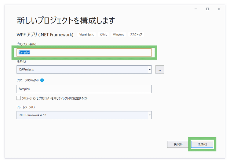
Visual Studio 2019を起動し、「新しいプロジェクトの作成」ボタンを押します。
「新しいプロジェクトの作成」画面で「WPF アプリ(.NET Framework)」を選択し、「次へ」ボタンを押します。
「プロジェクト名」にSample4と入力し、「作成」ボタンを押します。
🍗4. 準備
◇4-1. 共通スタイル定義
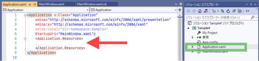
まずは「Application.xaml」を開き、「Application.Resources」の中にスタイル定義を書きます。
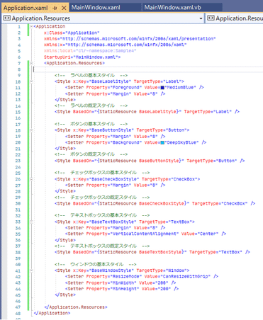
<!--  ラベルの基本スタイル  -->
<Style x:Key="BaseLabelStyle" TargetType="Label">
    <Setter Property="Foreground" Value="MediumBlue" />
    <Setter Property="Margin" Value="8" />
</Style>
これはラベルのスタイル定義です。
<!-- 〇〇〇 -->はコメントです。
文字色と余白を設定しています。
<!--  ラベルの既定スタイル  -->
<Style TargetType="Label" BasedOn="{StaticResource BaseLabelStyle}" />
そして「BasedOn」で定義したスタイルを適用しています。
このスタイルは「x:Key」指定がないため、Style指定なしのラベルに適用、
つまりラベルの既定スタイルになります。
※「TargetType」を先に書くことで、「BasedOn」を書くときに「BaseLabelStyle」が入力候補に出るようになります。
(保存するとXAML Stylerがアルファベット順に「BasedOn」、「TargetType」と並び変えます)

同様に他のコントロールのスタイルも定義します。
<!--  ボタンの基本スタイル  -->
<Style x:Key="BaseButtonStyle" TargetType="Button">
    <Setter Property="Margin" Value="8" />
    <Setter Property="Background" Value="DeepSkyBlue" />
</Style>
<!--  ボタンの既定スタイル  -->
<Style TargetType="Button" BasedOn="{StaticResource BaseButtonStyle}" />

<!--  チェックボックスの基本スタイル  -->
<Style x:Key="BaseCheckBoxStyle" TargetType="CheckBox">
    <Setter Property="Margin" Value="8" />
</Style>
<!--  チェックボックスの既定スタイル  -->
<Style TargetType="CheckBox" BasedOn="{StaticResource BaseCheckBoxStyle}" />

<!--  テキストボックスの基本スタイル  -->
<Style x:Key="BaseTextBoxStyle" TargetType="TextBox">
    <Setter Property="Margin" Value="8" />
    <Setter Property="VerticalContentAlignment" Value="Center" />
</Style>
<!--  テキストボックスの既定スタイル  -->
<Style TargetType="TextBox" BasedOn="{StaticResource BaseTextBoxStyle}" />

<!--  ウィンドウの基本スタイル  -->
<Style x:Key="BaseWindowStyle" TargetType="Window">
    <Setter Property="ResizeMode" Value="CanResizeWithGrip" />
    <Setter Property="MinWidth" Value="200" />
    <Setter Property="MinHeight" Value="200" />
</Style>
◇4-2. メニュー画面スタイル定義
サンプル画面を表示するためのメニュー画面を作成します。
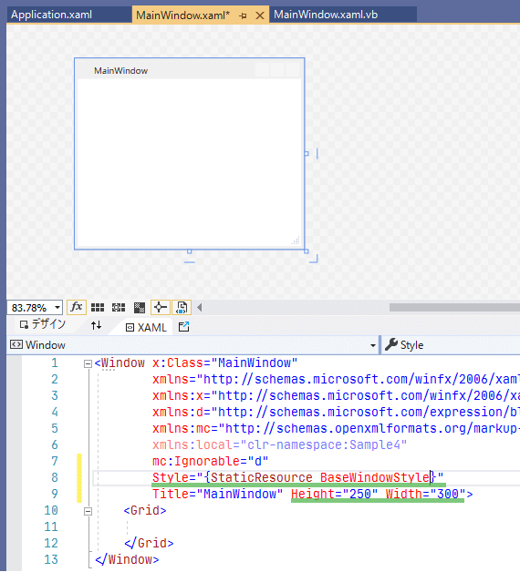
「MainWindow.xaml」を開き、Style="{StaticResource BaseWindowStyle}"を入力し、
「Height」に250を、「Width」に300を入力します。
「BaseWindowStyle」は「Application.xaml」に定義した、画面の共通スタイルです。
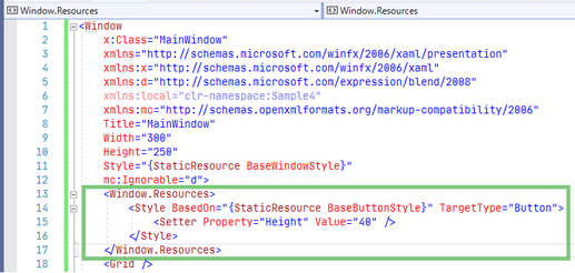
「MainWindow.xaml」に「Window.Resources」を作成します。
<Window.Resources>
    <Style TargetType="Button" BasedOn="{StaticResource BaseButtonStyle}">
        <Setter Property="Height" Value="40" />
    </Style>
</Window.Resources>
「BaseButtonStyle」のプロパティ設定に加え、高さの指定が適用されます。
「x:Key」指定がないため、これが「MainWindow」内の既定のボタンスタイルになります。
◇4-3. ボタン配置
デザインビューで「Grid」を右クリックし、「レイアウトの種類の変更」-「StackPanel」を選択します。

「Button」を「StackPanel」にドラッグ&ドロップします。
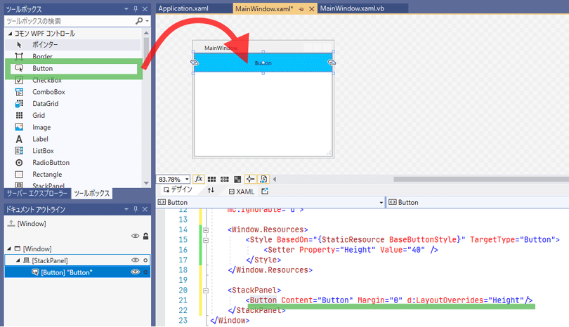
「Button」を右クリックし、「レイアウト」-「余白のリセット」を選択します。
もう一度「Button」を右クリックし、「レイアウト」-「サイズのリセット」を選択します。
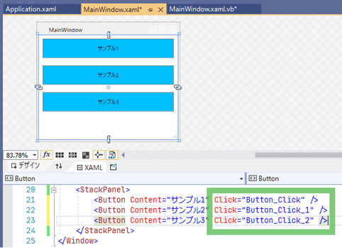
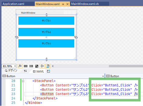
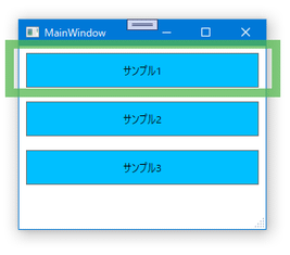
「Content」プロパティをサンプル1に書き換えます。
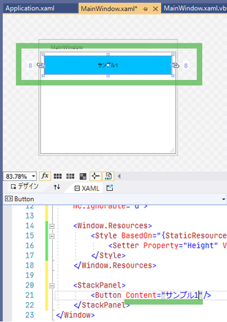
「BaseButtonStyle」の「Margin」「Background」、そして「MainWindow.xaml」で定義した「Height」が適用されています。
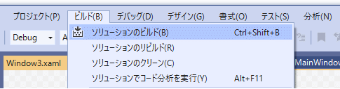
スタイルが思った通りに適用されない場合は、メニューの「ビルド」-「ソリューションのビルド」をすると直ることがあります。
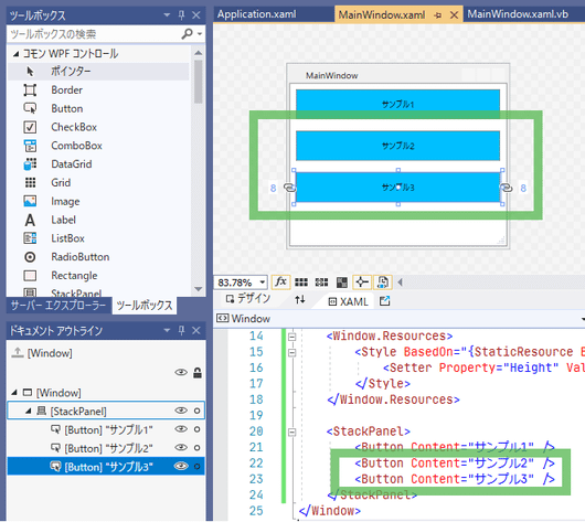
「Button」をコピペして3つにします。「Content」プロパティをサンプル2, サンプル3にします。
◇4-4. サンプル用画面追加
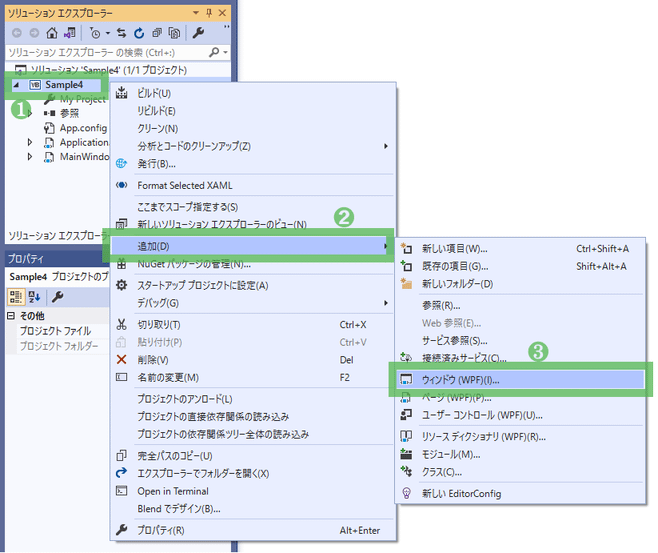
ソリューション エクスプローラーで「Sample4」プロジェクトを右クリックし、「追加」-「ウィンドウ(WPF)」を選択します。
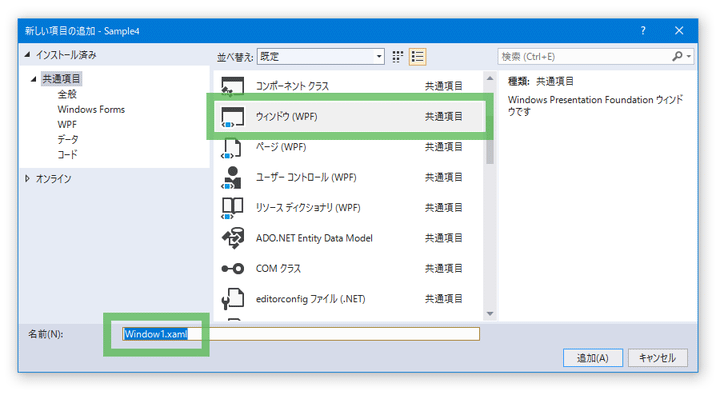
名前にWindow1.xamlを入力し、「追加」ボタンを押します。
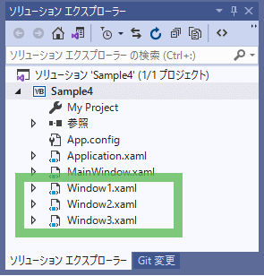
同様にWindow2.xaml, Window3.xamlを追加します。
◇4-5. ボタンクリック処理作成
デザインビューで「サンプル1」ボタンをダブルクリックします。
「MainWindow.xaml」に戻り、「サンプル2」ボタンをダブルクリックします。
「MainWindow.xaml」に戻り、「サンプル3」ボタンをダブルクリックします。

自動的に付けられたクリック処理の名前を修正します。
「Button_Click」の部分にカーソルを置き、右クリックし、「名前の変更」を選択します。
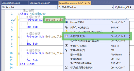
「Button_Click」が選択状態になって名前変更モードになります。
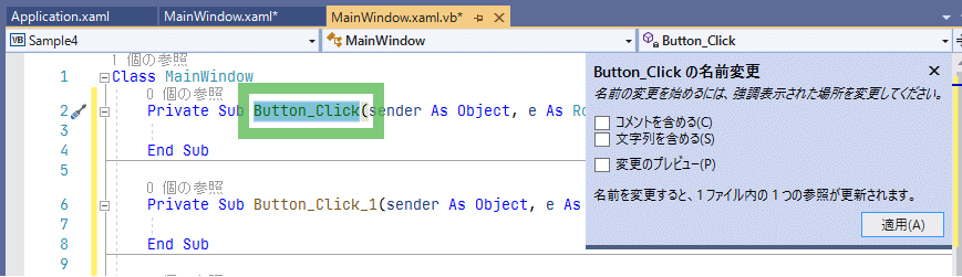
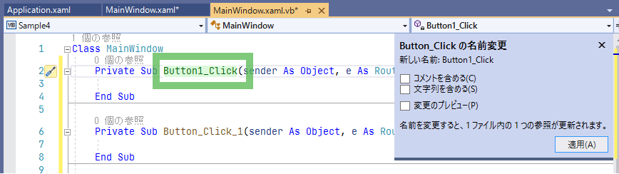
Button1_Clickに修正します。
Enterキーで確定します。
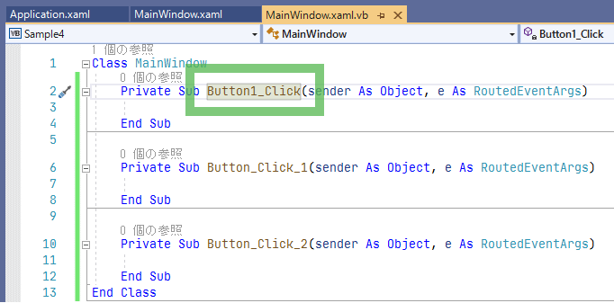
同様に残りの2つも「名前の変更」機能でButton2_Click, Button3_Clickに変えます。
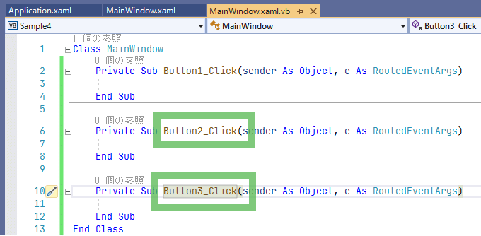
XAMLビューに戻ると、ちゃんとこちらにも変更が反映されています。
VBのコードに戻り、以下のように入力します。
先ほど追加した3つのウィンドウをそれぞれ表示する処理です。
Class MainWindow
    Private Sub Button1_Click(sender As Object, e As RoutedEventArgs)
        Dim w = New Window1
        w.ShowDialog()
    End Sub

    Private Sub Button2_Click(sender As Object, e As RoutedEventArgs)
        Dim w = New Window2
        w.ShowDialog()
    End Sub

    Private Sub Button3_Click(sender As Object, e As RoutedEventArgs)
        Dim w = New Window3
        w.ShowDialog()
    End Sub
End Class
これでサンプル画面を表示するための準備が整いました。
🍗5. サンプル1
◇5-1. 概要
何かの登録画面を作ります。
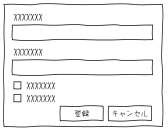
親のレイアウトパネルは「Grid」で、入力項目とボタンのあるエリアを区切ります。
上は縦並びの「StackPanel」、下は横並びの「StackPanel」を埋め込みます。
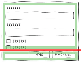
こうすることで入力項目やボタンが増えても変更が容易な画面になります。
◇5-2. 作成
◎5-2-1
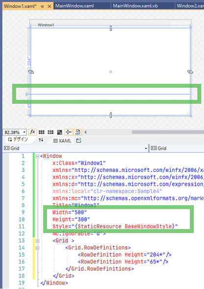
「Window1.xaml」を開き、「Window」にStyle="{StaticResource BaseWindowStyle}"を入力し、
「Height」に300を、「Width」に500を入力します。
「Grid」の行を分割します。
◎5-2-2
「StackPanel」を「Grid」のそれぞれの行にドラッグ&ドロップします。
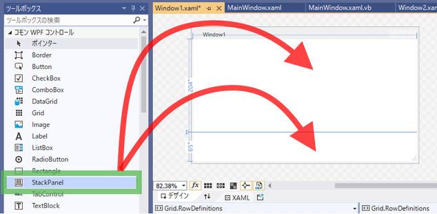
上の「StackPanel」を選択し、プロパティ ウィンドウの「レイアウト」を以下のように入力します。
| プロパティ | 値 |
|---|---|
| Row | 0 |
| RowSpan | 1 |
| Column | 0 |
| ColumnSpan | 1 |
そしてデザインビューで「StackPanel」を右クリックし、「レイアウト」-「すべてリセット」を選択します。
次は下の「StackPanel」を選択し、プロパティ ウィンドウの「レイアウト」を以下のように入力します。
| プロパティ | 値 |
|---|---|
| Row | 1 |
| RowSpan | 1 |
| Column | 0 |
| ColumnSpan | 1 |
| Orientation | Horizontal |
こちらも同様にデザインビューで「レイアウト」-「すべてリセット」します。

◎5-2-3
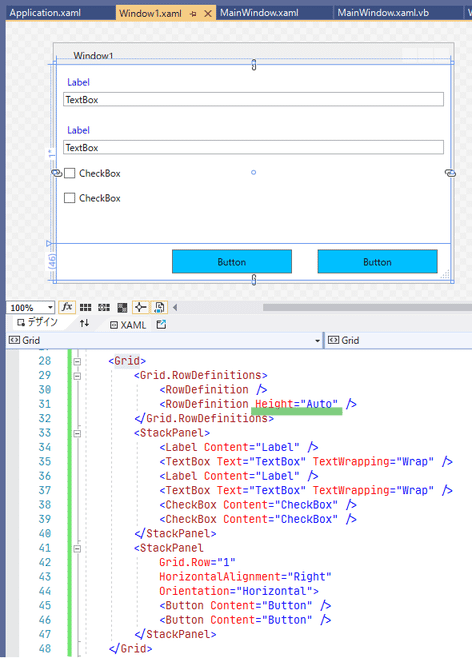
上の「StackPanel」に「Label」→「TextBox」→「Label」→「TextBox」→「CheckBox」→「CheckBox」の順に放り込んでください。
下の「StackPanel」に「Button」を2つ放り込んでください。
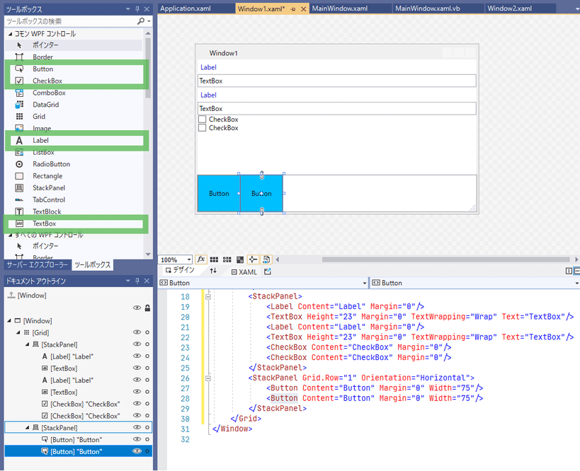
勝手に付けられた余白やサイズをクリアします。
ドキュメント アウトラインで一番上の「Label」をクリックし、一番下の「CheckBox」をShiftを押しながらクリックします。
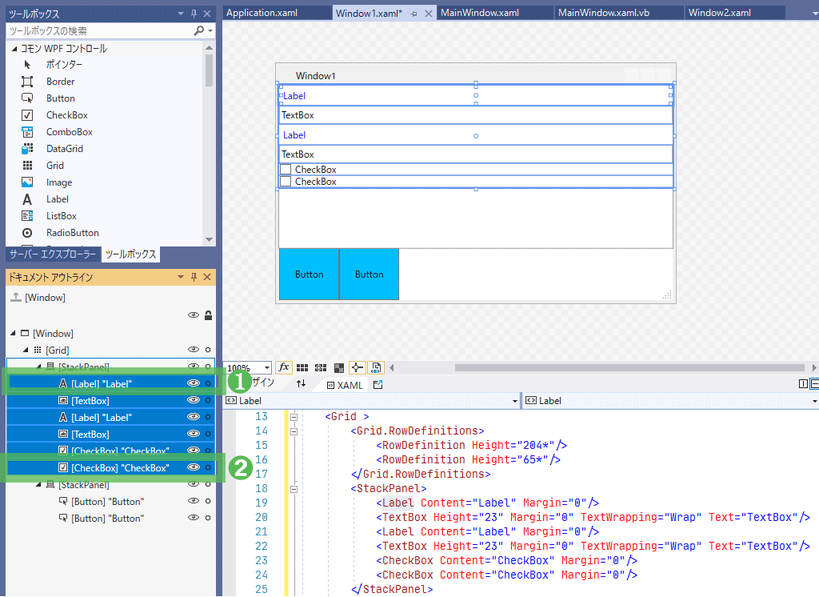
右クリックし、「レイアウト」-「すべてリセット」を選択します。

↓
「Application.xaml」で定義したスタイルが適用されています。
スタイルが思った通りに適用されない場合は、メニューの「ビルド」-「ソリューションのビルド」をしてください。
「Label」と「TextBox」をもう少しくっつけるために余白を調整します。
「Window.Resources」を定義し、「Label」と「TextBox」の「Margin」を上書きします。
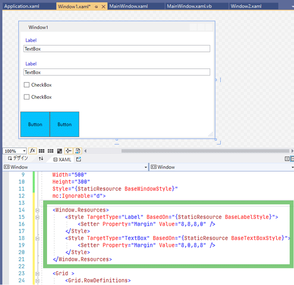
<Window.Resources>
    <Style TargetType="Label" BasedOn="{StaticResource BaseLabelStyle}">
        <Setter Property="Margin" Value="8,8,8,0" />
    </Style>
    <Style TargetType="TextBox" BasedOn="{StaticResource BaseTextBoxStyle}">
        <Setter Property="Margin" Value="8,0,8,8" />
    </Style>
</Window.Resources>
◎5-2-4
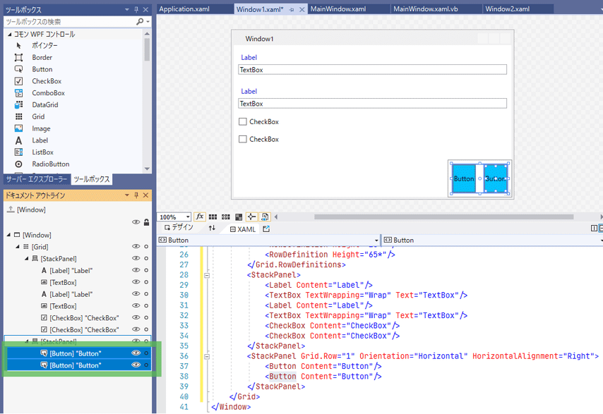
下の「StackPanel」を選択し、「HorizontalAlignment」プロパティを「Right」に設定します。
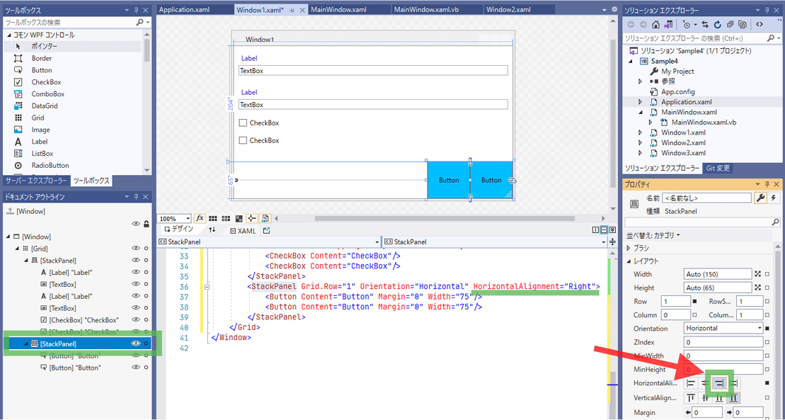
「Button」を2つ選択状態にし、右クリックから「レイアウト」-「すべてリセット」を選択します。
「Window.Resources」にボタンのスタイルを追加します。
<Style TargetType="Button" BasedOn="{StaticResource BaseButtonStyle}">
    <Setter Property="Margin" Value="16,8" />
    <Setter Property="Height" Value="30" />
    <Setter Property="Width" Value="150" />
</Style>
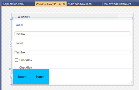
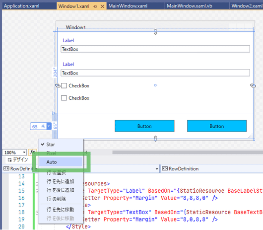
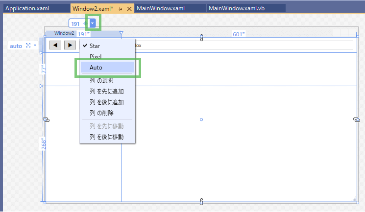
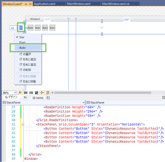
「Grid」を選択し、矢印のあたりにマウスカーソルを移動します。
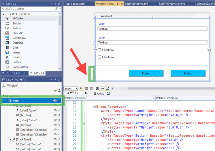
「▼」部分をクリックします。
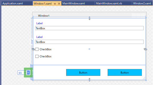
表示されたメニューから「Auto」を選択します。
◇5-3. 実行してみる
ツールバーの「開始」ボタンを押します。
「サンプル1」ボタンを押します。
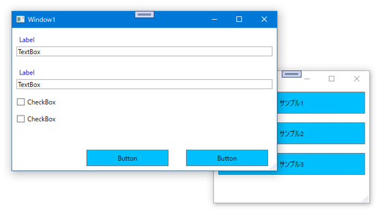
確認が終わったら2つの画面を「×」ボタンで閉じましょう。
🍗6. サンプル2
◇6-1. 概要
ブラウザ風の画面です。
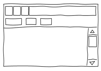
「Grid」を3行、2列に区切ります。
1行1列はボタン、1行2列がアドレスバー、2行目はブックマークバー、3行目がWebページを表示するエリアです。
◇6-2. 作成
◎6-2-1
「Window2.xaml」を開き、「Window」にStyle="{StaticResource BaseWindowStyle}"を入力します。
「Grid」の行を分割します。
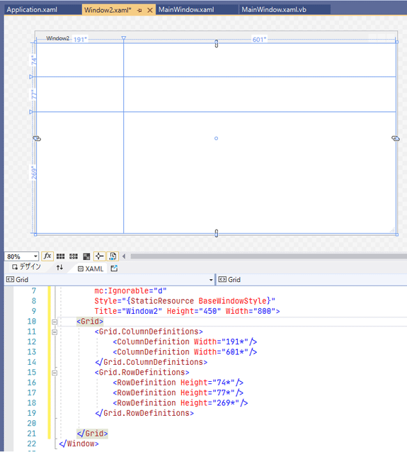
◎6-2-2
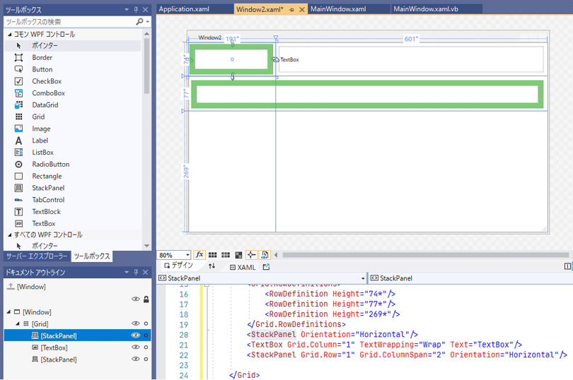
矢印の位置あたりに「StackPanel」と「TextBox」をドラッグ&ドロップしてください。
左上に配置した「StackPanel」のプロパティを以下のように設定してください。
| プロパティ(レイアウト) | 値 |
|---|---|
| Row | 0 |
| RowSpan | 1 |
| Column | 0 |
| ColumnSpan | 1 |
| Orientation | Horizontal |
そしてデザインビューで右クリックし、「レイアウト」-「すべてリセット」を選択してください。
右に配置した「TextBox」のプロパティを以下のように設定し、「レイアウト」-「すべてリセット」してください。
| プロパティ(レイアウト) | 値 |
|---|---|
| Row | 0 |
| RowSpan | 1 |
| Column | 1 |
| ColumnSpan | 1 |
真ん中あたりに配置した「StackPanel」のプロパティを以下のように設定し、「レイアウト」-「すべてリセット」してください。
| プロパティ(レイアウト) | 値 |
|---|---|
| Row | 1 |
| RowSpan | 1 |
| Column | 0 |
| ColumnSpan | 2 |
| Orientation | Horizontal |
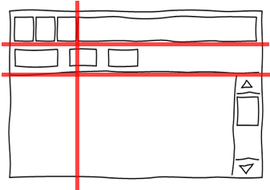
「StackPanel」が図のように配置されました。
◎6-2-3
これから追加するボタン用のスタイルを定義します。
<Window.Resources>
    <Style x:Key="NaviButtonStyle" TargetType="Button">
        <Setter Property="Margin" Value="8,8,0,8" />
        <Setter Property="Padding" Value="8,2" />
    </Style>
    <Style x:Key="BookmarkButtonStyle" TargetType="Button">
        <Setter Property="MinWidth" Value="20" />
        <Setter Property="MaxWidth" Value="60" />
        <Setter Property="Margin" Value="8" />
    </Style>
</Window.Resources>
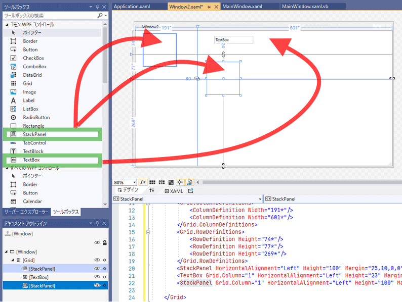
左上の「StackPanel」に「Button」を1つドラッグ&ドロップし、
プロパティ ウィンドウの「その他の指定」-「Style」の「■」をクリックし、「ローカルリソース」-「NaviButtonStyle」を選択します。
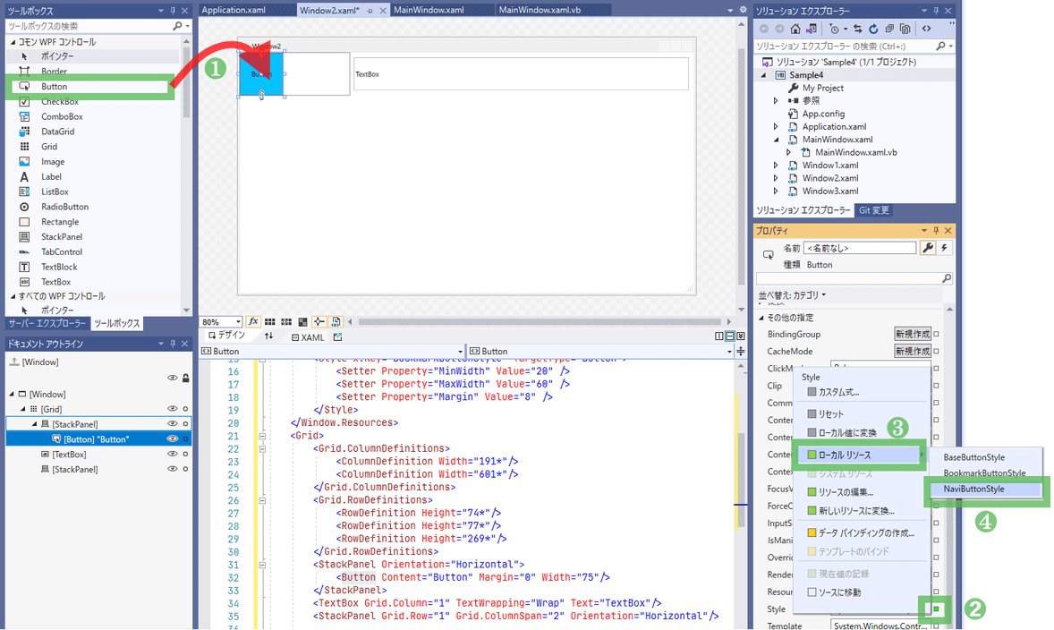
「レイアウト」-「すべてリセット」したあとコピペしてボタンを3つにします。
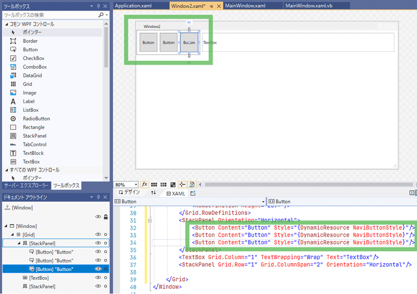
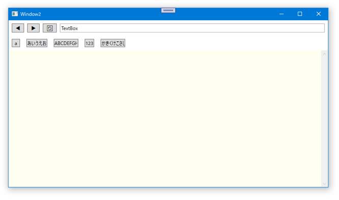
「Button」の「Content」プロパティを左(XAMLビューだと上)から順に◀, ▶, 🔄にします。
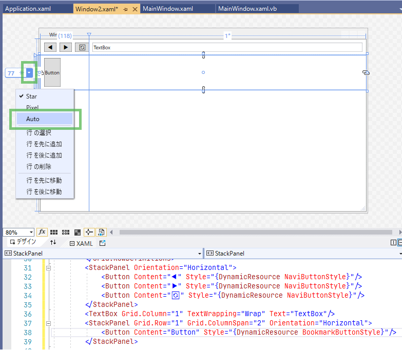
「Grid」を選択し、1行目を「Auto」にします。
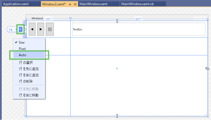
1列目を「Auto」にします。
これで行の高さは「Button」や「TextBox」の高さに合わせて自動調整されます。
「Button」を増やせば自動的に「TextBox」の幅がその分狭くなります。

◎6-2-4
次は2つ目の「StackPanel」に「Button」をドラッグ&ドロップします。

「レイアウト」-「すべてリセット」し、「Style」に「BookmarkButtonStyle」を適用します。
「Grid」を選択し、2行目を「Auto」に設定します。
「Button」をコピペして5つにし、「Content」プロパティをそれぞれ
a
あいうえお
ABCDEFGHIJKLM
123
かきくけこさしすせそ
にします。
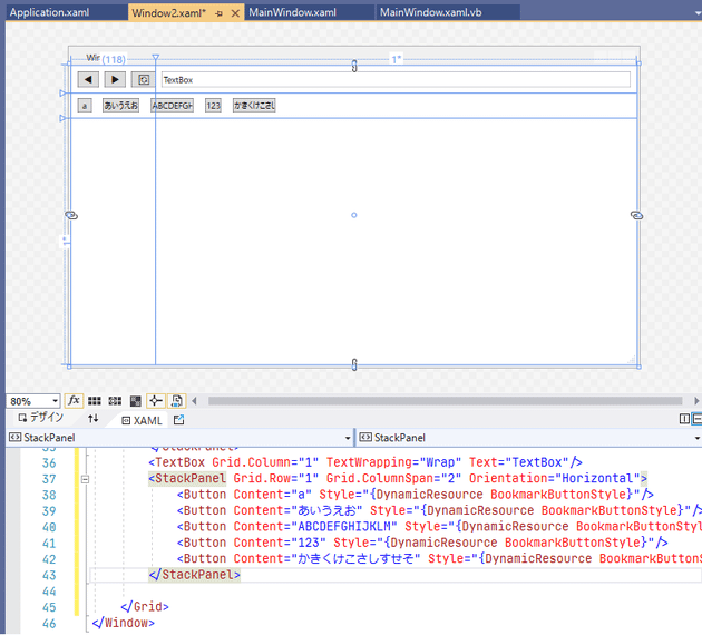
ボタン幅の上限を指定しているので、幅の長すぎるボタンができないようになっています。
◎6-2-5
最後のパーツです。
今回はドラッグ&ドロップ以外のやり方で配置してみましょう。
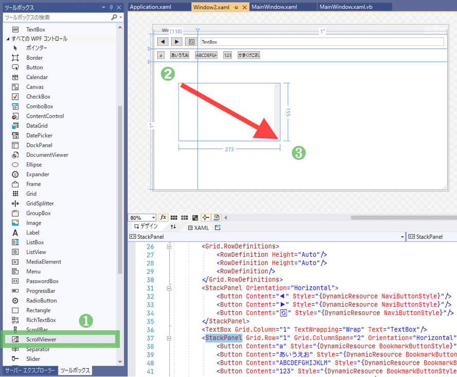
ツールボックスの「すべてのWPFコントロール」から「ScrollViewr」をクリックし、
「Grid」の3行目で2列を含むように対角線上にドラッグします。
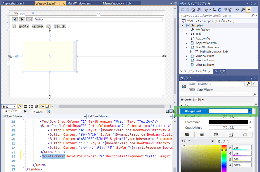
プロパティの「ブラシ」-「Background」にivoryを設定します。
プロパティの「レイアウト」が以下の通りになっているか確認します。
なっていなかったら修正します。
| プロパティ(レイアウト) | 値 |
|---|---|
| Row | 2 |
| RowSpan | 1 |
| Column | 0 |
| ColumnSpan | 2 |
そしてデザインビューで「レイアウト」-「すべてリセット」をします。
ついでに「Window2.xaml」を保存してXAMLを整えておきましょう。

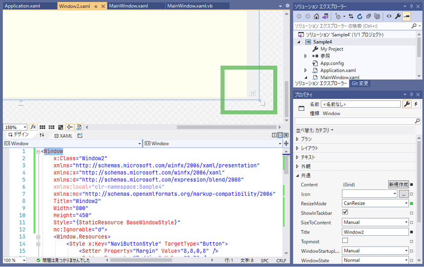
画面の右下隅に注目します。
スクロールバーの▼ボタンとサイズ変更グリップが重なっています。
この画面ではスクロールバーを画面下端まで表示するため、サイズ変更のグリップは隠すことにします。
ドキュメント アウトラインで「Window」を選択し、プロパティ ウィンドウの「共通」-「ResizeMode」の横の「■」をクリックし、「ローカル値に変換」を選択します。
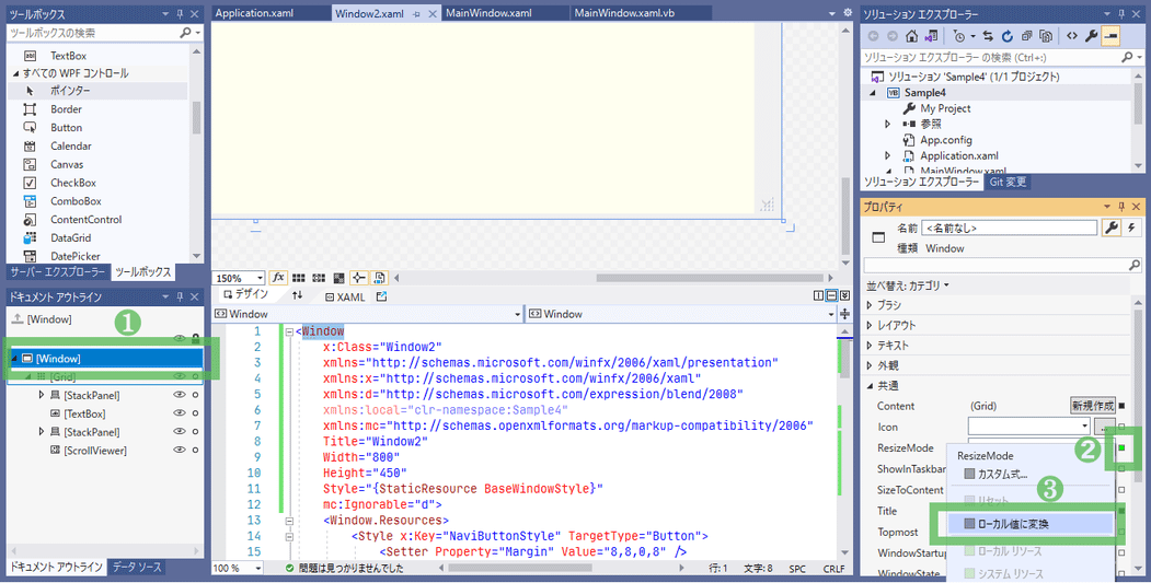
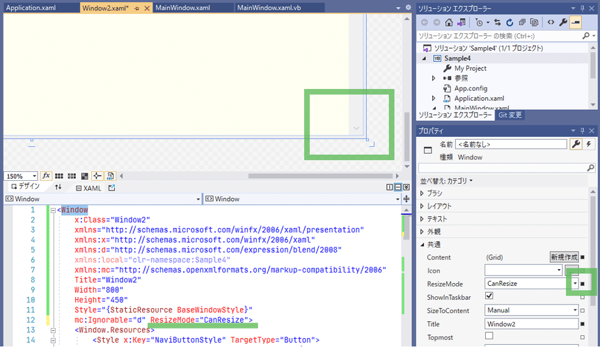
プロパティ ウィンドウの「ResizeMode」横の「■」が緑色から、変更されたことを意味する黒色に変わり、
XAMLビューで「ResizeMode="CanResize"」の記述が追加されています。
◇6-3. 実行してみる
ツールバーの「開始」ボタンを押します。
「サンプル2」ボタンを押します。
確認が終わったら2つの画面を「×」ボタンで閉じましょう。
🍗7. サンプル3
◇7-1. 概要
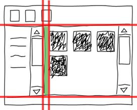
エクスプローラー風の一覧画面です。
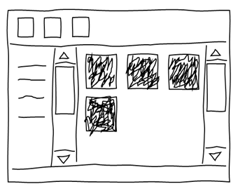
上にツールバー、下にステータスバー、真ん中に一覧が2つ。
そのため、以下のようにGridを区切ってもよいのですが、
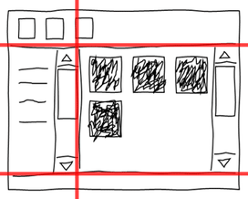
2つの一覧の境界をドラッグでサイズ変更したいので、
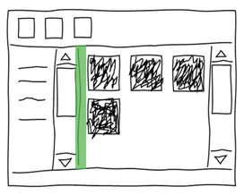
境界部分に「GridSplitter」というコントロールを入れるために3行、3列に区切ります。
◇7-2. 作成
◎7-2-1
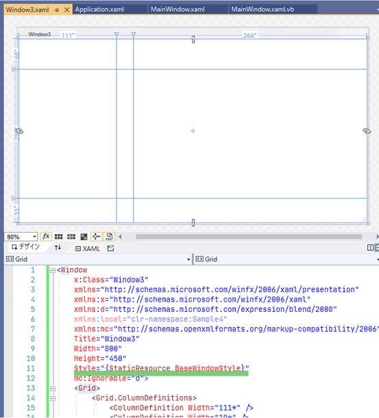
「Window3.xaml」を開き、「Window」にStyle="{StaticResource BaseWindowStyle}"を入力します。
「Grid」の行を分割します。
◎7-2-2
「StackPanel」をクリックし、「Grid」の1行目で3列すべて含むようにドラッグします。
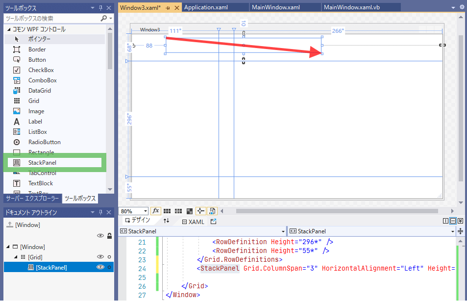
プロパティを以下のように設定し、デザインビューで「レイアウト」-「すべてリセット」します。
| プロパティ(レイアウト) | 値 |
|---|---|
| Row | 0 |
| RowSpan | 1 |
| Column | 0 |
| ColumnSpan | 3 |
| Orientation | Horizontal |
ここに配置するボタン用のスタイルを定義します。
<Window.Resources>
    <Style x:Key="ToolButton" TargetType="Button">
        <Setter Property="Height" Value="30" />
        <Setter Property="Width" Value="30" />
        <Setter Property="Margin" Value="8,8,0,8" />
    </Style>
</Window.Resources>
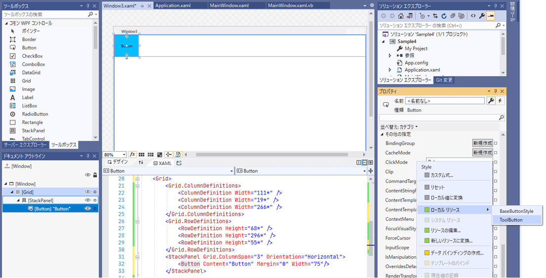
「Button」を1つ「StackPanel」にドラッグ&ドロップし、「Style」に「ToolButton」を設定します。
(スタイル名は「ToolButtonStyle」の方が適切ですが、スクリーンショットを撮ってしまったのでこのままいきます)
「Button」に「レイアウト」-「余白のリセット」と、「レイアウト」-「幅のリセット」を実行し、
XAMLビュー上でコピペしてボタン4つにします。
「Grid」の1行目の高さを「Auto」にします。
◎7-2-3
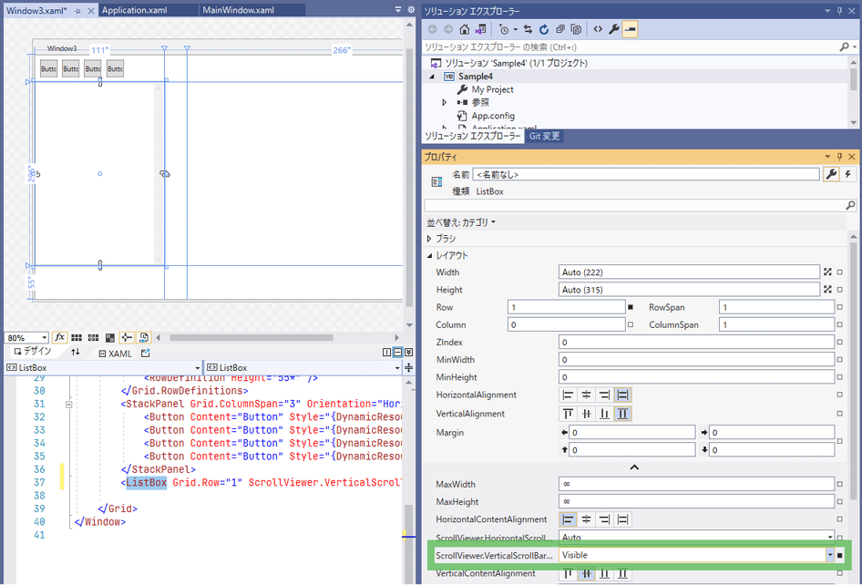
「ListBox」を「Grid」の2行目、1列目にドラッグ&ドロップします。

「レイアウト」-「すべてリセット」し、プロパティを以下のように設定します。
| プロパティ(レイアウト) | 値 |
|---|---|
| Row | 1 |
| RowSpan | 1 |
| Column | 0 |
| ColumnSpan | 1 |
| ScrollViewer.VerticalScrollBarVisibility | Visible |
◎7-2-4
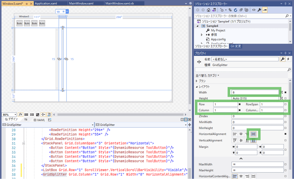
ツールボックスの「すべてのWPFコントロール」から「GridSplitter」を「Grid」の2行目、2列目の細いエリアにドラッグ&ドロップします。
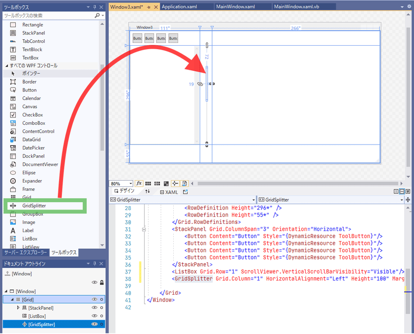
ドキュメント アウトラインで「レイアウト」-「すべてリセット」した後、プロパティを以下のように設定します。
| プロパティ(レイアウト) | 値 |
|---|---|
| Width | 8 |
| Row | 1 |
| RowSpan | 1 |
| Column | 1 |
| ColumnSpan | 1 |
| HorizontalAlignment | Stretch |
「Grid」の2列目を「Auto」にします。
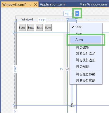
◎7-2-5
ツールボックスの「すべてのWPFコントロール」から「ScrollViewer」を「Grid」の2行目、3列目にドラッグ&ドロップします。
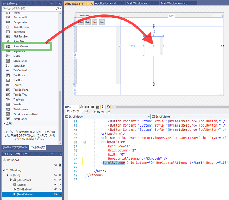
「レイアウト」-「すべてリセット」し、広がった「ScrollViewr」の上に
「WrapPanel」をドラッグ&ドロップします。
ドキュメント アウトラインで「WrapPanel」を右クリックし、「レイアウト」-「すべてリセット」します。

◎7-2-6
ツールボックスの「TextBlock」をクリックし、「Grid」の3行目で1列目~3列目にかけてドラッグします。
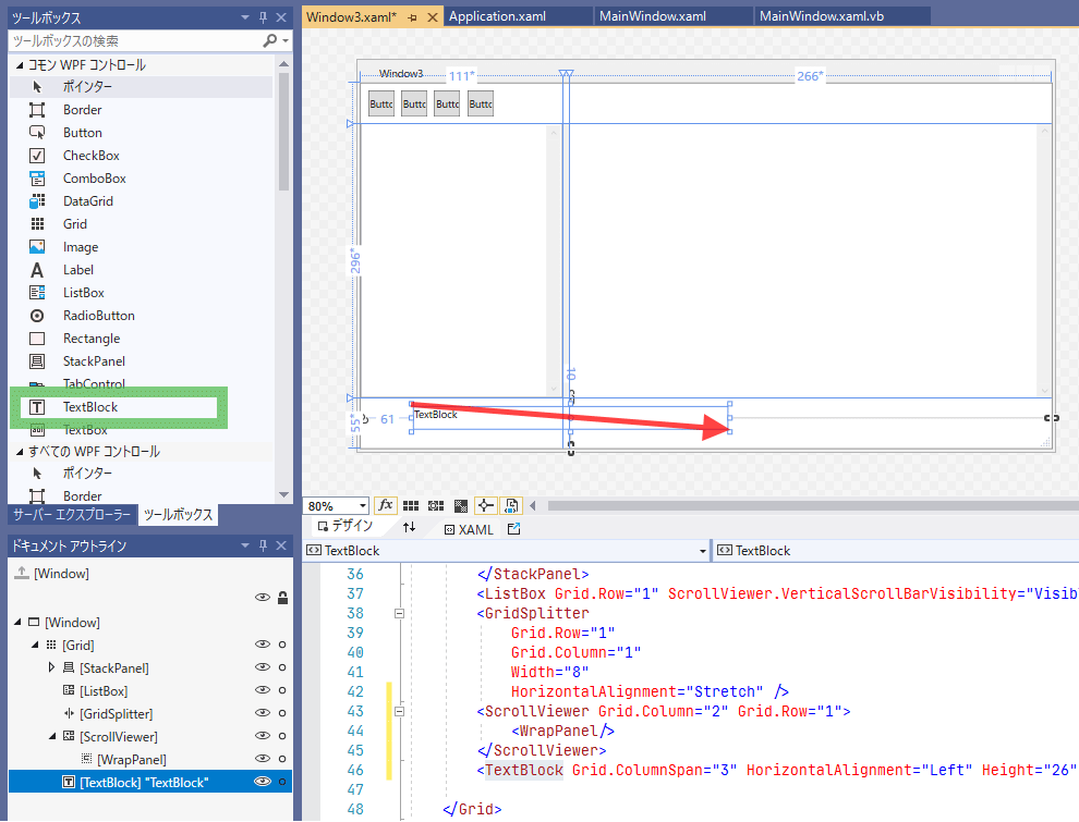
「レイアウト」-「すべてリセット」します。
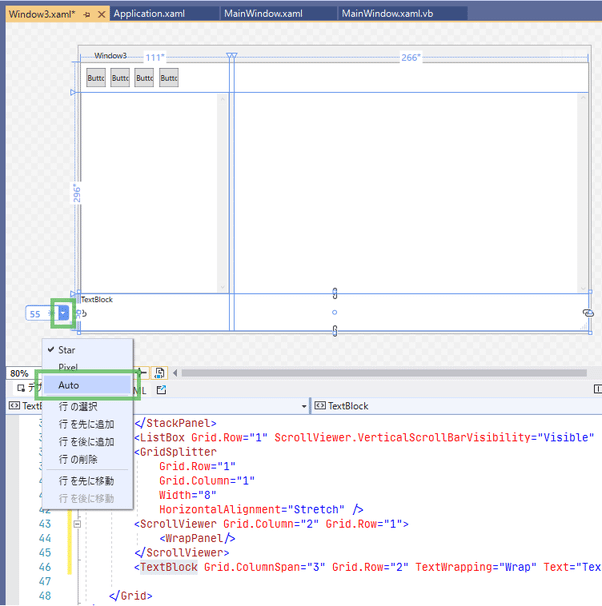
「Grid」の3行目の高さを「Auto」にします。
◎7-2-7
「Window.Resources」に「Rectangle」の既定スタイルを追加します。
<Style TargetType="Rectangle">
    <Setter Property="Fill" Value="SteelBlue" />
    <Setter Property="Width" Value="100" />
    <Setter Property="Height" Value="100" />
    <Setter Property="Margin" Value="24" />
</Style>
スタイルを追加したので念のためメニューの「ビルド」-「ソリューションのビルド」を実行しておきます。
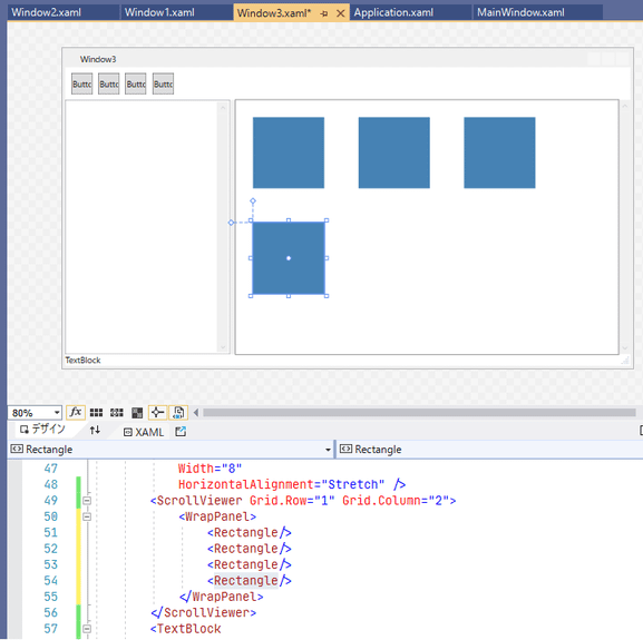
デザインビューで「WrapPanel」を選択状態にしてから、ツールボックスから「Rectangle」をドラッグ&ドロップします。
(ScrollViewrが選択状態になっていると、ScrollViewrの直下に配置されてしまいます)
XAMLビューを見ると余計な「Margin」が付いているので「レイアウト」-「余白のリセット」をします。
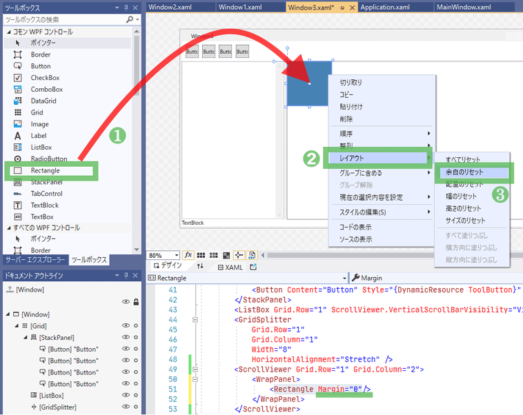
「Rectangle」をコピペして4つにします。
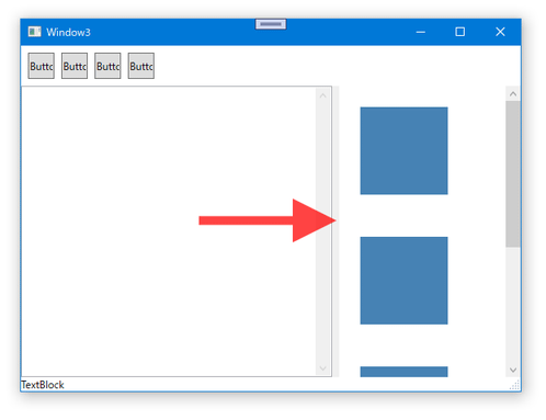
◇7-3. 実行してみる
ツールバーの「開始」ボタンを押します。
「サンプル3」ボタンを押します。

画面サイズを変えたり、一覧の境界を左右にドラッグしてみたりします。
🍗8. 作成コード
最後に作成したコードを載せます。
◇8-1. Application
<Application
    x:Class="Application"
    xmlns="http://schemas.microsoft.com/winfx/2006/xaml/presentation"
    xmlns:x="http://schemas.microsoft.com/winfx/2006/xaml"
    xmlns:local="clr-namespace:Sample4"
    StartupUri="MainWindow.xaml">
    <Application.Resources>

        <!--  ラベルの基本スタイル  -->
        <Style x:Key="BaseLabelStyle" TargetType="Label">
            <Setter Property="Foreground" Value="MediumBlue" />
            <Setter Property="Margin" Value="8" />
        </Style>
        <!--  ラベルの既定スタイル  -->
        <Style BasedOn="{StaticResource BaseLabelStyle}" TargetType="Label" />

        <!--  ボタンの基本スタイル  -->
        <Style x:Key="BaseButtonStyle" TargetType="Button">
            <Setter Property="Margin" Value="8" />
            <Setter Property="Background" Value="DeepSkyBlue" />
        </Style>
        <!--  ボタンの既定スタイル  -->
        <Style BasedOn="{StaticResource BaseButtonStyle}" TargetType="Button" />

        <!--  チェックボックスの基本スタイル  -->
        <Style x:Key="BaseCheckBoxStyle" TargetType="CheckBox">
            <Setter Property="Margin" Value="8" />
        </Style>
        <!--  チェックボックスの既定スタイル  -->
        <Style BasedOn="{StaticResource BaseCheckBoxStyle}" TargetType="CheckBox" />

        <!--  テキストボックスの基本スタイル  -->
        <Style x:Key="BaseTextBoxStyle" TargetType="TextBox">
            <Setter Property="Margin" Value="8" />
            <Setter Property="VerticalContentAlignment" Value="Center" />
        </Style>
        <!--  テキストボックスの既定スタイル  -->
        <Style BasedOn="{StaticResource BaseTextBoxStyle}" TargetType="TextBox" />

        <!--  ウィンドウの基本スタイル  -->
        <Style x:Key="BaseWindowStyle" TargetType="Window">
            <Setter Property="ResizeMode" Value="CanResizeWithGrip" />
            <Setter Property="MinWidth" Value="200" />
            <Setter Property="MinHeight" Value="200" />
        </Style>

    </Application.Resources>
</Application>
◇8-2. MainWindow
<Window
    x:Class="MainWindow"
    xmlns="http://schemas.microsoft.com/winfx/2006/xaml/presentation"
    xmlns:x="http://schemas.microsoft.com/winfx/2006/xaml"
    xmlns:d="http://schemas.microsoft.com/expression/blend/2008"
    xmlns:local="clr-namespace:Sample4"
    xmlns:mc="http://schemas.openxmlformats.org/markup-compatibility/2006"
    Title="MainWindow"
    Width="300"
    Height="250"
    Style="{StaticResource BaseWindowStyle}"
    mc:Ignorable="d">

    <Window.Resources>
        <Style BasedOn="{StaticResource BaseButtonStyle}" TargetType="Button">
            <Setter Property="Height" Value="40" />
        </Style>
    </Window.Resources>

    <StackPanel>
        <Button Click="Button1_Click" Content="サンプル1" />
        <Button Click="Button2_Click" Content="サンプル2" />
        <Button Click="Button3_Click" Content="サンプル3" />
    </StackPanel>
</Window>
Class MainWindow
    Private Sub Button1_Click(sender As Object, e As RoutedEventArgs)
        Dim w = New Window1
        w.ShowDialog()
    End Sub

    Private Sub Button2_Click(sender As Object, e As RoutedEventArgs)
        Dim w = New Window2
        w.ShowDialog()
    End Sub

    Private Sub Button3_Click(sender As Object, e As RoutedEventArgs)
        Dim w = New Window3
        w.ShowDialog()
    End Sub
End Class
◇8-3. Window1
<Window
    x:Class="Window1"
    xmlns="http://schemas.microsoft.com/winfx/2006/xaml/presentation"
    xmlns:x="http://schemas.microsoft.com/winfx/2006/xaml"
    xmlns:d="http://schemas.microsoft.com/expression/blend/2008"
    xmlns:local="clr-namespace:Sample4"
    xmlns:mc="http://schemas.openxmlformats.org/markup-compatibility/2006"
    Title="Window1"
    Width="500"
    Height="300"
    Style="{StaticResource BaseWindowStyle}"
    mc:Ignorable="d">

    <Window.Resources>
        <Style BasedOn="{StaticResource BaseLabelStyle}" TargetType="Label">
            <Setter Property="Margin" Value="8,8,8,0" />
        </Style>
        <Style BasedOn="{StaticResource BaseTextBoxStyle}" TargetType="TextBox">
            <Setter Property="Margin" Value="8,0,8,8" />
        </Style>
        <Style BasedOn="{StaticResource BaseButtonStyle}" TargetType="Button">
            <Setter Property="Margin" Value="16,8" />
            <Setter Property="Height" Value="30" />
            <Setter Property="Width" Value="150" />
        </Style>
    </Window.Resources>

    <Grid>
        <Grid.RowDefinitions>
            <RowDefinition />
            <RowDefinition Height="Auto" />
        </Grid.RowDefinitions>
        <StackPanel>
            <Label Content="Label" />
            <TextBox Text="TextBox" TextWrapping="Wrap" />
            <Label Content="Label" />
            <TextBox Text="TextBox" TextWrapping="Wrap" />
            <CheckBox Content="CheckBox" />
            <CheckBox Content="CheckBox" />
        </StackPanel>
        <StackPanel
            Grid.Row="1"
            HorizontalAlignment="Right"
            Orientation="Horizontal">
            <Button Content="Button" />
            <Button Content="Button" />
        </StackPanel>
    </Grid>
</Window>
◇8-4. Window2
<Window
    x:Class="Window2"
    xmlns="http://schemas.microsoft.com/winfx/2006/xaml/presentation"
    xmlns:x="http://schemas.microsoft.com/winfx/2006/xaml"
    xmlns:d="http://schemas.microsoft.com/expression/blend/2008"
    xmlns:local="clr-namespace:Sample4"
    xmlns:mc="http://schemas.openxmlformats.org/markup-compatibility/2006"
    Title="Window2"
    Width="800"
    Height="450"
    ResizeMode="CanResize"
    Style="{StaticResource BaseWindowStyle}"
    mc:Ignorable="d">
    <Window.Resources>
        <Style x:Key="NaviButtonStyle" TargetType="Button">
            <Setter Property="Margin" Value="8,8,0,8" />
            <Setter Property="Padding" Value="8,2" />
        </Style>
        <Style x:Key="BookmarkButtonStyle" TargetType="Button">
            <Setter Property="MinWidth" Value="20" />
            <Setter Property="MaxWidth" Value="60" />
            <Setter Property="Margin" Value="8" />
        </Style>
    </Window.Resources>
    <Grid>
        <Grid.ColumnDefinitions>
            <ColumnDefinition Width="Auto" />
            <ColumnDefinition />
        </Grid.ColumnDefinitions>
        <Grid.RowDefinitions>
            <RowDefinition Height="Auto" />
            <RowDefinition Height="Auto" />
            <RowDefinition />
        </Grid.RowDefinitions>
        <StackPanel Orientation="Horizontal">
            <Button Content="◀" Style="{DynamicResource NaviButtonStyle}" />
            <Button Content="▶" Style="{DynamicResource NaviButtonStyle}" />
            <Button Content="🔄" Style="{DynamicResource NaviButtonStyle}" />
        </StackPanel>
        <TextBox
            Grid.Column="1"
            Text="TextBox"
            TextWrapping="Wrap" />
        <StackPanel
            Grid.Row="1"
            Grid.ColumnSpan="2"
            Orientation="Horizontal">
            <Button Content="a" Style="{DynamicResource BookmarkButtonStyle}" />
            <Button Content="あいうえお" Style="{DynamicResource BookmarkButtonStyle}" />
            <Button Content="ABCDEFGHIJKLM" Style="{DynamicResource BookmarkButtonStyle}" />
            <Button Content="123" Style="{DynamicResource BookmarkButtonStyle}" />
            <Button Content="かきくけこさしすせそ" Style="{DynamicResource BookmarkButtonStyle}" />
        </StackPanel>
        <ScrollViewer
            Grid.Row="2"
            Grid.ColumnSpan="2"
            Background="Ivory" />

    </Grid>
</Window>
◇8-5. Window3
<Window
    x:Class="Window3"
    xmlns="http://schemas.microsoft.com/winfx/2006/xaml/presentation"
    xmlns:x="http://schemas.microsoft.com/winfx/2006/xaml"
    xmlns:d="http://schemas.microsoft.com/expression/blend/2008"
    xmlns:local="clr-namespace:Sample4"
    xmlns:mc="http://schemas.openxmlformats.org/markup-compatibility/2006"
    Title="Window3"
    Width="800"
    Height="450"
    Style="{StaticResource BaseWindowStyle}"
    mc:Ignorable="d">
    <Window.Resources>
        <Style x:Key="ToolButton" TargetType="Button">
            <Setter Property="Height" Value="30" />
            <Setter Property="Width" Value="30" />
            <Setter Property="Margin" Value="8,8,0,8" />
        </Style>
        <Style TargetType="Rectangle">
            <Setter Property="Fill" Value="SteelBlue" />
            <Setter Property="Width" Value="100" />
            <Setter Property="Height" Value="100" />
            <Setter Property="Margin" Value="24" />
        </Style>
    </Window.Resources>
    <Grid>
        <Grid.ColumnDefinitions>
            <ColumnDefinition Width="111*" />
            <ColumnDefinition Width="Auto" />
            <ColumnDefinition Width="266*" />
        </Grid.ColumnDefinitions>
        <Grid.RowDefinitions>
            <RowDefinition Height="Auto" />
            <RowDefinition />
            <RowDefinition Height="Auto" />
        </Grid.RowDefinitions>
        <StackPanel Grid.ColumnSpan="3" Orientation="Horizontal">
            <Button Content="Button" Style="{DynamicResource ToolButton}" />
            <Button Content="Button" Style="{DynamicResource ToolButton}" />
            <Button Content="Button" Style="{DynamicResource ToolButton}" />
            <Button Content="Button" Style="{DynamicResource ToolButton}" />
        </StackPanel>
        <ListBox Grid.Row="1" ScrollViewer.VerticalScrollBarVisibility="Visible" />
        <GridSplitter
            Grid.Row="1"
            Grid.Column="1"
            Width="8"
            HorizontalAlignment="Stretch" />
        <ScrollViewer Grid.Row="1" Grid.Column="2">
            <WrapPanel>
                <Rectangle />
                <Rectangle />
                <Rectangle />
                <Rectangle />
            </WrapPanel>
        </ScrollViewer>
        <TextBlock
            Grid.Row="2"
            Grid.ColumnSpan="3"
            Text="TextBlock"
            TextWrapping="Wrap" />

    </Grid>
</Window>