■はじめに
.NET Core 3.1とVisual Studioで基本的なコントロールを使ってみます。
■環境
- Windows 10
- Visual Studio 2019
- .NET Core 3.1
■画面作成
まず、こちら を参考に「準備」と「プロジェクトの作成」をしてください。
そして以下のようにコントロールを配置し、コードを書きます。
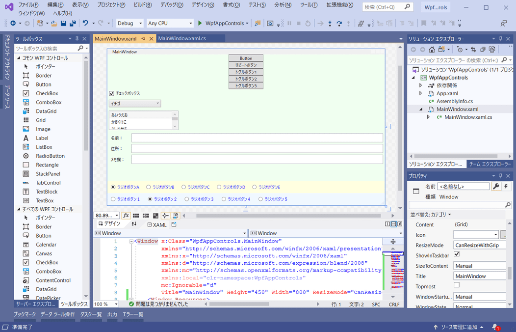
◇コントロール
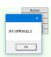
Button(ボタン)
普通のボタンです。
サンプルでは押すとメッセージボックスを表示します。
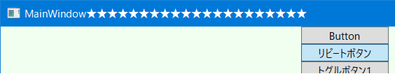
RepeatButton(リピートボタン)
長押しボタン(繰り返しボタン)です。押している間、クリックイベントが連続して発生します。
ツールボックスには表示されていないのでタグ手打ちで追加します。
サンプルでは押している間、タイトルバーに★を追加し続けます。
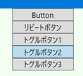
ToggleButton(トグルボタン)
ON/OFFを表せるボタンです。通常の状態と押されたままの状態をとることができます。
機能的にチェックボックスでも代用できます。
ツールボックスには表示されていないのでタグ手打ちで追加します。
CkeckBox(チェックボックス)
トグルボタンと同様、チェックが付いた状態とチェックなしの状態をとることができます。

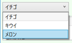
ComboBox(コンボボックス)
複数の選択肢の中から項目を選択できます。
ドロップダウンリストは通常閉じているので省スペースです。
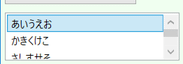
ListBox(リストボックス)
スペースに余裕がある場合はコンボボックスよりこちらの方がリストを開く手間が省けます。
Label(ラベル)
表示用のテキストコントロールです。
項目の名前表示などに使います。

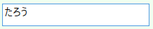
TextBox(テキストボックス)
テキスト入力用のコントロールです。
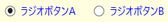
RadioButton(ラジオボタン)
複数の選択肢の中から1つを選ぶときに使います。
◇レイアウト用コントロール
Grid(グリッド)
格子状に領域を区切って配置できます。
サンプルでは列の分割は使っておらず、RowDefinitionで3行に分割しています。
StackPanel(スタックパネル)
コントロールを縦並びまたは横並びに配置できます。
DockPanel(ドックパネル)
コントロールを上、下、左、右、その他に配置できます。
サンプルではテキストボックスを画面サイズに合わせて表示するために使用しています。
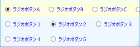
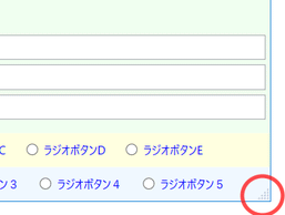
WrapPanel(ラップパネル)
コントロールを左から右に配置していき、右に入らなかったら折り返して次の行に配置します。
上の黄色背景が横配置のStackPanel、下の青背景がWrapPanelです。
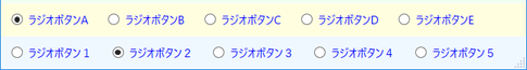
幅が狭くなった時、StackPanelは見切れてしまいますが、WrapPanelは折り返して表示されます。
◇ウィンドウ
Window(フォーム、画面)です。
サンプルではウィンドウのサイズ変更がしやすいようにグリップを表示するよう、
ResizeModeプロパティにCanResizeWithGripを設定しています。
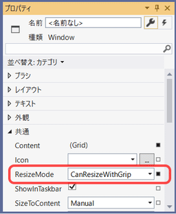
細いウィンドウ縁を掴まなくても、右下の三角でサイズ変更できるようになります。
◇スタイル
複数の同種のコントロールに同じプロパティ設定をする場合、スタイルとして定義して適用すると楽です。
利用するときは、定義したスタイルの名前(x:Key)をコントロールのStyleプロパティに指定してやります。
◇コード
<Window x:Class="WpfAppControls.MainWindow"
xmlns="http://schemas.microsoft.com/winfx/2006/xaml/presentation"
xmlns:x="http://schemas.microsoft.com/winfx/2006/xaml"
xmlns:d="http://schemas.microsoft.com/expression/blend/2008"
xmlns:mc="http://schemas.openxmlformats.org/markup-compatibility/2006"
xmlns:local="clr-namespace:WpfAppControls"
mc:Ignorable="d"
Title="MainWindow" Height="450" Width="800" ResizeMode="CanResizeWithGrip">
<Window.Resources>
<!-- 入力エリアコンテナのスタイル -->
<Style x:Key="InputContainer" TargetType="DockPanel">
<Setter Property="LastChildFill" Value="True"/>
</Style>
<!-- 入力エリア見出しのスタイル -->
<Style x:Key="InputTitleStyle" TargetType="Label">
<Setter Property="Margin" Value="5,5,5,0"/>
<Setter Property="Width" Value="60"/>
<Setter Property="DockPanel.Dock" Value="Left"/>
</Style>
<!-- 入力エリア入力部のスタイル -->
<Style x:Key="InputTextStyle" TargetType="TextBox">
<Setter Property="Margin" Value="0,5,5,0"/>
<Setter Property="DockPanel.Dock" Value="Right"/>
</Style>
<!-- ラジオボタンの既定スタイル -->
<Style TargetType="RadioButton">
<Setter Property="Margin" Value="10"/>
<Setter Property="Foreground" Value="Blue"/>
</Style>
</Window.Resources>
<Grid>
<Grid.RowDefinitions>
<RowDefinition />
<RowDefinition Height="Auto"/>
<RowDefinition Height="Auto"/>
</Grid.RowDefinitions>
<StackPanel Background="Honeydew">
<Button Content="Button" Width="100" Click="Button_Click"/>
<RepeatButton Content="リピートボタン" Width="100" Click="RepeatButton_Click"/>
<ToggleButton Content="トグルボタン1" Width="100"/>
<ToggleButton Content="トグルボタン2" Width="100"/>
<ToggleButton Content="トグルボタン3" Width="100"/>
<CheckBox Content="チェックボックス" IsChecked="True" Margin="5"/>
<ComboBox SelectedIndex="0" Width="150" HorizontalAlignment="Left" Margin="5">
<ComboBoxItem Content="イチゴ"/>
<ComboBoxItem Content="キウイ"/>
<ComboBoxItem Content="メロン"/>
</ComboBox>
<ListBox SelectedIndex="0" Width="200" Height="55" HorizontalAlignment="Left" Margin="5">
<ListBoxItem Content="あいうえお"/>
<ListBoxItem Content="かきくけこ"/>
<ListBoxItem Content="さしすせそ"/>
<ListBoxItem Content="たちつてと"/>
</ListBox>
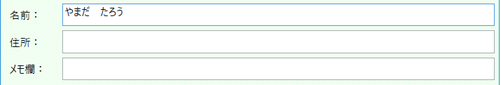
<DockPanel Style="{StaticResource InputContainer}">
<Label Content="名前:" Style="{StaticResource InputTitleStyle}"/>
<TextBox Text="" Style="{StaticResource InputTextStyle}"/>
</DockPanel>
<DockPanel Style="{StaticResource InputContainer}">
<Label Content="住所:" Style="{StaticResource InputTitleStyle}"/>
<TextBox Text="" Style="{StaticResource InputTextStyle}"/>
</DockPanel>
<DockPanel Style="{StaticResource InputContainer}">
<Label Content="メモ欄:" Style="{StaticResource InputTitleStyle}"/>
<TextBox Text="" Style="{StaticResource InputTextStyle}"/>
</DockPanel>
</StackPanel>
<StackPanel Orientation="Horizontal" Grid.Row="1" Background="LightYellow">
<RadioButton GroupName="g1" Content="ラジオボタンA" IsChecked="True"/>
<RadioButton GroupName="g1" Content="ラジオボタンB"/>
<RadioButton GroupName="g1" Content="ラジオボタンC"/>
<RadioButton GroupName="g1" Content="ラジオボタンD"/>
<RadioButton GroupName="g1" Content="ラジオボタンE"/>
</StackPanel>
<WrapPanel Grid.Row="2" Background="AliceBlue">
<RadioButton GroupName="g2" Content="ラジオボタン1"/>
<RadioButton GroupName="g2" Content="ラジオボタン2" IsChecked="True"/>
<RadioButton GroupName="g2" Content="ラジオボタン3"/>
<RadioButton GroupName="g2" Content="ラジオボタン4"/>
<RadioButton GroupName="g2" Content="ラジオボタン5"/>
</WrapPanel>
</Grid>
</Window>
using System.Windows;

# nullable enable

namespace WpfAppControls
{
    /// <summary>
    /// Interaction logic for MainWindow.xaml
    /// </summary>
    public partial class MainWindow : Window
    {
        public MainWindow()
        {
            InitializeComponent();
        }

        /// <summary>
        /// ボタンクリック時の処理
        /// </summary>
        /// <param name="sender"></param>
        /// <param name="e"></param>
        private void Button_Click(object sender, RoutedEventArgs e)
        {
            MessageBox.Show("ボタンが押されました");
        }

        /// <summary>
        /// リピートボタンクリック時の処理
        /// </summary>
        /// <param name="sender"></param>
        /// <param name="e"></param>
        private void RepeatButton_Click(object sender, RoutedEventArgs e)
        {
            // タイトルバーに★を追加
            Title += "★";
        }
    }
}
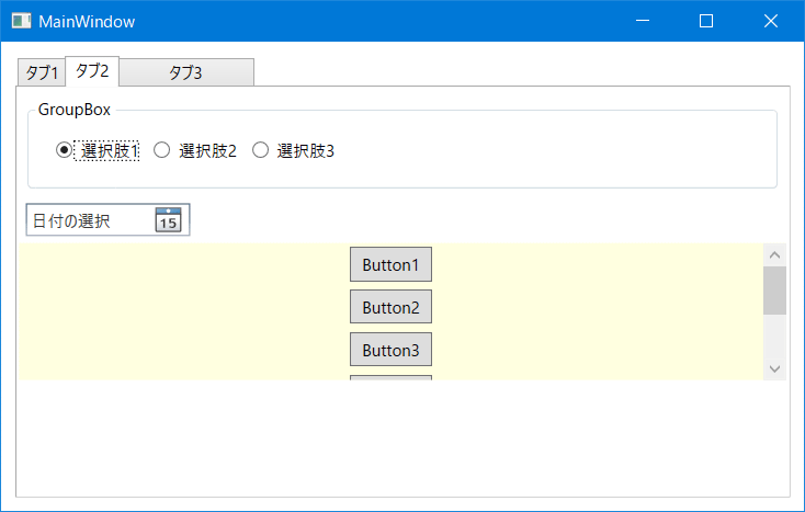
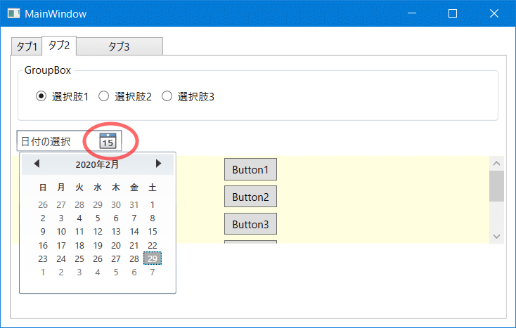
■画面作成その2
もう一つプロジェクトを作り、以下のコントロールを使ってみます。
TabControl, Rectangle, Border, Ellipse, Expander, Slider, ProgressBar
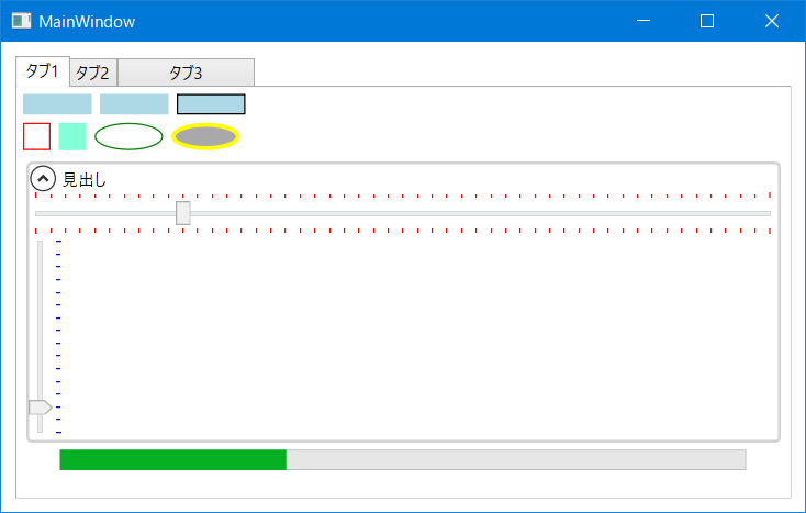
GroupBox, DatePicker, ScrollViewer
<Window x:Class="WpfAppControls2.MainWindow"
xmlns="http://schemas.microsoft.com/winfx/2006/xaml/presentation"
xmlns:x="http://schemas.microsoft.com/winfx/2006/xaml"
xmlns:d="http://schemas.microsoft.com/expression/blend/2008"
xmlns:mc="http://schemas.openxmlformats.org/markup-compatibility/2006"
xmlns:local="clr-namespace:WpfAppControls2"
mc:Ignorable="d"
Title="MainWindow" Height="380" Width="600">
<Grid>
<TabControl Margin="10">
<TabItem Header="タブ1" IsSelected="True">
<StackPanel>
<StackPanel Orientation="Horizontal">
<Rectangle Width="50" Height="15" Fill="LightBlue" Margin="3"/>
<Rectangle Width="50" Height="15" Fill="LightBlue" Margin="3"/>
<Rectangle Width="50" Height="15" Fill="LightBlue" Stroke="Black" Margin="3"/>
</StackPanel>
<StackPanel Orientation="Horizontal">
<Border Width="20" Height="20" BorderBrush="Red" BorderThickness="1" Margin="3"/>
<Border Width="20" Height="20" Background="Aquamarine" Margin="3"/>
<Ellipse Width="50" Height="20" Stroke="Green" Margin="3"/>
<Ellipse Width="50" Height="20" Stroke="Yellow" StrokeThickness="3" Fill="DarkGray" Margin="3"/>
</StackPanel>
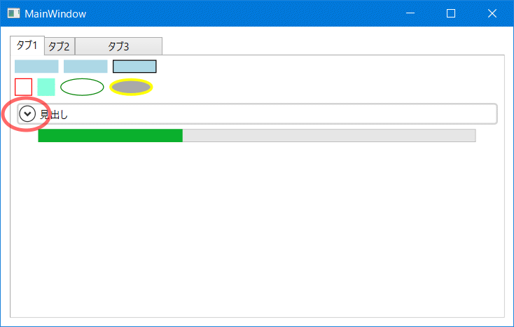
<Expander Header="見出し" IsExpanded="True" BorderBrush="LightGray" BorderThickness="2" Margin="5">
<StackPanel>
<Slider Minimum="0" Maximum="50" Value="10" TickPlacement="Both" Foreground="Red"/>
<Slider Minimum="0" Maximum="15" Value="2" TickPlacement="BottomRight"
Foreground="Blue" Orientation="Vertical" Height="150"/>
</StackPanel>
</Expander>
<ProgressBar Height="15" Width="500" Minimum="0" Maximum="100" Value="33"/>
</StackPanel>
</TabItem>
<TabItem Header="タブ2">
<StackPanel>
<GroupBox Header="GroupBox" Margin="5" Padding="10">
<StackPanel Orientation="Horizontal">
<RadioButton Content="選択肢1" IsChecked="True" GroupName="grp1" Margin="5"/>
<RadioButton Content="選択肢2" GroupName="grp1" Margin="5"/>
<RadioButton Content="選択肢3" GroupName="grp1" Margin="5"/>
</StackPanel>
</GroupBox>
<DatePicker Width="120" Margin="5" HorizontalAlignment="Left"/>
<ScrollViewer Height="100" Background="LightYellow">
<StackPanel>
<Button Content="Button1" Width="60" Height="25" Margin="3"/>
<Button Content="Button2" Width="60" Height="25" Margin="3"/>
<Button Content="Button3" Width="60" Height="25" Margin="3"/>
<Button Content="Button4" Width="60" Height="25" Margin="3"/>
<Button Content="Button5" Width="60" Height="25" Margin="3"/>
<Button Content="Button6" Width="60" Height="25" Margin="3"/>
</StackPanel>
</ScrollViewer>
</StackPanel>
</TabItem>
<TabItem Header="タブ3" Width="100">
<StackPanel/>
</TabItem>
</TabControl>
</Grid>
</Window>