はじめに
streamlitで位置情報をプロットする際、地図上に線や点を打てる状態にしたい。
そこで、streamlitで実装可能なOpenStreatMapとCartoDBについて比較してみる。
比較
| 観点 | OpenStreetMap | CartoDB Positron | CartoDB DarkMatter | グラフ表示 |
|---|---|---|---|---|
| コード量 | ✅ 短い | ✅ 短い | ✅ 短い | ❌ やや多い |
| 点の見やすさ | ❌ 見ずらい | ✅ 見やすい | ✅ 見やすい | ✅ 見やすい |
| 距離感の表現 | ✅ 見やすい | ✅ 見やすい | ✅ 見やすい | ❌ 分かりずらい |
| おすすめ度 | 周辺の道路情報などを合わせて利用したい場合 | シンプル一番おすすめ | ダークテーマに対応させる場合 | 位置関係の形だけ見たいとき |
それぞれのグラフは、fig.update_layoutのmap_styleで名称を指定することで切り替えられる。
# 地図表示
def create_map(style_name: str):
    fig = px.scatter_map(
        df,
        lat="lat",
        lon="lon",
        hover_name="place",
        zoom=zoom,
        height=height,
    )
    fig.update_traces(marker=dict(size=point_size))
    fig.update_layout(
        map_style=style_name,
        margin=dict(l=0, r=0, t=30, b=0),
    )
    return fig
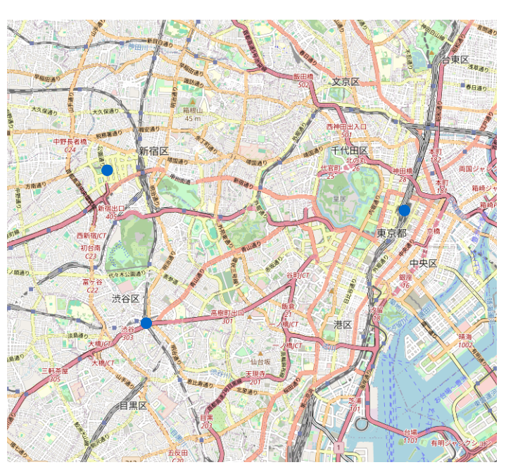
OpenStreatMap
実際の街の雰囲気が一番わかりやすい標準マップ。
点の位置を現実の地形と結びつけたい時に便利。
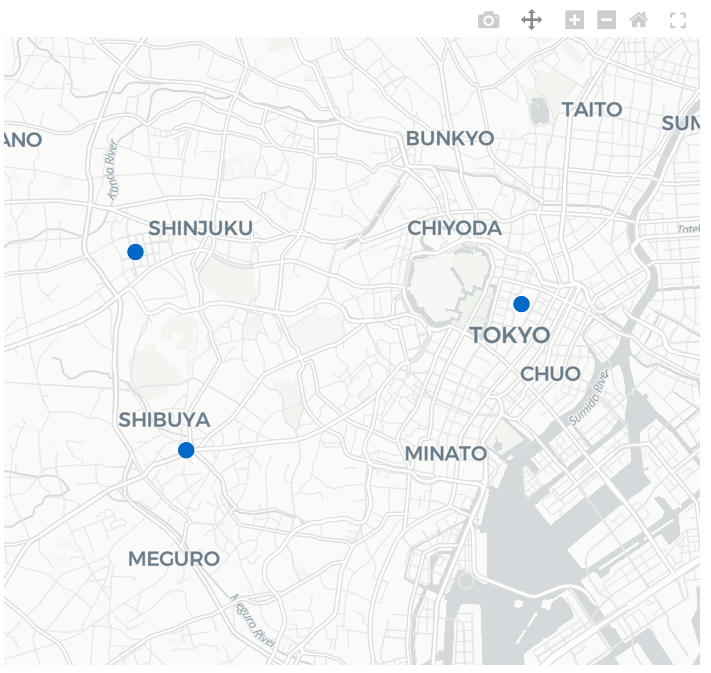
CartoDB Positron
背景が控えめで情報が整理され、点やラベルがとても見やすい。可視化用途では一番使うことになると思う。
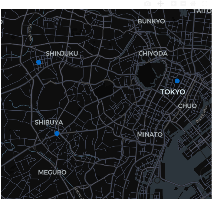
CartoDB DarkMatter
ダークテーマ版。もし、streamlit全体のテーマをダークテーマで作るならこっち。
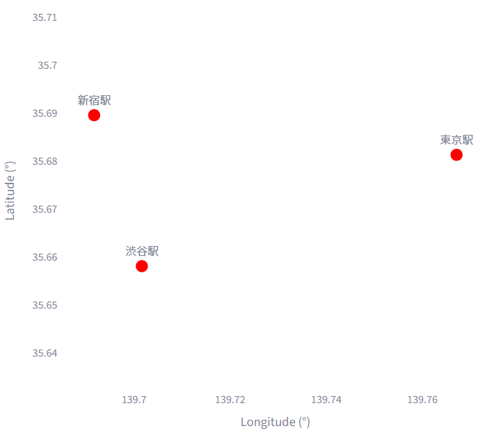
(参考)グラフにプロットすると
純粋に位置関係の“形”だけを見るときに使う。位置情報というより分布などをのみに絞ってみたいときであれば一度こっちでプロットするかもしれない。
コード全文
import streamlit as st
import pandas as pd
import plotly.express as px
import plotly.graph_objects as go

st.set_page_config(page_title="Plotly Map 比較", layout="wide")

# サンプルとなるデータ
df = pd.DataFrame({
    "lat": [35.681236, 35.689487, 35.658034],
    "lon": [139.767125, 139.691711, 139.701636],
    "place": ["東京駅", "新宿駅", "渋谷駅"],
})

# サイドバー設定値
st.sidebar.header("表示設定")
zoom = st.sidebar.slider("ズーム", 10, 16, 12)
height = st.sidebar.slider("高さ(px)", 300, 800, 500)
point_size = st.sidebar.slider("点サイズ", 5, 30, 15)

# 比較対象
TILES = {
    "OpenStreetMap": "open-street-map",
    "CartoDB Positron": "carto-positron",
    "CartoDB DarkMatter": "carto-darkmatter",
    "グラフ表示": "white-plot",
}
tabs = st.tabs(list(TILES.keys()))

# 地図表示
def create_map(style_name: str):
    fig = px.scatter_map(
        df,
        lat="lat",
        lon="lon",
        hover_name="place",
        zoom=zoom,
        height=height,
    )
    fig.update_traces(marker=dict(size=point_size))
    fig.update_layout(
        map_style=style_name,
        margin=dict(l=0, r=0, t=30, b=0),
    )
    return fig

# グラフ表示
def create_white_plot():
    fig = go.Figure()

    # 散布図(XY)
    fig.add_trace(
        go.Scatter(
            x=df["lon"],
            y=df["lat"],
            mode="markers+text",
            text=df["place"],
            textposition="top center",
            marker=dict(size=point_size, color="red"),
        )
    )

    # レイアウト(xaxis / yaxis を1回だけ定義)
    fig.update_layout(
        title="白背景 XY グラフ(グリッドなし)",
        xaxis=dict(
            title="Longitude (°)",
            showgrid=False,
        ),
        yaxis=dict(
            title="Latitude (°)",
            scaleanchor="x",   # X軸と比率固定
            scaleratio=1,
            showgrid=False,
        ),
        height=height,
        margin=dict(l=0, r=0, t=30, b=0),
        plot_bgcolor="white",
    )

    return fig

# タブ表示
for tab, (label, style_name) in zip(tabs, TILES.items()):
    with tab:
        st.subheader(label)

        if style_name == "white-plot":
            st.write("地図ではなく、緯度・経度をXY軸にした **Plotlyグラフ** を表示しています。")
            fig = create_white_plot()
            st.plotly_chart(fig, width="stretch")
        else:
            fig = create_map(style_name)
            st.plotly_chart(fig, width="stretch")