きっかけ
ゲームのパワーアップアイテムで、「スキルの範囲をxx%増加」というアイテムがあったとする。該当するスキルを2個以上を取った場合の計算式はどのようにするべきか迷うことがあった。
そこで、いろんな計算パターンの範囲を可視化してレベルデザインを用意にするツールをstreamlitで作ってみる
範囲の計算方式(4パターン)
半径を r、円の面積を S、アイテム1個あたりの増加倍率を k(例:10% アップ → k = 1.1)とする。
アイテムを n 個取得したとき の「範囲(半径または面積)」の増え方には、主に次の4つの方式がある。
1. 半径に加算で効く方式(線の長さ比・加算型)
- 1個取るごとに 元の半径に対して (k−1) 分だけ増える
- n 個取得時の半径
$$
r(n) = r \cdot \bigl(1 + n (k - 1)\bigr)
$$ - 例:2個目取得時 → $$r \cdot (1 + 2(k - 1)) = r \cdot (2k - 1)$$
2. 半径に乗算で効く方式(線の長さ比・乗算型)
- 1個取るごとに半径が k 倍
- n 個取得時の半径
$$
r(n) = r \cdot k^{n}
$$ - 例:2個目取得時 → $$r \cdot k^{2}$$
3. 面積に加算で効く方式(面積比・加算型)
- 面積が 1個あたり (k−1) 分だけ増える
- n 個取得時の面積
$$
S(n) = S \cdot \bigl(1 + n (k - 1)\bigr)
$$ - 半径に換算すると
$$
r(n) = r \cdot \sqrt{1 + n (k - 1)}
$$ - 例:2個目取得時の面積 → $$S \cdot (1 + 2(k - 1)) = S \cdot (2k - 1)$$
4. 面積に乗算で効く方式(面積比・乗算型)
- 面積が 1個取るごとに k 倍
- n 個取得時の面積
$$
S(n) = S \cdot k^{n}
$$ - 半径に換算すると
$$
r(n) = r \cdot k^{,n/2}
$$ - 例:2個目取得時 → $$S \cdot k^{2}$$
イメージ
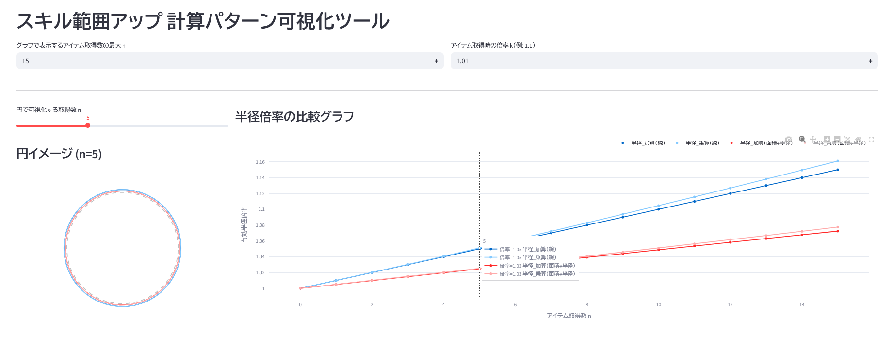
- [入力]アイテム取得数 (0~100個程度)
- [入力]アイテム取得時の倍率
- [出力]4つの計算方法で範囲と倍率を比較できるグラフ
ソース
import streamlit as st
import numpy as np
import pandas as pd
import plotly.graph_objects as go
from typing import Dict

# 定数定義
DEFAULT_MAX_ITEMS = 3
DEFAULT_SCALE_K = 1.1

def calculate_radius_patterns(max_n: int, k: float) -> pd.DataFrame:
    """
    各計算パターンに基づく半径の推移を算出する
    """
    n = np.arange(0, max_n + 1)
    r0 = 1.0
    bonus = k - 1.0

    # 計算ロジック
    # 1. 線形加算: Base * (1 + n * bonus)
    r_lin_add = r0 * (1 + n * bonus)
    # 2. 乗算累積: Base * k^n
    r_exp_mult = r0 * (k ** n)
    # 3. 面積加算(半径換算): sqrt(Area_base * (1 + n * bonus))
    r_area_add = r0 * np.sqrt(1 + n * bonus)
    # 4. 面積乗算(半径換算): Base * k^(n/2)
    r_area_mult = r0 * (k ** (n / 2))

    return pd.DataFrame({
        "n": n,
        "半径_加算(線)": r_lin_add,
        "半径_乗算(線)": r_exp_mult,
        "半径_加算(面積→半径)": r_area_add,
        "半径_乗算(面積→半径)": r_area_mult,
    })

def render_line_chart(df: pd.DataFrame):
    """
    Plotlyによる折れ線グラフ描画(比較用)
    """
    st.subheader("半径倍率の比較グラフ")

    fig = go.Figure()

    # x軸データ
    x_data = df["n"]
    # y軸データ(n列以外すべて)
    y_cols = [c for c in df.columns if c != "n"]

    for col in y_cols:
        fig.add_trace(go.Scatter(
            x=x_data,
            y=df[col],
            mode='lines+markers',
            name=col,
            hovertemplate=f"倍率=%{{y:.2f}} <b>{col}</b><extra></extra>"
        ))

    fig.update_layout(
        xaxis_title="アイテム取得数 n",
        yaxis_title="有効半径倍率",
        hovermode="x unified",
        legend=dict(
            orientation="h",
            yanchor="bottom",
            y=1.02,
            xanchor="right",
            x=1
        ),
        margin=dict(l=20, r=20, t=30, b=20),
    )

    st.plotly_chart(fig, width="stretch")

def render_circle_chart(df: pd.DataFrame, max_n: int):
    """
    Plotlyによる円の可視化(直感理解用)
    """
    # スライダーでnを選択
    n_view = st.slider(
        "円で可視化する取得数 n",
        min_value=0,
        max_value=max_n,
        value=min(5, max_n),
    )

    st.subheader(f"円イメージ (n={n_view})")

    # 指定したn行のデータを取得
    row = df[df["n"] == n_view].iloc[0]

    cols = [c for c in df.columns if c != "n"]
    radii = {col: row[col] for col in cols}

    fig = go.Figure()
    theta = np.linspace(0, 2 * np.pi, 200)

    # 各パターンの円を追加
    for label, r in radii.items():
        fig.add_trace(go.Scatter(
            x=r * np.cos(theta),
            y=r * np.sin(theta),
            mode="lines",
            name=label,
            line=dict(width=2),
        ))

    # 基準円 (r0=1.0)
    fig.add_trace(go.Scatter(
        x=np.cos(theta),
        y=np.sin(theta),
        mode="lines",
        name="基準半径 r₀",
        line=dict(width=2, dash="dash", color="gray"),
        opacity=0.5,
        hoverinfo="skip"
    ))

    # レイアウト調整(アスペクト比を1:1に固定)
    max_r = max(max(radii.values()), 1.0)
    limit = max_r * 1.15

    fig.update_layout(
        width=350,
        height=350,
        margin=dict(l=10, r=10, t=30, b=10),
        showlegend=False,
        xaxis=dict(range=[-limit, limit], scaleanchor="y", scaleratio=1, visible=False),
        yaxis=dict(range=[-limit, limit], visible=False),
    )

    st.plotly_chart(fig, width="stretch")

def main():
    st.set_page_config(page_title="範囲アップ比較ツール", layout="wide")
    st.title("スキル範囲アップ 計算パターン可視化ツール")

    # --- 入力フォーム ---
    col1, col2 = st.columns(2)
    with col1:
        max_items = st.number_input(
            "グラフで表示するアイテム取得数の最大 n",
            min_value=0, max_value=200, value=DEFAULT_MAX_ITEMS
        )

    with col2:
        k_val = st.number_input(
            "アイテム取得時の倍率 k(例: 1.1)",
            min_value=1.0, max_value=5.0, value=DEFAULT_SCALE_K, step=0.01, format="%.2f"
        )

    if max_items == 0:
        st.warning("アイテム数を1以上に設定してください")
        return

    st.divider()

    # --- 出力エリア ---
    df_result = calculate_radius_patterns(int(max_items), k_val)

    left_panel, right_panel = st.columns([1, 3])

    with left_panel:
        render_circle_chart(df_result, int(max_items))

    with right_panel:
        render_line_chart(df_result)

if __name__ == "__main__":
    main()