グラフが表示できない。グレイアウトしている
Add Chart" button is not enabled.
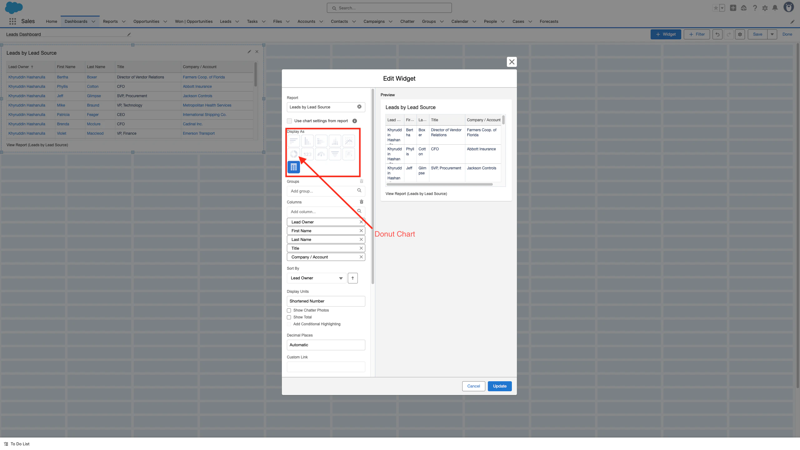
レポートを作成するときに、レポートをグラフとして表示できます。グラフは、レポート内のデータを視覚的に理解する手段をあなたとあなたのユーザーに提供します。ただし、レポートを作成するときに、「グラフの追加」アイコンがグレー表示になっていることがわかります。
[グラフの追加] アイコンがグレー表示になっているのは、レポートにグループ化されたフィールドが少なくとも 1 つ必要なためです。
When creating a report you can display the report as a chart. Charts provide you and your users with a visual way to understand the data in your report. When creating a report however, users can find that the Add Chart icon is greyed out.
The reason why the Add Chart icon is greyed out is because a report must have at least one grouped field.
- Click to open the report you would like to add a chart to
- Click Edit on the right side of the screen
- Click Outline on the left side of the screen
- Under the Groups section, click within the lookup field titled Group Rows
- Select a field that you would like to group your report by. Fields that are commonly grouped are the Owner fields.
- Now that you have a grouped field, the Add Chart icon can be clicked and a chart added to your report
- To edit the default chart that is added to your report after clicking Add Chart, click the gear icon on the top right corner of the chart and edit it as needed
https://help.salesforce.com/s/articleView?id=000389964&type=1
ダッシュボードでも同じ