時系列データの分析
DATAIさんのカーネル
を使ってARIMAでの時系列分析・推定を学んでいきます。
カーネルについて
第二次世界大戦の空爆オペレーションのデータと、気象観測所の気温データを使用します。
このカーネルは時系列予測のチュートリアルを目的としており、同時にEDA(Exploratory Data Analysis)を行っていきます。
EDA(探索的データ解析) : データがどのような性質を持っているのか俯瞰する初期アプローチ。
「まずモデルありき」で計算を始めるのでなく、現実的な立場でデータを多角的に捉え、モデルの選択・修正を行う取り組み。
データマイニングと関係深い。
参考サイト
カーネルを翻訳し、写経するだけでも勉強になりますが、発信する以上は付加価値を付けていきたいと思いますので、疑問点など調べたことも勝手に追記していきます。
カーネル中のデータとDLデータが異なるようでカーネル内の図と異なっている部分があります。
この記事にGPS情報のplotは記載しておりません。ソースのカーネルを参照してください。
カーネルの内容
import numpy as np
import pandas as pd
import seaborn as sns
import matplotlib.pyplot as plt
import plotly.plotly as py
from plotly.offline import init_notebook_mode, iplot
init_notebook_mode(connected=True)
import plotly.graph_objs as go


import os
print(os.listdir(""))
# ディレクトリ、ファイル名を取得。
# read_csv時にはファイル名をここからコピーしてきたらいいので楽。

import warnings
warnings.filterwarnings("ignore")
plt.style.use('ggplot')
aerial = pd.read_csv("operations.csv")
weather_station_location = pd.read_csv("Weather Station Locations.csv")
weather = pd.read_csv("Summary of Weather.csv")
・operations.csv
17万行 46列のデータ
空爆オペレーションのあった1943/8/15 ~ 1945/2/16 の時系列データと、ミッションID,国名、標的地の緯度経度分類などの詳細、離陸飛行場などが入っている。
・Weather Station Locations.csv
162行 8列のデータ、気象観測所の緯度経度
・Summary of Weather.csv
気温の測定日と平均気温
天気・気温のデータはWBANという気象観測所番号で結び付けられるようになっている。
データのクリーニング
空爆オペレーションのデータoperations.csv
には複数のNaNが含まれているため、NaNの入っているデータや必要のない変数を削除していく。
気象に関するデータは削除の必要はない(整っている)
# drop countries that are NaN
aerial = aerial[pd.isna(aerial.Country)==False]
# drop if target longitude is NaN
aerial = aerial[pd.isna(aerial['Target Longitude'])==False]
# Drop if takeoff longitude is NaN
aerial = aerial[pd.isna(aerial['Takeoff Longitude'])==False]
# drop unused features
drop_list = ['Mission ID','Unit ID','Target ID','Altitude (Hundreds of Feet)','Airborne Aircraft',
             'Attacking Aircraft', 'Bombing Aircraft', 'Aircraft Returned',
             'Aircraft Failed', 'Aircraft Damaged', 'Aircraft Lost',
             'High Explosives', 'High Explosives Type','Mission Type',
             'High Explosives Weight (Pounds)', 'High Explosives Weight (Tons)',
             'Incendiary Devices', 'Incendiary Devices Type',
             'Incendiary Devices Weight (Pounds)',
             'Incendiary Devices Weight (Tons)', 'Fragmentation Devices',
             'Fragmentation Devices Type', 'Fragmentation Devices Weight (Pounds)',
             'Fragmentation Devices Weight (Tons)', 'Total Weight (Pounds)',
             'Total Weight (Tons)', 'Time Over Target', 'Bomb Damage Assessment','Source ID']
aerial.drop(drop_list, axis=1,inplace = True)
aerial = aerial[ aerial.iloc[:,8]!="4248"] # drop this takeoff latitude
aerial = aerial[ aerial.iloc[:,9]!=1355]   # drop this takeoff longitude
aerial.info()
17のカラムが表示される
Data columns (total 17 columns):
Mission Date             2555 non-null object
Theater of Operations    2555 non-null object
Country                  2555 non-null object
Air Force                2505 non-null object
Aircraft Series          2528 non-null object
Callsign                 10 non-null object
Takeoff Base             2555 non-null object
Takeoff Location         2555 non-null object
Takeoff Latitude         2555 non-null object
Takeoff Longitude        2555 non-null float64
Target Country           2499 non-null object
Target City              2552 non-null object
Target Type              602 non-null object
Target Industry          81 non-null object
Target Priority          230 non-null object
Target Latitude          2555 non-null float64
Target Longitude         2555 non-null float64
# what we will use only
weather_station_location = weather_station_location.loc[:,["WBAN","NAME","STATE/COUNTRY ID","Latitude","Longitude"] ]
weather_station_location.info()
Data columns (total 5 columns):
WBAN                161 non-null int64
NAME                161 non-null object
STATE/COUNTRY ID    161 non-null object
Latitude            161 non-null float64
Longitude           161 non-null float64
# what we will use only
weather = weather.loc[:,["STA","Date","MeanTemp"] ]
weather.info()
Data columns (total 3 columns):
STA         119040 non-null int64
Date        119040 non-null object
MeanTemp    119040 non-null float64
データの可視化
まずデータを理解するために可視化しましょう。
攻撃対象の国や航空機の使用頻度
オペレーション戦域などなど...
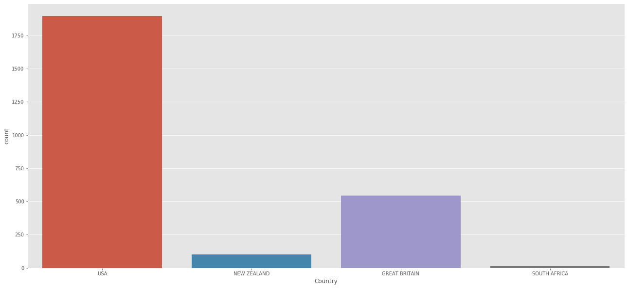
# country
print(aerial['Country'].value_counts())
plt.figure(figsize=(22,10))
sns.countplot(aerial['Country'])
plt.show()
USA              1895
GREAT BRITAIN     544
NEW ZEALAND       102
SOUTH AFRICA       14
圧倒的USA
# Top target countries
print(aerial['Target Country'].value_counts()[:10])
plt.figure(figsize=(22,10))
sns.countplot(aerial['Target Country'])
plt.xticks(rotation=90)
plt.show()
ITALY      1104
BURMA       335
LIBYA       272
TUNISIA     113
GREECE       87
EGYPT        80
JAPAN        71
CHINA        52
SICILY       46
GERMANY      41
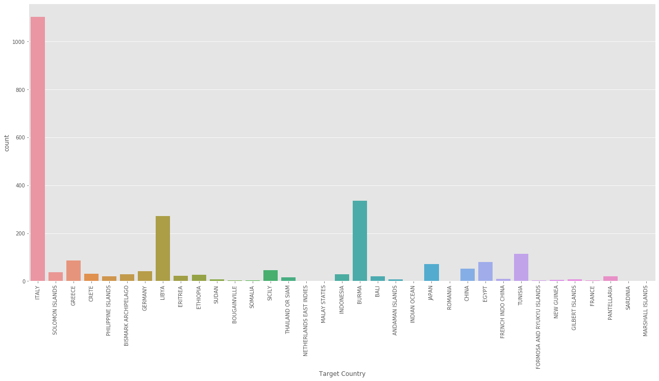
イタリアが集中砲火されてます
次いでブルマ、リビア
# Aircraft Series
data = aerial['Aircraft Series'].value_counts()
print(data[:10])
data = [go.Bar(
            x=data[:10].index,
            y=data[:10].values,
            hoverinfo = 'text',
            marker = dict(color = 'rgba(177, 14, 22, 0.5)',
                             line=dict(color='rgb(0,0,0)',width=1.5)),
    )]

layout = dict(
    title = 'Aircraft Series',
)
fig = go.Figure(data=data, layout=layout)
iplot(fig)
A36             990
B25             416
B24             337
BLEN            180
LIB             145
WELL            129
B17             119
PV-1 VENTURA     70
WHIT             32
HALI             18
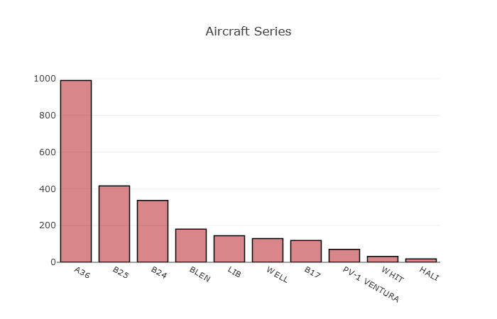
航空機はA36がダントツの登場頻度ですね
ソース元のカーネルではここにMAPデータが入る。
爆破経路や離陸飛行場などを地図上にGPSデータからplotしている。
オペレーションの行われた戦域
print(aerial['Theater of Operations'].value_counts())
plt.figure(figsize=(22,10))
sns.countplot(aerial['Theater of Operations'])
plt.show()
MTO            1802
CBI             425
PTO             247
ETO              44
EAST AFRICA      37
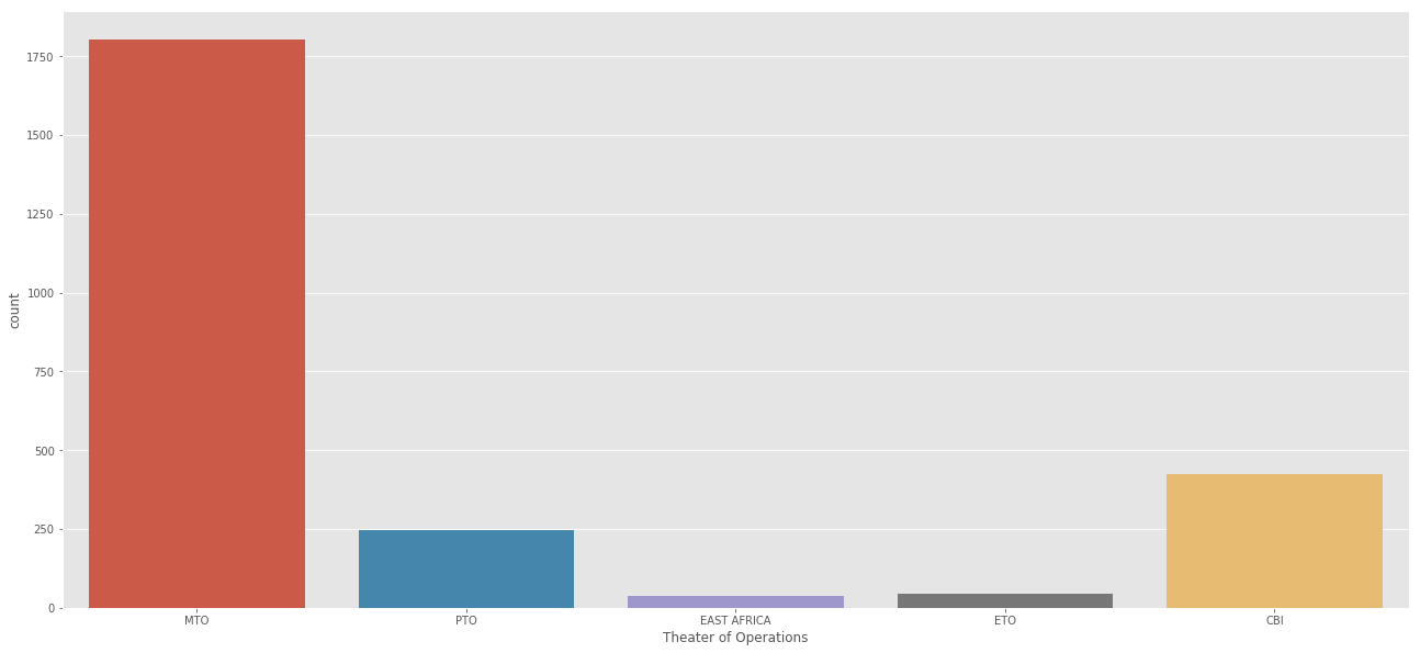
MTO:欧州戦域
PTO:太平洋戦域
MTO:地中海戦域
CBI:中国・ビルマ・インド戦域
EAST AFRICA:東アフリカ戦域
欧州での争いがメインだったようです。
ここでもMAPデータが入る
アメリカとブルマの戦争についてより詳しく見てみる
アメリカとブルマの戦争区域に最も近い気象観測所はBINDUKURIという場所。
1943~1945までの温度記録を使って可視化してみましょう。
weather_station_id = weather_station_location[weather_station_location.NAME == "BINDUKURI"].WBAN
weather_bin = weather[weather.STA == 32907]
weather_bin["Date"] = pd.to_datetime(weather_bin["Date"])
plt.figure(figsize=(22,10))
plt.plot(weather_bin.Date,weather_bin.MeanTemp)
plt.title("Mean Temperature of Bindukuri Area")
plt.xlabel("Date")
plt.ylabel("Mean Temperature")
plt.show()

気温の測定データをplotできました。
冬と夏で温度に傾向的な影響があります。
気温は12~32度の間です。
aerial = pd.read_csv("operations.csv")
aerial["year"] = [ each.split("/")[2] for each in aerial["Mission Date"]]
aerial["month"] = [ each.split("/")[0] for each in aerial["Mission Date"]]
aerial = aerial[aerial["year"]>="1943"]
aerial = aerial[aerial["month"]>="8"]

aerial["Mission Date"] = pd.to_datetime(aerial["Mission Date"])

attack = "USA"
target = "BURMA"
city = "KATHA"

aerial_war = aerial[aerial.Country == attack]
aerial_war = aerial_war[aerial_war["Target Country"] == target]
aerial_war = aerial_war[aerial_war["Target City"] == city]
# I get very tired while writing this part, so sorry for this dummy code But I guess you got the idea
liste = []
aa = []
for each in aerial_war["Mission Date"]:
    dummy = weather_bin[weather_bin.Date == each]
    liste.append(dummy["MeanTemp"].values)
aerial_war["dene"] = liste
for each in aerial_war.dene.values:
    aa.append(each[0])

# Create a trace
trace = go.Scatter(
    x = weather_bin.Date,
    mode = "lines",
    y = weather_bin.MeanTemp,
    marker = dict(color = 'rgba(16, 112, 2, 0.8)'),
    name = "Mean Temperature"
)
trace1 = go.Scatter(
    x = aerial_war["Mission Date"],
    mode = "markers",
    y = aa,
    marker = dict(color = 'rgba(16, 0, 200, 1)'),
    name = "Bombing temperature"
)
layout = dict(title = 'Mean Temperature --- Bombing Dates and Mean Temperature at this Date')
data = [trace,trace1]

fig = dict(data = data, layout = layout)
iplot(fig)
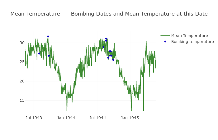
筆者はこの部分のスクリプトを書くのに大変苦労したようです。
平均気温のトレンドに爆破オペレーションが行われた場合をplotしています。
パット見て気温が25度以上の日に爆破オペレーションは実行されたみたいですね。
このトレンドグラフと青いplotの関係性から、「爆撃が決行されるかが予測できるようになる」というわけですね。
そのためにも、まず時系列予測をしてみましょう。
ARIMAを使った時系列の予測
よく使われるARIMAという手法を使用します。
ARIMA: auto regressive integrated moving average
自己回帰移動平均モデルってやつですね
時系列モデリングについて付加的な情報
前提として
・線形の回帰については一般的に同じ確率分布から出現したデータとして捉えるが、時系列データの場合はt+1の時とt+2の時でデータの出現する確率分布は異なるものと捉える
・時系列データでの特徴量
平均:ある一定時間Tの間のデータの合計をTで割ったもの
分散:平均とT(t0~tnまでの区間とする)時点の平方和をTで割ったもの。
標準偏差:分散の平方根をとったもの
自己共分散:(過去のある時点の値-平均)*(現在の値-平均)をTで割ったもの
自己相関関数:過去の時点の自分との相関係数のこと。共分散はスケールに引っ張られるが、相関は関係しないため安定した結果を得ることができる。
自己共分散を(過去の時点の分散)*(現在の分散) の平方根をとった値
ACF:auto-correlation function
現在の値が過去のデータの影響をどの程度受けているか(過去の値との相関がどの程度あるのか)。
編自己相関:自己相関関数の過去の時点から現在の時点までの間にある値の影響を取り除いたもの。
PACF:partial auto-correlation function
現在と過去の一時点の二点間の相関性
・時系列データの分析をするにあたって
データは定常過程か?
増加し続けているデータやランダムウォークのデータは定常性のないデータであり、平均を算出して特徴を掴もうとしても、まず平均を算出することの意味がなくなる。
・自己共分散が、すべての時点において0の時、(自己相関を持たない時)時系列は定常過程であるとみなせる。(ただし時点=0の時は純粋に分散のみを持つ=分散は時刻に依存せず一定である)
・定常でない場合は分析しにくいため、対数や季節性の調整をおこなったり、累積和の場合には差分をとることで定常過程に直して分析したり....。
AR(自己回帰過程)とMA(移動平均過程)を混合させた過程が自己回帰モデルと呼ばれる手法になっている。
ARMA: 自己回帰移動平均過程 auto-regressive moving average
ARIMA: 自己回帰和分移動平均過程
非定常なデータについても、季節性のような周期を加味することで分析するのが
SARIMA: seasonal auto-regressive integrated moving average
非季節性のデータをARIMA(p,d,q)過程で推定し、周期sをARIMA(P,D,Q)過程で推定する。
sはプロットから判断。P,D,Qは小さいものを選択する。
ARIMA(p,d,q)とARIMA(P,D,Q)s を混合させたものがSARIMAになる。
本題にもどって....
・time series(時系列)ってなんぞ?
時系列は一定間隔で収集されたデータの集まり。
時系列は季節性を持つものがおおい。
アイスクリームの販売は夏に向けて売り上げが上昇する。
もう一つ例をあげると、一日に一回さいころを振ってみることを想像しましょう。期間は一年間。サイコロの目は夏に5が出やすく冬に5が出やすいとかありますか?ないですよね。こんなデータは季節性なしと言えます。
・時系列の定常性について
時系列には三つの基準があります。
一定の平均(ローリング平均として確認)
一定の分散(ローリング標準偏差として確認)
時間に依存しない自己共分散
視覚化して季節性を確認してみましょう
# Mean temperature of Bindikuri area
plt.figure(figsize=(22,10))
plt.plot(weather_bin.Date,weather_bin.MeanTemp)
plt.title("Mean Temperature of Bindukuri Area")
plt.xlabel("Date")
plt.ylabel("Mean Temperature")
plt.show()

# lets create time series from weather
timeSeries = weather_bin.loc[:, ["Date","MeanTemp"]]
timeSeries.index = timeSeries.Date
ts = timeSeries.drop("Date",axis=1)
気象観測所 Bindikuri の周りでの気温をplotしています
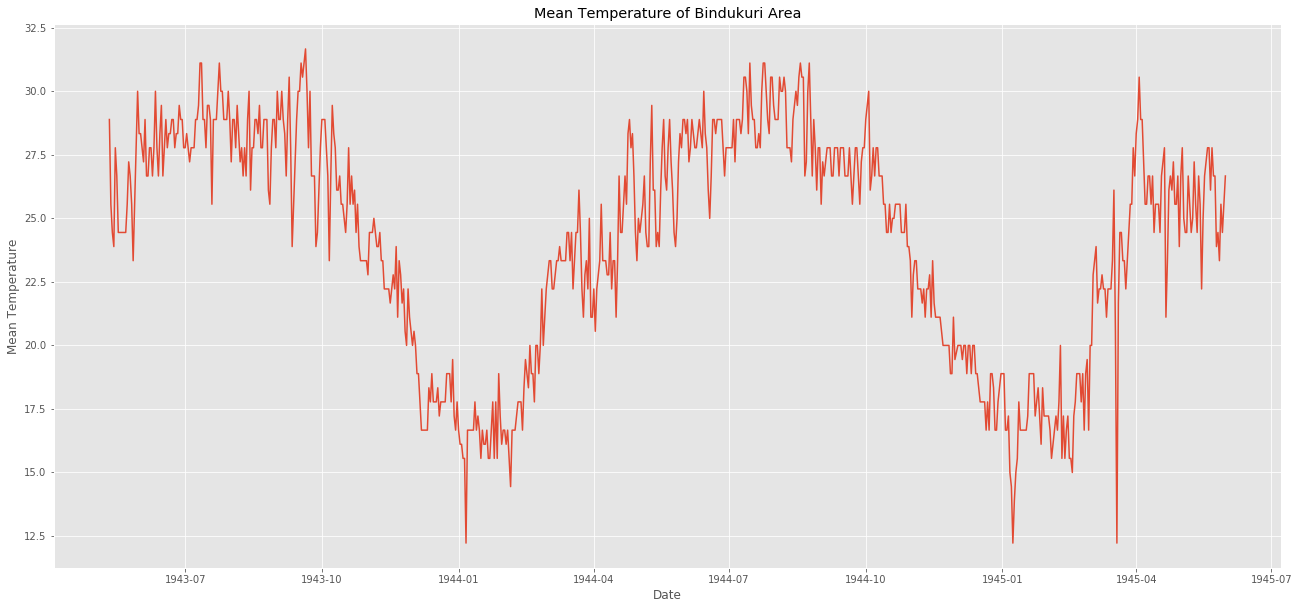
見ての通り季節の変動がありますね。
夏は気温が高く冬は気温が低い
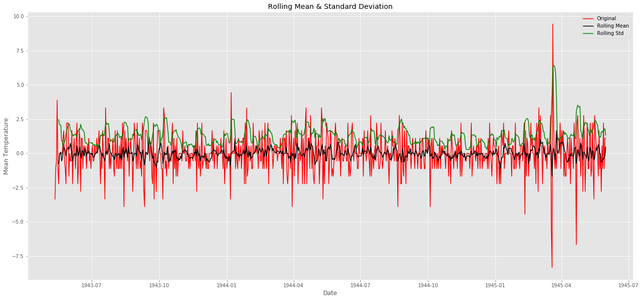
次は時系列の定常性を確認しましょう。以下のような方法で確認します。
ローリング統計とplotします。
windowを6に指定し、ローリング平均とローリング分散をチェックします。
次にDickey-Fuller検定を行います。
検定結果を確認し、統計量が棄却限界値より小さければ時系列が定常であると言えます。
ここでまた横から追記
ローリングって言葉に親しみが無かったので調べてみることに。
経済系の分野では結構一般的なんですかね?
ある一定区間のフィルタみたいなものをつくって順番にスライド(ローリング)させていくようなもの(らしい)。「6個を調べて平均をとる」というフィルターで1~100のデータに適応すると仮定する。1~6番目を調べたら次に2~7番目・・・94~100番目までをしらべて、終わり。
(移動平均とは厳密には違うのか...?)
Dickey-Fuller検定についても
自己回帰モデルが単位根を持つかどうかを調べるもの。
単純なAR(1)モデルにおいてYt=r Yt-1 + ut
のとき、rが1であれば単位根が存在し、モデルは非定常となる。
r=1であるか、という検定になる。
まだモデリングなんでしないぞ
# adfuller library
from statsmodels.tsa.stattools import adfuller
# check_adfuller
def check_adfuller(ts):
    # Dickey-Fuller test
    result = adfuller(ts, autolag='AIC')
    print('Test statistic: ' , result[0])
    print('p-value: '  ,result[1])
    print('Critical Values:' ,result[4])
# check_mean_std
def check_mean_std(ts):
    #Rolling statistics
    rolmean = pd.rolling_mean(ts, window=6)
    rolstd = pd.rolling_std(ts, window=6)
    plt.figure(figsize=(22,10))
    orig = plt.plot(ts, color='red',label='Original')
    mean = plt.plot(rolmean, color='black', label='Rolling Mean')
    std = plt.plot(rolstd, color='green', label = 'Rolling Std')
    plt.xlabel("Date")
    plt.ylabel("Mean Temperature")
    plt.title('Rolling Mean & Standard Deviation')
    plt.legend()
    plt.show()

# check stationary: mean, variance(std)and adfuller test
check_mean_std(ts)
check_adfuller(ts.MeanTemp)
ちなみにココのrollingの関数部分ですがpandasのAPIで変わったって載っているらしく、書き換えが必要です。以下に修正する場合の書き方を載せておきます。
    #rolmean = pd.rolling_mean(ts, window=6)
    rolmean = ts.rolling(window=6).mean()

    #rolstd = pd.rolling_std(ts, window=6)
    rolstd = ts.rolling(window=6).std()
いくつか修正すべき場所が入り込んだりしているので注意です。
本筋にもどります。
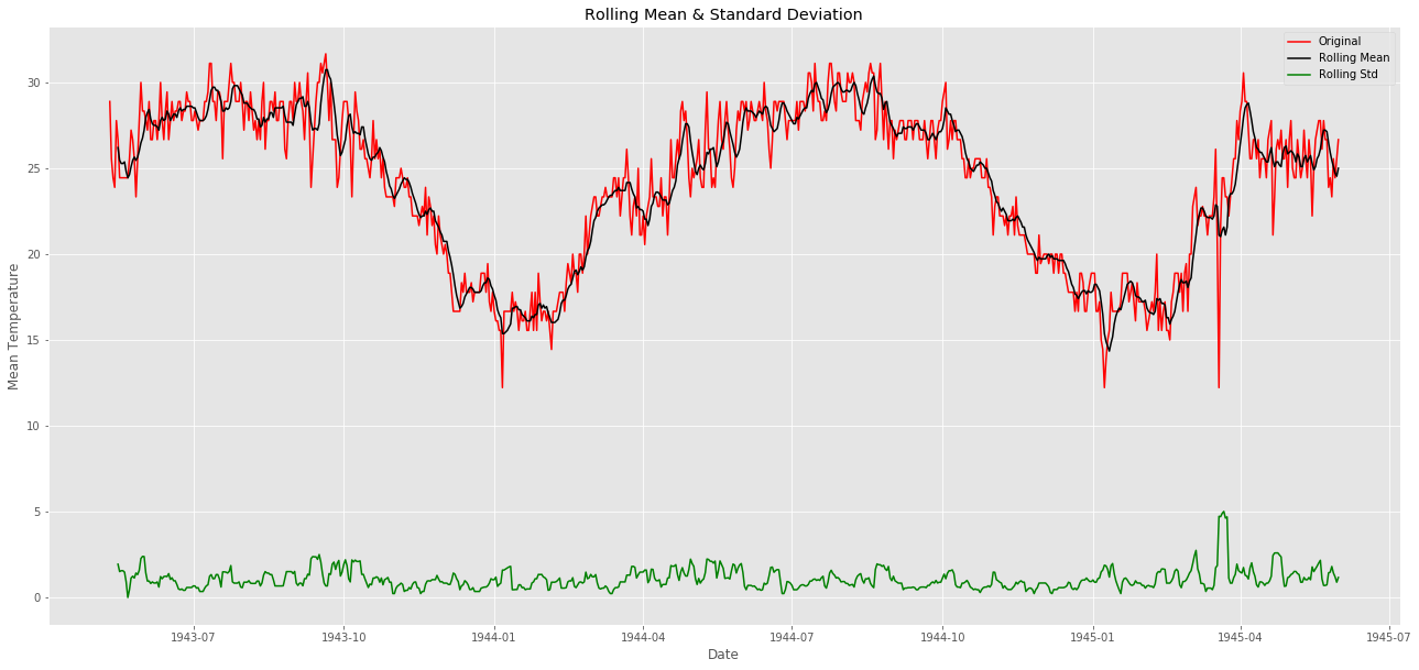
赤色が単純な平均気温です。
黒色がローリング平均であり、一定にはなっていないことがわかります(感覚的に6時刻のデータの平均をとっても平均気温が平らになる地域ではないことがわかる)。
緑色がローリング標準偏差です。分散はどうやら一定で定常のようです。
最後に三つ目である検定結果を見てみましょう
Test statistic:  -1.4095966745887747
p-value:  0.577666802852636
Critical Values: {'1%': -3.439229783394421, '5%': -2.86545894814762, '10%': -2.5688568756191392}
値は-1.40....
棄却限界値を見ると10%すら超えていないようです。
-1.4は大きすぎるので定常データとは言えません。
次に定常データに直して分析できるようにしていきましょう。
定常データになおすって?
非定常のデータには二つの原因があります
trend: 時間の経過とともに平均が変化している
seasonality: 特定の季節性(周期的に変動する性質のこと)がある
trendを解消するなら移動平均をとることです。
# Moving average method
window_size = 6
moving_avg = pd.rolling_mean(ts,window_size)
plt.figure(figsize=(22,10))
plt.plot(ts, color = "red",label = "Original")
plt.plot(moving_avg, color='black', label = "moving_avg_mean")
plt.title("Mean Temperature of Bindukuri Area")
plt.xlabel("Date")
plt.ylabel("Mean Temperature")
plt.legend()
plt.show()

ts_moving_avg_diff = ts - moving_avg
ts_moving_avg_diff.dropna(inplace=True) # first 6 is nan value due to window size

# check stationary: mean, variance(std)and adfuller test
check_mean_std(ts_moving_avg_diff)
check_adfuller(ts_moving_avg_diff.MeanTemp)
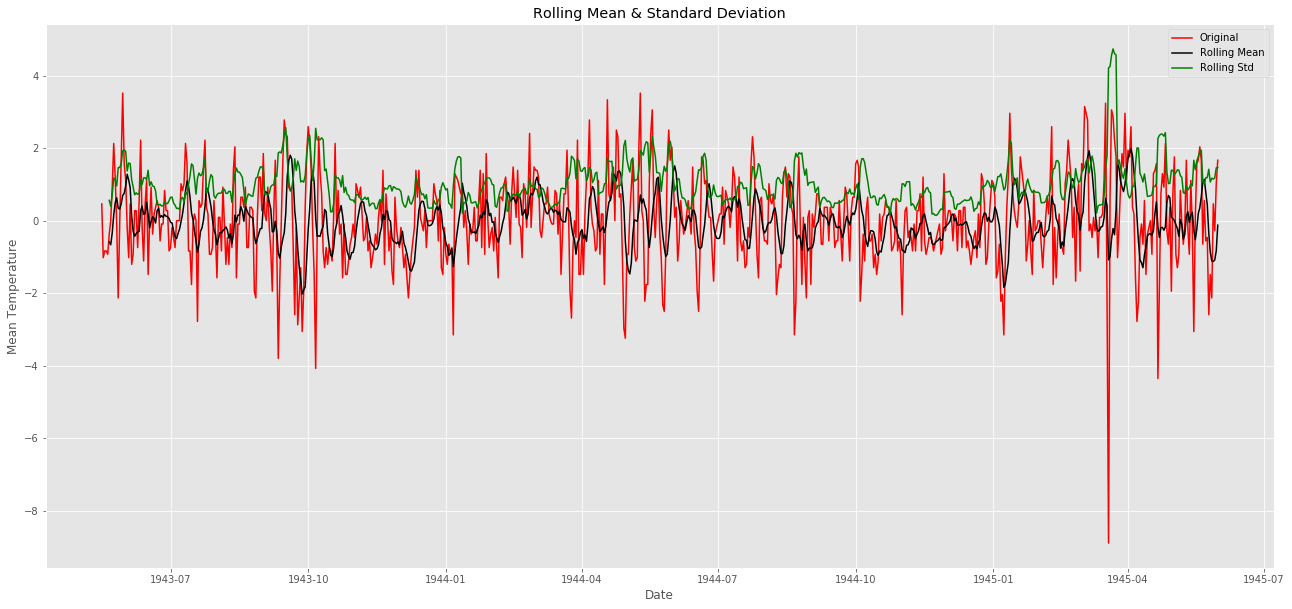
移動平均の値を元のplotから引いているようですね。こうすれば平均は0に近づくでしょう。
黒色のグラフを見ると一定になっていますね。定常にできました。
分散も一定のように見えました。定常にできていそうです。
Test statistic:  -11.138514335138474
p-value:  3.150868563164652e-20
Critical Values: {'1%': -3.4392539652094154, '5%': -2.86546960465041, '10%': -2.5688625527782327}
統計量を確認すると1%よりも小さい値を得られました。
これで定常にできたといえるでしょう。
周期性やトレンドの影響を取り除くための別の手法も見てみましょう。
別の手法でのアプローチ:トレンドをずらして差分をとってみる。
'''py
differencing method
ts_diff = ts - ts.shift()
plt.figure(figsize=(22,10))
plt.plot(ts_diff)
plt.title("Differencing method")
plt.xlabel("Date")
plt.ylabel("Differencing Mean Temperature")
plt.show()
'''
shift()を使うとdayの列はそのままに、valの列をひとつづつずらすことが出来る。ずらした場合、一行目のvalはNaNになる。
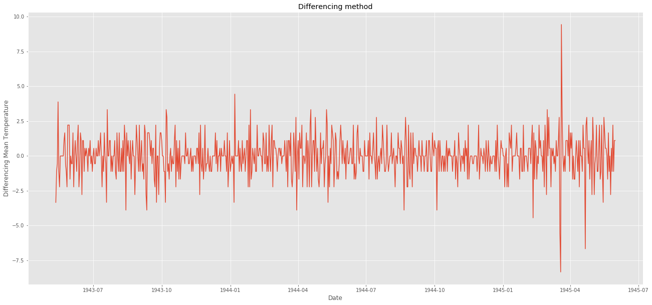
ts_diff.dropna(inplace=True) # due to shifting there is nan values
# check stationary: mean, variance(std)and adfuller test
check_mean_std(ts_diff)
check_adfuller(ts_diff.MeanTemp)
naを除いてローリング平均やローリング標準偏差と重ね合わせてみましょう。
Test statistic:  -11.678955575105366
p-value:  1.760207569355997e-21
Critical Values: {'1%': -3.439229783394421, '5%': -2.86545894814762, '10%': -2.5688568756191392}
統計量を確認してみても定常になっているようです。
(おそらくこれで終わりではなくてshiftを何パターンか繰り返して定常かどうか試してみるんですかね?半年分くらいずらして一致していれば定常になったってことで。)
時系列の予測(ようやくここでモデリング)
trendやseasonの影響を回避して定常データにするための二つの方法を使いました。
予測(prediction, forecasting)にはshiftさせたts_diffを使います。
わざわざ処理したts_diffを選んだのは.....特に意味はありません。
(本文中にはそんな風に書かれているが、実際にts_diffはACFとPACFでしか使われていない。実際のpredictionをするときにはtsを使用している。ts_diffをつかったら(1,1,1)になるのかな?)
予測手法はARIMAです。
ARIMA : Auto-Regressive Integrated Moving Averages
AR: Auto-Regressive (p): AR(p)
pが3であったとしましょう。その時は
x(t)を予測するのに三つ前までのデータを使って予測するのです。
※注 以下の式は感覚的なもので係数や誤差項など記入していません。
x(t-1) + x(t-2) + x(t-3) → x(t) という値が得られる
こんな感じという理解で。
I: Integrated (d):I(d)
季節性でない変化です。
今回はd=0を入れましょう。
MA: Moving Averages (q):MA(q)
移動平均です。
pdqというパラメータはARIMAのモデルに使用します。
pdqを選ぶためにACFやPACFを使います。
ACF:ある時点と過去の時点の相関を計測しています。
PACF:ある時点と過去の時点の相関を計算しますが、間のデータの影響を除いたものです。
# ACF and PACF
from statsmodels.tsa.stattools import acf, pacf
lag_acf = acf(ts_diff, nlags=20)
lag_pacf = pacf(ts_diff, nlags=20, method='ols')
# ACF
plt.figure(figsize=(22,10))

plt.subplot(121)
plt.plot(lag_acf)
plt.axhline(y=0,linestyle='--',color='gray')
plt.axhline(y=-1.96/np.sqrt(len(ts_diff)),linestyle='--',color='gray')
plt.axhline(y=1.96/np.sqrt(len(ts_diff)),linestyle='--',color='gray')
plt.title('Autocorrelation Function')

# PACF
plt.subplot(122)
plt.plot(lag_pacf)
plt.axhline(y=0,linestyle='--',color='gray')
plt.axhline(y=-1.96/np.sqrt(len(ts_diff)),linestyle='--',color='gray')
plt.axhline(y=1.96/np.sqrt(len(ts_diff)),linestyle='--',color='gray')
plt.title('Partial Autocorrelation Function')
plt.tight_layout()
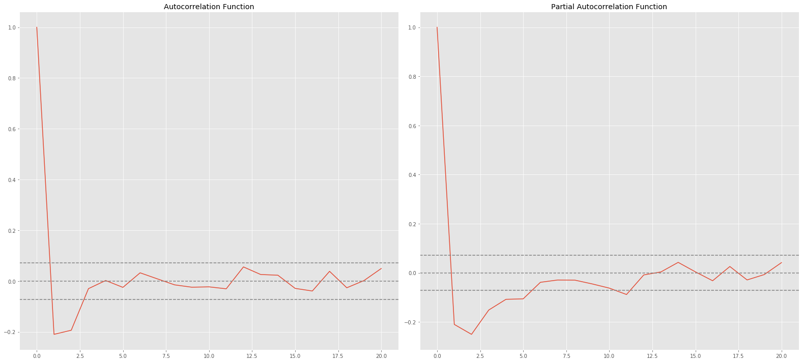
点線は信頼区間を表します。
pはPACFで上側信頼区間を横切った時のlag。p=1ですね
qはACFが初めて上側信頼区間を横切った時のlag。こちらもp=1
ここでARIMAのパラメータを(1,0,1)にして予測します
# ARIMA LİBRARY
from statsmodels.tsa.arima_model import ARIMA
from pandas import datetime
# fit model
model = ARIMA(ts, order=(1,0,1)) # (ARMA) = (1,0,1)
model_fit = model.fit(disp=0)
# predict
start_index = datetime(1944, 6, 25)
end_index = datetime(1945, 5, 31)
forecast = model_fit.predict(start=start_index, end=end_index)
# visualization
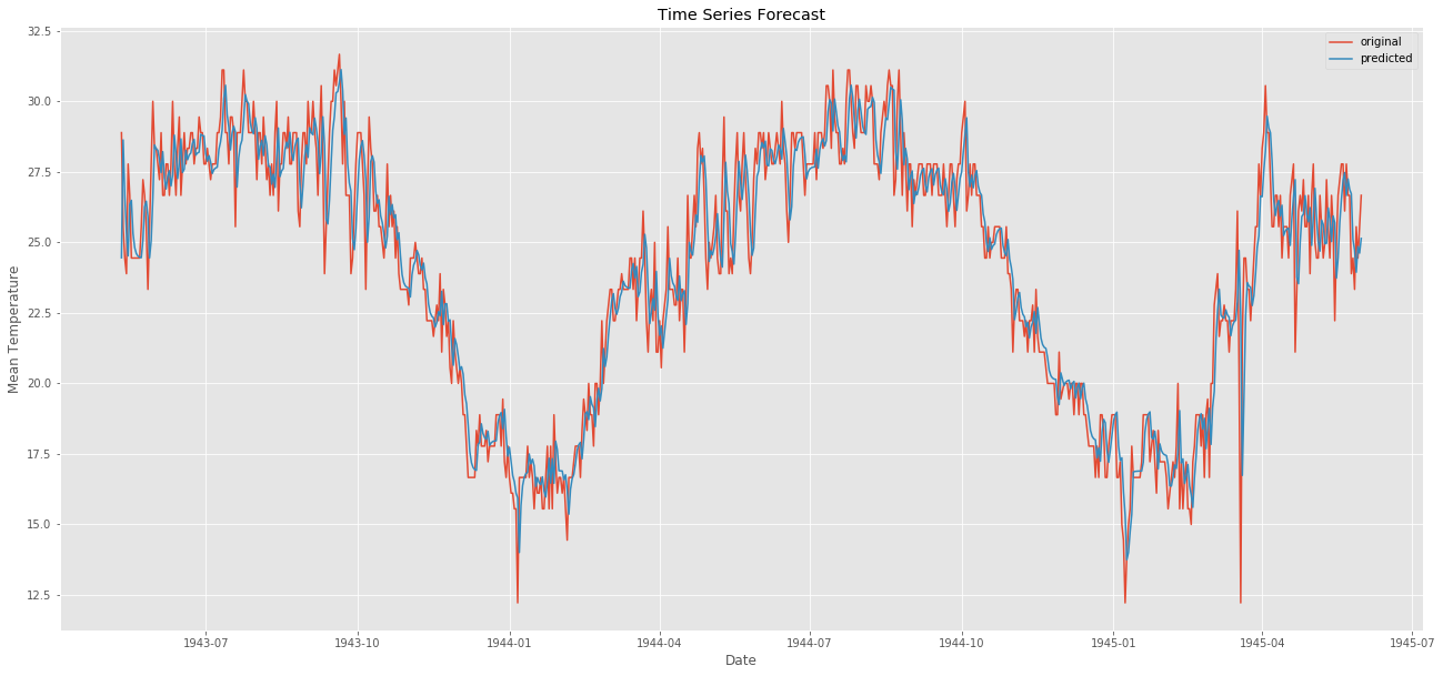
plt.figure(figsize=(22,10))
plt.plot(weather_bin.Date,weather_bin.MeanTemp,label = "original")
plt.plot(forecast,label = "predicted")
plt.title("Time Series Forecast")
plt.xlabel("Date")
plt.ylabel("Mean Temperature")
plt.legend()
plt.show()
元のデータが赤色で予測したものが青色です。
部分的じゃなく全体で予測してみましょう。
# predict all path
from sklearn.metrics import mean_squared_error
# fit model
model2 = ARIMA(ts, order=(1,0,1)) # (ARMA) = (1,0,1)
model_fit2 = model2.fit(disp=0)
forecast2 = model_fit2.predict()
error = mean_squared_error(ts, forecast2)
print("error: " ,error)
# visualization
plt.figure(figsize=(22,10))
plt.plot(weather_bin.Date,weather_bin.MeanTemp,label = "original")
plt.plot(forecast2,label = "predicted")
plt.title("Time Series Forecast")
plt.xlabel("Date")
plt.ylabel("Mean Temperature")
plt.legend()
plt.savefig('graph.png')

plt.show()
質問コメントの中で
Q:三つの基準「一定の平均、一定の分散、検定の統計量が優位か」を確認するとあるが、これのうちひとつでもやぶられていたらだめなのか?
A:一般的に言われる基準がこの三つです。破られてはだめです。
カーネルはここまで。
え?
爆破される場合予想できてなくない?
これで気温が25度よりも高いと予想されれば、天気予報の雨ように
空襲確率がニュースでながれるわけですかね。
夏は外に出歩かず、コンクリート塀の裏に隠れましょう?
先の予測トレンドが書けないので、近いうちに時系列データのpredictについて追加で追いかけてみます。
今回はここまで。