- 製造業出身のデータサイエンティストがお送りする記事
- 今回は自然言語データの可視化にnlplotというライブラリーが良さそうでしたので試してみました。
はじめに
今までずっと構造化データを扱っておりましたが、非構造化データも扱えるようになりたいと思い、まずは自然言語データを対象に可視化から勉強してみました。
nlplotとは
nlplotは基本的には、自然言語(NLP)において基本的な可視化を簡単にできるようにしたパッケージらしいです。
NLPにおいては、知識が無いので、詳しいことはnlplotのGithubを参考にご確認ください。
ブログの記事も見つけましたので、確認して頂けますと幸いです。
nlplotを使ってみる
今回、使用するデータはlivedoorニュースコーパスの「ldcc-20140209.tar.gz」を使います。
まず、データフレームを作成します。
import os
from glob import glob
import pandas as pd
import linecache
import nlplot
import plotly
from plotly.subplots import make_subplots

pd.set_option('display.max_columns', 300)
pd.set_option('display.max_rows', 300)
pd.options.display.float_format = '{:.3f}'.format
pd.set_option('display.max_colwidth', 5000)

# カテゴリを配列で取得
categories = [name for name in os.listdir("text") if os.path.isdir("text/" + name)]
print(categories)
# ['dokujo-tsushin', 'it-life-hack', 'kaden-channel', 'livedoor-homme', 'movie-enter', 'peachy', 'smax', 'sports-watch', 'topic-news']

df = pd.DataFrame(columns=["title", "category"])
for cat in categories:
    path = "text/" + cat + "/*.txt"
    files = glob(path)
    for text_name in files:
        title = linecache.getline(text_name, 3)
        s = pd.Series([title, cat], index=df.columns)
        df = df.append(s, ignore_index=True)

# データフレームシャッフル
df = df.sample(frac=1).reset_index(drop=True)
df.head()

次にデータを各々インスタンス化します。
# 全データ・livedoor-homme・#kaggleをそれぞれインスタンス化
npt = nlplot.NLPlot(df, target_col='title')
npt_livedoor = nlplot.NLPlot(df.query('category == "livedoor-homme"'), target_col='title')
npt_movie = nlplot.NLPlot(df.query('category == "movie-enter"'), target_col='title')
次にストップワードの計算をします。
# top_nで頻出上位単語, min_freqで頻出下位単語を指定できる
# 今回は上位5単語(livedoor-homme・movie-enter)をストップワードに指定
stopwords = npt.get_stopword(top_n=5, min_freq=0)
stopwords
# ['ゆるっとcafe', '【Sports', 'by', 'PHONE', '-']
ここから可視化になります。
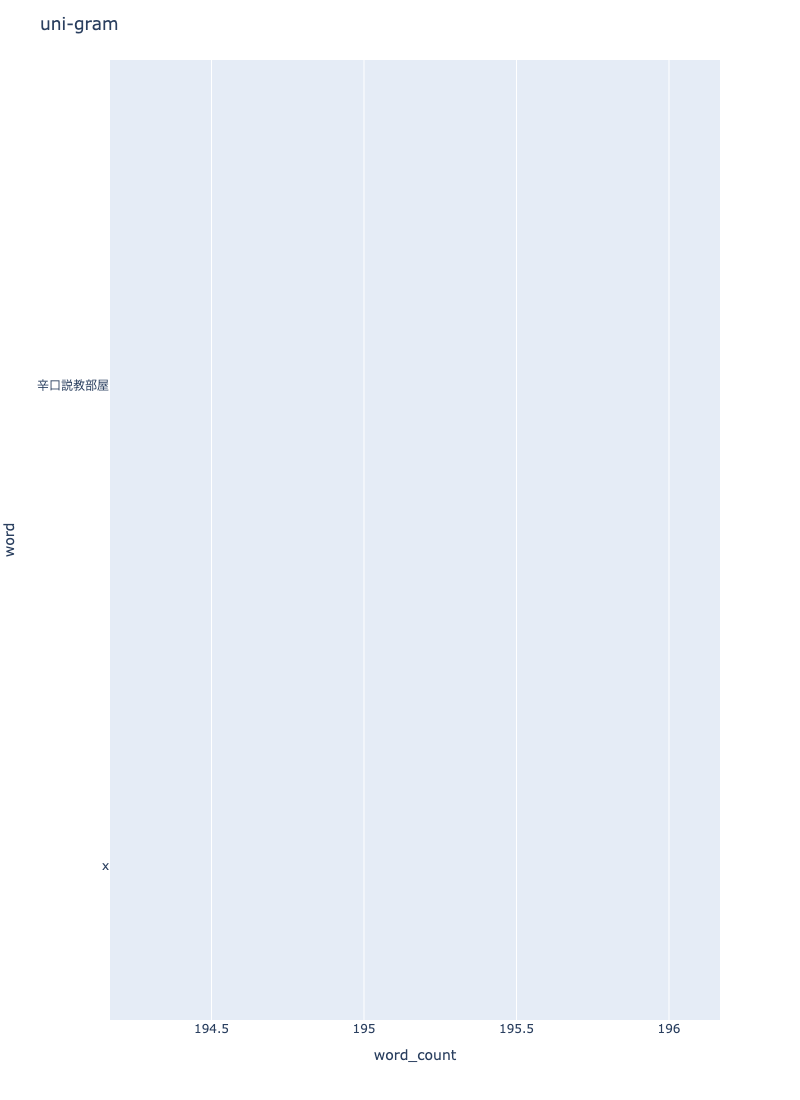
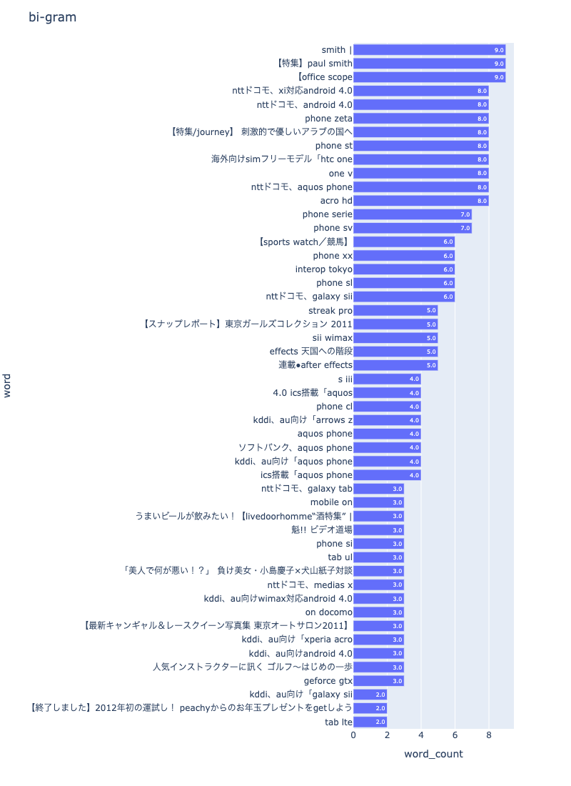
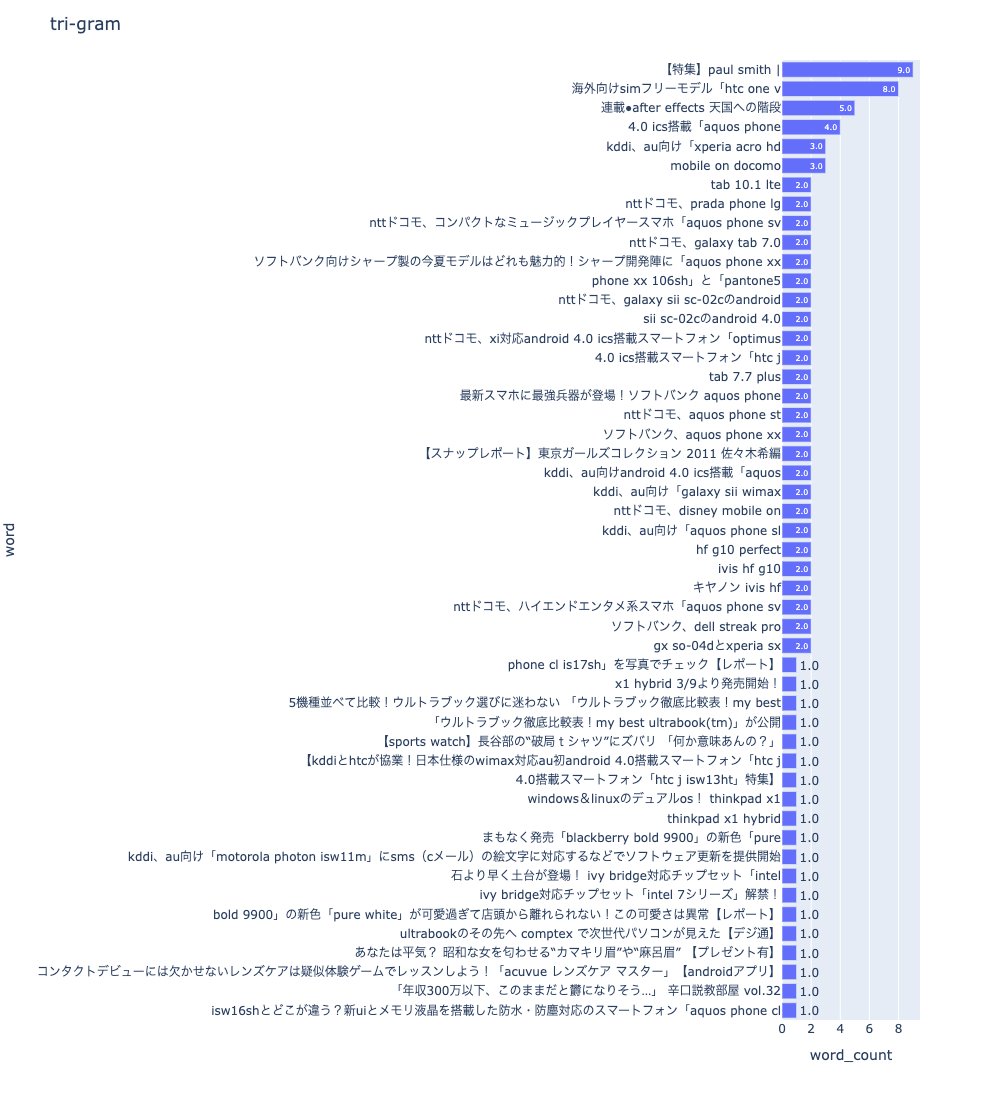
最初は「N-gram bar chart」です。
npt.bar_ngram(
    title='uni-gram',
    xaxis_label='word_count',
    yaxis_label='word',
    ngram=1,
    top_n=50,
    width=800,
    height=1100,
    color=None,
    horizon=True,
    stopwords=stopwords,
    verbose=True,
    save=False,
)
npt.bar_ngram(
    title='bi-gram',
    xaxis_label='word_count',
    yaxis_label='word',
    ngram=2,
    top_n=50,
    width=800,
    height=1100,
    color=None,
    horizon=True,
    stopwords=stopwords,
    verbose=True,
    save=False,
)
npt.bar_ngram(
    title='tri-gram',
    xaxis_label='word_count',
    yaxis_label='word',
    ngram=3,
    top_n=50,
    width=1000,
    height=1100,
    color=None,
    horizon=True,
    stopwords=stopwords,
    verbose=True,
    save=False,
)
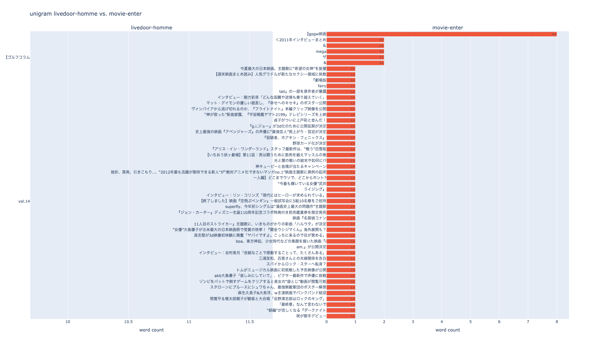
次はラベル毎に比較します。
# livedoor-hommeのfigを取得
fig_unigram_livedoor = npt_livedoor.bar_ngram(
    stopwords=stopwords,
    title='uni-gram',
    xaxis_label='word_count',
    yaxis_label='word',
    ngram=1,
    top_n=50,
    width=600,
    height=1100,
    color=None,
    horizon=True,
    verbose=True,
    save=False,
)

# movie-enterのfigを取得
fig_unigram_movie = npt_movie.bar_ngram(
    stopwords=stopwords,
    title='uni-gram',
    xaxis_label='word_count',
    yaxis_label='word',
    ngram=1,
    top_n=50,
    width=600,
    height=1100,
    color=None,
    horizon=True,
    verbose=True,
    save=False,
)

# subplot
trace1 = fig_unigram_livedoor['data'][0]
trace2 = fig_unigram_movie['data'][0]

fig = make_subplots(rows=1, cols=2, subplot_titles=('livedoor-homme', 'movie-enter'), shared_xaxes=False)
fig.update_xaxes(title_text='word count', row=1, col=1)
fig.update_xaxes(title_text='word count', row=1, col=2)

fig.update_layout(height=1100, width=1900, title_text='unigram livedoor-homme vs. movie-enter')
fig.add_trace(trace1, row=1, col=1)
fig.add_trace(trace2, row=1, col=2)

plotly.offline.plot(fig, filename='unigram livedoor-homme_vs_movie-enter.html', auto_open=False)

fig.show()
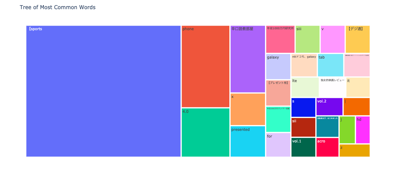
次はN-gram tree Mapを可視化してみます。
npt.treemap(
    title='Tree of Most Common Words',
    ngram=1,
    top_n=30,
    stopwords=stopwords,
)
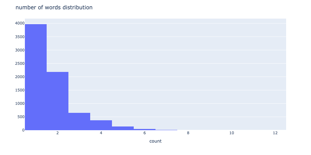
次は単語の出現頻度の分布を可視化します。
# 単語数の分布
npt.word_distribution(
    title='number of words distribution',
    xaxis_label='count',
    yaxis_label='',
    width=1000,
    height=500,
    color=None,
    template='plotly',
    bins=None,
    save=False,
)
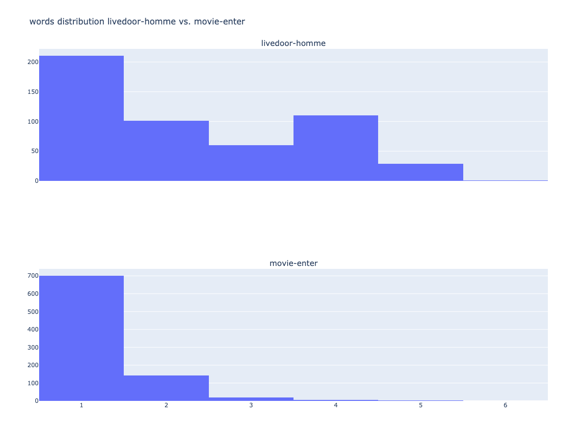
ラベル毎に出現頻度の分布も可視化できます。
# livedoor-hommeのfigを取得
fig_wd_livedoor = npt_livedoor.word_distribution(
    title='number of words distribution',
    xaxis_label='length',
    yaxis_label='',
    width=1000,
    height=500,
    color=None,
    template='plotly',
    bins=None,
    save=False,
)

# movie-enterのfigを取得
fig_wd_movie = npt_movie.word_distribution(
    title='number of words distribution',
    xaxis_label='length',
    yaxis_label='',
    width=1000,
    height=500,
    color=None,
    template='plotly',
    bins=None,
    save=False,
)

trace1 = fig_wd_livedoor['data'][0]
trace2 = fig_wd_movie['data'][0]

fig = make_subplots(rows=2, cols=1, subplot_titles=('livedoor-homme', 'movie-enter'), shared_xaxes=True)

fig.update_layout(height=900, width=1200, title_text='words distribution livedoor-homme vs. movie-enter')
fig.add_trace(trace1, row=1, col=1)
fig.add_trace(trace2, row=2, col=1)

plotly.offline.plot(fig, filename='words distribution #データサイエンティストvs#kaggle.html', auto_open=False)

fig.show()
良く見るword cloudも簡単に使えます。
npt.wordcloud(
    stopwords=stopwords,
    width=1000,
    height=600,
    max_words=100,
    max_font_size=100,
    colormap='tab20_r',
    mask_file=None,
    save=True
)

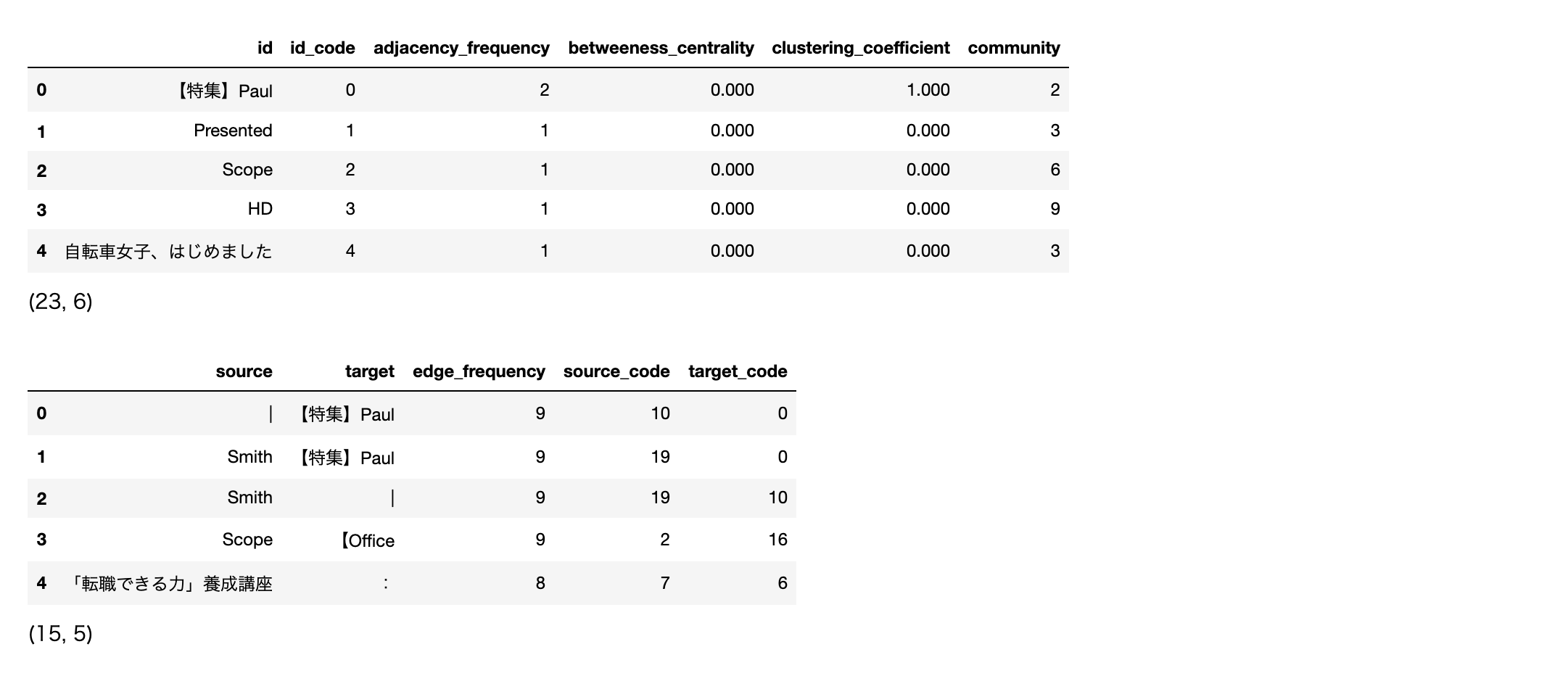
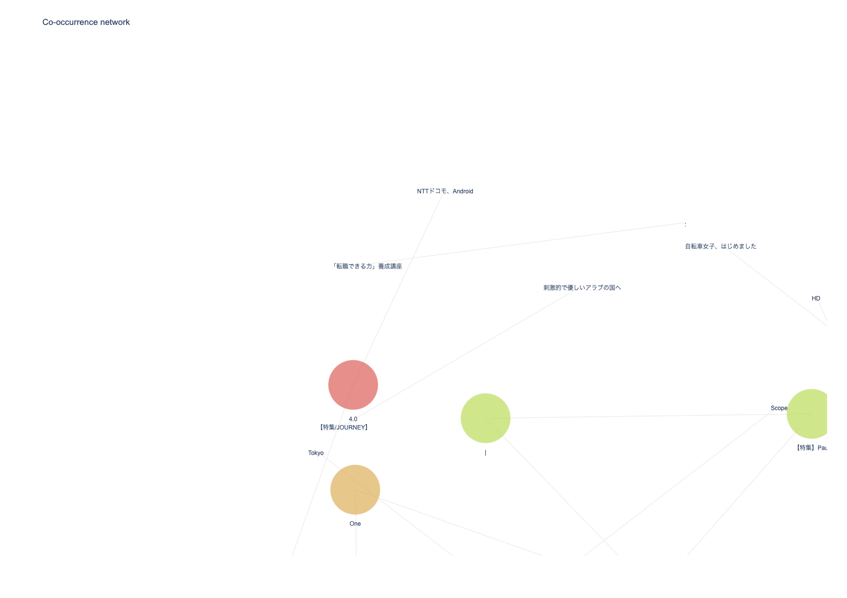
次は共起ネットワークの可視化です。
# ビルド(データ件数によっては処理に時間を要します)※ノードの数のみ変更
npt.build_graph(stopwords=stopwords, min_edge_frequency=5)

display(
    npt.node_df.head(), npt.node_df.shape,
    npt.edge_df.head(), npt.edge_df.shape
)

npt.co_network(
    title='Co-occurrence network',
)
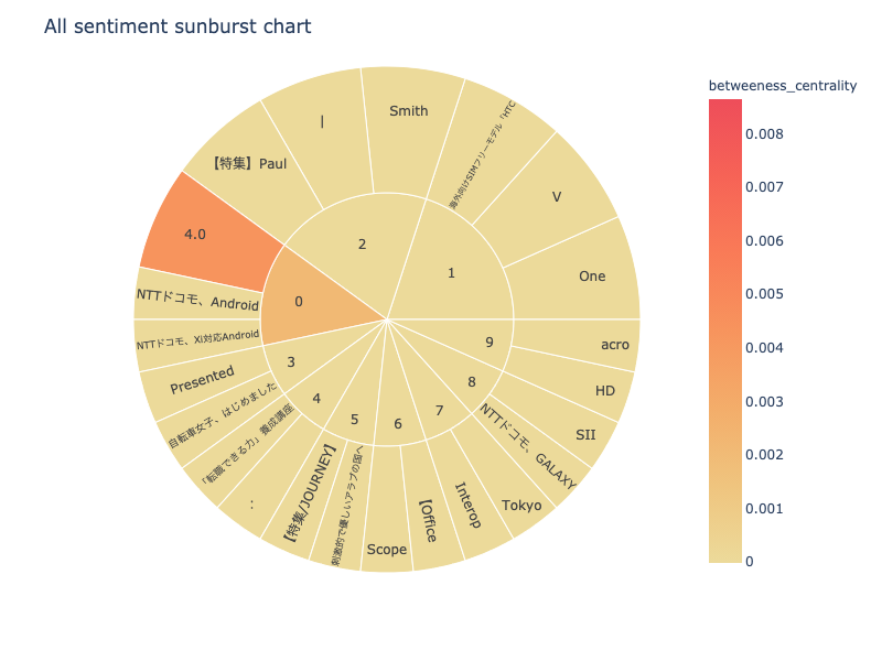
次は、sunburst chartを可視化します。
npt.sunburst(
    title='All sentiment sunburst chart',
    colorscale=True,
    color_continuous_scale='Oryel',
    width=800,
    height=600,
    save=True
)
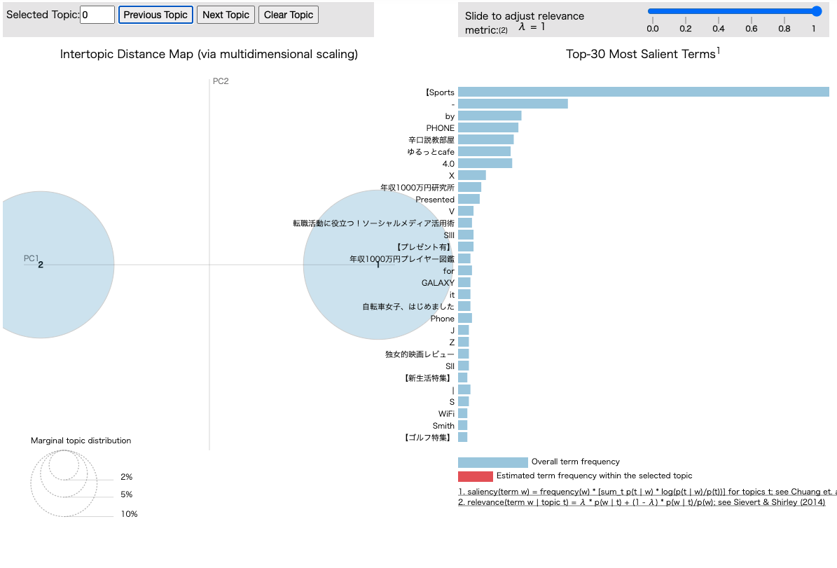
最後はpyLDAvisです。
npt.ldavis(num_topics=2, passes=5, save=True)
さいごに
最後まで読んで頂き、ありがとうございました。
今回、初めて自然言語の可視化ライブラリーnlplotを使って自然言語データの可視化をしてみました。
シンプルに可視化できて凄い良いですね。今後、非構造化データについても扱っていけるように勉強しようと思います。
訂正要望がありましたら、ご連絡頂けますと幸いです。