CSSを使っていい感じのテーブルを作ります。
※htmlはpug、cssはsassで記載します。
天板を作る
はじめに天板を作ります。
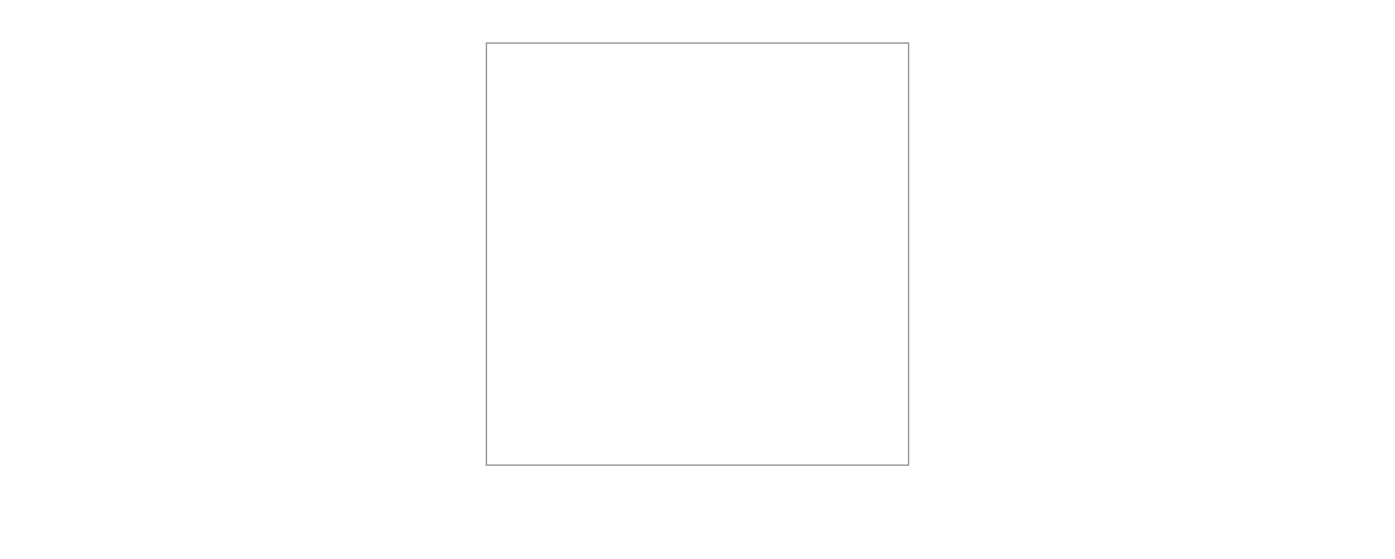
とりあえず板を一枚用意します。
table.pug
.table
  .tenban
.tenban
  width: 300px
  height: 300px
  border: 1px solid #999
  margin: 30px auto
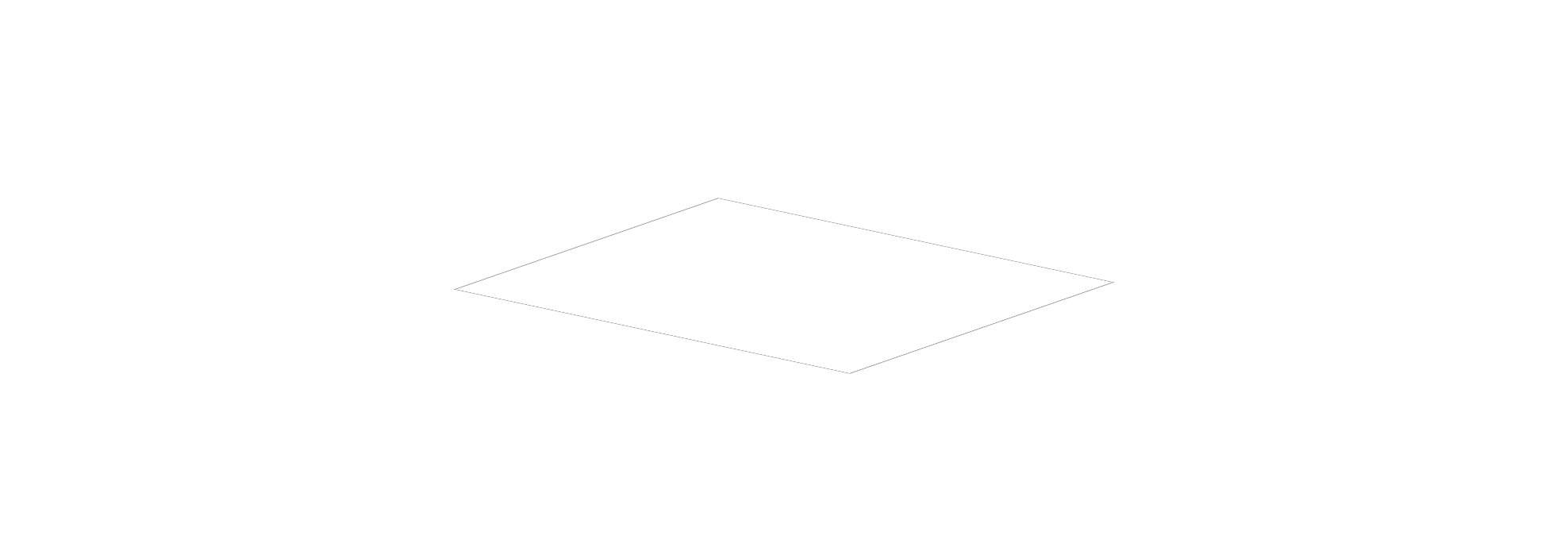
板の角度を変えてそれっぽい感じにします。
.tenban
  width: 300px
  height: 300px
  border: 1px solid #999
  margin: 30px auto

  // 追加
  transform: skew(5deg, 2deg) rotateX(75deg) rotateZ(35deg)
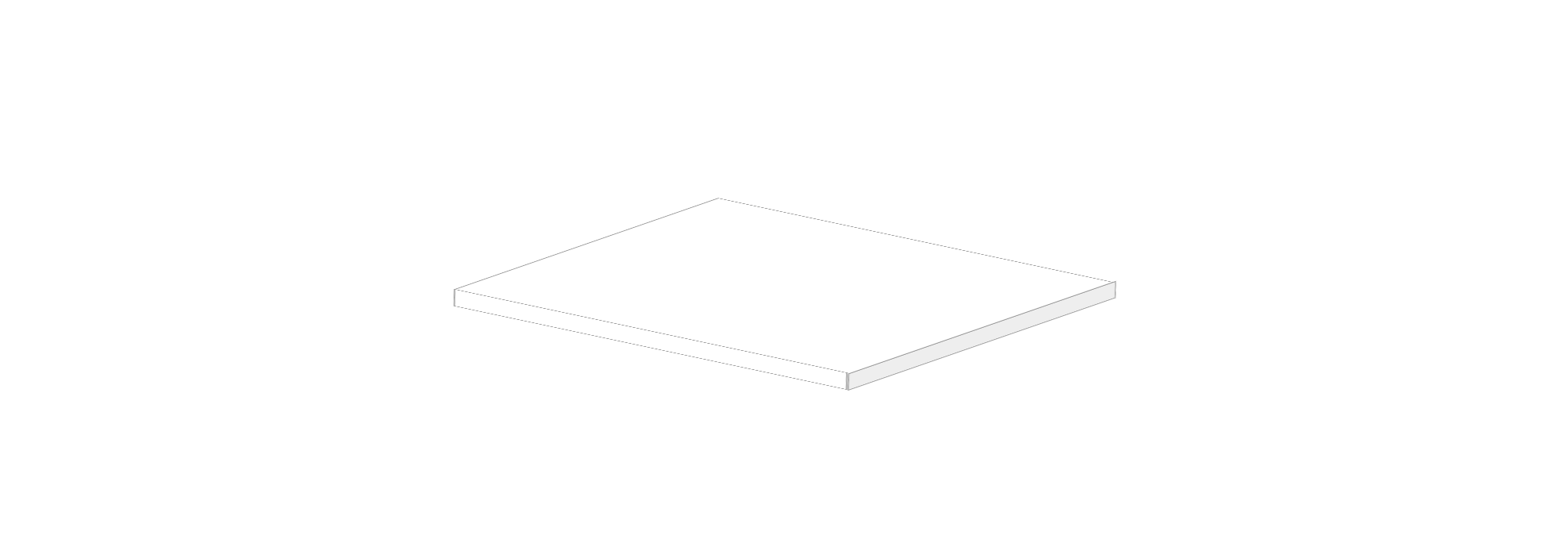
これでは板というより紙なので、板に厚みをもたせましょう。
table.pug
.table
  .tenban

    // - 追加
    .fuchi.temae
    .fuchi.migi
.tenban

  width: 300px
  height: 300px
  border: 1px solid #999
  margin: 30px auto
  transform: skew(5deg, 2deg) rotateX(75deg) rotateZ(35deg)

  // 以下追加
  .fuchi
    position: absolute
    border: 1px solid #999

    &.temae
      width: 100%
      height: 35px
      top: 100%
      left: 10px
      background-color: #fff
      transform: skew(33.5deg, 0)

    &.migi
      width: 23px
      height: 102%
      top: 13px
      left: 100%
      background-color: #eee
      transform: skew(0, 56.7deg)
脚を作る
脚を作ります。
table.pug
.table
  .tenban
    .fuchi.temae
    .fuchi.migi
    .ashi.oku
    .ashi.hidari
    .ashi.temae
    .ashi.migi
脚は位置をposition: absoluteで決める関係で、.tenbanの子要素にしておきます。
.ashi
  background-color: white
  width: 30px
  height: 500px
  border: 1px solid #999
  position: absolute
  transform: skew(34deg, 0) translate(34px, 200px)
  z-index: -1

  &.oku
    bottom: -40px
    left: 0

  &.hidari
    top: 100px
    left: 0

  &.temae
    top: 100px
    right: 0

  &.migi
    bottom: -40px
    right: 0
こんなペラペラの脚ではテーブルを支えられないので太く(見えるように)しましょう。
.ashi

  // 略

  &:before
    background-color: #eee
    border: 1px solid #999
    content: ''
    display: block
    width: 100%
    height: 100%
    position: absolute
    top: -19px
    left: 100%
    transform: skew(0deg, -56deg)

  // 以下略
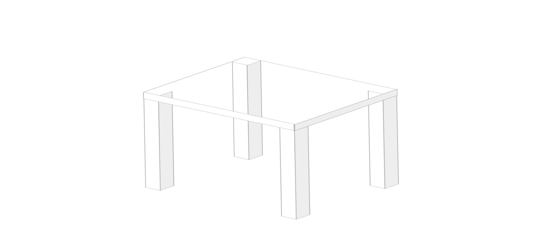
だいぶテーブルっぽさが出てきました。
天板が透けているので色を塗りましょう。
.tenban

  // 略

  &:before
    content: ''
    display: block
    width: 100%
    height: 100%
    background-color: white
    position: absolute
    top: 0
    left: 0
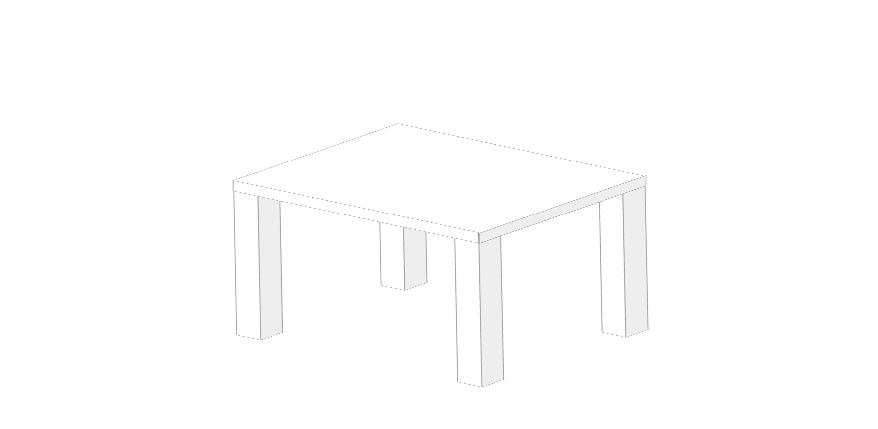
脚を天板の子要素にしているため、z-indexで天板を脚より上に重ねることができません。
そのため疑似要素を上に重ねることで天板を脚の上に載せることを実現しています。
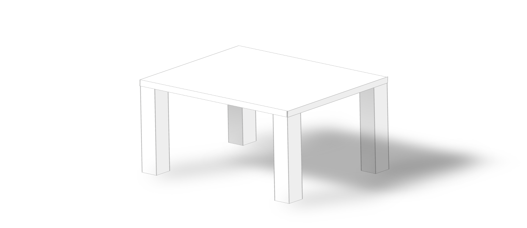
影をつける
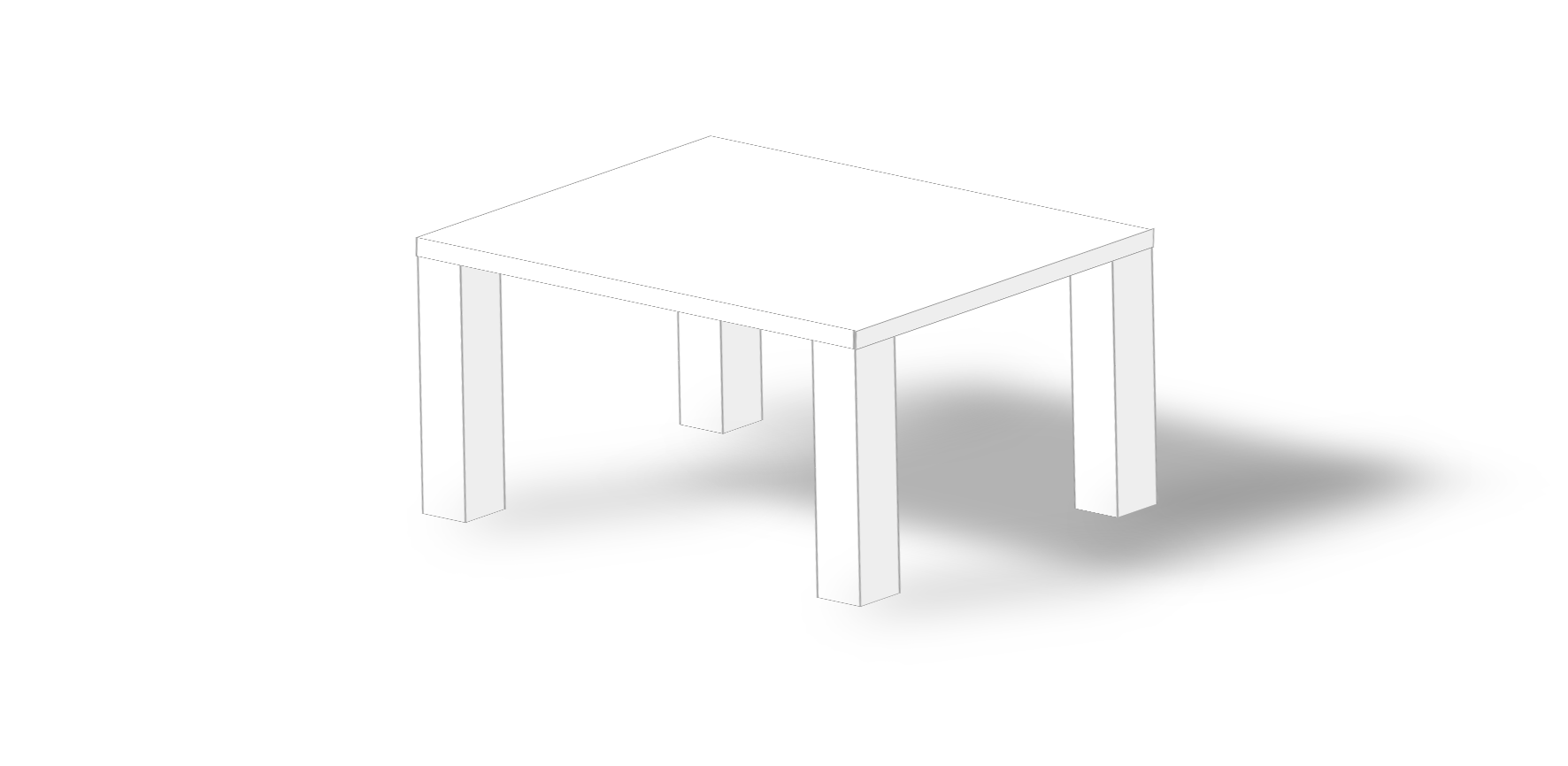
真っ白い空間に真っ白いテーブルでは味気ないので、影をつけてみます。
.tenban

  // 略

  &:after
    content: ''
    display: block
    width: 100%
    height: 100%
    background-color: #000
    position: absolute
    top: 113%
    left: 141%
    z-index: -2
    filter: blur(30px)
    opacity: 0.3

.ashi

  // 略

  &:after
    background-color: #000
    content: ''
    display: block
    width: 100%
    height: 50%
    position: absolute
    top: 55%
    left: 115px
    transform: rotateZ(48deg) skew(0deg, 42deg)
    filter: blur(30px)
    opacity: 0.3
    z-index: -2

  // 以下略
完成
あとは色々微調整をして完成です。
完成コード
table.pug
  .table
    .tenban
      .fuchi.temae
      .fuchi.migi
      .ashi.oku
      .ashi.hidari
      .ashi.temae
      .ashi.migi
table.sass
.tenban
  width: 300px
  height: 300px
  border: 1px solid #999
  margin: 30px auto
  transform: skew(5deg, 2deg) rotateX(75deg) rotateZ(35deg)
  position: relative

  &:before
    content: ''
    display: block
    width: 100%
    height: 100%
    background-color: white
    position: absolute
    top: 0
    left: 0

  &:after
    content: ''
    display: block
    width: 100%
    height: 100%
    background-color: #000
    position: absolute
    top: 113%
    left: 141%
    z-index: -2
    filter: blur(30px)
    opacity: 0.3

  .fuchi
    position: absolute
    border: 1px solid #999

    &.temae
      width: 100%
      height: 35px
      top: 100%
      left: 10px
      background-color: #fff
      transform: skew(33.5deg, 0)

    &.migi
      width: 23px
      height: 102%
      top: 13px
      left: 100%
      background-color: #eee
      transform: skew(0, 56.7deg)


.ashi
  background-color: white
  width: 30px
  height: 500px
  border: 1px solid #999
  position: absolute
  transform: skew(34deg, 0) translate(34px, 200px)
  z-index: -1

  &:before
    background-color: #eee
    border: 1px solid #999
    content: ''
    display: block
    width: 100%
    height: 100%
    position: absolute
    top: -19px
    left: 100%
    transform: skew(0deg, -56deg)

  &:after
    background-color: #000
    content: ''
    display: block
    width: 100%
    height: 50%
    position: absolute
    top: 55%
    left: 115px
    transform: rotateZ(48deg) skew(0deg, 42deg)
    filter: blur(30px)
    opacity: 0.3
    z-index: -2

  &.oku
    background: linear-gradient(#ddd, #fff)
    bottom: -40px
    left: 0

    &:before
    background: linear-gradient(#aaa, #ddd)

  &.hidari
    top: 100px
    left: 0

  &.temae
    top: 100px
    right: 0

  &.migi
    background: linear-gradient(#333, #eee)
    bottom: -40px
    right: 0
    z-index: -3

    &:after
    background: linear-gradient(#ccc, #eee)
まとめ
CSS初心者さん向けにposition, transform, filter, background: linear-gradient...などテーブルを作る際には必ず出てくるプロパティを使って、いい感じにテーブルを作りました。
webサイトでテーブルが必要になることはよくあると思いますので、参考になれば幸いです。
おしまい
…って、テーブルってそっち!?
というのがやりたかっただけです