続き:【ggplot2】 もっと・コロナウイルス感染者数を可視化しよう。 - Qiita
趣旨
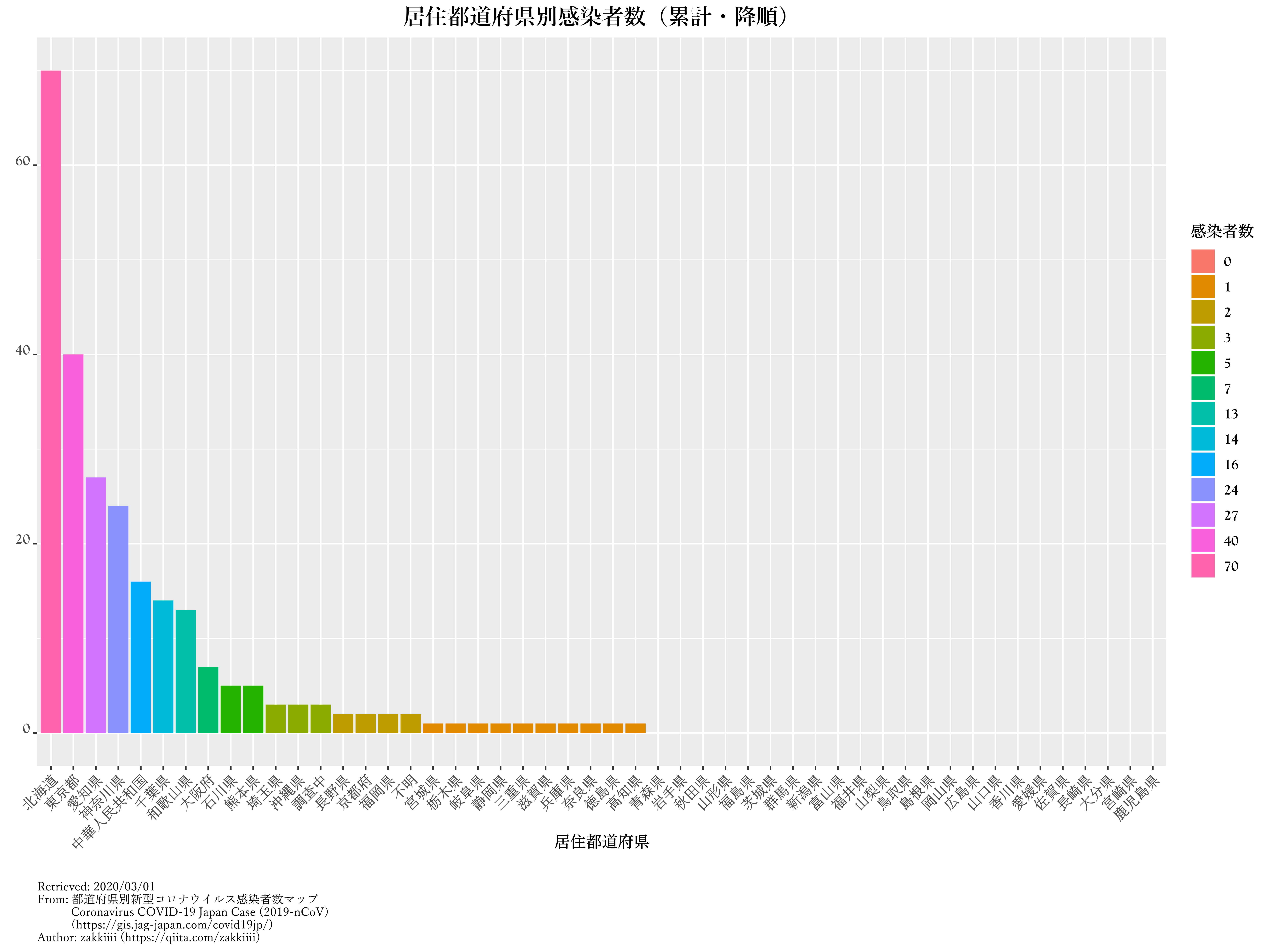
国内のコロナウイルス(COVIT-19)感染者数の状況をヒストグラムで可視化してみました。
最近ようやく慣れつつある{ggplot2}の練習で作ってみました。
想定より時間かかりました。
データ元
こちらからCSVファイルを拝借しました。
https://gis.jag-japan.com/covid19jp/
結果

難しかった点
・ 日付データの変換
非定型的な日付データにはそのうち出くわすと思っていたので、初めて触れられて良かったです。
・ 都道府県別の感染者数のカウント
最近知ったgroup_by()からのsummarize(.data, n = n())でカウントさせました。
{dplyr}で使えるコイツら、めちゃくちゃ便利です。
・ 都道府県順のソート
データセットをfactor型に変換して順序付けを行うことで解決しました。
基本的に避けてきたfactor型データの良い勉強になりました。
あと、group_by()でグループ化させた状態のままだと上手くソートできないので、summarize()で出力されるデータフレームを流用させました。
・ 降順でのソート
シンプルに手法を知らなかったので、今更ながら知れてよかったです。
http://tips-r.blogspot.com/2017/09/reorderggplot.html
・ プロットの微調整
{ggplot2}でキャプションや凡例を調整するのに手間取りました。
ただの修行僧。
スクリプト
# package required
library(dplyr)
library(stringr)
library(readxl)
library(foreach)
library(extrafont)
library(rvg)
library(ggplot2)

# EXCELでCSV⇒.XLSXに変換してから使用。
COVID_19 <- read_excel("dataset/COVID-19.xlsx")
cvd <- COVID_19[,c(1, 8, 10, 11, 16, 19, 20, 24, 25, 26)]
cvd$確定日 <- as.Date(cvd$確定日, "%m/%d/%y")
pref.data <- c("北海道","青森県","岩手県","宮城県", "秋田県",
               "山形県", "福島県", "茨城県", "栃木県", "群馬県",
               "埼玉県", "千葉県", "東京都", "神奈川県", "新潟県",
               "富山県", "石川県", "福井県", "山梨県", "長野県",
               "岐阜県", "静岡県", "愛知県", "三重県", "滋賀県",
               "京都府", "大阪府", "兵庫県", "奈良県", "和歌山県",
               "鳥取県", "島根県", "岡山県", "広島県", "山口県",
               "徳島県", "香川県", "愛媛県", "高知県", "福岡県",
               "佐賀県", "長崎県", "熊本県", "大分県", "宮崎県",
               "鹿児島県", "沖縄県", "中華人民共和国", "不明",
               "調査中")
pref.factor <- factor(pref.data, levels = pref.data)
cvd$居住都道府県 <- factor(cvd$居住都道府県, levels = pref.data)
cvd <- group_by(cvd, 居住都道府県)
kansen.n <- summarize(cvd, n = n())
kansen.n <- full_join(data.frame(居住都道府県 = pref.factor), kansen.n, by = "居住都道府県")
kansen.n$n[is.na(kansen.n$n)] <- 0

kansen.graph <- ggplot(kansen.n, aes(y = n,
                                     x = 居住都道府県,
                                     fill = factor(n)))+
  geom_bar(stat = "identity")+
  ggtitle("居住都道府県別感染者数(累計)") +
  labs(caption = paste("Retrieved: 2020/03/01 \nFrom: 都道府県別新型コロナウイルス感染者数マップ \n           Coronavirus COVID-19 Japan Case (2019-nCoV)\n           (https://gis.jag-japan.com/covid19jp/)\nAuthor: zakkiiii (https://qiita.com/zakkiiii)"),
       x = "居住都道府県",
       y= element_blank(),
       fill = "感染者数")+
  theme(plot.title = element_text(family = "Yu Mincho Demibold",
                                  size = 15,
                                  hjust = 0.5),
        axis.text.x = element_text(angle = 45,
                                   hjust = 1,
                                   family = "Yu Mincho Light",
                                   face = "bold",
                                   size = 10),
        axis.text.y = element_text(vjust = 0,
                                   family = "Goudy Old Style",
                                   face = "bold",
                                   size = 10),
        axis.title.x = element_text(family = "Yu Mincho",
                                    size = 11,
                                    vjust = 8,
                                    face = "bold"),
        axis.title.y = element_text(family = "Yu Mincho",
                                    size = 11,
                                    vjust = 1,
                                    face = "bold"),
        legend.text = element_text(family = "Goudy Old Style",
                                   face = "bold",
                                   size = 10),
        legend.title = element_text(family = "Yu Mincho",
                                    size = 11,
                                    vjust = 1,
                                    face = "bold"),
        plot.caption  = element_text(family = "Yu Mincho", size = 8, hjust = 0))

kansen.graph.d <- ggplot(kansen.n, aes(y = n,
                                       x = reorder(居住都道府県, -n),
                                       fill = factor(n)))+
  geom_bar(stat = "identity")+
  ggtitle("居住都道府県別感染者数(累計・降順)") +
  labs(caption = paste("Retrieved: 2020/03/01 \nFrom: 都道府県別新型コロナウイルス感染者数マップ \n           Coronavirus COVID-19 Japan Case (2019-nCoV)\n           (https://gis.jag-japan.com/covid19jp/)\nAuthor: zakkiiii (https://qiita.com/zakkiiii)"),
       x = "居住都道府県",
       y= element_blank(),
       fill = "感染者数")+
  theme(plot.title = element_text(family = "Yu Mincho Demibold",
                                  size = 15,
                                  hjust = 0.5),
        axis.text.x = element_text(angle = 45,
                                   hjust = 1,
                                   family = "Yu Mincho Light",
                                   face = "bold",
                                   size = 10),
        axis.text.y = element_text(vjust = 0,
                                   family = "Goudy Old Style",
                                   face = "bold",
                                   size = 10),
        axis.title.x = element_text(family = "Yu Mincho",
                                    size = 11,
                                    vjust = 8,
                                    face = "bold"),
        axis.title.y = element_text(family = "Yu Mincho",
                                    size = 11,
                                    vjust = 1,
                                    face = "bold"),
        legend.text = element_text(family = "Goudy Old Style",
                                   face = "bold",
                                   size = 10),
        legend.title = element_text(family = "Yu Mincho",
                                    size = 11,
                                    vjust = 1,
                                    face = "bold"),
        plot.caption  = element_text(family = "Yu Mincho", size = 8, hjust = 0))
svg(file = "kansen.svg", width = 12, height = 9, bg = "white")
kansen.graph
dev.off()
svg(file = "kansen_d.svg", width = 12, height = 9, bg = "white")
kansen.graph.d
dev.off()
おわりに
手洗い・うがいで乗り切りましょう。
おしまい。
参考文献
- as.Date: Date Conversion Functions to and from Character
- How To Easily Customize GGPlot Legend for Great Graphics - Datanovia
- ggplot2 legend : Easy steps to change the position and the appearance of a graph legend in R software - Easy Guides - Wiki - STHDA
- r - Changing fonts in ggplot2 - Stack Overflow
- r - Plotting order for ggplot groups with repeated factors - Stack Overflow
- R Graphics Devices for Vector Graphics Output • rvg
- reorderを使ってggplotの棒グラフの並び順を降順にする方法 - Rプログラミングの小ネタ
- グループ化 - group_by関数
- 超初心者向けのRガイド
- 都道府県別新型コロナウイルス感染者数マップ Coronavirus COVID-19 Japan Case (2019-nCoV)
(拙著)