この記事の目的
データ分析の最初に行う, EDA(探索的データ解析)においてよく使うコードをメモしておく.
今回は特に, 分類問題(タイタニック号の乗客生存予測など)の場合を想定している.
コード解説
ライブラリ読み込み
import numpy as np
import pandas as pd
pd.set_option('display.max_columns', 100)

import seaborn as sns
import matplotlib.pyplot as plt
import japanize_matplotlib

import os
from tqdm import tqdm
import warnings
warnings.filterwarnings('ignore')
データの読み込み
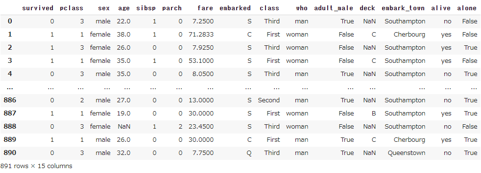
df = sns.load_dataset("titanic")
df = df.replace(float("nan"),np.nan) #後のunique()の計算のため
df
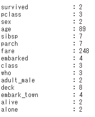
ぞれぞれの変数の中身を確認
for colname in df.columns:
    uni = len(df[colname].unique())
    print("{0:<20} : {1}".format(colname, uni))
目的変数の設定, 変数の型定義
target="survived"
cate_list = ["pclass", "sex", "sibsp", "parch", "embarked", "class",
                 "who", "adult_male", "deck", "embark_town", "alone"] #aliveは無視
num_list = ["age", "fare"]
all_list = cate_list + num_list
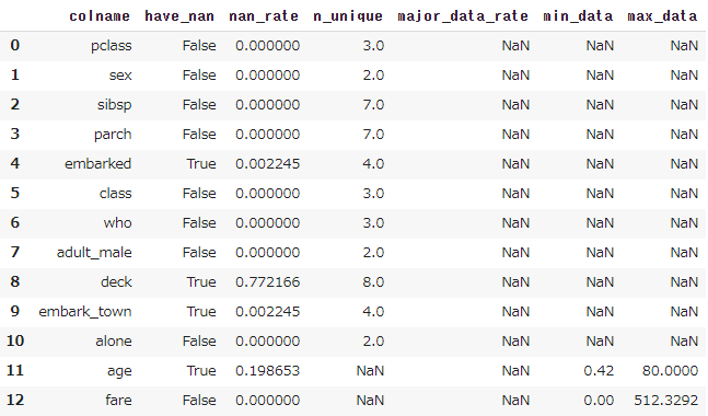
NaNなどの確認
こちら の記事を参照
カテゴリカルデータ
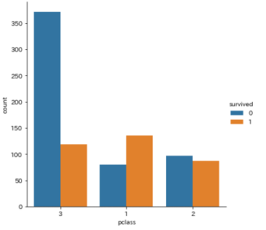
まず簡単に確認するだけなら, 以下の2種類のようにかける.
sns.countplot(x="pclass", hue=target, data=df)
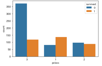
sns.catplot(x="pclass", hue=target, data=df,kind="count")
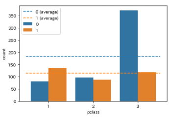
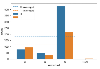
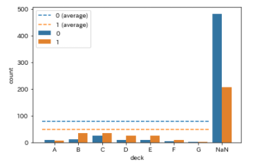
さらに, NaNや平均についても知りたい場合は以下の関数を定義して使う.
def category_plot(x, hue, data, order=[]):
    #NaNを文字列に
    flag_nan = False
    data[x] = data[x].astype("str").replace("nan","NaN")
    if "NaN" in data[x].values:
        flag_nan = True

    x_unique_list = sorted(data[x].unique())
    x_unique_len = len(x_unique_list)
    x_unique_len_dropna = x_unique_len-1 if flag_nan else x_unique_len

    hue_unique_list = sorted(data[hue].unique())
    hue_unique_len = len(hue_unique_list)

    if order==[]:
        if flag_nan:
            order = x_unique_list
            order.remove("NaN")
            order = order + ["NaN"]
        else:
            order = x_unique_list
    else:
        pass

    colors = plt.get_cmap("tab10").colors

    sns.countplot(x=x, hue=hue, data=data, order=order,hue_order=hue_unique_list)

    for i,ui in enumerate(hue_unique_list):
        h = data.loc[data[hue]==ui,:].shape[0] / x_unique_len_dropna
        plt.plot([0-0.5,x_unique_len_dropna-1+0.5],[h,h],color=colors[i], linestyle="dashed", label="{0} (average)".format(ui))
    plt.legend()
    plt.show()
category_plot(x="pclass", hue=target, data=df)
category_plot(x="embarked", hue=target, data=df)
category_plot(x="deck", hue=target, data=df)
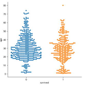
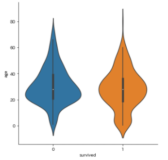
数値データ
以下の2種類のプロットを見れば大体OK
sns.catplot(x=target, y="age", data=df,kind="swarm")
sns.catplot(x=target, y="age", data=df,kind="violin")
参考
seaborn:seaborn.catplot
seaborn:seaborn.countplot