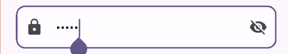
パスワード入力では、入力内容を隠す(マスクする)だけでなく、
「表示・非表示を切り替える機能」もよく使われます。
今回はその実装方法を紹介します。
実装イメージ
class PasswordField extends StatefulWidget {
  final Function(String) onChanged;

  const PasswordField({super.key, required this.onChanged});

  @override
  State<PasswordField> createState() => _PasswordFieldState();
}

class _PasswordFieldState extends State<PasswordField> {
  bool obscure = true;

  @override
  Widget build(BuildContext context) {
    return TextField(
      obscureText: obscure,
      onChanged: widget.onChanged,
      decoration: InputDecoration(
        hintText: 'パスワード',
        prefixIcon: const Icon(Icons.lock),
        suffixIcon: IconButton(
          icon: Icon(obscure ? Icons.visibility_off : Icons.visibility),
          onPressed: () {
            setState(() {
              obscure = !obscure;
            });
          },
        ),
        filled: true,
        fillColor: Colors.white.withValues(alpha: 0.6),
        border: OutlineInputBorder(borderRadius: BorderRadius.circular(12)),
      ),
    );
  }
}
obscureText: obscure,
trueのとき、入力された文字が「●●●」のように隠されます。
obscure = !obscure;
ボタン押下時にtrue / falseを切り替えることで、
パスワードの表示状態を変更しています。
suffixIcon: IconButton(...)
入力欄の右側にボタンを配置しています。
使用方法
String password = '';


PasswordField(
  onChanged: (value) {
    setState(() {
      password = value;
    });
  },
),
以上で、パスワード入力UIの作成は完了です。
今回はシンプルにTextFieldで実装しましたが、
Flutterにはバリデーションが簡単に行えるTextFormFieldも用意されています。
こちらについては次回解説していきます。