この記事は、Speee Advent Calender 2016の20日目です。
簡単に自己紹介
大学院をやめ、今年の10月から新卒で働いています。
現在はレコメンドアルゴリズムの調査・精度検証を主に行っています。
ダッシュボードがRで作れる?!
A/Bテストの実行中、パフォーマンスや異常がないかをリアルタイムで確認したい。
そのためには、ダッシュボードは必須ですよね!!
今回は、簡単なダッシュボードをRを用いて作ってみたいと思います。
エンジニアではない人でもわかるように書いてみたので冗長な部分もあるかもしれませんが、ご了承ください。
使用するパッケージ
- shinydashboard
- dplyr(Rでデータ整形する際には必須!!)
参考記事:dplyrを使いこなす!基礎編
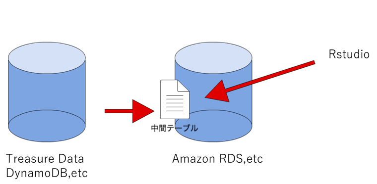
今回は、TreasureDataやdynamodbのようなDBに溜まっているデータからダッシュボード用に中間テーブルを作成して適当な場所へ予め置いておきます。そして、リアルタイムでそのテーブルを取ってきて、整形・可視化するという設定で進めます。
shinydashboardの基本的構造
shinydashboardは,基本的にuiとserverの2つで構成されています。
uiでダッシュボードの仕様を指定し、serverで表示するものを指定します。
家で例えるなら、uiが間取りで、serverが家具みたいな感じ、、、です。
ui
基本構造
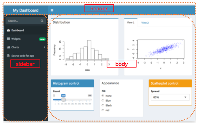
基本的にheader、sidebar、bodyの3つに分かれます。
header

- ダッシュボードの上帯の部分
ダッシュボードの名前を入れたり、異常検知のフラグを付けたりできます。
sidebar
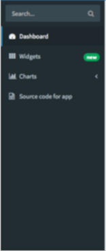
- ダッシュボードの横帯の部分
複数ページにしたい場合は、sidebar上で指定します。
body
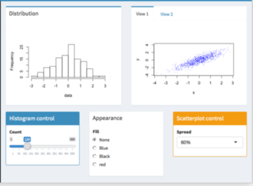
- ダッシュボード本体の部分
自分で好きなように箱を設定して概形を作ります。
server
uiで作った箱のなかに、入れたいアプリケーションを定義していきます。
uiで各々の箱に定義したIDでserverと紐付けます。
コード例(上のダッシュボードの例)
githubに上げられているコードに説明を加えています。
ui
#header
header <- dashboardHeader(
  title = "My Dashboard"
)

#sidebar
sidebar <- dashboardSidebar(
      sidebarSearchForm(label = "Search...", "searchText", "searchButton"),
  sidebarMenu(
    #複数ページにする場合はここでタブを設定
    menuItem("Dashboard", tabName = "dashboard", icon = icon("dashboard")),
    menuItem("Widgets", icon = icon("th"), tabName = "widgets", badgeLabel = "new",
             badgeColor = "green"
    ),
    #タブをネストにすることも可能
    menuItem("Charts", icon = icon("bar-chart-o"),
      menuSubItem("Chart sub-item 1", tabName = "subitem1"),
      menuSubItem("Chart sub-item 2", tabName = "subitem2")
    ),
    menuItem("Source code for app", icon = icon("file-code-o"),
      href = "https://github.com/rstudio/shinydashboard/blob/gh-pages/_apps/sidebar/app.R"
    )
  )
)

#body
body <- dashboardBody(
  tabItems(
    #sidebarで定義した"dashboard"タブのbodyを作る
    tabItem("dashboard",
      #1列目
      fluidRow(
        #ボックスを作る
        box(
          title = "Distribution",
          status = "primary",
          #plotする場所を定義し、IDを付与する
          plotOutput("plot1", height = 240),
          height = 300
        ),
        #タブの付いたボックスを作ることも可能
        tabBox(
          height = 300,
          tabPanel("View 1",
            plotOutput("scatter1", height = 230)
          ),
          tabPanel("View 2",
            plotOutput("scatter2", height = 230)
          )
        )
      ),

      # 2列目
      fluidRow(
        #リアクティブな機能も簡単に作れる
        box(
          title = "Histogram control", width = 4, solidHeader = TRUE, status = "primary",
          sliderInput("count", "Count", min = 1, max = 500, value = 120)
        ),
        box(
          title = "Appearance",
          width = 4, solidHeader = TRUE,
          radioButtons("fill", "Fill", # inline = TRUE,
            c(None = "none", Blue = "blue", Black = "black", red = "red")
          )
        ),
        box(
          title = "Scatterplot control",
          width = 4, solidHeader = TRUE, status = "warning",
          selectInput("spread", "Spread",
            choices = c("0%" = 0, "20%" = 20, "40%" = 40, "60%" = 60, "80%" = 80, "100%" = 100),
            selected = "60"
          )
        )
      )


    )
  )
)
server
server <- function(input, output) {

  set.seed(122)
  histdata <- rnorm(500)
  #uiで付与した"plot1"の場所にplotするものを定義
  output$plot1 <- renderPlot({
    if (is.null(input$count) || is.null(input$fill))
      return()

    data <- histdata[seq(1, input$count)]
    color <- input$fill
    if (color == "none")
      color <- NULL
    hist(data, col = color, main = NULL)
  })

  output$scatter1 <- renderPlot({
    spread <- as.numeric(input$spread) / 100
    x <- rnorm(1000)
    y <- x + rnorm(1000) * spread
    plot(x, y, pch = ".", col = "blue")
  })

  output$scatter2 <- renderPlot({
    spread <- as.numeric(input$spread) / 100
    x <- rnorm(1000)
    y <- x + rnorm(1000) * spread
    plot(x, y, pch = ".", col = "red")
  })
}

shinyApp(ui, server)
さらにリッチなダッシュボードにするには、
さらにplotlyなどの可視化パッケージを用いることで、可視化の幅が広がります。
plotlyには無料版と有料版がありますが、無料版で十分利用できます。
インタラクティブな作図が可能で、種類も豊富です。
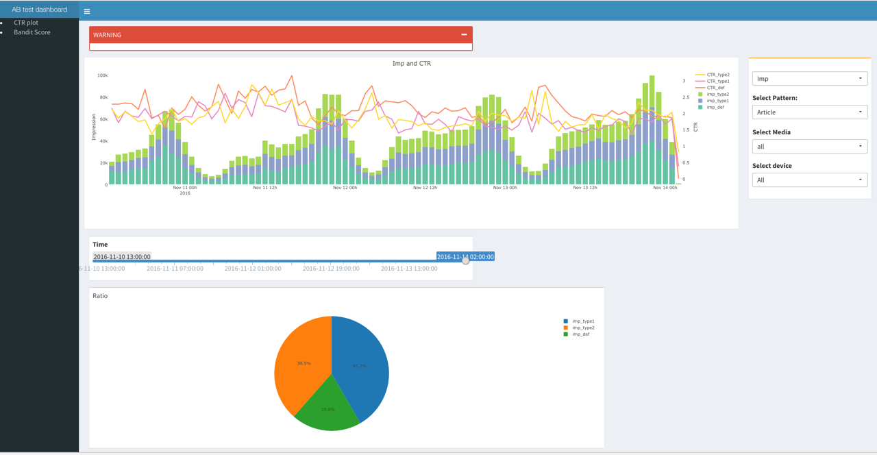
実際に作ってみた結果がこちら(こちらは自作です)
複数人で共有したい場合は、
サーバ上に、shinyserverを立てておき、
/srv/shiny-server/上に作成したソースコード(app.R)が入っているディレクトリを作成すれば、複数人で同時に閲覧することができます。
参考:
Rstudio serverのインストール方法
Shiny serverのインストール方法
まとめ
- 最初は作るのに時間はかかるかもしれませんが、1回作っておくと次回から簡単に使いまわしできます。
- 作り始めるとよりリッチなものを作りたくなります。(私だけかもしれませんが、、、)
ただ、必要以上に工数をかけるのではなく、ダッシュボードを利用する人はそれを見て何を確認したいのか、何があると必要十分なのかを抑えることが重要です。
年末年始のまとまった時間で一度作ってみてはいかがでしょうか?!