はじめに
Pythonで可視化したい場合
- pandasでCSV化してExcelでグラフ化
- Pythonのグラフライブラリで可視化
- matplotlib
- seaborn
- Mayavi
- Plotly
- bokeh
- holoviews
- pandasでCSV化してRDBに投入して、BIツールで分析
- metabase
- Redash
Bokehを使った経緯
- Pythonで公開APIにアクセスし、取得したデータを可視化したい
- 取得できるデータは日々変わるので、「CSV→Excelでグラフ表示」は面倒
- matplotlibで可視化してみたけど、分析しづらい
- インタラクティブなBokehを使おう!
matplotlib
matplotlibとは
- グラフ描画ライブラリ
- 2003年リリース
- ほとんどのPython入門本で紹介されている(はず)
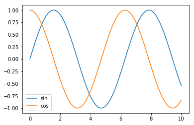
matplotlibでグラフを表示
import matplotlib.pyplot as plt

x=np.linspace(0,10,100)
y1=np.sin(x)
y2=np.cos(x)

fig, ax = plt.subplots()
ax.plot(x,y1, label="sin")
ax.plot(x,y2, label="cos")
ax.legend()
plt.show()
matplotlibのイケてないこと
- 些細なことだと...
- デフォルトで目盛が表示されない
- デフォルト(のフォント設定)では、日本語が表示できない
- 見た目が古い
- 出力結果が画像であるため、対話的な操作ができない
- ある範囲を拡大して表示できない
- プロットした線を非表示にできない(sinカーブを非表示)
- プロットした点の詳細な値を確認できない
Bokeh
Bokehとは?
インタラクティブなデータ可視化ライブラリ
https://bokeh.pydata.org/en/latest/
- js, cssが組み込まれたHTMLファイルを生成
- インタラクティブな操作が可能
- グラフをドラッグして拡大縮小、要素や範囲を選択
- ボタンやスライダーなどの表示
- IPython, Jupyter Notebookに対応
- 読み方は「ボケ」(写真のボケと綴りが同じ)
http://shirabeta.net/Python-Visualization-Bokeh-basic-plotting.html#bokehbokeh 参考
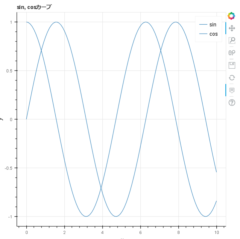
Bokehでグラフを表示
from bokeh.plotting import figure, output_file, show, reset_output

# 出力設定
reset_output()

output_file("graph.html")

TOOLTIPS = [
    ("index", "$index"),
    ("(x,y)", "($x, $y)"),
]

# グラフ設定
p = figure(tooltips=TOOLTIPS, title="sin, cosカーブ", x_axis_label="x", y_axis_label="y")

# プロット
p.line(x, y1, legend="sin")
p.line(x, y2, legend="cos")

# 凡例をクリックしたときにプロットを非表示にする
p.legend.click_policy = "hide"

# グラフ表示
show(p)
出力結果(graph.html)
以下の機能が利用できる
- Pan(移動)
- Wheel Zoom
- Save
- tooltip(プロットにカーソルを当てる)
- 凡例の表示/非表示切り替え
Jupyter Notebookでグラフを表示
output_file()でなくoutput_notebook()を使用する。
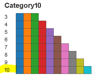
プロットごとに色を変える方法
デフォルトでは色を変えてくれない
my_palette = bokeh.palettes.Category10[10]
p.line(x, y1, legend="sin", line_color=my_palette[0])
p.line(x, y2, legend="cos", line_color=my_palette[1])
個人的にtooltip機能がおすすめ
- 詳細情報を表示できるので、グラフが大きく変化している部分を分析できる
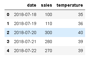
アイスの売り上げをグラフ化
df = pd.read_csv("icecream.csv")
df["date"] = pd.to_datetime(df['date'])
print(df)
from bokeh.plotting import ColumnDataSource
from bokeh.models import HoverTool

arr2d = [[datetime.date(2018, 7, 18), 100, 35],
        [datetime.date(2018, 7, 19), 110, 36],
        [datetime.date(2018, 7, 20), 300, 40],
        [datetime.date(2018, 7, 21), 280, 39],
        [datetime.date(2018, 7, 22), 270, 39],
]
df = pd.DataFrame(arr2d, columns=["date", "sales", "temperature"])
# df["date"] = pd.to_date(df["date"])

reset_output()
output_file("icecream.html")

hover_tool = HoverTool(
    tooltips=[
        ('date',  "@date{%F}"),
        ("sales", "@{sales}"),
        ("temperature", "@{temperature}")
    ],
    formatters={
        'date': 'datetime',
    },
    mode='mouse'
)

p = figure(title="日ごとのアイスの売り上げ", x_axis_label="date", y_axis_label="sales", x_axis_type="datetime", tools=[hover_tool])
source = ColumnDataSource(data=df)
p.line(x="date", y="sales", source=source)
show(p)
出力結果(icecream.html)
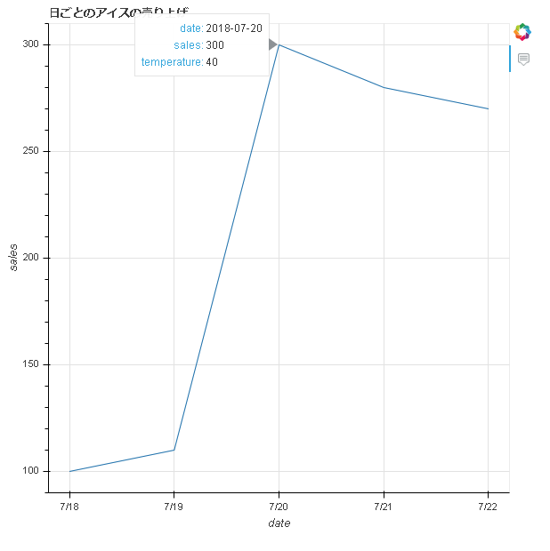
- 「X日に売り上げ個数が急激に増えたのは、気温が上がったから?」という仮説が立てられる
Holoviews
Holoviewsとは
HoloViews は砕けた表現をすると、matplotlibやBokehなどの可視化ツールを使いやすくしたラッパです
https://qiita.com/driller/items/53be86cea3c3201e7e0f 引用
- bokehの高機能API
bkchartsは現在メンテナンスされておらず、Holoviewsへの参照を推奨している
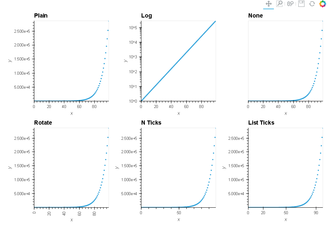
holoviewsでグラフ表示
import holoviews as hv
renderer = hv.renderer("bokeh")

xs = np.linspace(0, np.pi*4, 100)
points = hv.Points(np.exp(xs))
axes_opts = [('Plain', {}),
             ('Log', {'logy': True}),
             ('None', {'yaxis': None}),
             ('Rotate', {'xrotation': 90}),
             ('N Ticks', {'xticks': 3}),
             ('List Ticks', {'xticks': [0, 20, 50, 90]})]

l = hv.Layout([points.relabel(group=group).options(**opts)
           for group, opts in axes_opts]).cols(3)
renderer.save(l, "sample-holoviews")
http://holoviews.org/user_guide/Plotting_with_Bokeh.html 参考
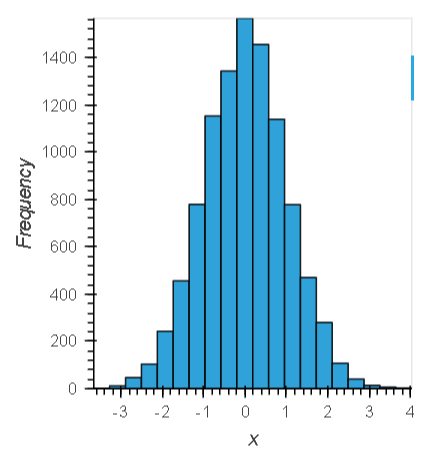
ヒストグラムを表示
import holoviews as hv
hv.extension('bokeh')

np.random.seed(1)
data = np.random.randn(10000)

frequencies, edges = np.histogram(data, 20)
hv.Histogram((edges, frequencies))
面グラフを表示
# Declaring Data

# create some example data
python=np.array([2, 3, 7, 5, 26, 221, 44, 233, 254, 265, 266, 267, 120, 111])
pypy=np.array([12, 33, 47, 15, 126, 121, 144, 233, 254, 225, 226, 267, 110, 130])
jython=np.array([22, 43, 10, 25, 26, 101, 114, 203, 194, 215, 201, 227, 139, 160])

dims = dict(kdims='time', vdims='memory')
python = hv.Area(python, label='python', **dims)
pypy   = hv.Area(pypy,   label='pypy',   **dims)
jython = hv.Area(jython, label='jython', **dims)

# Plot
overlay = (python * pypy * jython).options('Area', fill_alpha=0.5)
overlay.relabel("Area Chart") + hv.Area.stack(overlay).relabel("Stacked Area Chart")
-
+でグラフを並べて表示できる
出力結果
まとめ
- BokehはグラフをHTMLで出力して、対話的な操作が可能
- デフォルトでは、プロットごとに色を変えてくれない
- 個人的にはBokehのtooltip機能がおすすめ
- holoviewsが普及しそう?
気になったこと
- みんなどんな可視化ツールを使っている?
- 今後、どの可視化ツールを学習していくべき?
- Bokehとholoviewsで、サイトのレイアウトが同じなのはなぜ?
補足
オフラインでBokehを使う場合
- デフォルトでは、CDNの
bokeh-xxx.min.js,bokeh-xxx.min.cssをロードしている
-
output_fileメソッドのmodeオプションを指定する
output_file("graph1.html", mode="inline")
Bokehの歴史
- 2013年リリース(0.1.0)
- 2018/07/21時点で、最新は0.13.0
- 0.13.xは、小規模リリースの最終バージョン
0.13.x series is a final series of small releases leading to a 1.0 release.
BokehはR, Scalaにも一応対応している
-
Bokeh for Scalaの最終コミットは2年前...
https://github.com/bokeh/bokeh-scala
Bokehの開発環境
- Bokehのpackage source code : Python
- BokehJs(クライアント側のライブラリ): TypeScript
the Bokeh package source code, written in Python, and the BokehJS client-side library, written in TypeScript
https://bokeh.pydata.org/en/latest/docs/dev_guide/setup.html#devguide-setup 引用
実行環境
- Python 3.6.5
- IPython
参考サイト
お仕事で使った機能
bokeh
- 折れ線グラフ、散布図
- 凡例の表示/非表示機能
- tooltip
holoviews
- ヒストグラム
- 面グラフ
metabaseで分析するのもありかも
BokehServer
http://harmonizedai.com/article/bokehserver/
https://bokeh.pydata.org/en/latest/docs/user_guide/server.html