Objective
To explore Individual Conditional Expectation (ICE) and run it in R script. This article is based on information in 「機械学習を解釈する技術 ~Techniques for Interpreting Machine Learning~」by Mitsunosuke Morishita. In this book, the author does not go through all the methods by R, so I decided to make a brief note with an R script.
Individual Conditional Expectation (ICE)
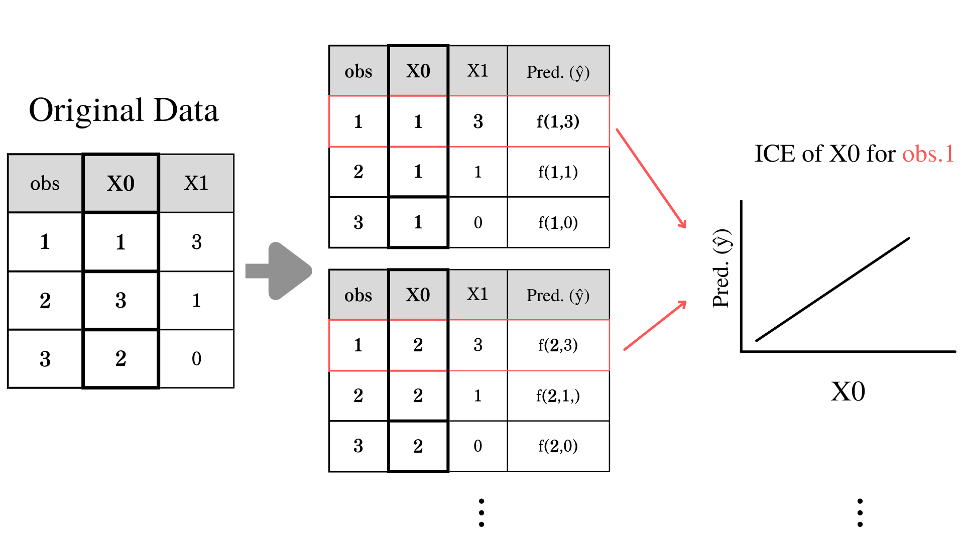
Individual Conditional Expectation (ICE) is a method of visualizing and understanding the relationship between the response variable and individual observation. The technique of calculating ICE is pretty simple if you are familiar with calculating Partial Dependence (PD). PD is just a mean of ICE. PD is calculated by changing the value of an explanatory variable while keeping track of the prediction. For example, if we increase the unit of explanatory variable $X0$, and the response variable also increases, these variables have a positive relationship. In PD, we average out all observation orders to see the overview of the relationship, but in ICE, we plot all observations individually.
Formula for ICE
ICE formula looks like a formula for PD. For your review, PD is
$$
\large \hat{PD_j}(x_j) = \displaystyle \frac{1}{N} \sum_{i = 1}^{N} \hat{f}(x_j,x_{i,-j})
$$
Your set of explanatory variable as $X = (X_0,...,X_J)$, and define your trained model as $\hat{f}(X)$. Your target explanatory variable is $X_j$, and $X$ without $X_j$ is $X_{-j} = (X_0,...,X_{j-1},X_{j+1},...,X_J)$. Actual observation of $X_j$ at $i$th observation is defined as $x_{j,i}$. So actual observation without $x_{j,i}$ is $x_{i,-j} = (x_{i,0},...,x_{i,j-1},x_{i,j+1},...,x_{i,J})$.
Explanatory variables are $X_j = x_j$, $\hat{PD_j}(x_j)$.
For ICE, we take out the averaging out part $\displaystyle \frac{1}{N} \sum_{i = 1}^{N}$ and add little i for individual observation.
$$
\large \hat{ICE_{i,j}}(x_j) = \hat{f}(x_j,x_{i,-j})
$$
Why? (The Limitation of PD)
Let's say you are predicting customer satisfaction at a restaurant. The restaurant has a variety of customers of all ages. One of your explanatory variables is the amount of food per dish (g). You assume for a younger customer, would have higher satisfaction with more food on the dish. On the other hand, older people might not be interested in the amount of food. In the situation like that and if you only look at PD, you would miss the relationship between individual observation and the response variable.
Execution with Real Data
Now, let's see how to run PFI with actual dataset.
Get Dataset
# Set up
library(mlbench)
library(tidymodels)
library(DALEX)
library(ranger)
library(Rcpp)
library(corrplot)
library(ggplot2)
library(gridExtra)

data("BostonHousing")
df = BostonHousing
`%notin%` <- Negate(`%in%`)
set.seed(3)
Overview of the Dataset
Here is overview of the dataset
Build a Model
We won't cover building a model in this article. I used XGBoost.
split = initial_split(df, 0.8)
train = training(split)
test = testing(split)

model = rand_forest(trees = 100, min_n = 1, mtry = 13) %>%
  set_engine(engine = "ranger", seed(25)) %>%
  set_mode("regression")

fit = model %>%
  fit(medv ~., data=train)
fit
Predict medv
result = test %>%
  select(medv) %>%
  bind_cols(predict(fit, test))

metrics = metric_set(rmse, rsq)

result %>%
  metrics(medv, .pred)
Interpre ICE
Use the function explain to create an explainer object that helps us to interpret the model.
explainer = fit %>%
  explain(
    data = test %>% select(-medv),
    y = test$medv
  )
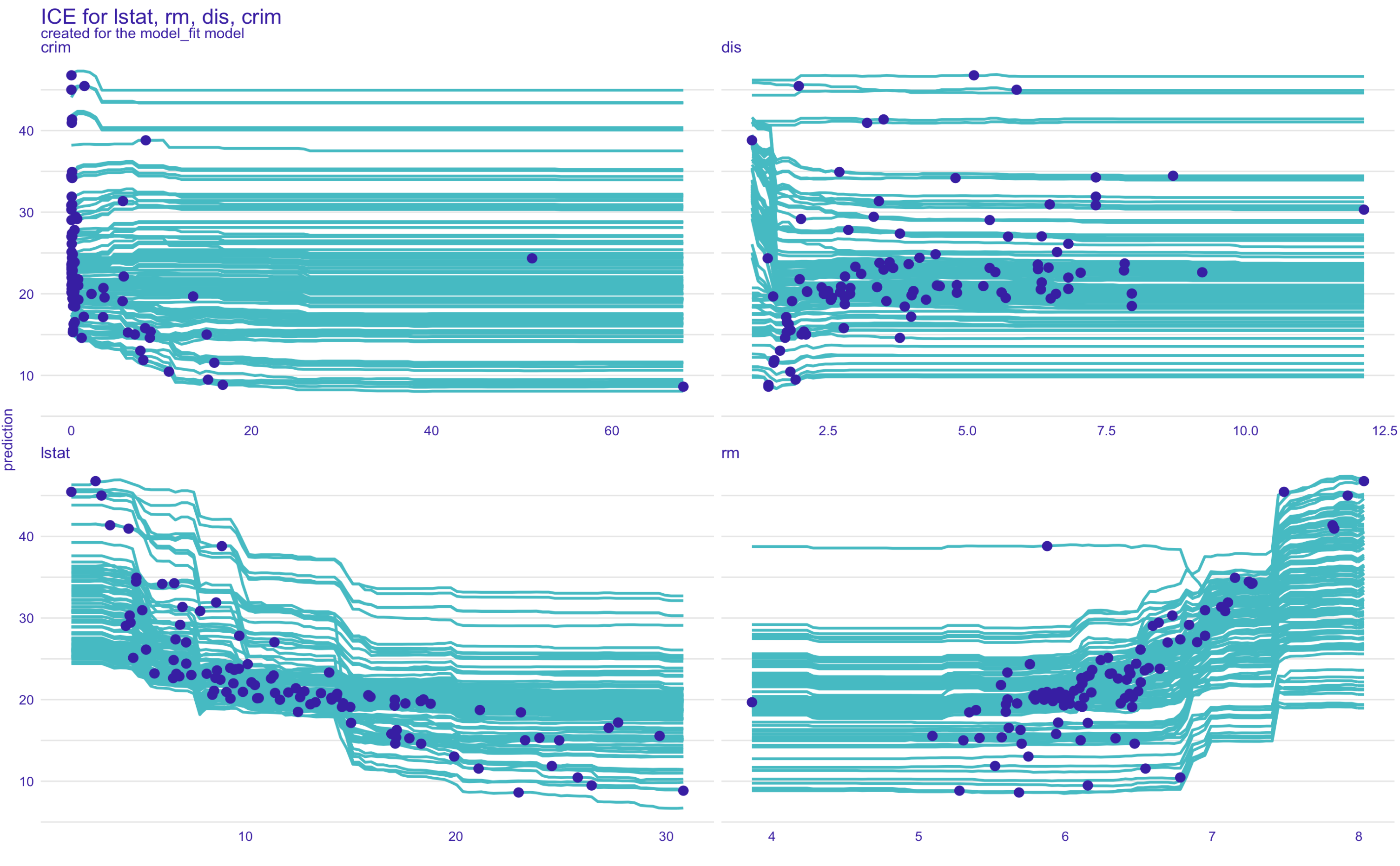
Use predict_profile function to get ICE plot. The source code of predict_profile is here. You can designate which plot you like to plot by giving the variables method a vector of variable names in the plot function. (The blue dots are actual prediction and variable)
ice = explainer %>%
  predict_profile(
    new_observation = test
  )
plot(ice,variables = c("lstat", "rm", "dis", "crim"), title = "ICE for lstat, rm, dis, crim")
FYI
| Method | Function |
|---|---|
| Permutation Feature Importance(PFI) | model_parts() |
| Partial Dependence(PD) | model_profile() |
| Individual Conditional Expectation(ICE) | predict_profile() |
| SHAP | predict_parts() |
rm
plot(ice,variables = c("rm"), title = "ICE for rm")
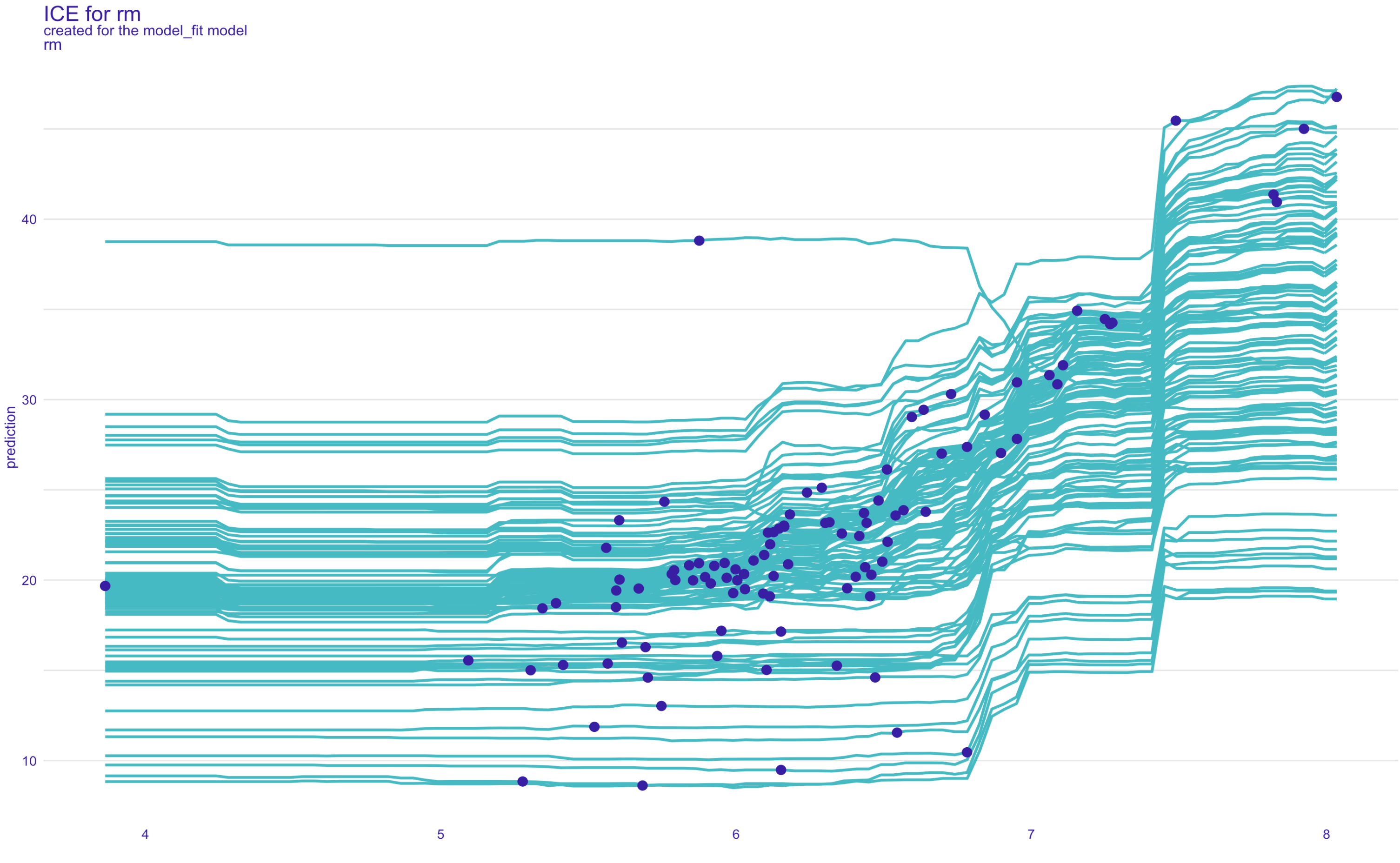
If you look at the outlier on rm plot, as other observations follow the path, there is one unique observation with an opposite relationship with prediction.
cor  <- df[,unlist(lapply(df, is.numeric))]
pairs(cor, pch = 19, upper.panel = NULL, panel=panel.smooth, col = dplyr::case_when(row(cor) == 373 ~"red",T ~"grey"))
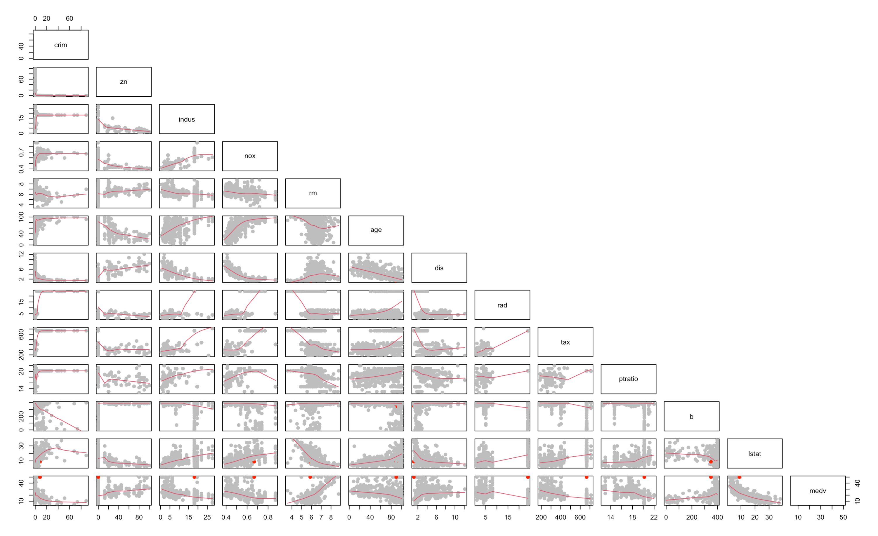
# Merge prediction and test data.
test_pred = cbind(test, explainer$y_hat)
# Get outlier
outlier = test_pred[(test_pred$`explainer$y_hat`>35)&(test_pred$rm<6),]
outlier
| index | crim | zn | indus | chas | nox | rm | age | dis | rad | tax | ptratio | b | lstat | medv | y_hat |
|---|---|---|---|---|---|---|---|---|---|---|---|---|---|---|---|
| 373 | 8.26725 | 0 | 18.1 | 1 | 0.668 | 5.875 | 89.6 | 1.1296 | 24 | 666 | 20.2 | 347.88 | 8.88 | 50 | 40.461 |
With its extremely high rad, tax, and low dis, we can assume the houses are the center of the city. Maybe there ain't many houses with more than 6 rooms, so our model could not do a good job on that (extrapolation). or As the room number increases, the size of each room get smaller and smaller, so the house price would decrease due to the decrease of the house value.
Conclution
While PD could not visualize individual relationships, ICE is a great way to visualize individual relationships to the response variable. It is a substance of PD, so if you understand PD, I bet ICE was straightforward to you.
References
Methods of Interpreting Machine Learning Qiita Links