0. 目次
- 本記事の背景
- 今回の分析の概要
- 実装
- 考察・残された課題
- 感想
このブログはAidemy Premiumのカリキュラムの一環で、受講修了条件を満たすために公開しています
1. 本記事の背景
2024年5月より、Aidemy premium データ分析講座を通して、Python、機械学習、ディープラーニングのモデルなど、データサイエンスの基礎を学ばさせていただいております。
今回は、学んだPythonや分析モデルを使い、世界の幸福度ランキングの分析を行いました。拙い文章ですが、最後まで目を通していただけますと幸いです。
簡単な自己紹介
社会人4年目。
前職は医療系・病院勤務であり、データ分析は初心者。
今回はキャリアチェンジを目指し、Aidemy premium データ分析講座を受講しました。
2. 今回の分析の概要
2-1. 開発環境
- Mac M2
- Google Colaboratory
2-2. 使用データ
今回、kaggleのデータセット「World Happiness Report-2024」を用いて分析を行いました。
カラムの説明
クリックで表示します
- Country name: 国名
- Regional indicator: それぞれの国が属する地域
# Regional indicatorを表示
print(df['Regional indicator'].unique())

# >>> 出力結果
['Western Europe' 'Middle East and North Africa' 'North America and ANZ'
'Latin America and Caribbean' 'Central and Eastern Europe' 'Southeast Asia' 'East Asia'
'Commonwealth of Independent States' 'Sub-Saharan Africa' 'South Asia']
- Ladder score: 最高を10、最低を0としたときの幸福度
- Upper whisker: 箱ひげ図における最大値
- Lower whisker: 箱ひげ図における最低値
- Log GDP per capita: 一人当たりGDPの自然対数
- Social support: 「困ったときに助けてくれるような親類や友人がいますか?」という質問に対する国全体の平均
- Healthy life expectancy: 健康寿命
- Freedom to make life choices: 「人生における選択の自由について、満足ですか?」という質問に対する国全体の平均
- Generosity: 「過去1ヶ月で寄付しましたか?」という質問で、一人当たりGDPで回帰した際の残差
- Perceptions of corruption: 「政府に汚職が蔓延していますか?」「ビジネスに汚職/腐敗が蔓延していますか?」という質問に対する国全体の平均
- Dystopida + residual: Dystopiaとは、最も幸福度の低い人が暮らす架空の国。residualとは、上記6つのカラムで説明できない要素を反映している
2-3. 目的
- どのような要素が幸福度に寄与しているのか、回帰分析を行い検討する
- 学習内容のアウトプット:さまざまな回帰分析モデルを扱う
以下から、全体の流れ・具体的なコードを説明します。
3. 実装
Step1: 使用するライブラリのインポート
import numpy as np
import pandas as pd
import seaborn as sns
import matplotlib.pyplot as plt
import plotly.express as px
import missingno as msno
import random
import os
from sklearn.model_selection import train_test_split
from sklearn.model_selection import KFold
from sklearn.metrics import r2_score
from sklearn.linear_model import LinearRegression
from sklearn.linear_model import Lasso
from sklearn.linear_model import Ridge
from sklearn.linear_model import ElasticNet
from sklearn.svm import SVR
from sklearn.ensemble import RandomForestRegressor
from sklearn.neighbors import KNeighborsRegressor
import tensorflow as tf
import lightgbm as lgb
from xgboost import XGBRegressor
import scipy.stats
import optuna
Step2: データの可視化
データは、kaggleの「World Happiness Report- 2024」のWorld-happiness-report-2024.csvを使用しました。
matplotlibやseabornライブラリを用いて、データを可視化し、分析方針を立てます。
まずは、幸福度(Ladder score)の分布を確かめます。
# Ladder scoreの上位5カ国、下位5カ国を表示
df_happiest_unhappiest = df[(df['Ladder score']>7.32) | (df['Ladder score']<3.3)]
sns.barplot(data=df_happiest_unhappiest, x='Ladder score', y='Country name', palette='coolwarm')
plt.show()

# 白地図を使って、Ladder scoreの分布を表示
px.choropleth(df, locations='Country name',
color='Ladder score', locationmode='country names')

# 日本の順位とスコアを表示
df_sorted = df.sort_values(by='Ladder score', ascending=False)
japan_rank = df_sorted[df_sorted['Country name'] == 'Japan'].index[0] + 1
japan_score = df_sorted.loc[japan_rank-1, 'Ladder score']
print(f'日本は{japan_rank}位で、Ladder scoreは{japan_score}')

# >>> 出力結果
# 日本は51位で、Ladder scoreは6.06
次に、目的変数であるLadder scoreと説明変数の関係を調べます。
# Ladder scoreと地域との関係
plt.figure(figsize=(12,5))
sns.violinplot(data= df, x='Regional indicator', y='Ladder score', palette='coolwarm')
plt.xticks(rotation=60)
plt.show()
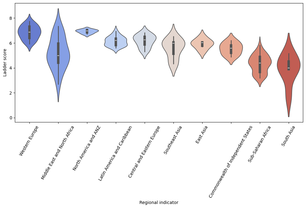
上記より、地域とLadder scoreとの間に関連があるように見えます。
次に、特徴量間の相関関係を調べてみます。
ここで、Upper whiskerとLower whiskerを説明変数に組み込むべく、その差を新たな特徴量として設定してみました。
df['Ladder range'] = df['upperwhisker'] - df['lowerwhisker']
# 新たな特徴量も含めて、ヒートマップを作成
sns.heatmap(df[['Ladder score', 'Log GDP per capita', 'Social support', 'Healthy life expectancy', 'Generosity', 'Freedom to make life choices', 'Perceptions of corruption', 'Ladder range']].corr(),annot=True)

上記より、Ladder scoreと、
Log GDP per capita、Social support、Health life expectancy間に強い正の相関があり、Freedom to make life choices、Perceptions of corruption間に中程度の正の相関があることが分かりました。一方、Ladder rangeとは中程度の負の相関があることが読み取れました。
Step3: データの前処置
(1) 欠損値の処理
まずは欠損値の確認をします。
df.isnull().sum()

# >>> 出力結果
Country name                    0
Regional indicator              0
Ladder score                    0
upperwhisker                    0
lowerwhisker                    0
Log GDP per capita              3
Social support                  3
Healthy life expectancy         3
Freedom to make life choices    3
Generosity                      3
Perceptions of corruption       3
Dystopia + residual             3
Ladder range                    0
msno.matrix(df)
plt.show()
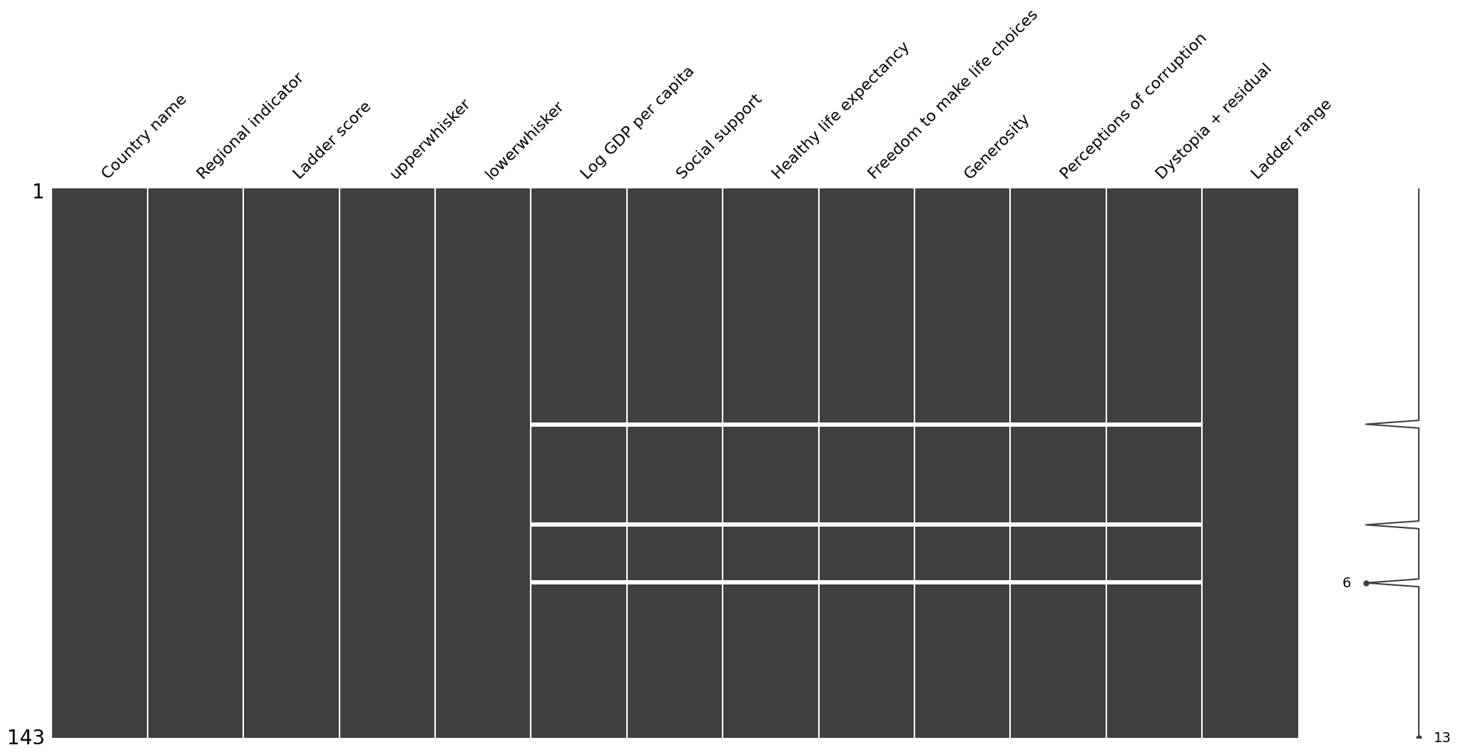
欠損値を可視化してみると、それぞれの欠損値3つは同一の国に集中していることが分かり、欠損値の処理としてリストワイズ削除を行いました。
df = df.dropna()
(2) 外れ値の処理
まず、各カラムの外れ値を確認します。
fig, axes = plt.subplots(figsize=(12,8), nrows=2, ncols=4)
sns.boxplot(data=df, x='Ladder score', ax= axes[0,0])
sns.boxplot(data=df, x='Log GDP per capita', ax= axes[0,1])
sns.boxplot(data=df, x='Social support', ax= axes[0,2])
sns.boxplot(data=df, x='Healthy life expectancy', ax= axes[0,3])
sns.boxplot(data=df, x='Generosity', ax= axes[1,0])
sns.boxplot(data=df, x='Freedom to make life choices', ax= axes[1,1])
sns.boxplot(data=df, x='Perceptions of corruption', ax= axes[1,2])
sns.boxplot(data=df, x='Ladder range', ax= axes[1,3])

plt.show()

Perceptions of corruptionとLadder rangeにおいて、外れ値が多いことを確認しました。
次に、外れ値の処理を行います。
# 四分位範囲を用いて外れ値を検知し、平均値に置き換え
def outlier(data):
  Q1 =  data.quantile(0.25)
  Q3 =  data.quantile(0.75)
  IQR = Q3 - Q1

  min = Q1 - 1.5*IQR
  max = Q3 + 1.5*IQR

  mean = data.mean()
  data_replaced = data.apply(lambda x: mean if (x>max) or (x<min) else x)
  return data_replaced

df['Ladder range'] = outlier(df['Ladder range'])
df['Perceptions of corruption'] = outlier(df['Perceptions of corruption'])
Step4: モデルの比較
回帰分析を行うに当たり、さまざまなモデルを決定係数を用いて比較していきます。より正確な評価を行うために、KFoldを使います。
# シード値の設定
np.random.seed(0)
tf.random.set_seed(0)
random.seed(0)
os.environ['PYTHONHASHSEED'] = str(0)

# 学習に用いないカラムを削除
drop_col = ['Country name', 'lowerwhisker', 'upperwhisker', 'Dystopia + residual']
df_base = df.drop(columns=drop_col)

# Regional indicatorをOne-Hot Encodingで変換
df_base = pd.get_dummies(df_base, columns=['Regional indicator'])

# 説明変数X, 目的変数yを定義
df_base = df_base.reset_index(drop=True)
X = df_base.drop(columns='Ladder score')
y = df_base['Ladder score']

# KFoldを使い、モデルを比較する関数を定義
def comparison(model):
  cv = KFold(n_splits=5, random_state=0, shuffle=True)

  train_acc_score =[]
  test_acc_score =[]

  for trn_index, test_index in cv.split(X, y):
    X_train, X_test = X.loc[trn_index], X.loc[test_index]
    y_train, y_test = y.loc[trn_index], y.loc[test_index]

    model.fit(X_train, y_train)
    train_acc_score.append(r2_score(y_train, model.predict(X_train)))
    test_acc_score.append(r2_score(y_test, model.predict(X_test)))

  print(f'train_dataのスコアは{np.mean(train_acc_score)}, test_dataのスコアは{np.mean(test_acc_score)}')

# MLPモデルを比較する関数を定義
def comparison_mlp():
  df_mlp = df_base.applymap(lambda x: int(x) if type(x) == bool else x)
  cv = KFold(n_splits=5, random_state=0, shuffle=True)

  train_acc_score =[]
  test_acc_score =[]

  for trn_index, test_index in cv.split(df_mlp.drop(columns='Ladder score'), df_mlp['Ladder score']):
    X_train, X_test = df_mlp.drop(columns='Ladder score').loc[trn_index], df_mlp.drop(columns='Ladder score').loc[test_index]
    y_train, y_test = df_mlp['Ladder score'].loc[trn_index], df_mlp['Ladder score'].loc[test_index]

    model_mlp = tf.keras.models.Sequential([
            tf.keras.layers.Input((X_train.shape[1],)),
            tf.keras.layers.Dense(32, activation='relu'),
            tf.keras.layers.Dropout(0.5),
            tf.keras.layers.Dense(64, activation='sigmoid'),
            tf.keras.layers.Dropout(0.5),
            tf.keras.layers.Dense(32, activation='relu'),
            tf.keras.layers.Dense(1)
        ])
    model_mlp.compile(optimizer='adam', loss='mean_squared_error')
    model_mlp.fit(X_train, y_train, epochs=100, verbose=0)

    train_acc_score.append(r2_score(y_train, model_mlp.predict(X_train)))
    test_acc_score.append(r2_score(y_test, model_mlp.predict(X_test)))

  print(f'---MLP--- \ntrain_dataのスコアは{np.mean(train_acc_score)}, test_dataのスコアは{np.mean(test_acc_score)}')
実際に、モデル同士を比較していきます。
# モデルの比較
models = {
    'Linear Regression': LinearRegression(),
    'Lasso': Lasso(random_state=0),
    'Ridge': Ridge(random_state=0),
    'ElasticNet': ElasticNet(random_state=0),
    'SVR': SVR(),
    'RandomForest': RandomForestRegressor(random_state=0),
    'KNeighbors': KNeighborsRegressor(),
    'LightGBM': lgb.LGBMRegressor(boosting_type='gbdt', objective='regression', metric='mse', seed=0, verbose=0),
    'XGBoost': XGBRegressor(seed=0)
}

for name, model in models.items():
  print(f'---{name}---')
  comparison(model)

# MLPの比較
comparison_mlp()
結果をまとめると以下の表のようになり、決定係数が最も高くなったのはRidge回帰でした。
| モデル | 検証データの決定係数 |
|---|---|
| Linear Regression | 0.8015 |
| Lasso | -0.0236 |
| Ridge | 0.8052 |
| ElasticNet | -0.0236 |
| SVR | 0.7707 |
| RandomForest | 0.7658 |
| Kneighbors | 0.7234 |
| LightGBM | 0.7575 |
| XGBoost | 0.7004 |
| MLP | 0.6702 |
Step5: パラメータの調整
続いて、パラメータの調整をしていきます。
X_train, X_test, y_train, y_test = train_test_split(X, y, test_size=0.2, shuffle=True, random_state=0)

def objective(trial):
  alpha = trial.suggest_loguniform('alpha', 1e-4, 1e1)
  fit_intercept = trial.suggest_categorical('fit_intercept', [True, False])
  solver = trial.suggest_categorical('solver', ['auto', 'svd', 'cholesky', 'lsqr', 'sparse_cg', 'sag', 'saga', 'lbfgs'])

  if solver == 'lbfgs':
    positive = True
  elif solver == 'auto':
    positive = trial.suggest_categorical('positive', [True, False])
  else:
    positive = False

  model = Ridge(alpha=alpha, fit_intercept=fit_intercept, solver=solver, random_state=0, positive=positive)
  model.fit(X_train, y_train)

  y_pred = model.predict(X_test)
  score = r2_score(y_test, y_pred)
  return score

study = optuna.create_study(direction='maximize')
study.optimize(objective, n_trials=100)

print(f'ハイパーパラメータ: {study.best_params}、ベストスコア: {study.best_value}')

# >>> 出力結果
ハイパーパラメータ: {'alpha': 0.5068680302146835, 'fit_intercept': True, 'solver': 'auto', 'positive': True},
ベストスコア: 0.8664764484556673
Step6: モデルの定義・トレーニング・予測
上記のモデルを使って、モデリングをしていきます。
# Ridge回帰モデルの作成
X_train, X_test, y_train, y_test = train_test_split(X, y, test_size=0.2, shuffle=True, random_state=0)

model = Ridge(alpha= 0.5068680302146835, fit_intercept=True, solver='auto', random_state=0,positive=True)
model.fit(X_train, y_train)
print(f'train_dataのスコアは{r2_score(y_train, model.predict(X_train))}, test_dataのスコアは{r2_score(y_test, model.predict(X_test))}')

# >>> 出力結果
train_dataのスコアは0.8399056703677167, test_dataのスコアは0.8664764484556673
# 係数を取得
coef_ = model.coef_
coef_df = pd.DataFrame({'Feature':X.columns, 'Coefficient':coef_})

# 係数を絶対値でソート
coef_df['abs_Coefficient'] = coef_df['Coefficient'].abs()
coef_df = coef_df.sort_values(by='abs_Coefficient', ascending=False).drop(columns='abs_Coefficient').reset_index(drop=True)
※ 上位5つのみ表示
| Feature | Coefficient |
|---|---|
| Freedom to make life choices | 1.534946 |
| Social support | 1.247760 |
| Perceptions of corruption | 1.163918 |
| Log GDP per capita | 0.758651 |
| Latin America and Caribbean | 0.723633 |
今回の予測モデルでは、人生における選択の自由(Freedom to make life choices)が幸福度に最も寄与していることが分かりました。
4. 考察・残された課題
- 予測モデルについて
今回、回帰分析に用いるさまざまなモデルを用いて予測を行いました。予想では、LightGBMやXGBoostなどが良い結果を出すのではないかと考えていましたが、実際にはロジスティック回帰やRidge回帰による予測が最も精度が高くなる結果となりました。一般的に、強力で汎用的な回帰分析アルゴリズムとして知られているLightGBMやXGBoostですが、小規模なデータセットでは過学習のリスクが高くなってしまうようです。今回の結果でも、訓練データに対する決定係数は0.9以上と大きい一方、検証データに対する決定係数が0.70〜0.75と小さくなり、訓練データに非常にフィットした結果、過学習してしまったと考えられます。次回は、LightGBMやXGBoostを用い、大規模なデータセットに対する解析を行なってみたいと思いました。
- 説明変数について
今回、相関の高い説明変数がいくつか含まれていました。特徴量を減らすことも試みたのですが、精度を上げることができませんでした。解析の目的の一つに、どの要素が幸福度に寄与しているのか検討することを挙げていたため、今回は試していませんが、純粋に予測精度を上げるのであれば主成分分析も良い方法になるのではないかと思いました。
- データセットについて
今回使用したデータセットの特徴量には、一般的に「生活を評価する指標」である項目が挙げられていますが、失業率や不平等などの重要な特徴量は国際データがなく、盛り込まれていないとのことでした。それらのデータを加えることができれば、より精度が上がるのではないかと考えました。(参考:https://worldhappiness.report/faq/ )
5. 感想
今回初めて、データの分析方針の検討・前処理・実装までの一連の流れを実践してみることができました。分析を通じて、新たな気づきを得るのはとても楽しい時間でした。引き続きインプットとアウトプットを繰り返し、さらにデータ分析や機械学習の知識をつけていきたいと思います。
次の記事ではkaggleのコンペに挑戦してみました。ご興味のある方は、ぜひご覧になってみてください。
最後まで目を通してくださり、ありがとうございました。