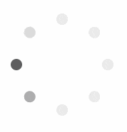
React Circular Loading
ローディングを示すコンポーネントが欲しかったので react-circular-loading を作りました。
コンポーネントのサンプルは https://yami-beta.github.io/react-circular-loading/ で見ることが出来ます。
react-circular-loading は コンポーネント自体を提供せず、コンポーネントを生成する関数を提供します。
ローディングを表示する場合、大きさや色、アニメーションの速度等を変えたいといったユースケースに対応するため、与えられたオプションからコンポーネントを生成する関数を提供する形を取りました。
オプション
| オプション名 | 設定項目 | 備考 |
|---|---|---|
| distance | 中心からの距離 | 単位: em, デフォルト: 4
|
| dotSize | ドットの大きさ | 単位: em, デフォルト: 1
|
| dotColor0 | ドットの色(初期) | デフォルト: rgba(50, 51, 52, 0.1)
|
| dotColor1 | ドットの色(ハイライトの両隣) | デフォルト: rgba(50, 51, 52, 0.2)
|
| dotColor2 | ドットの色(ハイライト) | デフォルト: rgba(50, 51, 52, 1.0)
|
| num | ドットの数 | デフォルト: 8
|
| speed | アニメーション速度 | 単位: ms, デフォルト: 1000
|
使い方
npm か yarn でインストールした後
$ npm install @yami_beta/react-circular-loading
$ # または
$ yarn add @yami_beta/react-circular-loading
circularLoading() にオプションを渡してコンポーネントを生成します。
下記の例だと、ドットが12個のコンポーネントが生成されます。
import React from 'react';
import { render } from 'react-dom';
import { circularLoading }  from '@yami_beta/react-circular-loading';

const CircularLoading = circularLoading({
  num: 12,
});

class App extends React.Component {
  constructor(props) {
    super(props);
  }

  render() {
    return (
      <div className="app">
        <h1>React Circular Loading Example</h1>
        <CircularLoading />
      </div>
    );
  }
}

render(<App />, document.getElementById('app'));