モバイルアプリ開発エンジニアの木村です。
私が所属するエフアンドエムネット株式会社では、見積書アプリ検索ランキング1位の見積・請求書作成アプリ『ジムー』をはじめとするモバイルアプリ開発を行っており、私は主にアプリの開発を担当しています。
本記事では、私がFlutterで画面レイアウトをコーディングする際に、どのような手順で考えているかを共有します。 この記事は、Flutterをこれから始めてみたい方や、触り始めたばかりの初心者の方を対象としています。
はじめに
まずは、作成したい画面のレイアウトを確認してみましょう。 その際に、どのようなパーツが、どのような位置に配置されているのか、そしてどのように動くのかも合わせて確認するとコーディングが進めやすくなります。
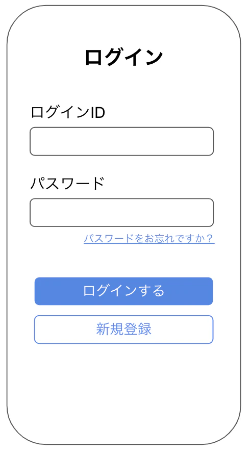
今回は例として以下のようなログイン画面を見ていきます。
本記事ではこのログイン画面のパーツ配置(レイアウト)を解説していきます。
(後半の記事でテキストやボタンの設定を解説します。)
レイアウトのコーディング
前章で確認したログイン画面のレイアウトを、いくつかの手順に分けて実際にコーディングしていきます。
手順1:画面全体の余白を設定する
初めに、画面全体を確認して、パーツが配置されない上下左右の余白を確認しましょう。
以下の図のように、画面の端には余白(マージン)が設定されています。
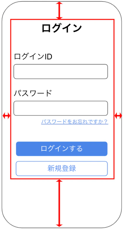
まずは、この余白から設定していきます。
余白を設定するには、Container というWidgetを使用します。body の子要素として Container を追加し、margin プロパティで余白を指定しましょう。
@override
  Widget build(BuildContext context) {
    return Scaffold(
      body: Container(
        margin: const EdgeInsets.only(left: 30, top: 100, right: 30, bottom: 50),
      ),
    );
  }
手順2:各パーツの並び方(縦・横)を設定する
次に、各パーツがどの方向(縦または横)に並んでいるかを確認します。
今回の画面では、全てのパーツが縦方向に並んでいることが分かります。
Flutterでパーツを縦に並べるには Column というWidgetを使用します。先ほど追加した Container の子要素として Column を追加しましょう。
@override
  Widget build(BuildContext context) {
    return Scaffold(
      body: Container(
        margin: const EdgeInsets.only(left: 30, top: 100, right: 30, bottom: 50),
        child: Column(
        ),
      ),
    );
  }
手順3:パーツの揃え方(左右・中央)を設定する
ログイン画面全体を見ると、多くのパーツは左端から配置されています。
そこで、手順2で追加した Column に、子要素を左寄せにする設定を追加しましょう。
左寄せにするには、crossAxisAlignment プロパティに CrossAxisAlignment.start を指定します。
Widget build(BuildContext context) {
    return Scaffold(
      body: Container(
        margin: const EdgeInsets.only(left: 30, top: 100, right: 30, bottom: 50),
        child: Column(
          crossAxisAlignment: CrossAxisAlignment.start,
        ),
      ),
    );
  }
【補足】 Column(縦並び)の場合、crossAxisAlignment は水平方向(左右)の揃え方を指定します。mainAxisAlignment は垂直方向(上下)の揃え方を指定します。
手順4:画面にパーツを追加する
ログイン画面全体を見ると、大きく分けて8個のパーツが並んでいるのがわかります。
(ログインタイトル、ID入力欄、ログインボタンなど)
まずはレイアウトの骨組みを作るため、これらのパーツの代わりに仮の Container を8個配置してみましょう。 Column の children プロパティに 8個の Container を追加します。
(今回は分かりやすいように、仮のサイズ・色・余白を設定しています)
@override
  Widget build(BuildContext context) {
    return Scaffold(
      body: Container(
        margin: const EdgeInsets.only(left: 30, top: 100, right: 30, bottom: 50),
        child: Column(
          mainAxisAlignment: MainAxisAlignment.start,
          children: [
            Container(
              margin: const EdgeInsets.all(5),
              height: 50,
              width: 200,
              color: Colors.orangeAccent,
            ),
            ///    省略      ///
            Container(
              margin: const EdgeInsets.all(5),
              height: 50,
              width: 200,
              color: Colors.orangeAccent,
            ),
          ],
        ),
      ),
    );
  }

手順5:特定のパーツの揃え方(左右・中央)を設定する
手順3では全体を左寄せにしましたが、完成イメージを見ると「ログイン」というタイトルだけは画面の中央に表示されています。
このように、特定のパーツだけ表示位置を変更したい場合は、そのWidgetを Row Widgetで囲みます。
そして、Row の mainAxisAlignment プロパティに MainAxisAlignment.center を設定することで、その中のパーツを中央に寄せることができます。
///   省略   ///
child: Column(
  crossAxisAlignment: CrossAxisAlignment.start,
  children: [
    Row(
      mainAxisAlignment: MainAxisAlignment.center,
      children: [
        Container(
          margin: const EdgeInsets.all(5),
          height: 50,
          width: 200,
          color: Colors.orangeAccent,
        ),
      ],
    ),
///   省略   ///

手順6:各パーツのサイズと余白を調整する
最後に、各パーツのサイズと、パーツ間の余白を調整して、完成イメージのレイアウトに近づけていきます。
各パーツのサイズは width と height で調整します。
入力欄やボタンのように、横幅いっぱいに表示したい場合は width に double.infinity を設定します。
パーツ間の余白は、Container の margin でも設定できますが、今回はパーツ間のスペースを明確にするため SizedBox を使います。
すべての手順を進めてきた、現時点でのソースコードと表示レイアウトは以下の通りです。
Widget build(BuildContext context) {
    return Scaffold(
      body: Container(
        margin: const EdgeInsets.only(left: 30, top: 100, right: 30, bottom: 50),
        child: Column(
          crossAxisAlignment: CrossAxisAlignment.start,
          children: [
            Row(
              mainAxisAlignment: MainAxisAlignment.center,
              children: [
                Container(
                  margin: const EdgeInsets.all(5),
                  height: 50,
                  width: 200,
                  color: Colors.orangeAccent,
                ),
              ],
            ),
            const SizedBox(
              height: 40,
            ),
            Container(
              margin: const EdgeInsets.all(5),
              height: 40,
              width: 200,
              color: Colors.orangeAccent,
            ),
            Container(
              margin: const EdgeInsets.all(5),
              height: 50,
              width: double.infinity,
              color: Colors.orangeAccent,
            ),
            const SizedBox(
              height: 20,
            ),
            Container(
              margin: const EdgeInsets.all(5),
              height: 40,
              width: 200,
              color: Colors.orangeAccent,
            ),
            Container(
              margin: const EdgeInsets.all(5),
              height: 50,
              width: double.infinity,
              color: Colors.orangeAccent,
            ),
            Row(
              mainAxisAlignment: MainAxisAlignment.end,
              children: [
                Container(
                  margin: const EdgeInsets.all(5),
                  height: 30,
                  width: 200,
                  color: Colors.orangeAccent,
                ),
              ],
            ),
            const SizedBox(
              height: 40,
            ),
            Container(
              margin: const EdgeInsets.all(5),
              height: 50,
              width: double.infinity,
              color: Colors.orangeAccent,
            ),
            Container(
              margin: const EdgeInsets.all(5),
              height: 50,
              width: double.infinity,
              color: Colors.orangeAccent,
            ),
          ],
        ),
      ),
    );
  }

まとめ
これでログイン画面のレイアウトの大枠は完成しました!
仮のオレンジ色の枠を、表示したい位置にそれぞれ設置することができましたね。
後編の記事では、このオレンジ色の枠を、それぞれテキスト、入力欄、ボタンに置き換えて、ログイン画面を完成させていきます。
Flutterのレイアウト入門【後編】主要Widgetで画面を完成させる方法
エフアンドエムネット株式会社からのお知らせ
最後までお読みいただきありがとうございます!
私たちエフアンドエムネット株式会社では、一緒に開発を楽しんでくれる仲間を募集しています。
ご興味を持っていただけましたら、ぜひ採用ページを覗いてみてください!