モバイルアプリ開発エンジニアの木村です。
私が所属するエフアンドエムネット株式会社では見積書アプリ検索ランキング1位の見積・請求書作成アプリ『ジムー』をはじめとするモバイルアプリ開発を行っており、私は主にアプリの開発を担当しております。
本記事は、私がFlutterで画面レイアウトをコーディングする際の手順を共有していく記事の後編になります。
まだ前編を見ていない方は「Flutterのレイアウト入門【前編】Widget配置の基本とコツ」から見ていただけると幸いです。
前回の振り返り
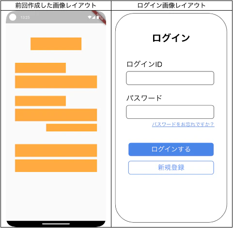
前編では、Container を使ってレイアウトの骨組みを作成し、以下のオレンジ色の枠で示したレイアウトの大枠が完成しました。
後編では、このオレンジ色の枠をそれぞれ文字、入力欄、ボタンといった具体的なUI部品(Widget)に置き換えて、ログイン画面を完成させていきます。
レイアウトのコーディング
それでは、文字(Text)、入力フォーム(TextField)、ボタン(Button)のWidgetごとに、解説とコーディングを進めていきましょう。
テキストを表示(Text Widget)
まずは、「ログイン」などの文字を表示しているテキスト部分から設定していきます。
文字は Text Widgetを使うことで表示できます。前編で配置した1つ目のオレンジ色の Container を、以下のコードに置き換えてみましょう。
// 【修正前】
Container(
  margin: const EdgeInsets.all(5),
  height: 40,
  width: 200,
  color: Colors.orangeAccent,
),
// 【修正後】
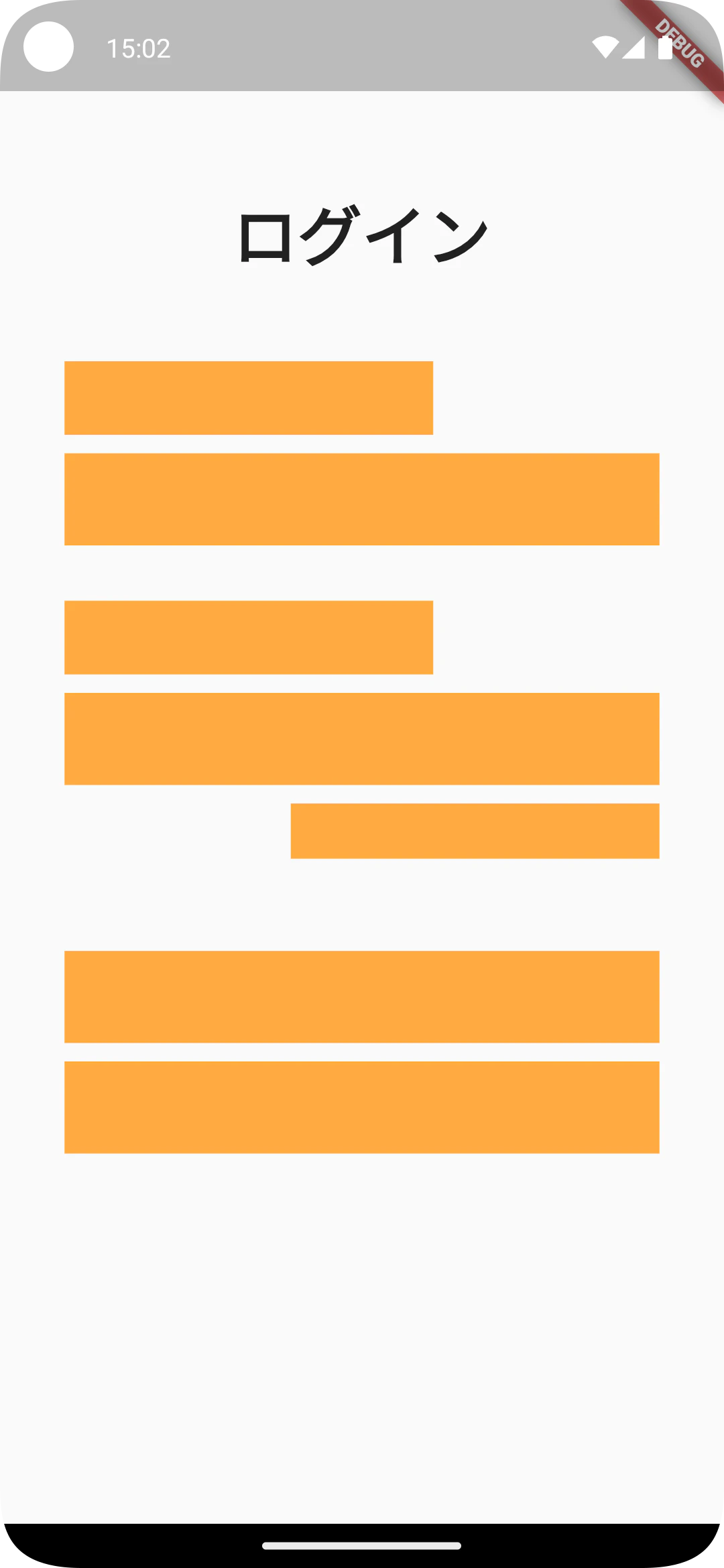
Text("ログイン"),
置き換えると以下のように画面に文字が表示されます。

このままでは文字のサイズや太さが完成イメージと異なるため、次は Text Widgetにスタイルを設定します。スタイルの設定は style プロパティに TextStyle を指定します。
Text(
   "ログイン",
   style: TextStyle(fontSize: 35, fontWeight: FontWeight.w900),
),
fontSize は文字の大きさ、fontWeight は文字の太さを設定できます。
これを反映すると、以下のようなレイアウトになります。
同じように、「ログインID」「パスワード」「パスワードをお忘れですか?」の Container も Text Widgetに置き換えていきましょう。(全体のソースコードは最後に記載します)
ちなみに、文字の色は TextStyle の color で、下線は decoration に TextDecoration.underline を追加することで設定できます。
Text(
   "パスワードをお忘れですか?",
   style: TextStyle(
      fontSize: 18,
      fontWeight: FontWeight.w400,
      color: Colors.blueAccent,
      decoration: TextDecoration.underline,
      decorationThickness: 2.0
   ),
),

入力フォームを表示する(TextField)
次に、ログインIDとパスワードを入力するフォームを設定します。
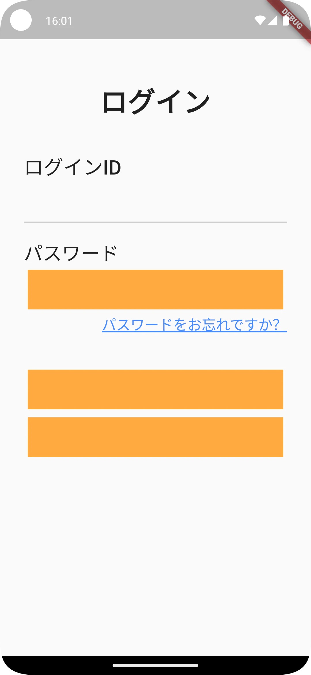
入力フォームは TextField Widgetを使うことで表示できます。「ログインID」テキストの下にあるオレンジ色の Container を、以下のコードに置き換えてみましょう。
TextField()
置き換えると、以下のように入力欄を示す線だけが表示されます。
この線をタップすると、キーボードが表示されて文字が入力できます。
【重要】キーボード表示によるエラーへの対処
しかし、このままではキーボードを表示した際に、以下のような画面表示領域のオーバーフローエラー(RenderFlex overflowed)が発生することがあります。
======== Exception caught by rendering library =====================================================
The following assertion was thrown during layout:
A RenderFlex overflowed by 41 pixels on the bottom.

これは、限られた画面の高さの中に、元々のレイアウトとキーボードが収まりきらなくなったために発生するエラーです。
このエラーは、画面全体をスクロール可能にすることで解決できます。
画面をスクロール可能にするには SingleChildScrollView Widgetを使います。
body の子要素である Container を、この SingleChildScrollView で囲みましょう。
@override
  Widget build(BuildContext context) {
    return Scaffold(
      body: SingleChildScrollView( // ここに追加
        child: Container(
          margin: const EdgeInsets.only(left: 30, top: 100, right: 30, bottom: 50),
   ・・・
これでキーボードを表示してもエラーが発生しなくなり、画面をスクロールできるようになりました!

では本題に戻り、TextField のデザインを調整します。
デザインの調整は decoration プロパティに InputDecoration を設定します。
今回は、入力欄の周りに枠線を表示してみましょう。
TextField(
   decoration: InputDecoration(
   border: OutlineInputBorder(),
   ),
),
これを追加すると、画面レイアウトは以下のようになります。
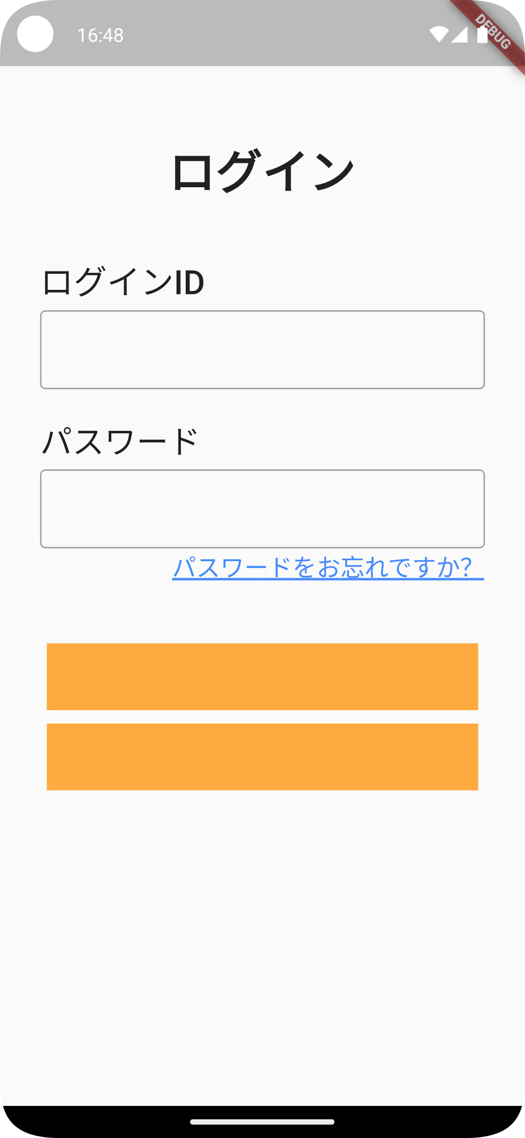
これで入力フォームは完成になります!
ボタンを表示する(Button)
最後に、ログインボタンと新規登録ボタンを設定します。
FlutterにはいくつかボタンWidgetがありますが、今回は代表的な ElevatedButton を使います。残っているオレンジ色の Container を、以下のコードに置き換えてみましょう。
Container(
   margin: const EdgeInsets.all(5),
   height: 50,
   width: double.infinity,
   child: ElevatedButton(
      child: const Text('ログインする'),
      onPressed: () {/*タップされた際の処理*/},
   ),
),

このままでは文字が小さく、また新規登録ボタンの色も完成イメージと異なります。これらを調整していきましょう。
- 文字のスタイル: Text Widgetと同様に style プロパティで設定します
- ボタンのスタイル: ElevatedButton の style プロパティで設定します。ElevatedButton.styleFrom を使うと簡単に色や枠線を指定できます
- 枠線: side プロパティに BorderSide を設定します
- 文字とアイコンの色: foregroundColor で設定します
- 背景色: backgroundColor で設定します
これらのスタイルを設定した、新規登録ボタンのコードは以下のようになります。
Container(
   margin: const EdgeInsets.all(5),
   height: 50,
   width: double.infinity,
   child: ElevatedButton(
      style: ElevatedButton.styleFrom(
         side: const BorderSide(color: Colors.blueAccent),
         foregroundColor: Colors.blueAccent,
         backgroundColor: Colors.white
      ),
      child: const Text(
          '新規登録',
         style: TextStyle(fontSize: 22, fontWeight: FontWeight.w500),
      ),
      onPressed: () {/*タップされた際の処理*/},
   ),
),
まとめ
2つの記事を通して、Flutterの画面レイアウトを作成してきましたが、いかがでしたでしょうか?
個人的には、Flutterのレイアウト作成は直感的で実装しやすいと感じています。
本記事では数種類のWidgetしか紹介できませんでしたが、Flutterには他にも数多くの便利なWidgetが用意されています。
作りたいと思う画面レイアウトの多くは、用意されているWidgetを組み合わせることで作成できます。 ぜひ、これからも様々なWidgetを調べて試してみてください!
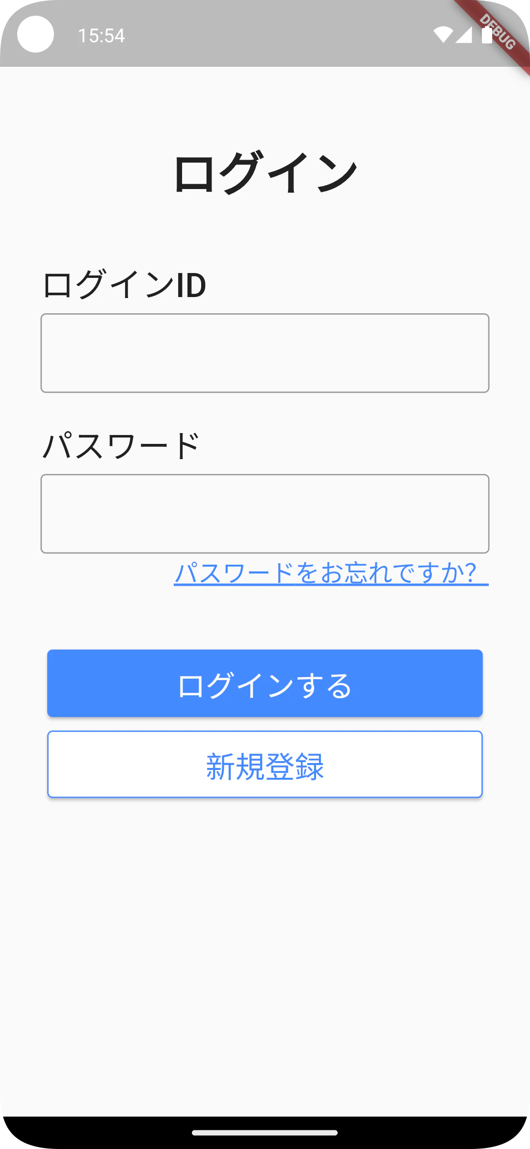
最後に完成した画面とコードを記載いたします。
@override
  Widget build(BuildContext context) {
    return Scaffold(
      body: SingleChildScrollView(
        child: Container(
          margin: const EdgeInsets.only(
            left: 30,
            top: 100,
            right: 30,
            bottom: 50
          ),
          child: Column(
            crossAxisAlignment: CrossAxisAlignment.start,
            children: [
              const Row(
                mainAxisAlignment: MainAxisAlignment.center,
                children: [
                  Text(
                    "ログイン",
                    style: TextStyle(fontSize: 35, fontWeight: FontWeight.w900),
                  ),
                ],
              ),
              const SizedBox(
                height: 40,
              ),
              const Text(
                "ログインID",
                style: TextStyle(fontSize: 25, fontWeight: FontWeight.w500),
              ),
              const SizedBox(
                height: 5,
              ),
              const TextField(
                decoration: InputDecoration(
                  border: OutlineInputBorder(),
                ),
              ),
              const SizedBox(
                height: 20,
              ),
              const Text(
                "パスワード",
                style: TextStyle(fontSize: 24, fontWeight: FontWeight.w400),
              ),
              const SizedBox(
                height: 5,
              ),
              const TextField(
                decoration: InputDecoration(
                  border: OutlineInputBorder(),
                ),
              ),
              const Row(
                mainAxisAlignment: MainAxisAlignment.end,
                children: [
                  Text(
                    "パスワードをお忘れですか?",
                    style: TextStyle(
                        fontSize: 18,
                        fontWeight:
                        FontWeight.w400,
                        color: Colors.blueAccent,
                        decoration: TextDecoration.underline,
                        decorationThickness: 2.0
                    ),
                  ),
                ],
              ),
              const SizedBox(
                height: 40,
              ),
              Container(
                margin: const EdgeInsets.all(5),
                height: 50,
                width: double.infinity,
                child: ElevatedButton(
                  style: ElevatedButton.styleFrom(
                      foregroundColor: Colors.white,
                      backgroundColor: Colors.blueAccent
                  ),
                  child: const Text(
                    'ログインする',
                    style: TextStyle(fontSize: 22, fontWeight: FontWeight.w500),
                  ),
                  onPressed: () {/*タップされた際の処理*/},
                ),
              ),
              Container(
                margin: const EdgeInsets.all(5),
                height: 50,
                width: double.infinity,
                child: ElevatedButton(
                  style: ElevatedButton.styleFrom(
                      side: const BorderSide(color: Colors.blueAccent),
                      foregroundColor: Colors.blueAccent,
                      backgroundColor: Colors.white
                  ),
                  child: const Text(
                    '新規登録',
                    style: TextStyle(fontSize: 22, fontWeight: FontWeight.w500),
                  ),
                  onPressed: () {/*タップされた際の処理*/},
                ),
              ),
            ],
          ),
        ),
      ),
    );
  }
エフアンドエムネット株式会社からのお知らせ
最後までお読みいただきありがとうございます!
私たちエフアンドエムネット株式会社では、一緒に開発を楽しんでくれる仲間を募集しています。
ご興味を持っていただけましたら、ぜひ採用ページを覗いてみてください!