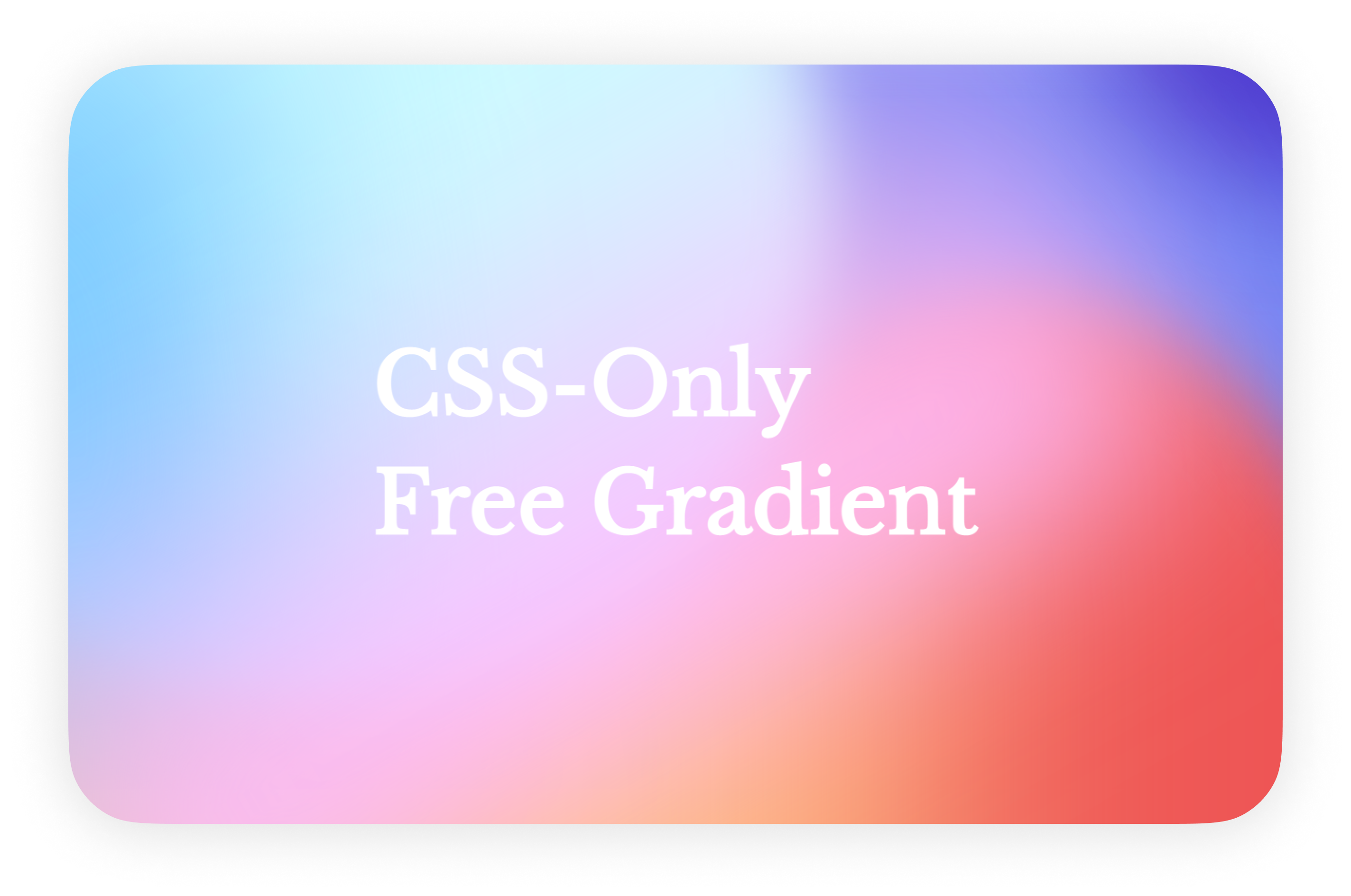
これは何
- フリーグラデーションっぽいグラフィックが使われる機会が増えているので、CSSだけでそれっぽい背景を作る方法をまとめました
- なお、あくまで「それっぽい」です
- よりリッチな表現を求めたい場合は素直にグラフィック制作ソフトで作った方が良いと思います
- また、記事投稿イベント「3000文字Tips - 知ると便利なTipsをみんなへ届けよう」への投稿記事でもあります
完成品
リポジトリとGitHub Pages
この記事を書くために書いたコードは全て公開しています。
実際の見た目はGitHub Pagesからどうぞ。
作り方
まずは用意したい色の数だけdivでも用意します。
<body>
  <div class="gradient-container">
    <div class="color1"></div>
    <div class="color2"></div>
    <div class="color3"></div>
    <div class="color4"></div>
    <div class="color5"></div>
    <div class="color6"></div>
    <div class="color7"></div>
  </div>
</body>
そして用意したdivに色を指定し、positionで良い感じに配置します。
.gradient-container {
  height: 100vh;
  overflow: hidden;
  position: relative;
  width: 100%;
}

.color1 {
  background-color: #6d83f3;
  height: 200vmax;
  left: 45vmax;
  position: absolute;
  top: -4vmax;
  width: 64vmax;
}

.color2 {
  background-color: #4d38ce;
  border-radius: 50%;
  height: 38vmax;
  left: 84vmax;
  position: absolute;
  top: -28vmax;
  width: 38vmax;
}

.color3 {
  background-color: #ee5555;
  border-radius: 50%;
  left: 45vmax;
  height: 100vmax;
  position: absolute;
  top: 19vmax;
  width: 67vmax;
}

.color4 {
  background-color: #ffbe82;
  height: 100vmax;
  left: -13vmax;
  position: absolute;
  top: 20vmax;
  width: 83vmax;
}

.color5 {
  background-color: #cdfcff;
  border-radius: 50%;
  height: 83vmax;
  left: -20vmax;
  position: absolute;
  top: -30vmax;
  width: 83vmax;
}

.color6 {
  background-color: #69c0ff;
  height: 64vmax;
  left: -16vmax;
  position: absolute;
  top: -6vmax;
  transform: rotate(-8deg);
  width: 30vmax;
}

.color7 {
  background: linear-gradient(to top, #febcff 20%, rgba(254, 202, 255, 0) 100%);
  top: 8vmax;
  filter: blur(8vmax);
  height: 50vmax;
  left: -12vmax;
  position: absolute;
  transform: rotate(-30deg);
  width: 100vmax;
}
現時点ではこんな感じ。
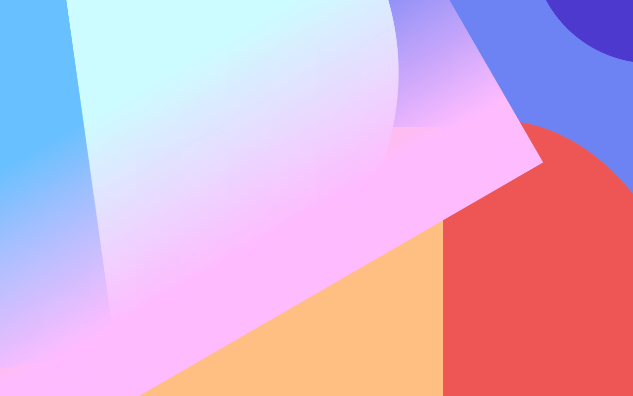
ポイントは以下かなと思っています。
CSSだけで作る以上表情が単調になりがちなので、少しでも要素が複雑に見えるような工夫です。
- 円と四角を両方使う
- いくつかの要素は斜めで配置する
- 全部ベタ塗りではなく、透明にグラデーションするような塗りのものも用意する
更に、それぞれの要素にfilter: blur()をかけます。
  .color1 {
    background-color: #6d83f3;
    height: 200vmax;
+   filter: blur(3vmax);
    left: 45vmax;
    position: absolute;
    top: -4vmax;
    width: 64vmax;
  }

  .color2 {
    background-color: #4d38ce;
    border-radius: 50%;
+   filter: blur(5vmax);
    height: 38vmax;
    left: 84vmax;
    position: absolute;
    top: -28vmax;
    width: 38vmax;
  }

  .color3 {
    background-color: #ee5555;
    border-radius: 50%;
+   filter: blur(3vmax);
    left: 45vmax;
    height: 100vmax;
    position: absolute;
    top: 19vmax;
    width: 67vmax;
  }

  .color4 {
    background-color: #ffbe82;
+   filter: blur(12vmax);
    height: 100vmax;
    left: -13vmax;
    position: absolute;
    top: 20vmax;
    width: 83vmax;
  }

  .color5 {
    background-color: #cdfcff;
    border-radius: 50%;
+   filter: blur(3vmax);
    height: 83vmax;
    left: -20vmax;
    position: absolute;
    top: -30vmax;
    width: 83vmax;
  }

  .color6 {
    background-color: #69c0ff;
+   filter: blur(12vmax);
    height: 64vmax;
    left: -16vmax;
    position: absolute;
    top: -6vmax;
    transform: rotate(-8deg);
    width: 30vmax;
  }

  .color7 {
    background: linear-gradient(to top, #febcff 20%, rgba(254, 202, 255, 0) 100%);
    top: 8vmax;
+   filter: blur(8vmax);
    height: 50vmax;
    left: -12vmax;
    position: absolute;
    transform: rotate(-30deg);
    width: 100vmax;
  }
一律でblur()をかけるとこれまた表情が単調になるので、要素によって値の大小を変えます。
あとは文字でも置いてあげれば、最初に貼った画像と同じ見た目が出来上がりです。