numpyの基本
配列作成 np.array([数字])
0〜nまでの配列を作成 np.arange(n)
データの型チェック sample.dtype
次元数確認 sample.ndim
要素数確認 sampe.size
2行3列, int型で全てが0の行列を作成 np.zeros((2,3), dtype='i')
2行3列,float型で全てを任意の値にした行列を作成 np.full((2,3), dtype='f')
昇順にソート sample.sort() 降順にソート sample[::-1].sort()
配列の合計 sample.sum()
配列の積み上げ sample.cumsum()
行列の形を変える sample.reshape
1行目,すべての行を抜き出し sample[0,:]
行列の掛け算 np.dot(sample1, sample2) ※ *を使うと要素を掛け算してしまう
乱数作成
乱数作成import numpy.random as random 以降はrandomを先につける前提
random.seed(0) #乱数を固定
rand(100) #0〜1の乱数を100個生成rand(10,10) #0〜1の乱数で10×10の行列を生成rand(100)*40+30 #30〜70の乱数を100個生成
randn(10) #標準正規分布(平均0、分散1)の乱数を10個発生randn(2,100) #標準正規分布による2×100の行列normal(50,10) #平均50,標準偏差10の正規分布
binormal(n=100,p=0.5) #二項分布。成功率0.5を100回試行
poisson(lam=10) #ポアソン分布。λ=10のポアソン分布
beta(a=3, b=5) #ベータ分布
randint(0,100,20) #0〜99の整数を20個生成randint(0,100,(5,5)) #0〜99の整数で5×5の行列を生成
random() #0.0〜1.0範囲のfloat型の値を生成uniform(2.0,5.0) #2.0以上5.0未満のfloat型の、一様分布の値を生成
array=["りんご","バナナ","かき","もも","オレンジ","さくらんぼ"]choice(array,3) #arrayから3つ選出。replace=Falseで重複なし
Scipyの基礎
Scipyのモジュール import scipy as sp# 線形代数用のモジュール import scipy.linalg as linalg
サンプルデータ sample= np.array([[1,-1,-1],[-1,1,-1],[-1,-1,1]])とします。
行列式 linalg.det(sample) 逆行列 linalg.inv(sample)
固有値, 固有ベクトル eig_value, eigvector = linalg.eig(sample)
ニュートン法による二次方程式の解
def function(x): return (x**2+2*x+1)from scipy.optimize import newtonprint(newton(function,0)
二次方程式の最小値をBrent法により求める
from scipy.optimize import minimize_scalarprint(minimize_scalar(function,method="Brent")
Pandasの基礎
データの作成
-
テーブルを読み込む pd.read_csv('データ名')
-
1列のデータテーブルを作る→Seriesを使う。
0〜9までの配列に対して、インデックスを特定の文字(a〜j)にする場合
df = pd.Series([0,1,2,3,4,5,6,7,8,9],index['a','b','c','d','e','f','g','h','i','j'])
- データが複数列のテーブルを作る→DataFrame
sample1 = {'ID':['100','101','102','103','104'],'city':['Tokyo','Osaka','Kyoto','Hokkaidao','Tokyo'],'birth_year':[1990,1989,1992,1997,1982],'name':['Hiroshi','Akiko','Yuki','Satoru','Steeve']}
df1 = pd.DataFrame(sample1)
データを観察する
- データサイズの確認 df.shape
- 要約統計量 df.describe(include='all')
※データタイプはSeriesの形式 - データの型を見る df1.dtypes
- 降順にソートする df.sort_values('カラム名',ascending= False)
- ユニークな値の個数をカウントする df.nunique()
- 欠損値の個数をカウントする df.isnull().sum()
- ヒストグラムを書く df.hist(bins=10)
データを取捨選択する
- 欠損値のある行を排除する df1.dropna()
- 特定のcolumn(tempやdepth)に欠損値がある場合,その行を削除する df.dropna(subset=['temp','depth'])
- 欠損値を0で埋める df1.fillna(0)
- カラムmembersが100以下の行を全て削除 df1[df1['members'] > 100]
- 行を削除 df.drop(['指定行名'], axis=0)
- 列を削除 df.drop(['指定列名'], axis=1)
- 列を抜き出す。df["カラム名1", "カラム名2"] ※列が一つの場合はドットを使っても良い df.カラム名
- 0行目から2行目まで取得 df.[:3]
- 条件を満たしている行を取り出す。(例 birthが1990年より上、1990年ジャストの人のデータだけ取り出す場合)
df1[df1.birth_year>1990]
df1[df1["birth_year"]==1990]
- loc属性はloc["インデックスラベル","カラムラベル"]で指定できる。
※単一要素の指定ではat属性も使える
# 0~1行目のcityとnameのみ抽出
df1.loc[0:2,["city","name"]]
- cityカラムがTokyoまたはOsakaであるデータを取り出す df1[df1['city'].isin(['Tokyo','Osaka'])]
データを編集する
- 転置(行と列を入れ替える) df.T
- データタイプをcategoryに変換する df1.city.astype('category')
- カラム名を変更する df.rename(columns={'変更前':'変更後'})
- カラムを追加してデータを入れる df['追加するカラム名']=データ値
- データのグループ集計 .groupby("グループするカラム名")["集計するカラム名"]
# 男女別に数学の成績をグループ集計する。
df2.groupby("sex")["math"].mean()
データテーブルを結合
df1
| index | 名前 | 年齢 |
|---|---|---|
| 1 | Dan | 24 |
| 2 | John | 29 |
df2
| index | 名前 | 年齢 |
|---|---|---|
| 1 | Kei | 31 |
| 2 | Ariel | 34 |
df3
| index | 名前 | 出身地 |
|---|---|---|
| 1 | Dan | Osaka |
| 2 | John | Toyama |
- インデックスで結合する場合はmergeでもconcatでも可
combine=pd.concat([df1, df2], axis=1)
combine=pd.merge(df1, df2, right_index=True, left_index=True)
combine
| index | 名前 | 年齢 |
|---|---|---|
| 1 | Dan | 24 |
| 2 | John | 29 |
| 3 | Kei | 31 |
| 4 | Ariel | 34 |
- df1とdf2のようにデータを縦に結合する場合はconcatを使う。
combine=pd.concat([df1,df2])
combine
| index | 名前 | 年齢 |
|---|---|---|
| 1 | Dan | 24 |
| 2 | John | 29 |
| 1 | Kei | 31 |
| 2 | Ariel | 34 |
- df1とdf3のようにデータ列で結合する場合はmergeを使う。名前をもとにしてテーブルをつなげる
pd.merge(df1,df2, on='名前')
combine
| index | 名前 | 年齢 | 出身地 |
|---|---|---|---|
| 1 | Dan | 24 | Osaka |
| 2 | John | 29 | Toyama |
Matplotlib.pyplotの基礎
matplotlibは"lib"とついている通りライブラリ(機能の集まり)なので、通常は使う機能(この場合はpyplot)まで指定する。
import matplotlib.pyplot as plt
# あるいは下の書き方もできる。(この場合はpltではなくpyplotになり、以降書くのがちょっと面倒)
from matplotlib import pyplot
書き方は以下の通り(xやyは適宜書き換える。)
x=[1,2,3,4]
y=[3,5,7,9]
plt(x,y,'b--') #b--は点のスタイル
plt.show()
散布図 plt.plot(x,y,"o") またはplt.scatter(x,y)
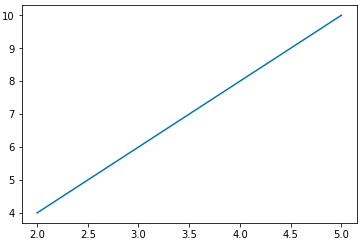
連続曲線plt.plot(x,y,label="Label")plt.legend()
ヒストグラム plt.hist(data) plt.grid(True)
箱ひげ図 plt.boxplot(data) plt.grid(True)
点のスタイル:r--(red -赤線), bs(blue squre青四角), g^(green ^緑三角)
2つ以上をプロットする時は、(xの値,yの値,スタイル)
plt.plot(t, t, 'r--', t, t**2, 'bs', t, t**3, 'g^')
または以下の書き方ができる。
def f(t):
    return t

def g(t):
    return t**2

def h(t):
    return t**3

plt.plot(t, t, 'r--', t, t**2, 'bs', t, t**3, 'g^')