

If you've been building with shadcn/ui for a while, you've probably wanted motion in your UI without adding a separate animation library or writing transitions from scratch. The gap between a static shadcn setup and something that actually feels alive is real, and it's one most developers solve badly the first time.
I put this guide together after going through the animated component libraries in one of the more complete open-source shadcn libraries available right now. It covers what each component does, where it fits, and what you actually install to get it running.
This is not a component showcase. It's a practical breakdown for developers who want to make a fast, informed decision.
I'm not recommending these because they look good in a demo. I'm recommending them because they install cleanly, fit a standard React and Next.js stack, and give you full code ownership after install.
How I Evaluated These Components
- Install method: Does it work with the Shadcn CLI? Can you use pnpm, npm, yarn, or bun without friction?
- Code ownership: Does the component source land in your project after install, with no hidden runtime abstraction?
- Stack fit: Does it require anything beyond React, Next.js, Tailwind CSS, and Framer Motion?
- Real use cases: Does the animation serve a functional purpose, or is it purely decorative?
- Motion clarity: Is the animation timing predictable and configurable through props or Tailwind utilities?
-
Accessibility: Does it handle
prefers-reduced-motion? Does it preserve keyboard navigation? - Maintenance signals: Is the component actively updated? Are bugs addressed and new patterns added over time?
- Component coverage: Do the animated components address real interaction patterns you'd actually ship, like onboarding steps, status feedback, file uploads, and hero motion?
Here is a breakdown of the animated components worth using, what they do, and where they actually belong.
What Are Shadcn Animated Components?
Shadcn animated components are React components that add controlled motion to UI elements using Framer Motion, Tailwind CSS, and either Radix UI or Base UI as the underlying primitive layer. They follow the same open-code approach as shadcn/ui: you install a component via CLI, the source code drops into your project, and you own it completely.
These are not wrapped library components. You can change anything after install, from easing and timing to trigger logic and visual behavior. There are no hidden dependencies and no vendor lock-in.
The animated components covered here span text effects, list animations, interactive UI elements, and background motion patterns. Each one is available to install for free, and some have premium variants with extended behavior. All are open source and ready to drop into any React or Next.js project.
Developer Checklist Before You Use Any Animated Component
Run through this before adding any shadcn component to your project:
- Confirm React 19+ is in use and Tailwind CSS is configured
- Install Framer Motion if not already present:
npm install framer-motion - Check whether the component uses Radix UI or Base UI and confirm no conflicts with your existing setup
- Use the correct CLI format:
pnpm dlx shadcn@latest add @shadcn-space/[component-name] - Identify the animation trigger — scroll, hover, mount, or manual state — before choosing the component
- Confirm the component handles
prefers-reduced-motionif accessibility is a requirement - Test in both light and dark mode since gradient and border animations render differently across themes
- Decide between free and premium variant before running the install command
- Read the component source after install before modifying timing props
- Avoid running multiple large list animations simultaneously to prevent frame drops on lower-end devices
- Confirm the component naming in your CLI command matches exactly the registry identifier
Setup Steps
Every component in this list installs through the Shadcn CLI. You pick your package manager and run a single command. The component source lands directly in your repo.
Here is the install command using pnpm:
pnpm dlx shadcn@latest add @shadcn-space/animated-list-02
The same pattern works with other package managers:
npm
npx shadcn@latest add @shadcn-space/animated-list-02
yarn
yarn dlx shadcn@latest add @shadcn-space/animated-list-02
bun
bunx shadcn@latest add @shadcn-space/animated-list-02
If you prefer not to use the CLI, every component also supports direct copy-paste from the source page. No build step is required. The official install guide and CLI documentation are available at the library's docs page.
Before installing any animated component, confirm that Framer Motion is present in your project. Several of these components depend on it for keyframe and transition logic.
npm install framer-motion
Quick Answer: Which Components Are Worth Trying First?
If you are short on time, here is a prioritized starting point by intent:
- For landing pages and marketing copy: Shiny Text, Gradient Text, Morph Text
- For onboarding and setup flows: Typing, Setup Steps (Animated List variant), Rolling Text
- For dashboards and admin panels: Stack Expandable, Animated Border, Animated File Upload, Apple Dock
- For status and async feedback: Shimmer Text, Rolling Text
- For hero backgrounds and visual sections: Blob Fill, Orbiting Circles with Globe
- For CTAs and primary actions: Animated Button With Icon
- For scroll-triggered section reveals: Reveal Text
Best Shadcn Animated Components
Setup Steps

Setup Steps renders a sequential list of onboarding steps where each item appears one at a time using staggered entry animations. The timing between steps is configurable, and the component works with both static step arrays and state-driven step progression in React.
Use cases:
- Account creation and workspace setup sequences
- CLI tool install guides with step-by-step visual feedback
- Product tour flows inside web apps
- API key generation walkthroughs
- In-app upgrade and plan activation flows
Best for: Multi-step onboarding flows in SaaS apps where step-by-step confirmation improves user orientation.
Stack Expandable

Stack Expandable starts in a collapsed state, showing stacked item previews, then expands on interaction to reveal the full list using staggered entrance transitions. The visual stacking effect gives users a clear signal that more content exists without exposing everything at once. It works with both static arrays and state-driven lists in React.
Use cases:
- Notification tray with collapsed and expanded states
- Activity log showing recent 3 entries with expand option
- Task list with overflow behavior in sidebar panels
- Event feed with lazy reveal on click
- Inbox preview with show-all interaction
Best for: Notification panels in dashboards where content density needs to stay controlled until a user actively requests more.
Shiny Text

Shiny Text applies a moving light sweep across text, creating a reflective shimmer effect driven by CSS keyframes through Tailwind utilities. The animation adds no render overhead to surrounding content and does not interfere with layout or text selection.
Use cases:
- Product launch or "New" labels in SaaS headers
- Hero taglines with subtle premium polish
- "Beta" or "Early Access" badges in app interfaces
- Promotional copy in marketing sections
- CTA labels that need to draw attention without animation overload
Best for: Hero section labels or feature badges on landing pages where visual attention is needed without distracting motion.
Gradient Text

Gradient Text renders text with an animated color gradient that shifts across the character range. It stays readable at all font sizes and weights, which makes it reliable for headings where you want visual hierarchy without increasing font size or adding icons. The gradient range and animation speed are adjustable through Tailwind utility classes.
Use cases:
- Hero headlines with brand gradient
- Pricing page tier labels to signal product levels
- Feature section titles in product documentation
- Active tab or navigation labels
- Highlighted keyword phrases in onboarding copy
Best for: Section headings in marketing pages or tier names in SaaS pricing sections where brand color range adds clarity.
Typing

The Typing component simulates a typewriter character-by-character reveal with a configurable cursor and speed. It supports both single strings and arrays of strings with loop behavior. It works predictably in Next.js across both client and server component setups, which makes it safe to use without worrying about hydration mismatches.
Use cases:
- App loading screen with status progression text
- Terminal-style command output in developer tool interfaces
- Onboarding intro screen with a personalized greeting reveal
- Feature demo copy that types out the value proposition
- Chat interface with simulated assistant response entrance
Best for: Hero sections or terminal-style UI where sequential text reveal adds contextual anticipation before a key message.
Rolling Text
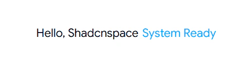
Rolling Text cycles through a list of strings using a smooth vertical roll transition, similar to a status ticker. Each string replaces the previous one by rolling in from below, controlled by configurable timing and easing props. It handles multi-string arrays cleanly without additional state management on your end.
Use cases:
- Hero copy cycling through product benefits
- Status ticker showing progression states like "Initializing", "Fetching Data", "Ready"
- Feature announcement labels in app headers
- Rotating testimonial attribution labels
- Onboarding steps shown inline within a sentence
Best for: Rotating value propositions in hero sections of SaaS or product landing pages where multiple key messages share the same space.
Shimmer Text

Shimmer Text applies a loading-style shimmer animation directly to visible text, signaling a processing or generating state without replacing the text with a skeleton. This makes it distinctly useful for async states where you want to keep context visible while showing that data is still in flight.
Use cases:
- "Generating your report..." state in dashboard views
- Table column headers while async data loads in
- AI response streaming indication in chat-style interfaces
- Form submission labels during processing
- Data export or compute state labels in analytics apps
Best for: AI-generated content states and async data loading labels in dashboards where removing the text would break user orientation.
Reveal Text

Reveal Text uses a mask-based animation to uncover text from a hidden state, giving the impression that words appear from behind a surface. It pairs well with scroll triggers and handles both word-level and line-level reveals. The component works cleanly with Framer Motion's viewport detection, so you can tie the reveal to scroll position without writing custom intersection logic.
Use cases:
- Section headers that animate in on scroll in long-form pages
- Feature reveal animations in product landing pages
- "New" labels appearing on recently updated components or content
- Staggered paragraph reveals in onboarding flow copy
- Tutorial step numbers revealed in sequence
Best for: Scroll-triggered section headings in marketing or documentation pages where text entrance adds structural rhythm.
Morph Text

Morph Text transitions between strings by morphing individual characters rather than fading or rolling. One word visually transforms into the next, which works especially well when the strings being cycled are conceptually related. The effect is more spatially contained than Rolling Text, making it suitable for tight headline areas.
Use cases:
- "blocks to components to templates" cycling in product hero copy
- Feature category names morphing through in a section header
- Dashboard state labels with animated transition between modes
- Rotating product tier or plan names in pricing UI
- Keyword cycling in SEO-focused landing page headlines
Best for: Hero sections where two or three related terms need to rotate in the same spatial position without a layout shift.
Apple Dock

Apple Dock renders a macOS-style dock with proximity-based magnification. Icons scale on hover with neighboring icons scaling proportionally using Framer Motion's motion values tied to real-time cursor position. Icon size, gap, and magnification factor are all configurable through props, giving you direct control over how the dock behaves without touching the animation logic.
Use cases:
- App switcher toolbar in SaaS admin dashboards
- Quick-access action bar in project management tools
- Demo interface navigation in product landing pages
- Portfolio or personal site project navigation
- Settings shortcut bar in developer tool interfaces
Best for: Navigation-dense admin panel layouts or product demos where hover interaction adds a premium feel without adding more UI chrome.
Animated Button With Icon

Animated Button With Icon adds icon motion on hover or click, typically sliding the icon in from outside the button boundary or scaling it as part of the interaction. It signals interactivity more clearly than a standard hover state change and works with any icon library you already have in your project.
Use cases:
- Submit and confirm buttons in multi-step forms
- "Download", "Export", or "Run" action triggers in dashboards
- Upgrade or checkout CTAs in SaaS product flows
- Icon-forward navigation buttons in sidebar menus
- Row-level action triggers in data tables
Best for: Primary CTAs in forms or dashboards where action visibility directly affects conversion behavior.
Animated Border
Animated Border draws a moving gradient or light trace along the edge of a container element. It works on cards, input fields, and panels, with control over border color, animation speed, and corner radius behavior through configurable props. Drop it onto any container that needs to communicate an active, selected, or highlighted state through motion rather than a static style change.
Use cases:
- Active plan card in pricing section layouts
- Selected row or focused item in data tables
- Input field highlight during active focus state
- Featured alert or info card in notification areas
- Premium tier container in SaaS product UI
Best for: Highlighting active states, selected cards, or premium content containers in pricing pages and SaaS dashboards.
Blob Fill

Blob Fill renders continuously morphing soft blob shapes as an animated background fill layer behind content. The shapes shift using Framer Motion keyframe sequences and run as a purely visual layer, so they never interfere with pointer events or content interaction. It adds depth to otherwise flat gradient backgrounds.
Use cases:
- Hero section background on product landing pages
- Feature card background in product marketing sections
- Empty state illustration background in dashboard views
- Onboarding screen backgrounds that need visual warmth
- Modal backdrop with added visual depth
Best for: Hero section backgrounds or feature card fills in marketing pages where static gradients look insufficient.
Animated File Upload

Animated File Upload communicates all four file states through visual motion: idle, dragging, uploading, and complete. State transitions are driven by Framer Motion, and the visual feedback means users understand file status without reading a text label, which reduces cognitive load in upload-heavy workflows.
Use cases:
- Resume or document upload in onboarding and intake flows
- Image upload in CMS or media asset management tools
- CSV import interface in data-heavy SaaS applications
- Attachment upload in project or task management tools
- Asset upload in content creation and publishing dashboards
Best for: Document and media upload interfaces in SaaS tools where clear file state feedback directly reduces support friction.
Orbiting Circles with Globe

Orbiting Circles with Globe renders icons moving in circular orbits around a central element, typically a globe or logo mark. Orbit speed, radius, icon assignments, and orbital spacing are configurable through props, giving you direct control over how the motion reads in context. It is a decorative motion component suited for visual sections that need to communicate platform connectivity or ecosystem scale without adding layout complexity.
Use cases:
- API integration visual on a SaaS product page
- "Connected services" section in app onboarding
- Platform ecosystem overview in product documentation
- Feature animation in hero sections for infrastructure products
- "Global reach" or CDN coverage visual in technical marketing pages
Best for: Integration showcase sections on product landing pages where a visual metaphor communicates network scale or connectivity.
FAQs
1. How do I install Shadcn animated components in a Next.js project using pnpm, npm, yarn, or bun?
Use the Shadcn CLI to add animated components to your Next.js project. The component source code is copied directly into your project, giving you full ownership and control. Make sure your project already has Next.js and Tailwind CSS configured. If a component depends on Framer Motion, install that dependency first before adding the component.
2. Are these Shadcn animated components safe to use in a production React or Next.js app?
Yes. The animation layer uses Framer Motion, which is a stable and production-tested library used widely across React applications. The components themselves carry no hidden runtime dependencies after install, since the code lives directly in your project.
3. What is the difference between Shadcn animated text components and animated list components, and when should I use each?
Animated text components add motion to a single text element, making them ideal for headings, labels, and hero copy. Animated list components animate multiple items in sequence, making them best for onboarding steps, activity feeds, and notifications. Use text components for individual content and list components for grouped content.
Final Verdict
If you want motion in your React or Next.js app without stitching together separate animation packages or fighting library abstractions, this set of animated components covers the most common patterns well. The stack is React, Next.js, Tailwind CSS, and Framer Motion. You install via CLI, the code is yours after that, and every component follows the same open-code approach that makes shadcn/ui practical to maintain long term.
Start with the animated text variants for landing pages and marketing copy, the animated list variants for dashboards and notification flows, and the interactive components like Apple Dock or Animated File Upload for specific interaction patterns. Pick based on your use case, install the component, read the source, and adjust from there.