フォームや設定画面を作っていると、
「この項目、説明をちょっとだけ添えたい…」
「でも長く書くとUIがゴチャつく…」
こういう場面、よくありませんか?
そんなときに便利なのが「補足ツールチップ(iボタン)」です。
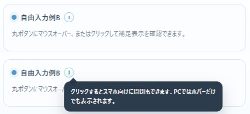
デモ
実際に動くものはこちらで公開しています。
「CSS をコピー」「要素をコピー」「JavaScript をコピー」ボタンで、それぞれコピーする事で、ご自身の html に簡単導入できます。
こんな人におすすめ
- 項目の横に「ちょっとした補足」を付けたい
- UIをスッキリ保ちたい
- スマホでも使いやすい説明UIを作りたい
- ツールチップを自作したいけど面倒そうと感じている
実装のポイント
今回の実装はかなりシンプルですが、実用的な工夫を入れています。
① ホバーで表示(PC)
マウスを乗せるだけで補足が表示されます。
直感的で、説明が邪魔になりません。
② クリックで開閉(スマホ対応)
スマホではホバーが使えないので、
- タップで開く
- もう一度タップ or 外側クリックで閉じる
という挙動になっています。
③ 外クリックで閉じる
複数開きっぱなしにならないように、
- 他を開く
- 画面クリック
で閉じる制御を入れています。
使い方のイメージ
UIとしてはこんな感じです。
- 項目名の横に「i」
- 押すと黒い吹き出しで説明表示
よくある設定画面のアレです。
なぜこの実装が良いか
インフォボタンって地味ですが、作るときに意外と悩みます。
- 位置どうする?
- スマホどうする?
- 開閉どう制御する?
- 外クリックで閉じる?
このあたりを全部いい感じにまとめているのが今回のポイントです。
まとめ
インフォボタンは小さいですが、UXにかなり効きます。
- 説明を隠せる
- UIがスッキリする
- ユーザーに優しい
「ちょっと補足入れたいな…」と思ったら、ぜひ使ってみてください。
補足
今回のサンプルは以下から確認できます。
そのまま流用できる形なので、気軽に試してみてください。
簡易実装プロンプト
下記の仕組みを導入して、操作方法が分かるように、多くの場所にツールチップを配置して下さい


/* css */

.info-wrap{
  position:relative;
  display:inline-flex;
  align-items:center;
}

.info-btn{
  appearance:none;
  width:20px;
  height:20px;
  min-width:20px;
  padding:0;
  border:1px solid #9fc1d6;
  border-radius:999px;
  background:linear-gradient(180deg, #ffffff 0%, #eef7ff 100%);
  color:#2f7e8d;
  font-size:12px;
  font-weight:700;
  line-height:1;
  display:inline-flex;
  align-items:center;
  justify-content:center;
  cursor:pointer;
}

.info-tooltip{
  position:fixed;
  top:0;
  left:0;
  z-index:2000;
  width:min(320px, 78vw);
  margin:0;
  padding:10px 12px;
  border:1px solid rgba(36,52,71,0.12);
  border-radius:12px;
  background:rgba(36,52,71,0.96);
  color:#ffffff;
  font-size:12px;
  line-height:1.6;
  box-shadow:0 12px 28px rgba(36,52,71,0.22);
  white-space:normal;
  overflow:visible;
  --tip-arrow-left:10px;
}

.info-tooltip::before{
  content:"";
  position:absolute;
  top:-6px;
  left:var(--tip-arrow-left);
  width:10px;
  height:10px;
  background:rgba(36,52,71,0.96);
  transform:rotate(45deg);
}

.info-tooltip[popover]{
  opacity:0;
  visibility:hidden;
}

.info-tooltip[popover]:popover-open,
.info-tooltip.is-open{
  opacity:1;
  visibility:visible;
}

/* body */

<div class="info-wrap">
  <button
    type="button"
    class="info-btn"
    aria-label="補足"
    aria-describedby="info-popover-1"
    data-popover-id="info-popover-1"
  >i</button>
  <span
    class="info-tooltip"
    id="info-popover-1"
    role="tooltip"
    popover="manual"
  >
    このテキストはテスト用です。少し長めの補足でも折り返して表示されるか確認できます。
  </span>
</div>

/* javascript */

function supportsPopover(){
  return typeof HTMLElement !== 'undefined'
    && typeof HTMLElement.prototype.showPopover === 'function';
}

function positionTooltip(wrap){
  const btn = wrap.querySelector('.info-btn');
  const tip = wrap.querySelector('.info-tooltip');
  if(!btn || !tip) return;

  const rect = btn.getBoundingClientRect();
  const gap = 8;

  tip.style.top = '0px';
  tip.style.left = '0px';

  const tipRect = tip.getBoundingClientRect();

  let left = rect.left;
  let top = rect.bottom + gap;

  const maxLeft = window.innerWidth - tipRect.width - 8;
  const maxTop = window.innerHeight - tipRect.height - 8;

  if(left > maxLeft) left = Math.max(8, maxLeft);
  if(top > maxTop){
    top = rect.top - tipRect.height - gap;
  }
  if(top < 8) top = 8;

  tip.style.left = Math.max(8, left) + 'px';
  tip.style.top = top + 'px';

  const btnCenter = rect.left + rect.width / 2;
  let arrowLeft = btnCenter - left - 5;

  if(arrowLeft < 10) arrowLeft = 10;
  if(arrowLeft > tipRect.width - 20) arrowLeft = tipRect.width - 20;

  tip.style.setProperty('--tip-arrow-left', arrowLeft + 'px');
}

function openTooltip(wrap){
  const tip = wrap.querySelector('.info-tooltip');
  if(!tip) return;

  document.querySelectorAll('.info-wrap').forEach(other => {
    if(other !== wrap) closeTooltip(other);
  });

  if(supportsPopover()){
    if(!tip.matches(':popover-open')){
      tip.showPopover();
    }
    positionTooltip(wrap);
  }else{
    tip.classList.add('is-open');
    positionTooltip(wrap);
  }

  wrap.classList.add('open');
}

function closeTooltip(wrap){
  const tip = wrap.querySelector('.info-tooltip');
  if(!tip) return;

  if(supportsPopover()){
    if(tip.matches(':popover-open')){
      tip.hidePopover();
    }
  }else{
    tip.classList.remove('is-open');
  }

  wrap.classList.remove('open');
}

function toggleTooltip(wrap){
  const tip = wrap.querySelector('.info-tooltip');
  if(!tip) return;

  const isOpen = supportsPopover()
    ? tip.matches(':popover-open')
    : tip.classList.contains('is-open');

  if(isOpen) closeTooltip(wrap);
  else openTooltip(wrap);
}

function initInfoTooltips(){
  const isTouch = 'ontouchstart' in window || navigator.maxTouchPoints > 0;

  document.querySelectorAll('.info-wrap').forEach(wrap => {
    const btn = wrap.querySelector('.info-btn');
    const tip = wrap.querySelector('.info-tooltip');
    if(!btn || !tip) return;

    if(isTouch){
      btn.addEventListener('click', function(e){
        e.preventDefault();
        e.stopPropagation();
        toggleTooltip(wrap);
      });
      return;
    }

    btn.addEventListener('mouseenter', function(){
      openTooltip(wrap);
    });

    btn.addEventListener('mouseleave', function(){
      setTimeout(function(){
        if(document.activeElement !== btn){
          closeTooltip(wrap);
        }
      }, 150);
    });

    btn.addEventListener('focus', function(){
      openTooltip(wrap);
    });

    btn.addEventListener('blur', function(){
      setTimeout(function(){
        if(!wrap.contains(document.activeElement)){
          closeTooltip(wrap);
        }
      }, 0);
    });

    btn.addEventListener('click', function(e){
      e.preventDefault();
      e.stopPropagation();
      toggleTooltip(wrap);
    });
  });
}

document.addEventListener('click', function(e){
  document.querySelectorAll('.info-wrap').forEach(function(wrap){
    if(!wrap.contains(e.target)){
      closeTooltip(wrap);
    }
  });
});

window.addEventListener('resize', function(){
  document.querySelectorAll('.info-wrap.open').forEach(function(wrap){
    positionTooltip(wrap);
  });
});

window.addEventListener('scroll', function(){
  document.querySelectorAll('.info-wrap.open').forEach(function(wrap){
    positionTooltip(wrap);
  });
}, true);

initInfoTooltips();