CSSだけで、少し高級感のある「ガラス風ボタン」を作ってみました。
最近のUIでは、単純なベタ塗りではなく、
- 上側だけ白く光らせる
- 左上に反射っぽいハイライトを入れる
- 内側に白い線を入れる
- グラデーションを重ねる
といった工夫で、立体感や質感を出すことが多いです。
今回はそんな「光沢感のあるボタン」を、画像なし・CSSのみで作ります。
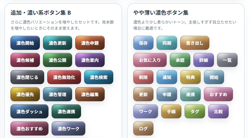
完成イメージ
<button class="sample-button">
  <span class="sample-button__label">保存</span>
</button>
.sample-button{
  position:relative;
  isolation:isolate;
  overflow:hidden;

  display:flex;
  align-items:center;
  justify-content:center;

  padding:12px 18px;
  min-height:45px;

  border:1px solid rgb(41, 68, 99);
  border-radius:12px;

  background:
    radial-gradient(
      circle at 20% 0%,
      rgba(255,255,255,.6),
      rgba(255,255,255,0) 40%
    ),

    linear-gradient(
      rgba(255,255,255,.45) 0%,
      rgba(255,255,255,.15) 35%,
      rgba(255,255,255,0) 55%,
      rgba(0,0,0,.04) 100%
    ),

    linear-gradient(
      135deg,
      rgb(71,109,152) 0%,
      rgb(47,75,108) 58%,
      rgb(31,51,73) 100%
    );

  background-blend-mode:overlay;

  color:#fff;
  font-size:14px;
  font-weight:700;
  letter-spacing:.35px;

  text-shadow:rgba(0,0,0,.22) 0 1px 1px;

  box-shadow:
    rgba(36,52,71,.12) 0 8px 18px,
    rgba(255,255,255,.58) 0 1px 0 inset;

  cursor:pointer;

  transition:
    transform .15s ease,
    filter .15s ease,
    box-shadow .15s ease;
}

.sample-button::before{
  content:"";
  position:absolute;
  inset:1px 1px auto 1px;
  height:20px;

  border-radius:12px;

  background:linear-gradient(
    180deg,
    rgba(255,255,255,.28) 0%,
    rgba(255,255,255,.13) 46%,
    rgba(255,255,255,.035) 76%,
    rgba(255,255,255,0) 100%
  );

  opacity:.32;
  pointer-events:none;
}

.sample-button:hover{
  transform:translateY(-2px);
  filter:saturate(1.03) brightness(1.02);
}

.sample-button:active{
  transform:translateY(1px) scale(.985);
}

.sample-button__label{
  position:relative;
  z-index:1;
}
ポイント解説
1. グラデーションを重ねて質感を作る
このボタンの一番重要な部分です。
background:
  radial-gradient(...),
  linear-gradient(...),
  linear-gradient(...);
背景を1つではなく、複数重ねています。
ベース色
linear-gradient(
  135deg,
  rgb(71,109,152) 0%,
  rgb(47,75,108) 58%,
  rgb(31,51,73) 100%
)
ここが土台の色です。
単色ではなく斜めグラデーションにすることで、平面的になりにくくなります。
2. 左上を白くして「反射」を作る
radial-gradient(
  circle at 20% 0%,
  rgba(255,255,255,.6),
  transparent 40%
)
これが左上の光です。
ここがかなり重要で、これがあるだけで「ツヤ感」が一気に出ます。
特に、
circle at 20% 0%
で左上寄りに配置しているのがポイントです。
中央に置くと、のっぺりした印象になります。
3. 上側だけ明るくして立体感を出す
linear-gradient(
  rgba(255,255,255,.45) 0%,
  rgba(255,255,255,.15) 35%,
  transparent 55%
)
上から下に向かって白を薄くしています。
これによって、
- 上面に光が当たっている
- 下側は少し暗い
という自然な立体感が出ます。
ゲームUIや管理画面系UIでもよく使われるテクニックです。
4. 擬似要素で「表面の膜」を作る
.sample-button::before
を使って、上側にだけ半透明の白を追加しています。
opacity:.32;
でかなり薄くしているのがポイントです。
強すぎると安っぽいプラスチック感が出ます。
5. inset の box-shadow で内側の光を作る
box-shadow:
  rgba(255,255,255,.58) 0 1px 0 inset;
inset を使うと、内側に影を描けます。
今回は白を使っているので、
「上辺が光っている」
ように見えます。
これも立体感にかなり効きます。
6. hover時に少し浮かせる
.sample-button:hover{
  transform:translateY(-2px);
}
2pxだけ浮かせています。
大きく動かすより、このくらいの微妙な変化のほうが高級感が出やすいです。
7. active時は少し沈ませる
.sample-button:active{
  transform:translateY(1px) scale(.985);
}
押した感覚を出しています。
scale を少し小さくすると、押し込み感が自然になります。
まとめ
今回のポイントは、
- グラデーションを重ねる
- 左上を白く光らせる
- 上側だけ明るくする
- inset shadowで内側を光らせる
- hover/activeで微妙に動かす
この5つです。
単純な background-color だけでは出せない、少し高級感のあるボタンになるのでおすすめです。