棒グラフ
シンプルな棒グラフ
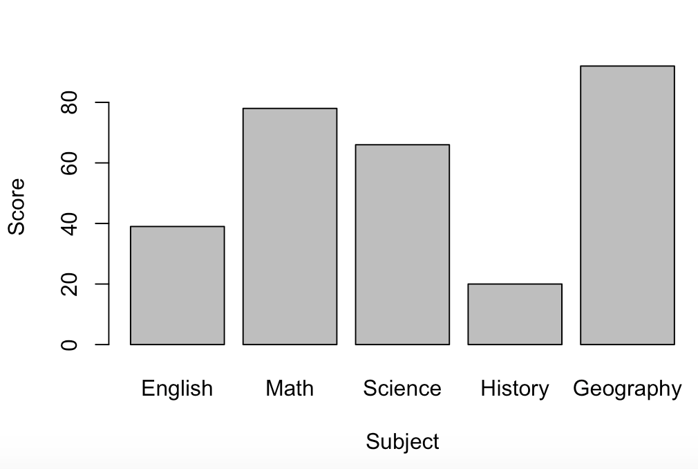
> score <- c(39, 78, 66, 20, 92)
> names(score) <- c("English", "Math", "Science", "History", "Geography" )
> barplot(score, xlab = "Subject", ylab = "Score" )
names()が使えるのは1次元のみ。
> score2 <- matrix(c(73, 42, 85, 26, 53, 19, 49, 90, 29, 39), 2, 5)
> score2
     [,1] [,2] [,3] [,4] [,5]
[1,]   73   85   53   49   29
[2,]   42   26   19   90   39
> barplot(score2, names.arg = c("English", "Math", "Science", "History", "Geography"), xlab = "Subject", ylab = "Score")
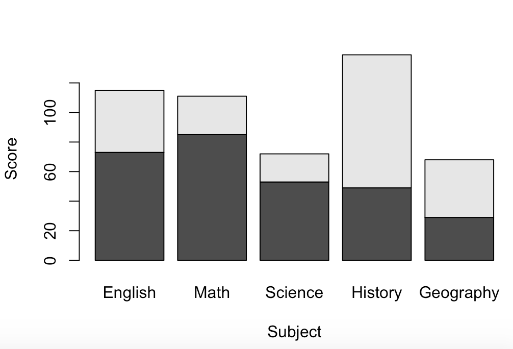
以下のように*barplot()*の引数にbeside = Tを付け加えると積み上げられない。
> barplot(score2, names.arg = c("English", "Math", "Science", "History", "Geography"), xlab = "Subject", ylab = "Score", beside = T)

棒グラフの装飾
| オプション | 詳細 |
|---|---|
| names.arg | 各要素の名前 |
| col | 棒の色の指定 |
| main | グラフのタイトル |
| xlab | x軸のラベル |
| ylab | y軸のラベル |
| ylim | y軸の範囲 |
| las | 目盛のスタイル |
| axis.lty | x軸のスタイル |
| font.main | タイトルのフォント |
| font.lab | 軸ラベルのフォント |
| font | 軸項目ののフォント |
| cex.main | タイトルのフォントサイズ |
| cex.lab | 軸ラベルのフォントサイズ |
| cex.names | x軸項目ののフォントサイズ |
| cex.axis | y軸目盛ののフォントサイズ |
| width | 棒の太さ |
| space | x軸のラベル |
| legend | 凡例 |
| horiz | 垂直グラフか水平グラフの指定 |
box()で枠線をグラフにつけることが出来る。box(lty =1)というようにltyでスタイルを指定できる。
barplot(score, col = c("red", "blue", "yellow", "green", "orange"), main = "Score Table", las = 1,
 xlab = "Subject", ylab = "Score", ylim = c(0, 100), cex.main = 3,cex.names = 0.8, axis.lty = 1)
> box(lty = 1) # グラフに枠線をつける

> barplot(score2, names.arg = c("English", "Math", "Science", "History", "Geography"), col = c("red", "blue"), main = "Score Table", xlab = "Subject", ylab = "Score", ylim = c(0, 100), cex.main = 3,cex.names = 0.8, axis.lty = 1, beside = T, legend = c("yamada", "hanako"))

円グラフ
シンプルな円グラフ
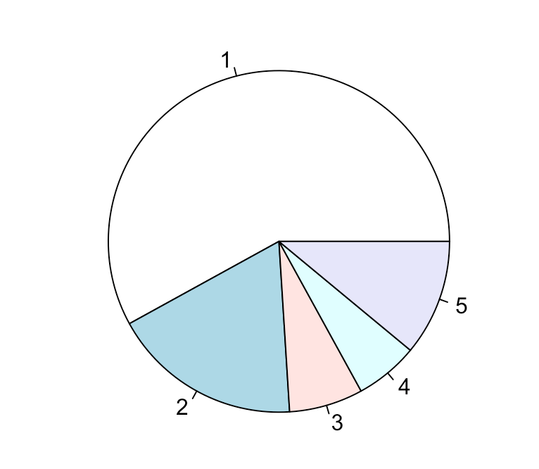
Rによる円グラフは情報量が少ないため、おすすめしない。
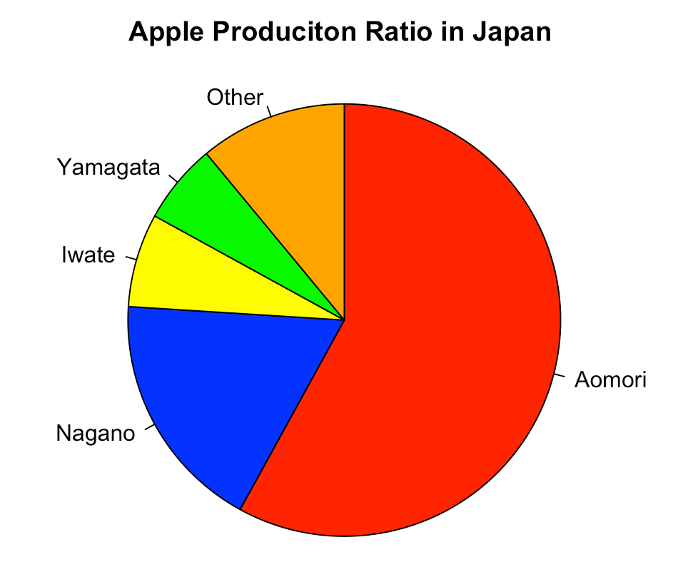
> apple <- c(58, 18, 7, 6, 11)
> pie(apple)
このままだとよく分からない円グラフができる。
円グラフの装飾
| オプション | 詳細 |
|---|---|
| radius | 円グラフの大きさ |
| labels | データの項目 |
| col | 色の指定 |
| clockwise | 時計回り(T)か反時計回り(F)の指定, c |
| border | 分割線の色 |
| main | タイトル |
| cex.main | タイトルのフォントサイズ |
| density | 射線を引く |
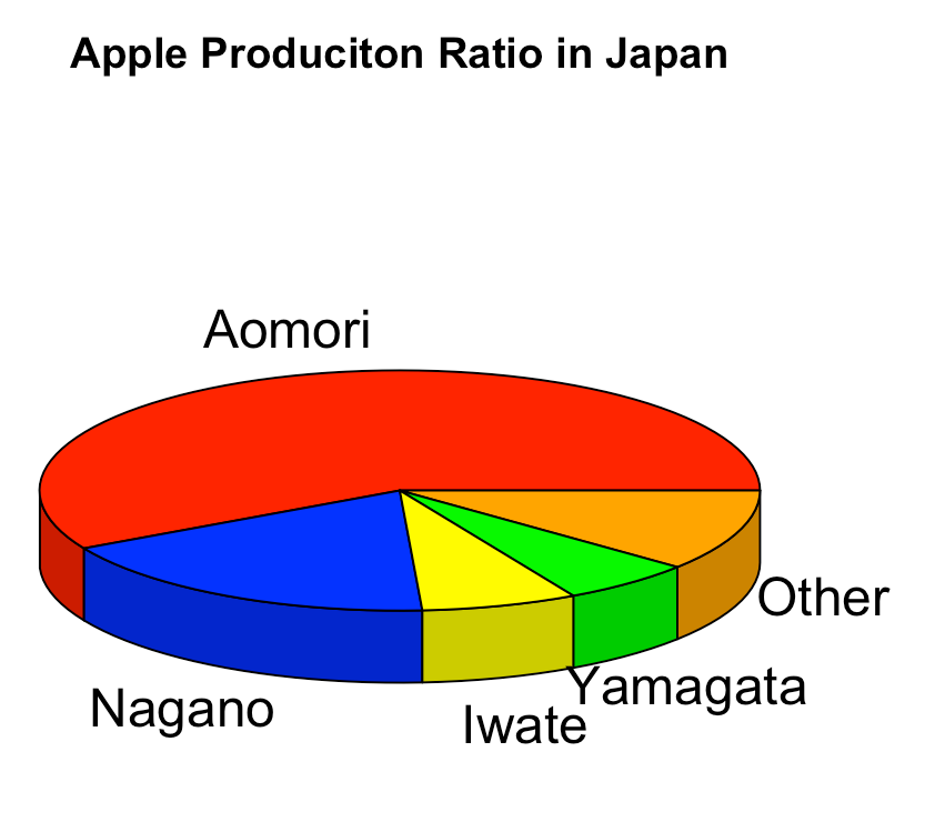
> pie(apple, radius = 1, labels = c("Aomori", "Nagano", "Iwate", "Yamagata", "Other"), col = c("red", "blue", "yellow", "green", "orange"), clockwise = T,main = "Apple Produciton Ratio in Japan")
3D円グラフ
> install.packages("plotrix")
> pie3D(apple, radius = 1, labels = c("Aomori", "Nagano", "Iwate", "Yamagata", "Other"), col = c("red", "blue", "yellow", "green", "orange"), main = "Apple Produciton Ratio in Japan")
もっと綺麗な円グラフ
もっと綺麗な円グラフを描くには自分で実装するしかない。
[参考] https://qiita.com/hachisukansw/items/3047e516ebdc55c74104
折れ線グラフ
シンプルな折れ線グラフ
以下のCSVデータは https://www.data.jma.go.jp/gmd/risk/obsdl/index.php からダウンロードして前処理したものを使用した。
> temperature <- read.csv("temperature.csv")
> temperature
   Month Osaka Tokyo Okinawa Hokkaido
1      1   8.6   7.1    18.7     -2.3
2      2   8.0   8.3    18.7     -2.1
3      3  11.4  10.7    20.1      3.3
4      4  13.7  12.8    19.8      6.8
5      5  20.8  19.5    24.8     13.7
6      6  24.9  23.2    28.1     18.3
7      7  26.0  24.3    29.3     21.2
8      8  30.7  29.1    29.4     23.3
9      9  25.8  24.2    27.7     20.1
10    10  18.7  17.5    25.8     13.1
11    11  14.7  14.0    23.4      6.3
12    12   8.7   7.7    19.2     -1.6
> plot(temperature[,1], temperature[,2], type ="l")

plot(), matplot()のオプションのtypeで折れ線のスタイルを指定できる。
matplot()を使えば折れ線の数を増やせる。
> matplot(temperature[,1], temperature[,2:5], type = "b")

折れ線グラフの装飾
| オプション | 詳細 |
|---|---|
| type | 折れ線のスタイル |
| pch | マーカーの形 |
| cex | マーカーの大きさ |
| lwd | 線の太さ |
| lty | 線のスタイル |
| col | 折れ線の色の指定 |
| main | グラフのタイトル |
| xlab | x軸のラベル |
| ylab | y軸のラベル |
| xlim | x軸の範囲 |
| ylim | y軸の範囲 |
| las | 目盛のスタイル |
| axis.lty | x軸のスタイル |
| font.main | タイトルのフォント |
| font.lab | 軸ラベルのフォント |
| cex.main | タイトルのフォントサイズ |
| cex.lab | 軸ラベルののフォントサイズ |
| xaxp | x軸のメモリの間隔の指定 |
> plot(temperature[,1], temperature[,2], type = "o", col = "blue", main = "Average Monthly Temperatures in Osaka", cex.main = 2, xlab = "Month", ylab = "Temperature", xlim = c(1,12), xaxp=c(1, 12, 11), las = "1")

> matplot(temperature[,1], temperature[,2:5], type = "o", pch = c(0, 1, 2, 5), lty = 1, col = c("blue", "red", "green", "orange"), main = "Average Monthly Temperatures in Japan", xlab = "Month", ylab = "Temperature", xlim = c(1,12), xaxp=c(1, 12, 11))
> legend("topleft", legend = c("Osaka", "Tokyo", "Okinawa", "Hokkaido"), col = c("blue", "red", "green", "orange"), pch = c(0, 1, 2, 5), lty = 1) # 凡例をつける

箱ひげ図
シンプルな箱ひげ図
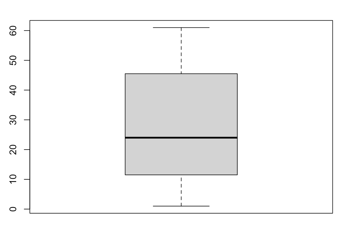
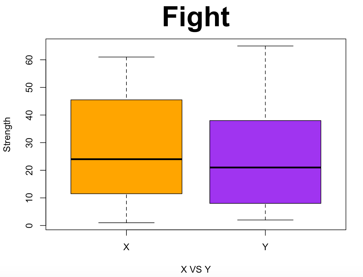
> x <- c(1, 5, 6,9, 14, 16, 19, 21, 27, 30, 34, 45, 46, 49, 52, 61)
> boxplot(x)
箱ひげ図の装飾
| オプション | 詳細 |
|---|---|
| type | 折れ線のスタイル |
| names | 各要素の名前 |
| col | 箱ひげの色の指定 |
| main | グラフのタイトル |
| xlab | x軸のラベル |
| ylab | y軸のラベル |
| xlim | x軸の範囲 |
| ylim | y軸の範囲 |
| width | 箱の幅 |
| staplewex | ひげの幅 |
| cex.main | タイトルのフォントサイズ |
| cex.lab | 軸ラベルののフォントサイズ |
| cex.axis | 軸目盛ののフォントサイズ |
| horizontal | 箱ひげ図の水平表示 |
| border | 箱の枠線とひげの色 |
| las | 目盛のスタイル |
| notch | 箱に切り込みを入れるかの指定 |
| range | ひげと箱の距離 |
> y <- c(2, 3, 4, 5, 11, 16, 17, 20, 22, 26, 33, 37, 39, 41, 50, 65)
> boxplot(x, y, xlab = "X VS Y", names = c("X", "Y"), ylab = "Strength", col = c("orange", "purple"), main = "Fight", cex.main = 3)
ちなみにsummary()を使うと中央値などを全て表示してくれる。
> summary(x)
   Min. 1st Qu.  Median    Mean 3rd Qu.    Max.
   1.00   12.75   24.00   27.19   45.25   61.00
> summary(y)
   Min. 1st Qu.  Median    Mean 3rd Qu.    Max.
   2.00    9.50   21.00   24.44   37.50   65.00
ヒストグラム
シンプルなヒストグラム
> iris[,2]
  [1] 3.5 3.0 3.2 3.1 3.6 3.9 3.4 3.4 2.9 3.1 3.7 3.4 3.0 3.0 4.0 4.4 3.9 3.5
 [19] 3.8 3.8 3.4 3.7 3.6 3.3 3.4 3.0 3.4 3.5 3.4 3.2 3.1 3.4 4.1 4.2 3.1 3.2
 [37] 3.5 3.6 3.0 3.4 3.5 2.3 3.2 3.5 3.8 3.0 3.8 3.2 3.7 3.3 3.2 3.2 3.1 2.3
 [55] 2.8 2.8 3.3 2.4 2.9 2.7 2.0 3.0 2.2 2.9 2.9 3.1 3.0 2.7 2.2 2.5 3.2 2.8
 [73] 2.5 2.8 2.9 3.0 2.8 3.0 2.9 2.6 2.4 2.4 2.7 2.7 3.0 3.4 3.1 2.3 3.0 2.5
 [91] 2.6 3.0 2.6 2.3 2.7 3.0 2.9 2.9 2.5 2.8 3.3 2.7 3.0 2.9 3.0 3.0 2.5 2.9
[109] 2.5 3.6 3.2 2.7 3.0 2.5 2.8 3.2 3.0 3.8 2.6 2.2 3.2 2.8 2.8 2.7 3.3 3.2
[127] 2.8 3.0 2.8 3.0 2.8 3.8 2.8 2.8 2.6 3.0 3.4 3.1 3.0 3.1 3.1 3.1 2.7 3.2
[145] 3.3 3.0 2.5 3.0 3.4 3.0
> hist(iris[,2])

> par(mfrow = c(2, 2))
> by(iris$Sepal.Length, iris$Species, hist)
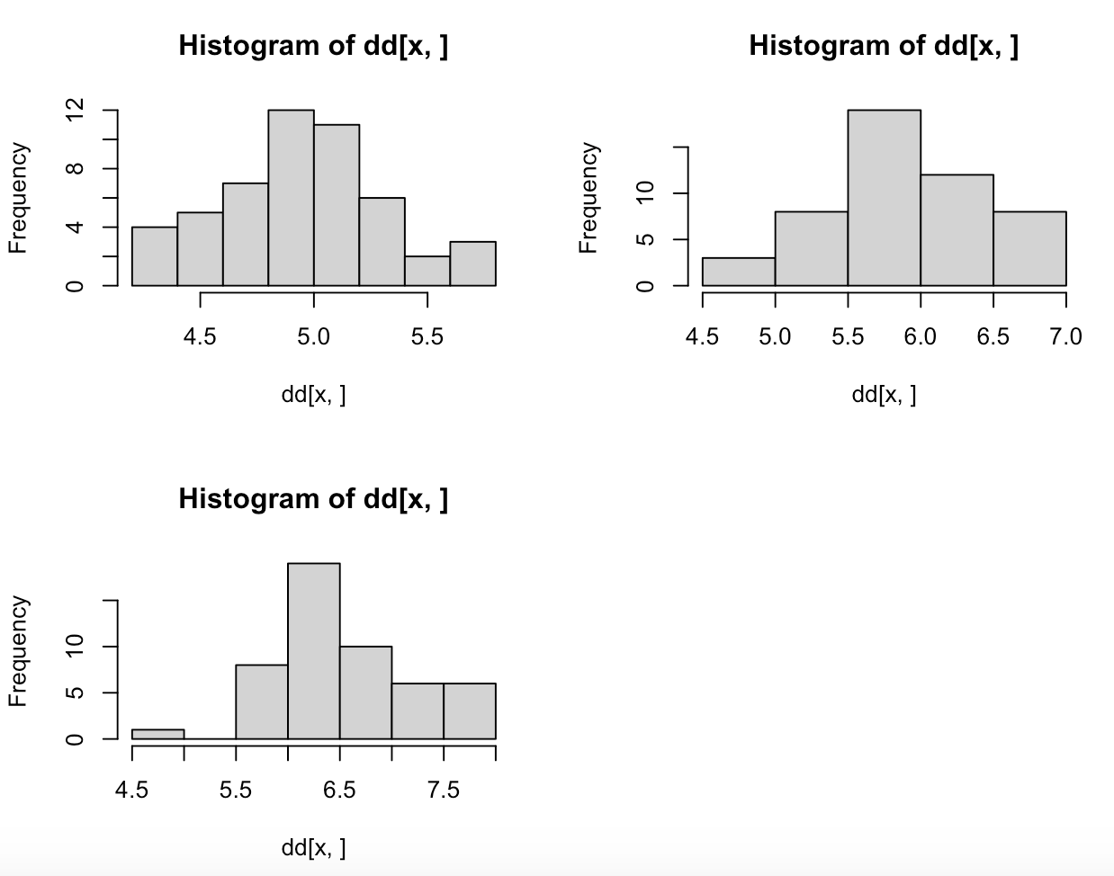
ちなみにby()はtapply()でも同じ結果になる。
ヒストグラムの装飾
> par(mfrow = c(2, 2))
> hist(iris[iris$Species=="setosa",]$Sepal.Length, col="red", main="setosa", xlim=range(iris$Sepal.Length), xlab="Sepal.Length")
> hist(iris[iris$Species=="versicolor",]$Sepal.Length, col="blue", main="versicolor", xlim=range(iris$Sepal.Length), xlab="Sepal.Length")
> hist(iris[iris$Species=="virginica",]$Sepal.Length, col="green", main="virginica", xlim=range(iris$Sepal.Length), xlab="Sepal.Length")

散布図
シンプルな散布図
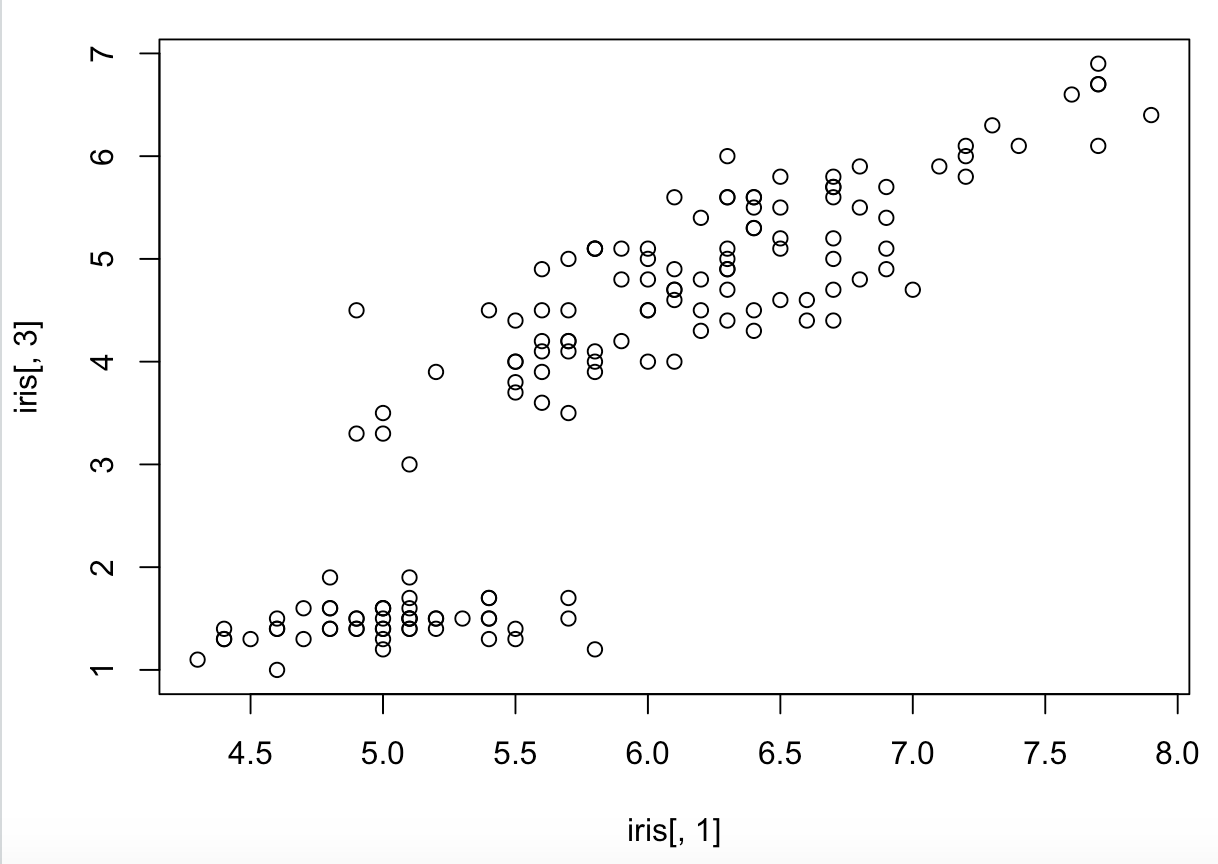
> plot(iris[,1], iris[,3])
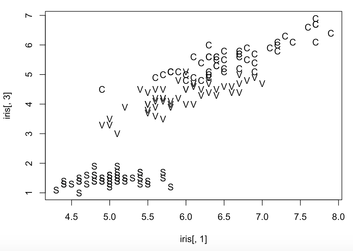
text()は散布図のラベルなどを加える関数で、plot()のオプション***type="n"***と組み合わせて使うと以下のように点にラベルをつけることが出来る。
なお、***type="n"***は点を書かないという意味。
> plot(iris[,1], iris[,3],type ="n")
> text(iris[,1], iris[,3])
rep()という関数を用いるとラベルを新たに作ることが出来る。
以下の場合のrep(50, 3)は始めの50のラベルがS、51〜100がC、101〜150がVとなる。

> iris.label <- rep(c("S", "V", "C"), rep(50,3))
> plot(iris[,1], iris[,3],type ="n")
> text(iris[,1], iris[,3], iris.label)
散布図の装飾
| オプション | 詳細 |
|---|---|
| type | グラフのスタイル |
| bg | 点の色の指定 |
| main | グラフのタイトル |
| xlab | x軸のラベル |
| ylab | y軸のラベル |
| xlim | x軸の範囲 |
| ylim | y軸の範囲 |
| cex | 点のサイズ |
| cex.main | タイトルのフォントサイズ |
| pch | 点のスタイル |
> plot(iris[,1],iris[,3],pch = 21,xlab = "Length of Sepal", ylab = "Length of Petal", cex=2,bg = c(2, 3, 4)[unclass(iris$Species)])

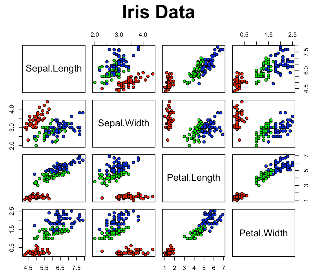
散布図行列
シンプルな散布図行列
> pairs(iris[1:4])

散布図行列の装飾
| オプション | 詳細 |
|---|---|
| type | グラフのスタイル |
| bg | 点の色の指定 |
| main | グラフのタイトル |
| cex | 点のサイズ |
| cex.main | タイトルのフォントサイズ |
| pch | 点のスタイル |
> pairs(iris[1:4], pch = 21, bg = c("red", "green", "blue")[unclass(iris$Species)], main = "Iris Data", cex.main = 2)
ggplot2
ggplot2というものを使えば、棒グラフ、ヒストグラム、散布図など多くのグラフを綺麗に描くことが出来る。また後日まとめた記事を書く予定です。