R の円グラフ描画が苦手でずっと避けてきたんですが、最近、何とかいうか、やっとというかで、以下みたいな円グラフが描けるようになったのでそのメモです。
サンプルデータ
まずは簡単なサンプルデータを用意します。
sample_data <- data.frame(
    type = c("飴菓子", "チョコレート", "チューインガム", "せんべい", "ビスケット", "米菓", "和生菓子", "洋生菓子", "スナック菓子", "油菓子", "その他"),
    n = c(2680, 5370, 970, 725, 3800, 3705, 4725, 4196, 4361, 504, 2873)
)
# 参考: 菓子統計資料H30, 全日本菓子協会(ANKA), http://anka-kashi.com/statistics.html, (参照2020-06-10)
あんまり考えずに描画
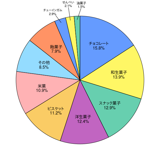
あんまり考えずに円グラフを描画しようとすると以下のようになってしまいます。これを見た時に、もっと簡単に綺麗でカッコイイ円グラフが描けると思っていた私は「 R で円グラフって難しい」って思ってしまって避けてきたところがあります。でも今回はここであきらめずに突き進んでみたいと思います。
library(dplyr)
library(ggplot2)
(sample_data %>%
    ggplot(aes(x = 0, y = n, fill = factor(n)))
    + geom_col()
    + coord_polar("y")
    + geom_text(aes(label = type), position = position_stack(vjust = 0.5))
)
余計な情報を消去
まずは背景や凡例、目盛りを消してしまいます。これだけでも少し分かりやすくなった気がします。
library(dplyr)
library(ggplot2)
(sample_data %>%
    ggplot(aes(x = 0, y = n, fill = factor(n)))
    + geom_col()
    + coord_polar("y")
    + geom_text(aes(label = type), position = position_stack(vjust = 0.5))
    + theme_void()
    + theme(legend.position = "none")
)
やっぱ割合欲しいでしょ
円グラフっていったらやっぱ欲しいのは割合かなと思いますので、割合を表示させてみます。
library(dplyr)
library(ggplot2)
(sample_data %>%
    mutate(per = n / sum(n)) %>%
    mutate(label = paste0(type, "\n", scales::percent(per, 0.1))) %>%
    ggplot(aes(x = 0, y = n, fill = factor(n)))
    + geom_col()
    + coord_polar("y")
    + geom_text(aes(label = label), position = position_stack(vjust = 0.5))
    + theme_void()
    + theme(legend.position = "none")
)

文字の座標は自分で計算するよ
文字を表示する際、 position_stack と vjust を使えば簡単に中心に合わせられたりとか良い部分もある反面、 position_stack があると使えないものあったりするみたいなので座標は自分で計算してみようと思います。実行結果はさっきのと変わりませんが、その何も変わっていないところをチェックします。
library(dplyr)
library(ggplot2)
(sample_data %>% arrange(desc(n)) %>%
    mutate(ypos = cumsum(n) - n / 2) %>%
    mutate(per = n / sum(n)) %>%
    mutate(label = paste0(type, "\n", scales::percent(per, 0.1))) %>%
    ggplot(aes(x = 0, y = n, fill = factor(n)))
    + geom_col()
    + coord_polar("y")
    + geom_text(aes(y = ypos, label = label))
    + theme_void()
    + theme(legend.position = "none")
)

座標を確認しよう
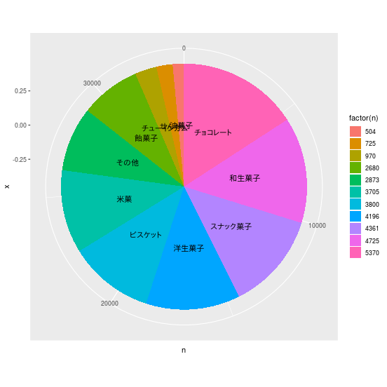
R の場合、棒グラフを描いてそれをぐにゃっと丸くして円にするみたいなイメージで私は理解しています。じゃあ円の真ん中の X 座標はいくつで円の端っこの X 座標はいくつなの?ってことで、それを確認しおきたいと思います。 coord_polar("y") の行を削除して棒グラフに戻して、座標を表示するようにしてみます。
library(dplyr)
library(ggplot2)
(sample_data %>% arrange(desc(n)) %>%
    mutate(ypos = cumsum(n) - n / 2) %>%
    mutate(per = n / sum(n)) %>%
    mutate(label = paste0(type, "\n", scales::percent(per, 0.1))) %>%
    ggplot(aes(x = 0, y = n, fill = factor(n)))
    + geom_col()
    + geom_text(aes(y = ypos, label = label))
    + scale_x_continuous(breaks = c(seq(-2, 2, 0.01)))
    + theme(axis.text.x = element_text(angle = 90, hjust = 1))
)
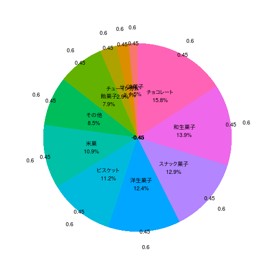
これを見ると左端の X 座標が -0.45 で右端の X 座標が 0.45 であることが分かります。ってことは円グラフの中心に描きたかったら X 座標を -0.45 にして、逆に円周上に描きたかったら X 座標を 0.45 に、円の外側なら X 座標を 0.45 より大きい値を指定すればよさそうなことが想定できます。実際に以下のコードで試してみると本当にそうであることが確認できます。
library(dplyr)
library(ggplot2)
(sample_data %>% arrange(desc(n)) %>%
    mutate(ypos = cumsum(n) - n / 2) %>%
    mutate(per = n / sum(n)) %>%
    mutate(label = paste0(type, "\n", scales::percent(per, 0.1))) %>%
    ggplot(aes(x = 0, y = n, fill = factor(n)))
    + geom_col()
    + coord_polar("y")
    + geom_text(aes(y = ypos, label = label))
    + geom_text(aes(x = -0.45, y = ypos, label = "-0.45"))
    + geom_text(aes(x = 0.45, y = ypos, label = "0.45"))
	+ geom_text(aes(x = 0.6, y = ypos, label = "0.6"))
    + theme_void()
    + theme(legend.position = "none")
)
重ならないようにする
文字が重なってしまっているところを何とかしてみます。 ggrepel っていうライブラリを使えば geom_text を geom_text_repel に変更するだけで重ならなくなります。ただ重ならなくなったことはなったんですがずれたこで分かりにくくなってしまう箇所もあるようです。うーん、なかなかうまくいかないものですね。
library(dplyr)
library(ggplot2)
library(ggrepel)
(sample_data %>% arrange(desc(n)) %>%
    mutate(ypos = cumsum(n) - n / 2) %>%
    mutate(per = n / sum(n)) %>%
    mutate(label = paste0(type, "\n", scales::percent(per, 0.1))) %>%
    ggplot(aes(x = 0, y = n, fill = factor(n)))
    + geom_col()
    + coord_polar("y")
    + geom_text_repel(aes(y = ypos, label = label))
    + theme_void()
    + theme(legend.position = "none")
)

いいとこ取り
てなわけで、 geom_text_repel と geom_text のいいとこ取りをしてみます。値の小さいものは円の外に取り出して重ならないようにして、大きい値は円の中に描いて座標はそのままで描画します。今回は外にするのか内にするのかの境界を 0.05(5%) としました。
library(dplyr)
library(ggplot2)
library(ggrepel)
(sample_data %>% arrange(desc(n)) %>%
    mutate(ypos = cumsum(n) - n / 2) %>%
    mutate(per = n / sum(n)) %>%
    mutate(label = paste0(type, "\n", scales::percent(per, 0.1))) %>%
    ggplot(aes(x = 0, y = n, fill = factor(n)))
    + geom_col()
    + coord_polar("y")
    + geom_text(data = (. %>% filter(per >= 0.05)),
        aes(x = 0.1, y = ypos, label = label))
    + geom_text_repel(data = (. %>% filter(!(per >= 0.05))),
        aes(x = 0.4, y = ypos, label = label), nudge_x = 0.2)
    + theme_void()
    + theme(legend.position = "none")
)

最終版
あとは枠線つけたりカラーパレット変えたりして自分好みにします。あ、あと値が同じだと同じ色になっちゃうみたいだったので fill オプションも変更してみました。ちなみにカラーパレットは「カラーユニバーサルデザイン推奨配色セット『特定非営利活動法人カラーユニバーサルデザイン機構CUDO』 」に手を加えたものを使用しています。
library(dplyr)
library(ggplot2)
library(ggrepel)
(sample_data %>% arrange(desc(n)) %>%
    mutate(ypos = cumsum(n) - n / 2) %>%
    mutate(per = n / sum(n)) %>%
    mutate(label = paste0(type, "\n", scales::percent(per, 0.1))) %>%
    ggplot(aes(x = 0, y = n, fill = factor(rev(ypos))))
    + geom_col(color = "black")
    + coord_polar("y")
    + geom_text(data = (. %>% filter(per >= 0.05)),
        aes(x = 0.1, y = ypos, label = label), lineheight = 0.9, size = 5)
    + geom_text_repel(data = (. %>% filter(!(per >= 0.05))),
        aes(x = 0.4, y = ypos, label = label), nudge_x = 0.2, lineheight = 0.9, size = 4)
    + scale_fill_manual(values = rep(alpha(c("#03af7a","#fff100","#005aff","#ff4b00","#4dc4ff","#ff8082","#f6aa00","#990099"), 0.6), 2))
    + theme_void()
    + theme(legend.position = "none")
)

エラーがでる
データによっては「 Error: Aesthetics must be either length 1 or the same as the data (1): y, label and fill 」って怒られるときがあります。
どうやら 0.05(5%) 未満がひとつもない、つまりが円の外に取り出すものがひとつもないときに発生するようです。
とりあえずは、 geom_text_repel の行を削除してしまうか注釈にすることで解決できそうです。ゼロ件の時は geom_text_repel を実行しないみたいな処理を考えても良いのかもしれませんが、そっちの方が複雑になりそうなので、まぁまた機会があったらということにしたいと思います。