普段Angular MaterialのMatTooltipModuleを使ってますが、あまり柔軟にできないので自作しました。
実現したいこと
・ツールチップに画像挿入したい
・任意の場所で改行できるようにしたい
・ツールチップのサイズを制御したい
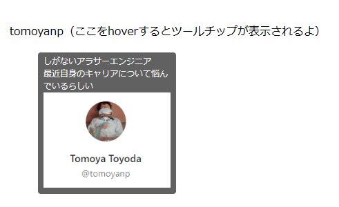
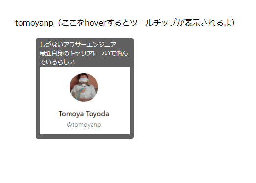
こういうやつ
「tomoyanp」の部分をマウスホバーしたら、画像付きツールチップが表示される。
実装上実現したいこと
・MatTooltipModuleと同じ使い心地としたく、下記のようにDirective的に呼び出したい
こんなイメージ
<div
  appCustomTooltip
  message="ツールチップのメッセージです。"
  [width]="200"
  [path]="assets/img/sample.png">
  ここをホバーするとツールチップが表示されるよ
</div>
どう作る?
〇Directive
・マウスイベントを捕捉
→ hoverされたこととhoverが外れたことの捕捉
・tooltip用コンポーネントをoverlayで表示・非表示
・呼び出し元から@Inputを受け取り、tooltip表示用Componentに渡す
・hoverが発生した際のマウスのX座標、Y座標をtooltip表示用Componentに渡す
〇Component
・DirectiveからInjector経由で引数を受け取る
・引数に応じてツールチップを表示する
前提
angular cdkを利用してoverlayを表示するため、最低限angular/cdkだけインストールしてください
npm install @angular/cdk
実装
Directive
import { Overlay, OverlayRef } from '@angular/cdk/overlay';
import { ComponentPortal } from '@angular/cdk/portal';
import {
  Directive,
  HostListener,
  InjectionToken,
  Injector,
  Input,
} from '@angular/core';
import {
  CustomTooltipArgs,
  CustomTooltipComponent,
  CustomTooltipPosition,
} from './custom-tooltip.component';

// Injector経由で参照する際のトークン
export const TOOLTIP_OVERLAY_DATA = new InjectionToken<any>(
  'TOOLTIP_OVERLAY_DATA'
);

// 画像挿入したい場合のパス。assets配下に限定するために型定義しておく
type AssetsPath = `assets/${string}`;

@Directive({
  selector: '[appCustomTooltip]',
})
export class CustomTooltipDirective {
  // ツールチップで表示するメッセージ
  // 改行を入れたい場合、string配列を渡すと要素ごとに改行されるような仕様にする
  @Input() message?: string | string[];
  // 画像を挿入したい場合、assetsからのパスを指定する
  @Input() path?: AssetsPath;
  // ツールチップ自体の横幅を制御したい場合は指定させる
  @Input() width?: number;
  // ツールチップをホバーした場所から見てどこに配置するか(上下)
  @Input() position?: CustomTooltipPosition;

  private overlayRef?: OverlayRef;

  // injectorとoverlayはDI
  constructor(private injector: Injector, private overlay: Overlay) {}

  // hoverしたイベントを捕捉
  @HostListener('mouseenter', ['$event'])
  onMouseenter($event: MouseEvent) {
    this.createTooltip($event);
  }

  // hoverが外れたイベントを捕捉
  @HostListener('mouseleave', ['$event'])
  onMouseleave() {
    if (this.overlayRef == null) {
      return;
    }

    // ツールチップ消す
    this.overlayRef.detach();
  }

  private createTooltip($event: MouseEvent) {
    this.overlayRef = this.overlay.create();

    // 表示用Componentに渡すデータの作成
    const args: CustomTooltipArgs = {
      message: this.message,
      path: this.path,
      position: this.position,
      width: this.width,
      x: $event.clientX, // マウスのX座標も渡す
      y: $event.clientY, // マウスのY座標も渡す
    };

    // Injectorを作成して渡すデータをuseValueで設定する
    const injector = Injector.create({
      parent: this.injector,
      providers: [
        {
          provide: TOOLTIP_OVERLAY_DATA,
          useValue: args,
        },
      ],
    });

    // 作成したInjectorを渡す
    // CustomTooltipComponentが、これ以降で作成するツールチップ表示用Componentです
    const componentPortal: ComponentPortal<CustomTooltipComponent> =
      new ComponentPortal(CustomTooltipComponent, null, injector);

    // overlayの表示
    this.overlayRef.attach<CustomTooltipComponent>(componentPortal);
  }
}
ポイント
・Injector経由でComponentにデータを渡す
・mouseenterイベントが発生した時点でのマウスのX座標、Y座標をComponentに渡す
※X座標、Y座標はtooltipをposition: absoluteで表示する際の位置決めに使います
Component
import { Component, Inject } from '@angular/core';
import { TOOLTIP_OVERLAY_DATA } from './custom-tooltip.directive';

// ツールチップの配置位置はとりあえず上下どちらかにしとく(左右とか入れてもよいけどね)
export type CustomTooltipPosition = 'above' | 'below';
export type CustomTooltipArgs = {
  message?: string | string[];
  path?: string;
  position?: CustomTooltipPosition;
  width?: number;
  x: number;
  y: number;
};

@Component({
  selector: 'app-custom-tooltip',
  templateUrl: './custom-tooltip.component.html',
  styleUrls: ['./custom-tooltip.component.scss'],
})
export class CustomTooltipComponent {
  messages?: string[];
  private offset: number;

  // Injector参照用のトークンを指定することで、InjectorのuseValueを取ることができる
  constructor(@Inject(TOOLTIP_OVERLAY_DATA) public data: CustomTooltipArgs) {
    // positionに応じて、どの程度ズラすか
    const offsetBase = 20;
    if (data.position == null) {
      // positionが指定されてない場合、下に表示されるようにする
      this.offset = offsetBase;
    } else {
      // aboveが指定されてる場合、マイナスオフセットを渡して相対的に上に表示されるようにする
      this.offset = data.position === 'below' ? offsetBase : -offsetBase;
    }

    // messageは文字列か文字列配列のどちらかの可能性があるため、文字列配列で統一させる
    if (data.message != null) {
      // 文字列の場合文字列配列に直して返却
      this.messages =
        typeof data.message === 'string' ? [data.message] : data.message;
    }
  }

  createStyle() {
    // 渡された引数に応じてstyleを作成する
    // position: absoluteを指定し、leftにX座標、topにY座標 + constructorで計算したoffsetとすることで表示位置を調整
    return `
      position: absolute;
      z-index: 1;
      left: ${this.data.x}px;
      top: ${this.data.y + this.offset}px;
      width: ${this.data.width == null ? '200' : this.data.width}px;
    `;
  }
}
<div [style]="createStyle()">
  <div class="container">
    <ng-container *ngIf="messages">
      <div *ngFor="let message of messages">
        {{ message }}
      </div>
    </ng-container>
    <div class="image" *ngIf="data.path">
      <img [src]="data.path" />
    </div>
  </div>
</div>
// まあこのへんは、、、好きにやってください!
.container {
  padding: 4px 8px;
  background-color: #616161;
  font-size: 12px;
  color: white;
  border-radius: 4px;
  width: fit-content; // 文字数に合わせてツールチップをフィットさせたい
  max-width: 100%;
  overflow-wrap: break-word; // はみ出したら折り返し
  .image {
    img {
      width: 100%; // tooltipの横幅いっぱいに画像表示する
    }
  }
}
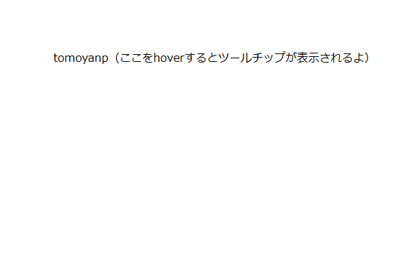
実際に使ってみるとこんな感じ
<div class="container">
  <div
    appCustomTooltip
    [width]="200"
    [message]="[
      'しがないアラサーエンジニア',
      '最近自身のキャリアについて悩んでいるらしい'
    ]"
    [path]="'assets/img/tomoyanp.png'"
    [position]="'below'"
  >
    tomoyanp(ここをhoverするとツールチップが表示されるよ)
  </div>
</div>
非hover時
hover時
以上です。
ほぼ、そのままコピペで動くと思います。(動かなければご連絡ください)
そこそこ良いのが出来た気がするんですが、改善点あれば教えてくださいませ。
最後に
いらないと思うけど一応app.module.ts載せときます
import { NgModule } from '@angular/core';
import { BrowserModule } from '@angular/platform-browser';

import { AppRoutingModule } from './app-routing.module';
import { AppComponent } from './app.component';
import { CustomTooltipComponent } from './custom-tooltip/custom-tooltip.component';
import { CustomTooltipDirective } from './custom-tooltip/custom-tooltip.directive';

import { OverlayModule } from '@angular/cdk/overlay';

@NgModule({
  declarations: [AppComponent, CustomTooltipComponent, CustomTooltipDirective],
  imports: [BrowserModule, AppRoutingModule, OverlayModule],
  providers: [],
  bootstrap: [AppComponent],
})
export class AppModule {}