Rで描いた、いろいろなビジュアライゼーションを集めました。
基本的には、ggplotで描いていますが、
ggplotでの表現が煩雑になる場合は、他のライブラリも使用しています。
- デフォルトで読み込むライブラリ
R
library(dplyr)
library(ggplot2)
属性間の比較
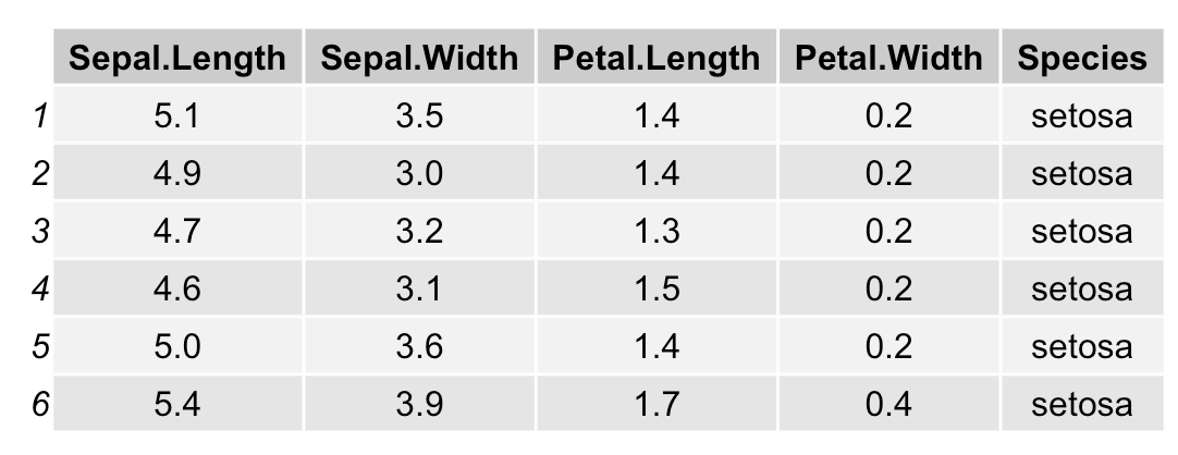
表(単純なもの)
R
library(gridExtra)
d <- head(iris)
grid.table(d)
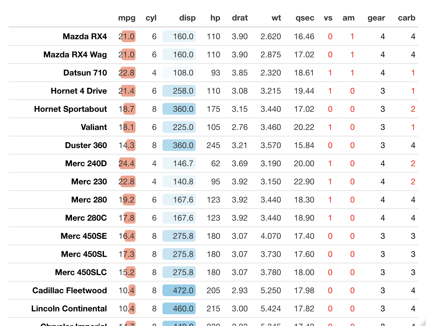
表(フォーマット指定)
R
library(formattable)
library(tibble)
data(mtcars)
mtcars <- rownames_to_column(mtcars, var=" ")

formattable(mtcars,
            list(' ' = formatter("span", style = ~ style(color = "black", font.weight = "bold")),
                 'mpg' = color_bar("#FAA18B"),
                 'disp' = color_tile("white", "skyblue"),
                 area(col=c(9:12)) ~ formatter("span",
                                               style = x ~ style(color = ifelse(x < 3, "red", "black")))
                 )
            )
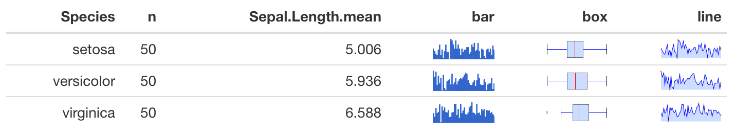
表(スパークライン付加)
R
library(formattable)
library(sparkline)
library(tidyverse)

# データ準備
data(iris)
iris %>%
  group_by(Species) %>%
  summarise(n=n(),
        Sepal.Length.mean=mean(Sepal.Length)) -> df

# Speciesごとの数値データを、sparkline()に入れてオブジェクトを作成、
# それをhtml文字列に変換する
Sepal.Length.bySpecies <- split(iris, iris$Species)
for(type in c("bar", "box", "line")){
  Sepal.Length.bySpecies %>%
    map(~ sparkline(.$Sepal.Length, type = type)) %>%
    map(~ as.character(htmltools::as.tags(.))) -> spakline.htmlstr
  df[[type]] <- spakline.htmlstr
}

# formattable()でフォーマットし出力
out = as.htmlwidget(formattable(df))
out$dependencies = c(out$dependencies, htmlwidgets:::widget_dependencies("sparkline", "sparkline"))
out
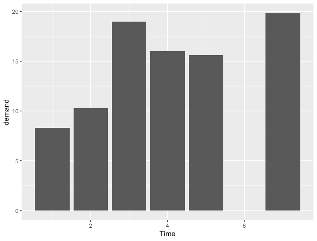
縦棒グラフ
R
ggplot(BOD, aes(x=Time, y=demand)) +
  geom_col()
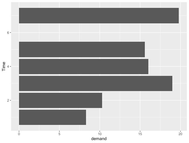
横棒グラフ
R
ggplot(BOD, aes(x=demand, y=Time)) +
  geom_col()
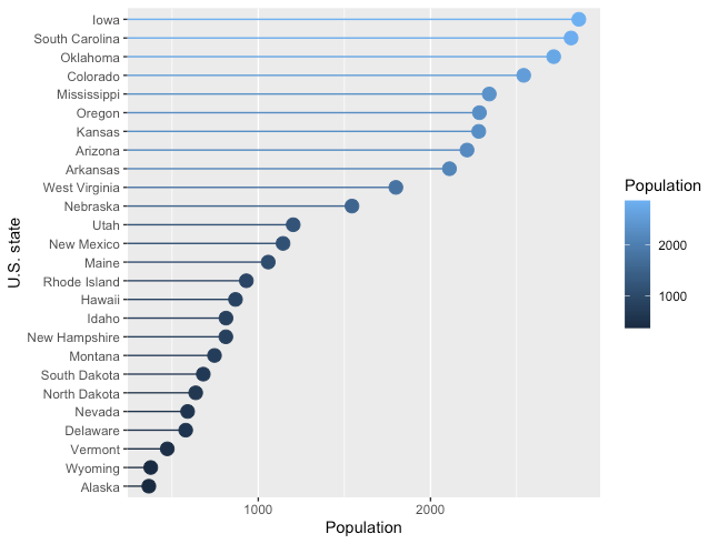
クリーブランドのドットプロット
R
# 描画用データ準備
df <- data.frame(state.x77)
df["Name"] <- rownames(df)

# geom_segment と geom_point を組み合わせることで描画
df[df$Population < 3000, ] %>%
  ggplot(aes(y=reorder(Name, Population), x=Population, color=Population)) +
  geom_segment(aes(yend=Name), xend=0) +
  geom_point(size=4) +
  theme(panel.grid.major.y=element_blank()) +
  ylab("U.S. state")
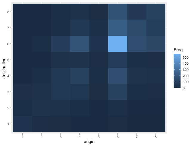
ヒートマップ
R
# 描画用データ準備
df <- data.frame(occupationalStatus)

# geom_rasterで描画。(geom_tileでも同じ図を描ける)
ggplot(df, aes(x=origin, y=destination, fill=Freq)) +
  geom_raster()
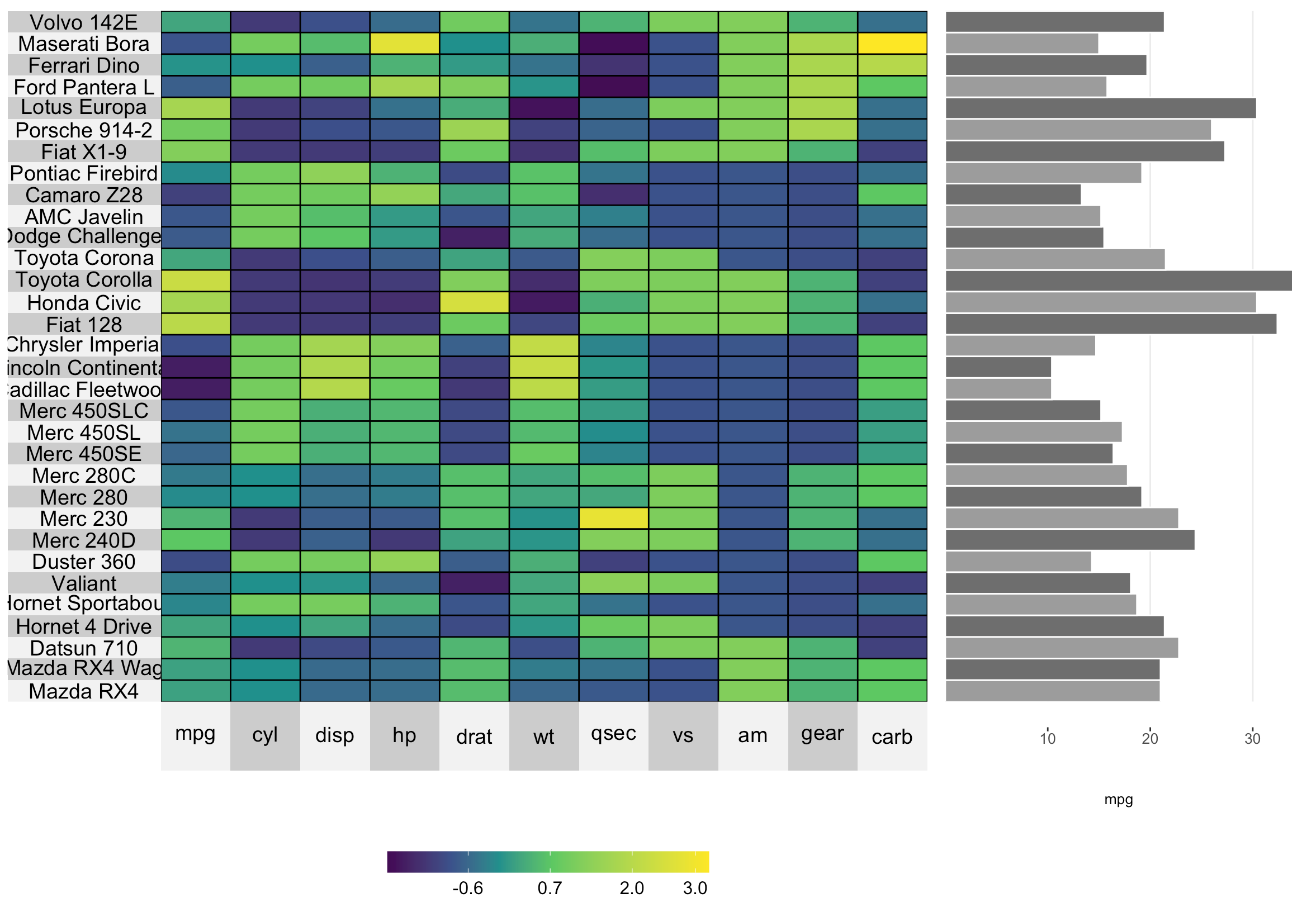
ヒートマップ + グラフ
superheatを使った色々な描き方は、こちらでも少し詳しく記載しています。
R
library(superheat)
superheat(mtcars,scale=TRUE,
          yr=mtcars$mpg,
          yr.plot.type="bar",
          yr.axis.name="mpg",
          yr.plot.size=0.5)
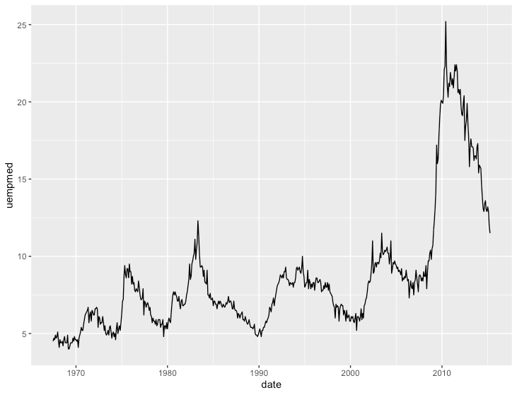
時系列の比較
折れ線グラフ
R
ggplot(economics, aes(x=date, y=uempmed)) +
  geom_line()
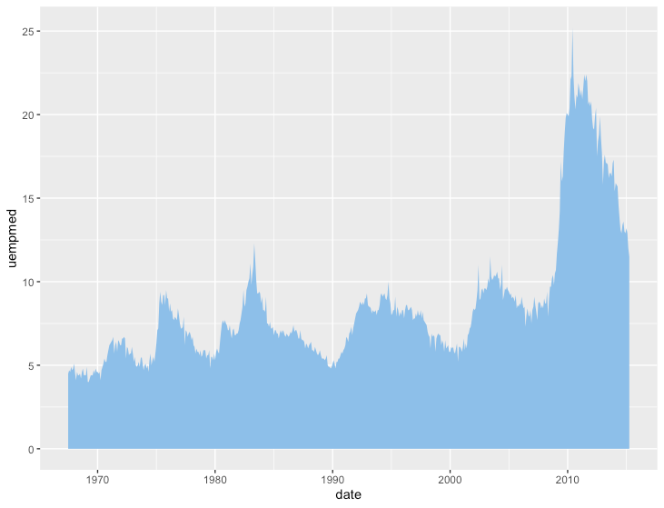
面グラフ
R
ggplot(economics, aes(x=date, y=uempmed)) +
  geom_area(fill="skyblue2")
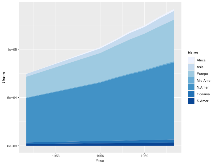
積み上げ面グラフ
R
library(tidyr)

# データ準備
# データが縦持ちの形式となっている必要がある
# WorldPhones
#      N.Amer Europe Asia S.Amer Oceania Africa Mid.Amer
# 1951  45939  21574 2876   1815    1646     89      555
# 1956  60423  29990 4708   2568    2366   1411      733
# 1957  64721  32510 5230   2695    2526   1546      773
# ...

# ---↓↓↓---

#   Year  Country Users
# 1  1951   N.Amer 45939
# 2  1956   N.Amer 60423
# 3  1957   N.Amer 64721
# 4  1958   N.Amer 68484
# ...

df <- data.frame(WorldPhones) %>%
  tibble::rownames_to_column("Year") %>%
  gather(key="Country", value="Users", -Year)
df$Year <- as.integer(df$Year)

ggplot(df, aes(x=Year, y=Users, fill=Country)) +
  geom_area() +
  scale_fill_brewer("blues")
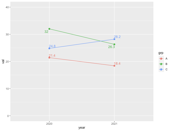
スロープグラフ
R
library("ggrepel") #geom_pointのラベル位置を適当に調整するために使用

# データ準備
df <- data.frame(year=c(2020, 2021, 2020, 2021, 2020, 2021),
                 grp=c("A", "A", "B", "B", "C", "C"),
                 val=c(21.4, 18.4, 32.0, 26.3, 24.8, 28.2))

ggplot(df, aes(x=factor(year), y=val, label=val, group=grp, colour=grp)) +
  geom_line() +
  geom_point(size=2) +
  geom_text_repel() +
  ylim(0, 40) +
  xlab("year")
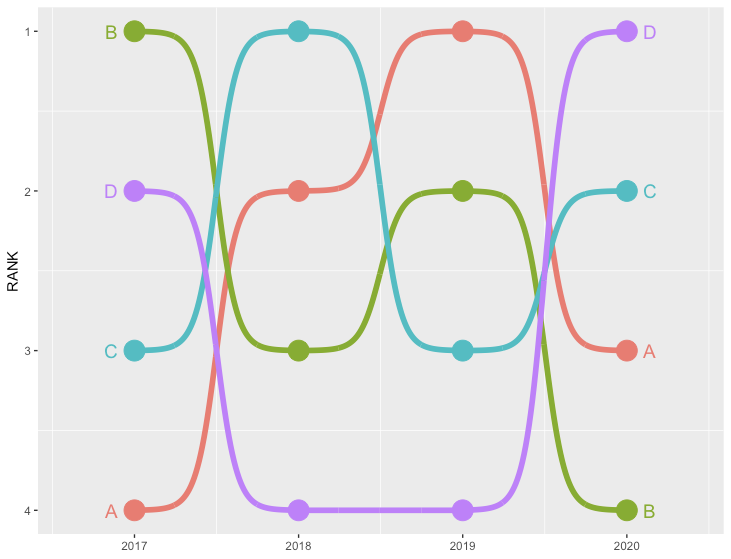
バンプチャート
R
library(ggbump) #install_github("davidsjoberg/ggbump")

# データ準備
df <- data.frame(country=c(rep("A", 4), rep("B", 4), rep("C", 4), rep("D", 4)),
           year=rep(c(2017, 2018, 2019, 2020), 4),
           rank=c(4,2,1,3, 1,3,2,4, 3,1,3,2, 2,4,4,1))

ggplot(df, aes(year, rank, color = country)) +
  geom_point(size = 7) +
  geom_text(data = df %>% filter(year == min(year)),
            aes(x = year - .1, label = country), size = 5, hjust = 1) +
  geom_text(data = df %>% filter(year == max(year)),
            aes(x = year + .1, label = country), size = 5, hjust = 0) +
  geom_bump(size = 2, smooth = 8) +
  scale_x_continuous(limits = c(2016.6, 2020.4),
                     breaks = seq(2017, 2020, 1)) +
  theme(legend.position = "none",
        panel.grid.major = element_blank()) +
  labs(y = "RANK",
       x = NULL) +
  scale_y_reverse()
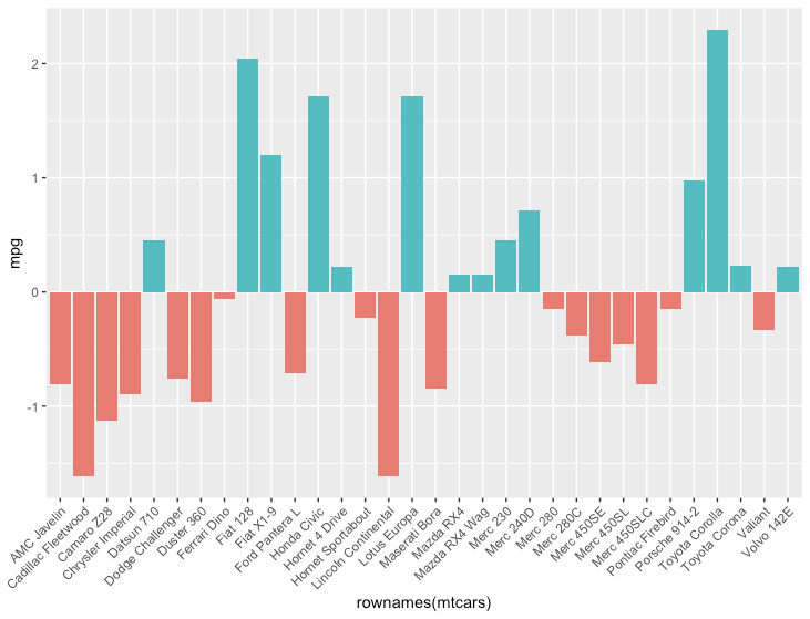
(分岐させた)色塗り線グラフ
R
# データ準備
scaled_mtcars <- mtcars %>%
  scale() %>%
  data.frame() %>%
  mutate(positive=mpg>0)

ggplot(scaled_mtcars, aes(x=rownames(mtcars), y=mpg, fill=positive)) +
  geom_col() +
  theme(axis.text.x = element_text(angle = 45, hjust = 1),
        legend.position = 'none')
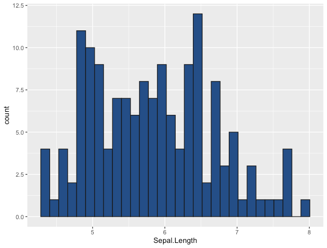
分布の把握
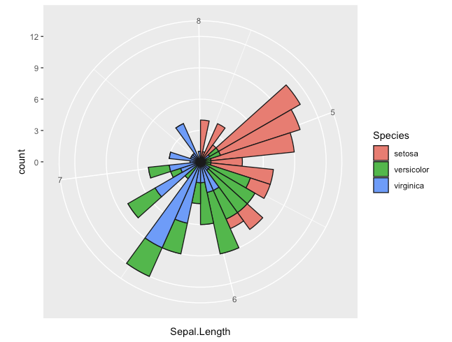
ヒストグラム
ggplotのヒストグラムについては、こちらにも少し詳しく記載しています。
R
ggplot(iris, aes(x=Sepal.Length)) +
  geom_histogram(colour = "gray10", fill = "dodgerblue4")
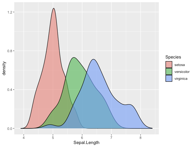
密度曲線
R
ggplot(iris, aes(x=Sepal.Length, fill=Species)) +
  geom_density(position="identity", alpha=0.6) +
  xlim(3.9, 8.4)
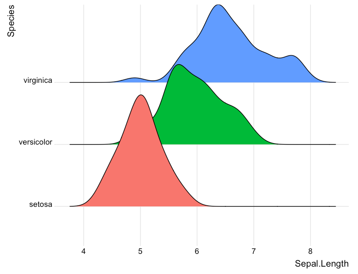
ジョイプロット
R
library(ggridges)
library(ggplot2)

ggplot(iris, aes(x = Sepal.Length, y = Species, fill = Species)) +
  geom_density_ridges() +
  theme_ridges() +
  theme(legend.position = "none")
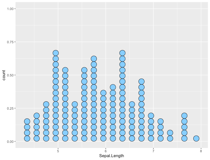
ドットプロット(ウィルキンソン)
R
ggplot(iris, aes(x=Sepal.Length)) +
  geom_dotplot(fill="skyblue1")
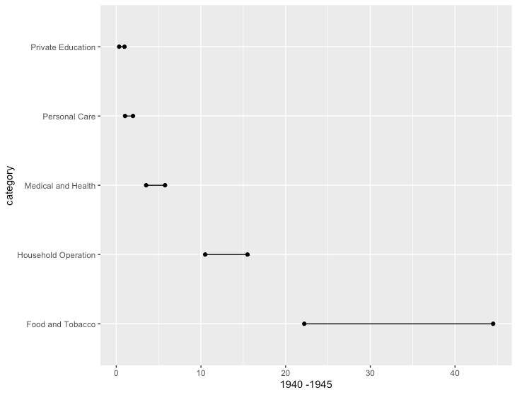
ダンベルチャート
R
library(ggalt) # install_github("hrbrmstr/ggalt")
data <- data.frame(USPersonalExpenditure)
data["category"] <- rownames(data)

ggplot(data, aes(x=X1940, xend=X1945, y=category, group=category)) +
  geom_dumbbell(size_x = 1.5,
                size_xend = 1.5) +
  xlab("1940 -1945")
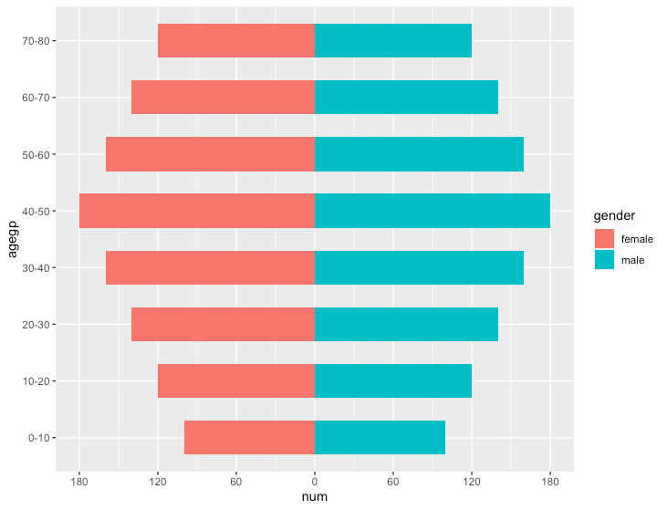
バタフライチャート
R
# データ作成
data <- data.frame(
  agegp=rep(c("0-10", "10-20", "20-30", "30-40", "40-50", "50-60", "60-70", "70-80"), 2),
  gender=c(rep("male", 8), rep("female", 8)),
  num=rep(c(100, 120, 140, 160, 180, 160, 140, 120), 2))

# 片方の属性の値をマイナスにして「対」を表現する
data <- mutate(data, num=ifelse(gender=="female", -num, num))

# x軸のラベルをつくる
# 上でマイナスにした部分を加味して補正したbreakとラベルを作成
max_num <- max(abs(data$num))
d <- diff(range(-max_num, max_num))/6
brks <- seq(-max_num, max_num, d)
lbls = as.character(c(seq(max_num, 0, -d), seq(d, max_num, d)))

# geom_barで描画
ggplot(data, aes(x = num, y = agegp, fill = gender)) +
  geom_bar(stat = "identity", width = .6) +
  scale_x_continuous(breaks = brks,
                     labels = lbls)
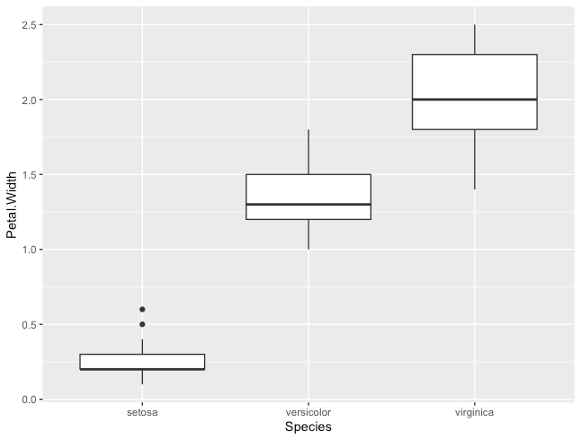
箱ひげ図
R
ggplot(iris, aes(x = Species, y=Petal.Width))+
  geom_boxplot()
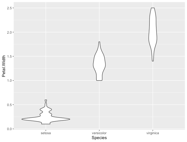
バイオリンプロット
R
ggplot(iris, aes(x = Species, y=Petal.Width))+
  geom_violin()
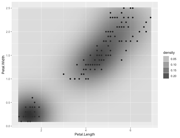
2次元の密度プロット
R
ggplot(iris, aes(x = Petal.Length, y=Petal.Width)) +
  geom_point() +
  stat_density2d(aes(alpha=..density..), geom="tile", contour = F)
相関の把握
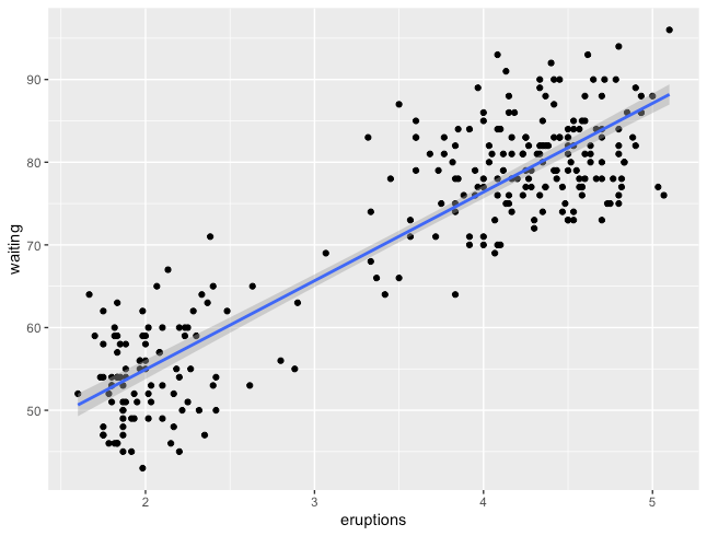
散布図
R
ggplot(faithful, aes(x=eruptions, y=waiting)) +
  geom_point() +
  stat_smooth(method=lm) # 傾向線をプロット
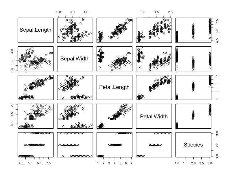
散布図行列
R
# ggplotでは散布図行列を作成できないの手軽なpairsを使用
pairs(iris)
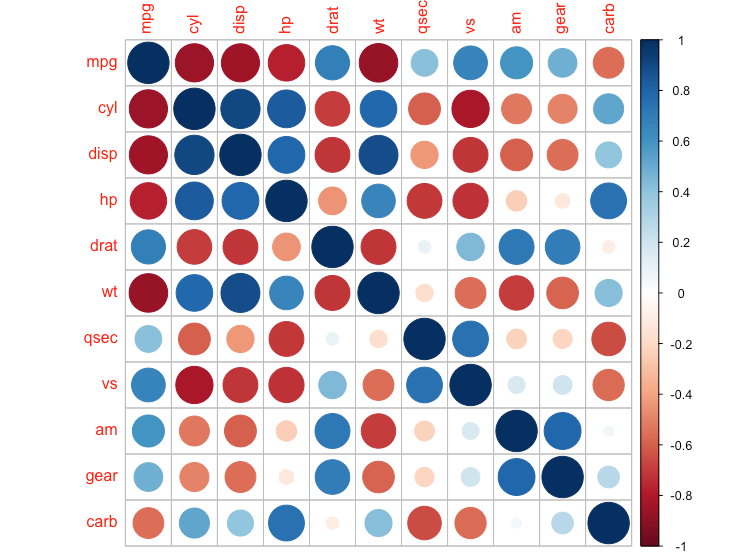
相関行列
R
library(corrplot)
cor_mtcars <- cor(mtcars)
corrplot(cor_mtcars)
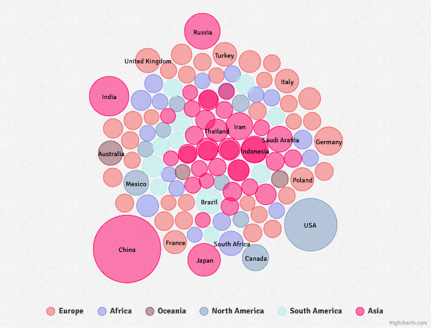
パックドバブルチャート
R
library(hpackedbubble)
hpackedbubble(CO2$continent, CO2$country, CO2$CO2,
              packedbubbleZmax = 10000, split = 0)
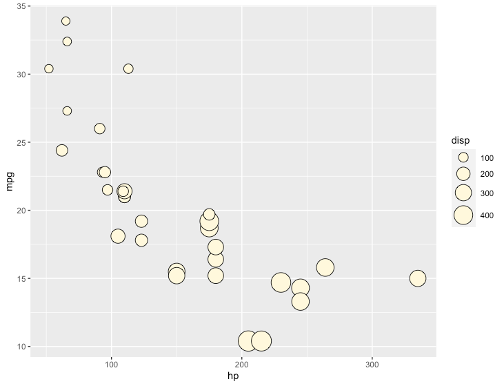
バルーンプロット
R
ggplot(mtcars, aes(x=hp, y=mpg, size=disp)) +
  geom_point(shape=21, colour="black", fill="cornsilk") +
  scale_size_area(max_size=10)
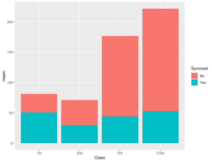
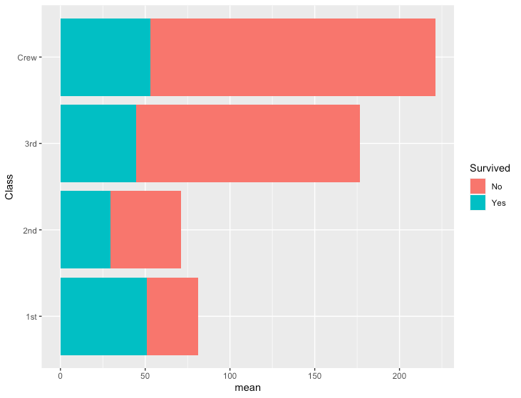
内訳の比較
積み上げ棒グラフ
R
# データ準備
df <- data.frame(Titanic) %>%
  group_by(Survived, Class) %>%
  summarize(n=n(), mean=mean(Freq))
- 積み上げ縦棒グラフ
R
ggplot(df, aes(x=Class, y=mean, fill=Survived)) +
  geom_col()
- 積み上げ横棒グラフ
R
ggplot(df, aes(x=mean, y=Class, fill=Survived)) +
  geom_col()
ウォーターフォールチャート
R
# install.packages("waterfalls")
library(waterfalls)

# ダミーデータ
df <- data.frame(x=c("name1", "name2", "name3", "name4", "name5", "name6"),
           y=c(100, 200, -100, 300, -200, -300))

# 描画
waterfall(df)

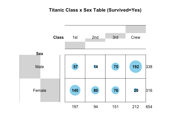
バルーンプロット
R
library(gplots)
balloonplot(Titanic[,, Age="Adult", Survived="Yes"],
            main="Titanic Class x Sex Table (Survived=Yes)")
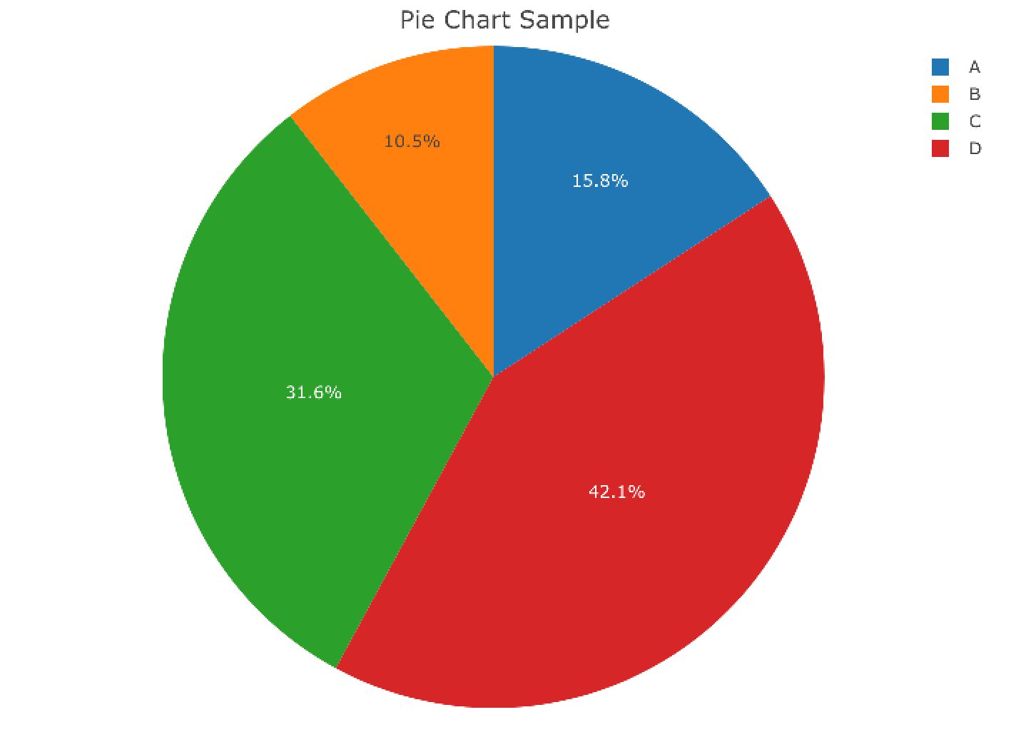
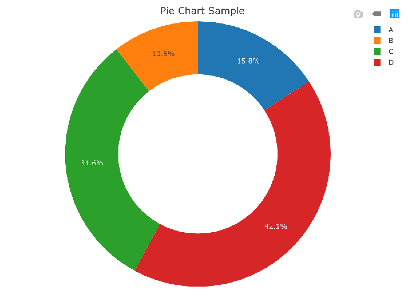
円グラフ
- ggplotで描くのが難しいため、plotlyで描く
R
library(plotly)
data <- data.frame(labels=c("A", "B", "C", "D"), values=c(30, 20, 60, 80))
#   labels values
# 1      A     30
# 2      B     20
# 3      C     60
# 4      D     80

plot_ly(data, labels = ~labels, values = ~values, type = "pie", sort=F) %>%
  layout(title="Pie Chart Sample")
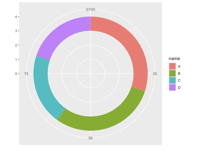
ドーナツグラフ
- 円グラフ同様、plotlyで描く
R
library(plotly)
data <- data.frame(labels=c("A", "B", "C", "D"), values=c(30, 20, 60, 80))
plot_ly(data, labels = ~labels, values = ~values, type = "pie", hole=0.6, sort=F) %>%
  layout(title="Pie Chart Sample")
- ggplotで頑張るパターン
R
df <- data.frame(name=c("A", "B", "C", "D"),
                 ymin=c(0, 30, 60, 80),
                 ymax=c(30, 60, 80, 100))
ggplot(df) +
  geom_rect(aes(fill=name, ymin=ymin, ymax=ymax, xmax=4, xmin=3)) +
  coord_polar(theta="y") + xlim(c(0,4))
階層型ドーナツグラフ
極座標プロット
R
ggplot(iris, aes(x=Sepal.Length, fill=Species)) +
  geom_histogram(colour = "gray10") +
  coord_polar()
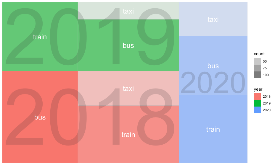
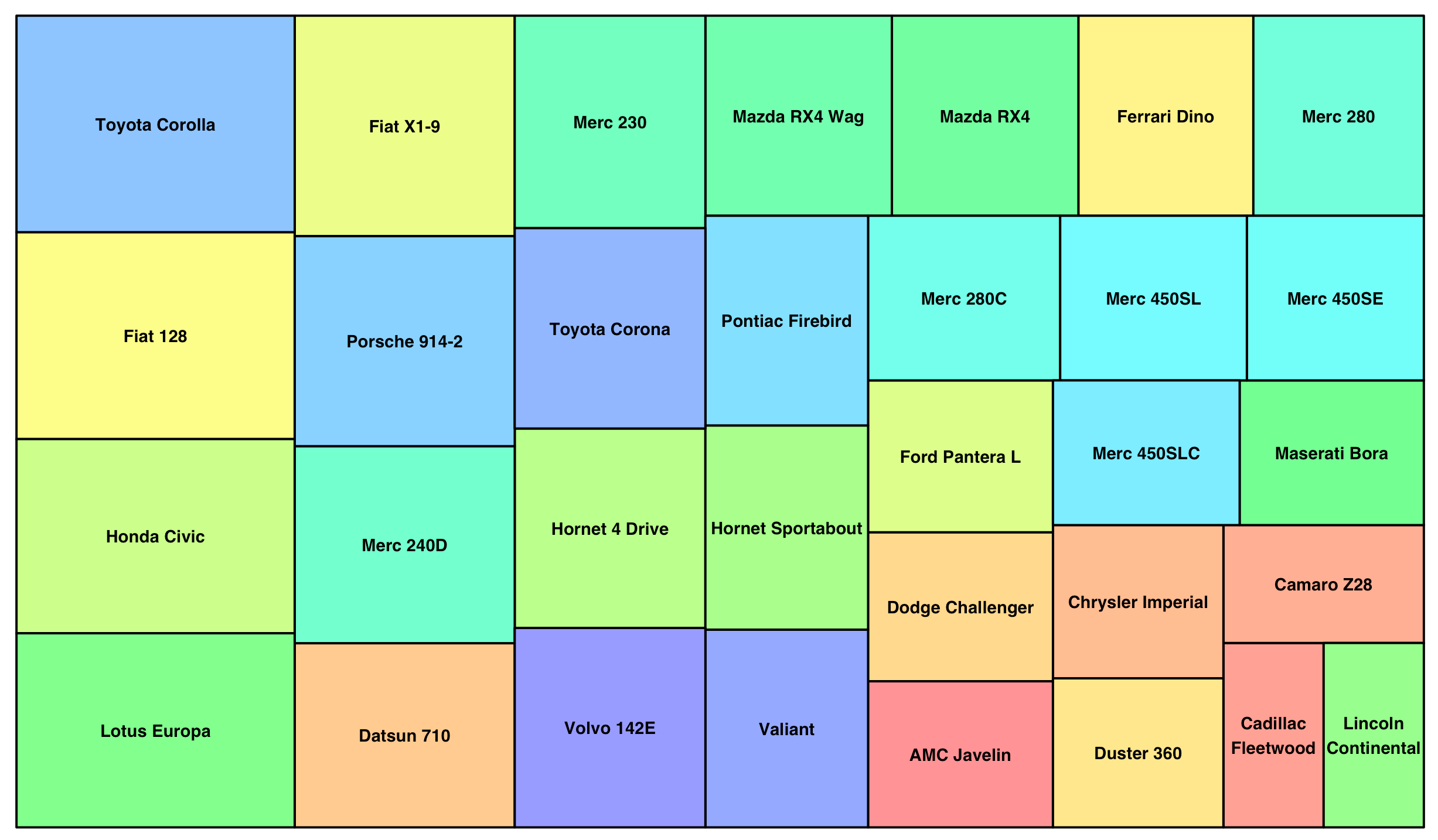
ツリーマップ
- treemapifyを使用
R
library(treemapify)

# データ作成
mobility <- c(rep("train",3),rep("bus",3),rep("taxi",3))
count <- c(c(100, 90, 80), c(120, 90, 70), c(60, 30, 40))
year <- rep(c("2018", "2019", "2020"), 3)
df <- data.frame(mobility, count, year)

ggplot(df, aes(area = count, fill = year, label=mobility, subgroup=year)) +
  geom_treemap(aes(alpha = count)) +
  geom_treemap_text(colour = "white", place = "centre") +
  geom_treemap_subgroup_text(place = "centre", grow = T, alpha = 0.2)
- treemapを使用
R
library(treemap)
data <- data.frame(index=rownames(mtcars),
                   value=mtcars$mpg)

rainbow_color <- rainbow(47,s=0.4) #set colors
treemap(data,
        index=c("index"),
        vSize="value",
        type="index",
        palette = rainbow_color)
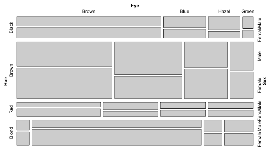
モザイクプロット
R
library(vcd)
mosaic(HairEyeColor)
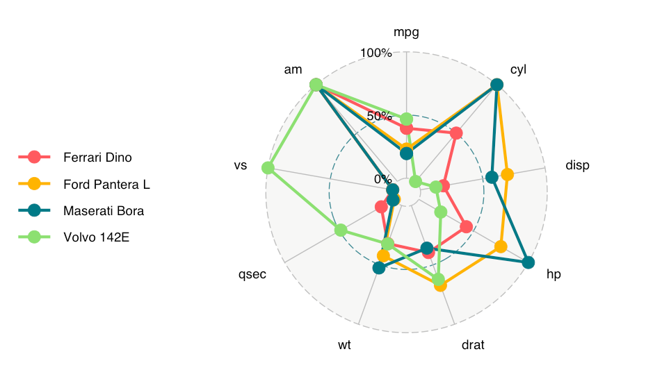
レーダーチャート
R
library(ggradar)
library(scales)

mtcars %>%
  tibble::rownames_to_column("group") %>%
  mutate_each(funs=rescale, -group) %>%
  tail(4) %>% select(1:10) -> mtcars_radar

ggradar(mtcars_radar)
面積グラフ
R
# データ作成
xs <- c()
ys <- c()
ds <- c()
for(x in 1:10){
  for(y in 1:10){
    xs <- c(xs, x)
    ys <- c(ys, y)
    if(x <= 3 & y <= 3){
      ds <- c(ds, "1")
    }else if(x <= 5 & y <=5){
      ds <- c(ds, "2")
    }else{
      ds <- c(ds, "3")
    }
  }
}
df <- data.frame(x=xs, y=ys, d=ds)

ggplot(df) +
  scale_x_continuous(breaks=NULL) +
  scale_y_continuous(breaks=NULL) +
  theme(axis.title.x = element_blank(),
        axis.title.y = element_blank(),
        panel.background = element_blank(),
        legend.position = 'none') +
  geom_tile(aes(x=xs,y=ys,fill=ds), width=1, height=1, size=0.5, colour="white") +
  scale_fill_manual(values=c("#00B0F0", "#808080", "#C0C0C0"))
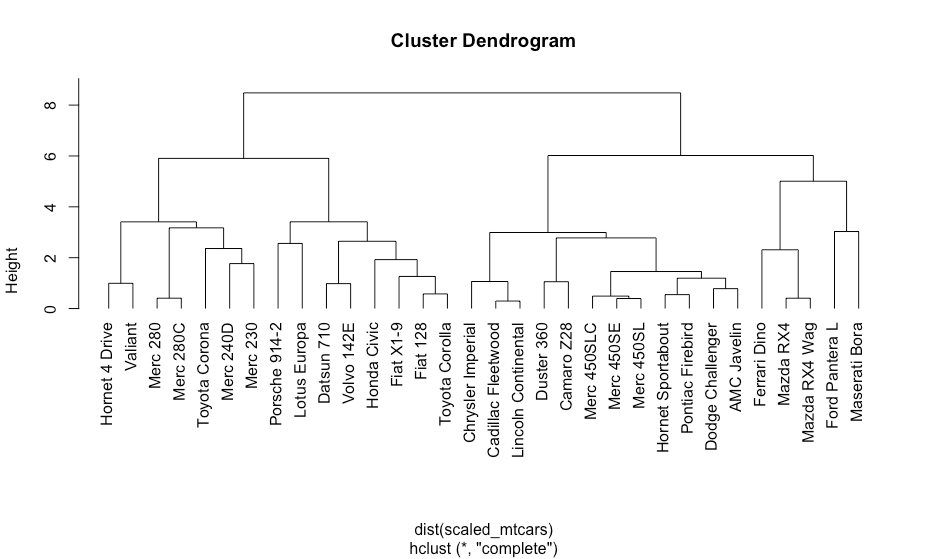
クラスタリング
樹形図
R
scaled_mtcars <- scale(mtcars)
hc <- hclust(dist(scaled_mtcars))
plot(hc, hang=-1)
その他
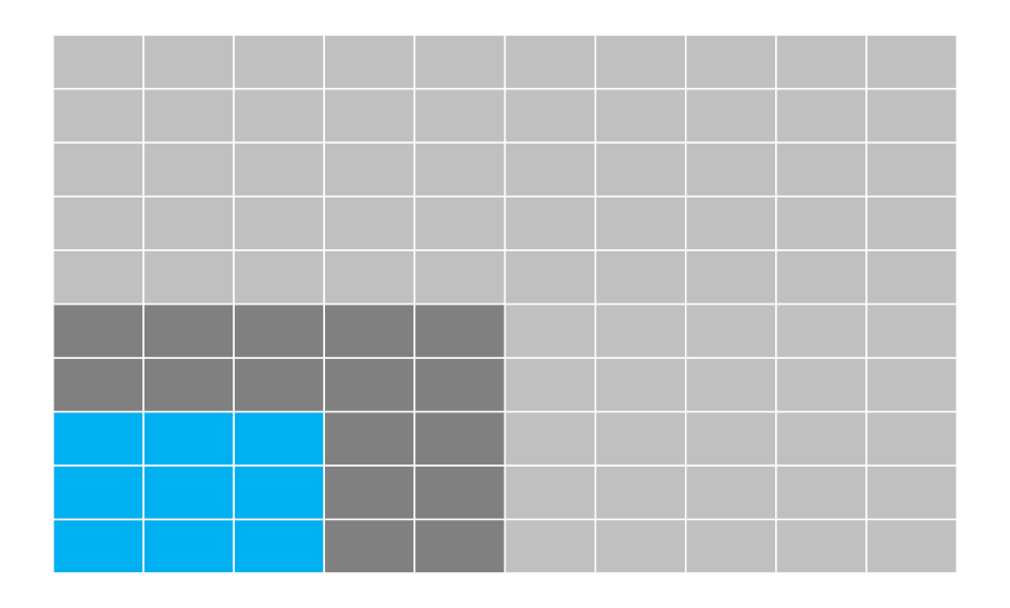
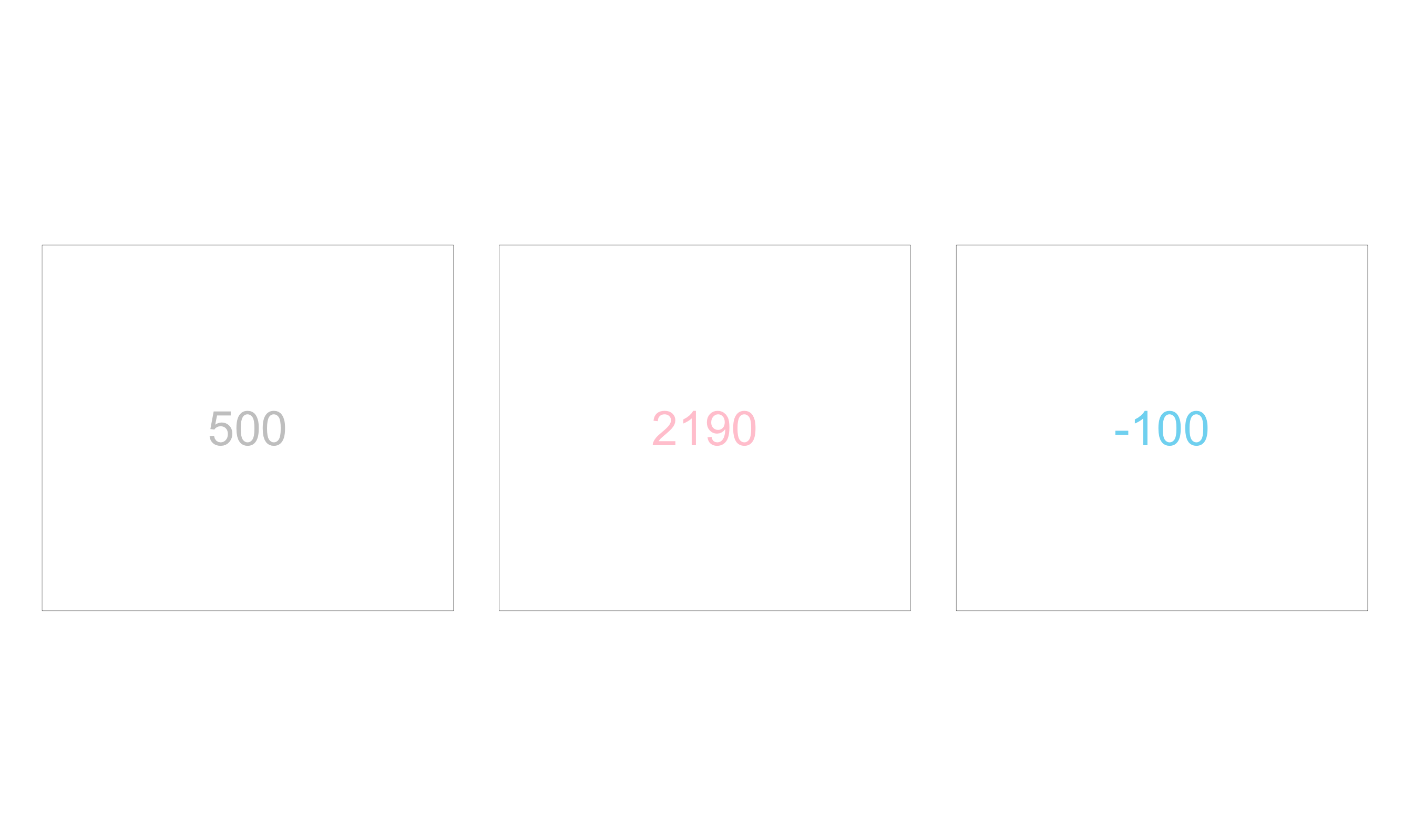
スコアカード(単純なテキスト)
R
rects <- data.frame(x=1:3,
                    text=c(500, 2190, -100),
                    colors=c("gray", "pink", "skyblue"))

ggplot(rects, aes(x, y = 0, label = text)) +
  geom_tile(width = .9, height = .8, fill="white", colour="black") +
  geom_text(aes(color = colors), size=12) +
  scale_color_identity(guide = "none") +
  coord_fixed() +
  theme_void()
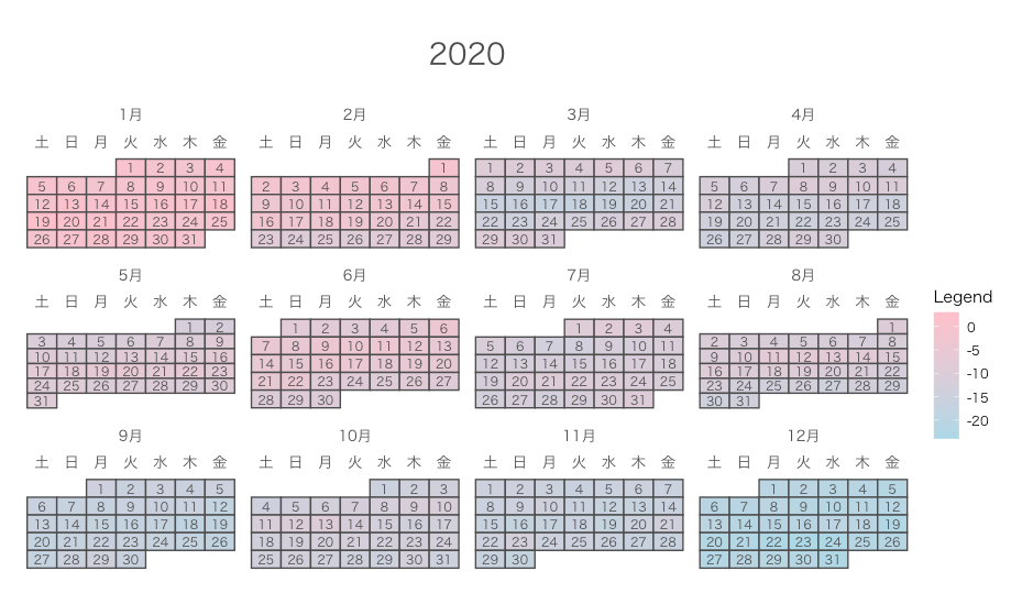
カレンダープロット
R
library(calendR)

# データ作成
date <- seq(as.Date("2020-01-01"), as.Date("2020-12-31"), by="day")
value <- random.walk <- cumsum(rnorm(n=length(date))) #ランダムウォーク

calendR(year=2020,
        weeknames = c("日", "月", "火", "水", "木", "金", "土"),

        special.days=value,
        gradient = TRUE,
        special.col = "pink",
        low.col = "lightblue",
        legend.pos = "right",
        legend.title = "Legend",

        font.family = "HiraKakuProN-W3") #文字化け対策(MACの場合)
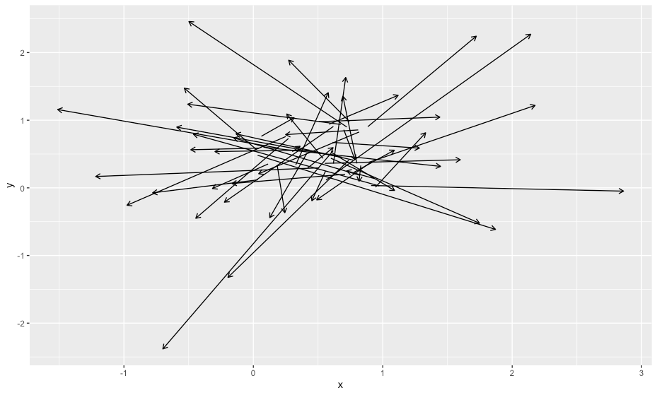
ベクトルフィールド
R
n <- 50
df <- data.frame(x=runif(n),y=runif(n),dx=rnorm(n),dy=rnorm(n))
ggplot(data=df, aes(x=x, y=y)) +
  geom_segment(aes(xend=x+dx, yend=y+dy), arrow = arrow(length = unit(0.2,"cm")))
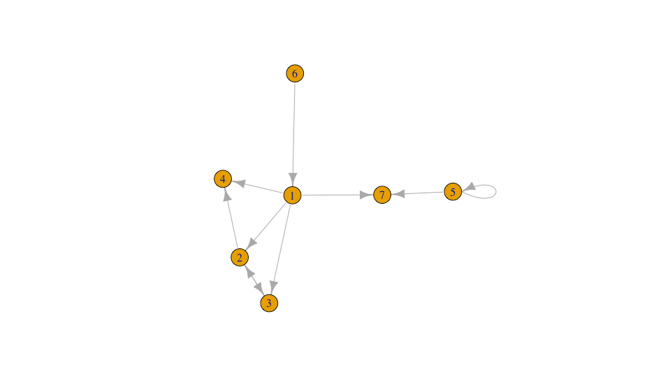
ネットワークグラフ
R
library(igraph)
network_df <- data.frame(from=c(1,2,1,1,3,2,5,6,5,1),
                         to  =c(2,3,3,4,2,4,5,1,7,7))
g <- graph.data.frame(network_df)
plot(g)
ワードクラウド
R
# stopwordsを使いランダム的にサイズ設定して表示していますが、これ自体にはとくに意味はありません。
library(wordcloud2)
library(stopwords)
words <- stopwords::stopwords("ja", source = "marimo")
df <- data.frame(words=words, freq=rnorm(length(words)))
wordcloud2(df)