R(ggplot2)によるヒストグラムのあれこれです。
- ライブラリを読み込み
R
library(dplyr)
library(ggplot2)
基本
geom_histogram()を呼び出します。
xに対象となる(連続)変数を与えます。
R
ggplot(iris, aes(x=Sepal.Length)) +
  geom_histogram()
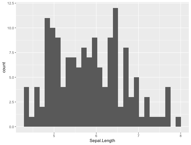
ヒストグラムの情報を取得する
ggplot_build()を用いることで取得可能です。
R
g <- ggplot(iris, aes(x=Sepal.Length)) +
  geom_histogram()
g_info <- ggplot_build(g)
print(g_info$data)
出力結果を一部抜粋したものが下記です。
例えば、xmin〜xmaxがそれぞれのビン幅で、ビン内の要素数がcountに出力されます。
g_info$dataのprint結果
    y count        x     xmin     xmax   density     ncount   ndensity …
1   4     4 4.344828 4.282759 4.406897 0.2148148 0.33333333 0.33333333 …
2   1     1 4.468966 4.406897 4.531034 0.0537037 0.08333333 0.08333333 …
3   4     4 4.593103 4.531034 4.655172 0.2148148 0.33333333 0.33333333 …
4   2     2 4.717241 4.655172 4.779310 0.1074074 0.16666667 0.16666667 …
5  11    11 4.841379 4.779310 4.903448 0.5907407 0.91666667 0.91666667 …
6  10    10 4.965517 4.903448 5.027586 0.5370370 0.83333333 0.83333333 …
7   9     9 5.089655 5.027586 5.151724 0.4833333 0.75000000 0.75000000 …
8   4     4 5.213793 5.151724 5.275862 0.2148148 0.33333333 0.33333333 …
9   7     7 5.337931 5.275862 5.400000 0.3759259 0.58333333 0.58333333 …
10  7     7 5.462069 5.400000 5.524138 0.3759259 0.58333333 0.58333333 …
色を指定する
colourで枠線色、fillで塗りつぶし色を指定できます。
指定可能な色の種類については、こちらのサイトが参考になります。
http://www.okadajp.org/RWiki/?%E8%89%B2%E8%A6%8B%E6%9C%AC
R
ggplot(iris, aes(x=Sepal.Length)) +
  geom_histogram(colour = "gray10", fill = "dodgerblue4")
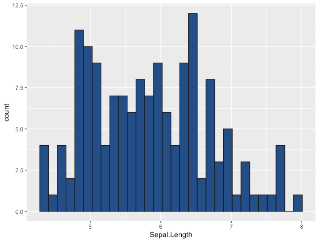
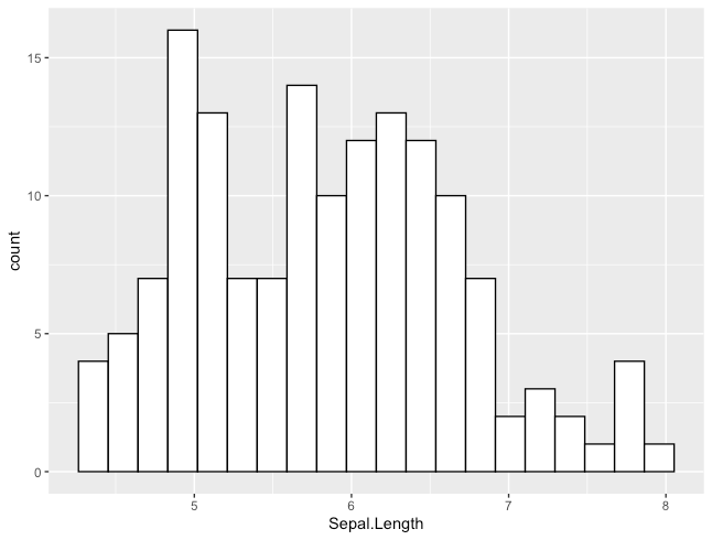
ビン幅を指定する
binwidthでビンの幅を指定できます。
R
ggplot(iris, aes(x=Sepal.Length)) +
  geom_histogram(binwidth=0.4, fill="white", colour="black")
ビン数を指定する
binsで全体のビンの数を指定できます。
R
ggplot(iris, aes(x=Sepal.Length)) +
  geom_histogram(bins=20, fill="white", colour="black")
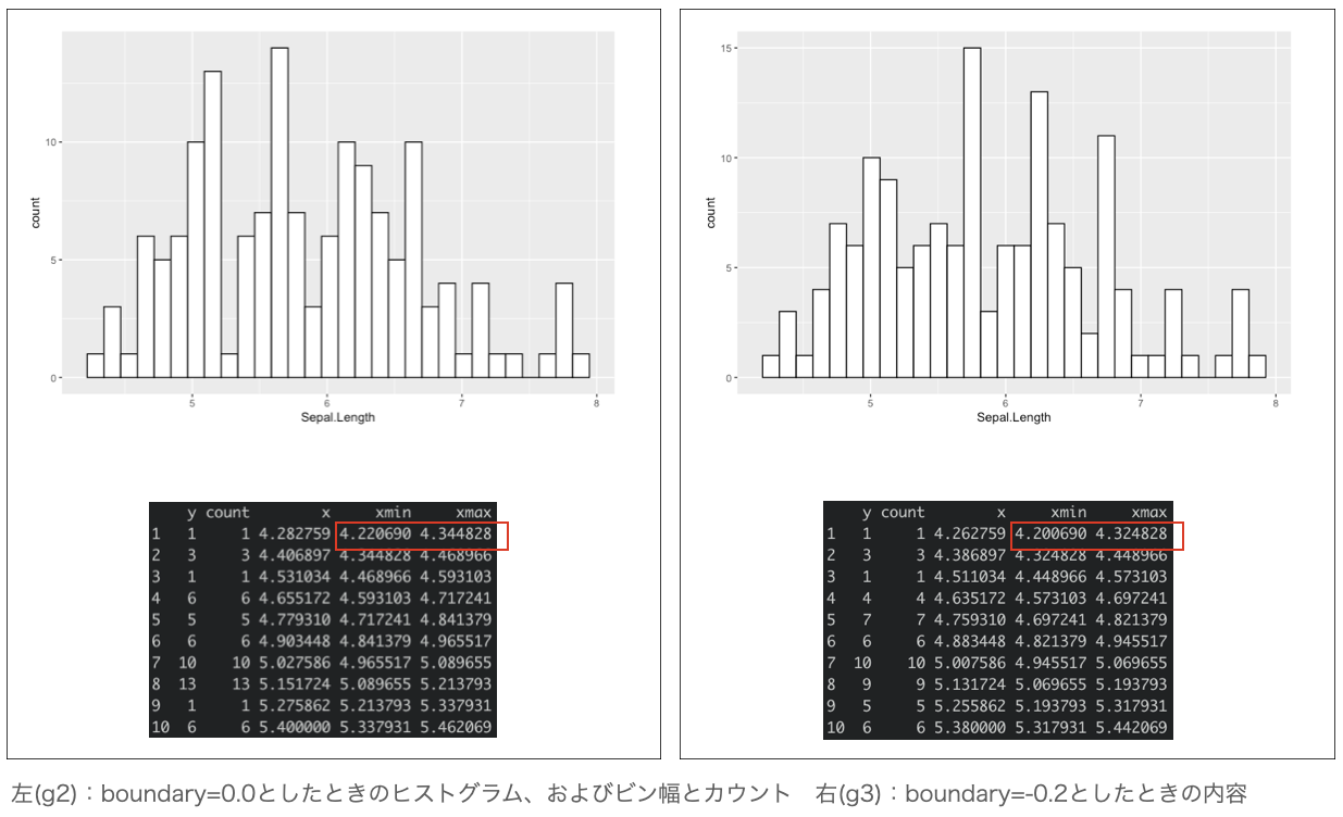
ビンの境界をずらす
boundaryでビンの境界をずらすことができます。
R
g <- ggplot(iris, aes(x=Sepal.Length))
g2 <- g + geom_histogram(boundary=0.0, fill="white", colour="black")
g2_info <- ggplot_build(g2)
print(g2)
print(g2_info$data)

g3 <- g + geom_histogram(boundary=-0.02, fill="white", colour="black")
g3_info <- ggplot_build(g3)
print(g3)
print(g3_info$data)
g2とg3を比較すると、xmin〜xmaxの範囲が0.2だけずれていることが分かります。
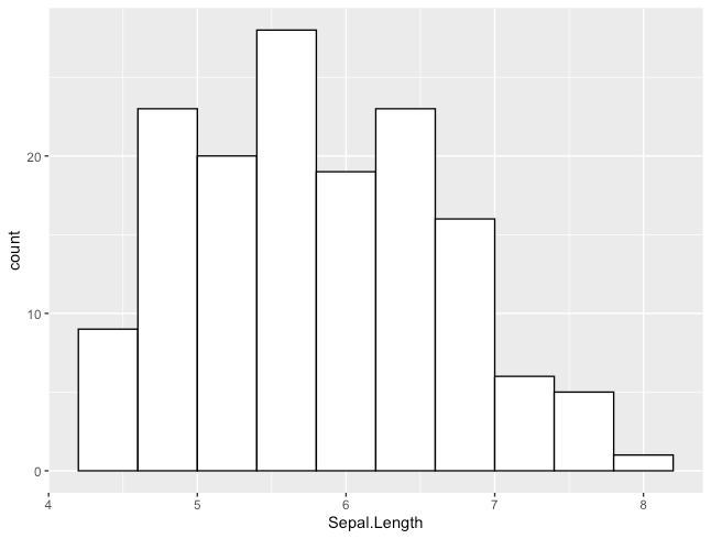
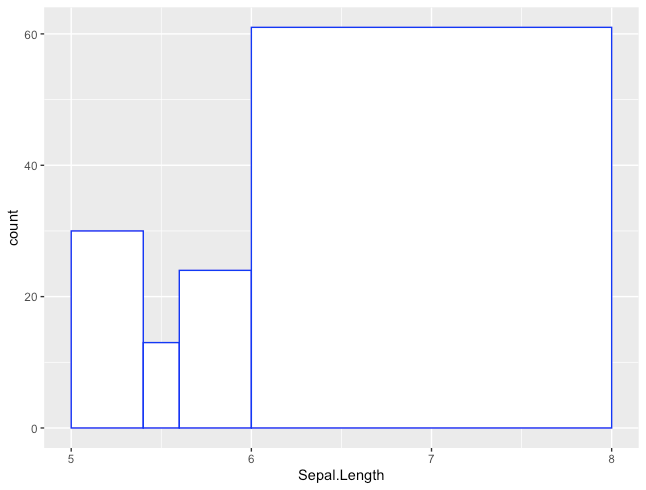
ビンの区切り方を直接指定する
breaksでビン境界を直接指定することができます。
R
ggplot(iris, aes(x=Sepal.Length)) +
  geom_histogram(breaks= c(5, 5.4, 5.6, 6.0, 8),
                   color = "blue", fill = "white")
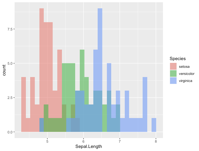
変数でグループ化する(同一グラフへの描画)
fillにグループ化に用いる変数を指定します。
また、positionを指定することで描画方法を変えられます。
それぞれを独立して描く
R
ggplot(iris, aes(x=Sepal.Length, fill=Species)) +
  geom_histogram(position="identity", alpha=0.6)
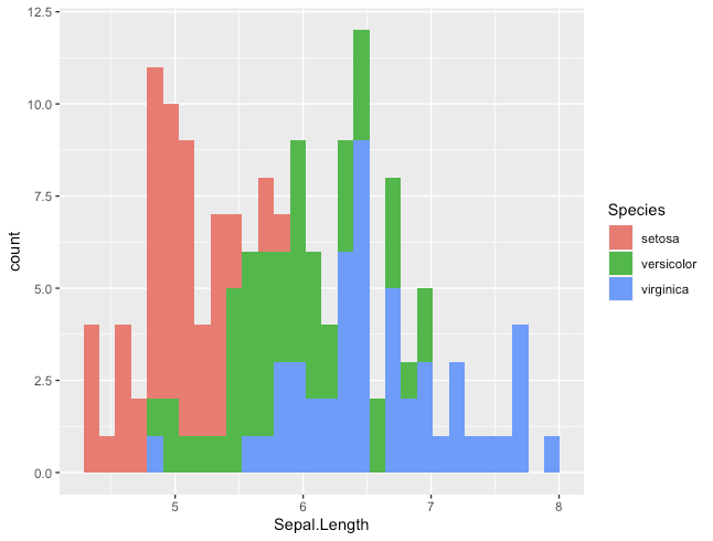
積み上げて描く
R
ggplot(iris, aes(x=Sepal.Length, fill=Species)) +
  geom_histogram(position="stack")
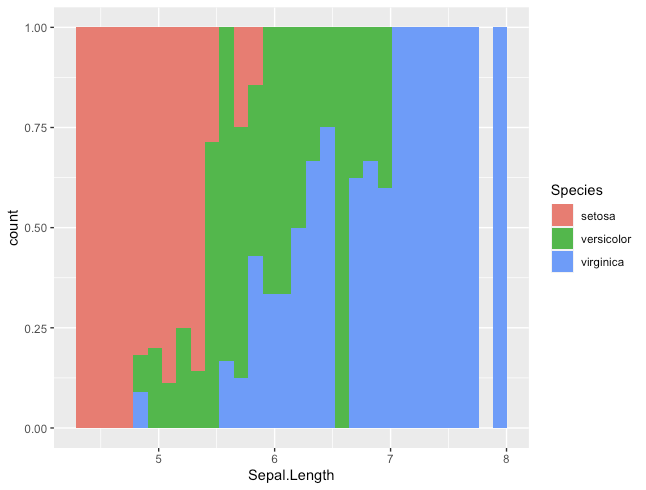
割合で描く
R
ggplot(iris, aes(x=Sepal.Length, fill=Species)) +
  geom_histogram(position="fill")
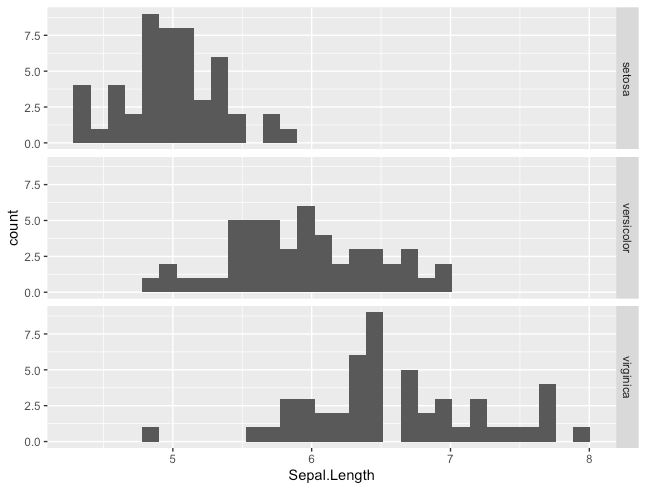
変数でグループ化する(複数グラフによる描画)
各ヒストグラムを並べて描画するときはfacet_grid()を呼び出します。
R
ggplot(iris, aes(x=Sepal.Length)) +
  geom_histogram() +
  facet_grid(Species ~ .)
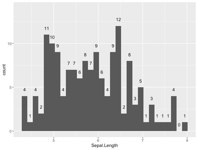
ビン毎のカウントのラベルを付加する
stat_bin()を使用します。
R
ggplot(iris, aes(x=Sepal.Length)) +
  geom_histogram() +
  ylim(0, 14) + # これを入れないとラベルがグラフ(上)をはみ出してしまう
  stat_bin(geom="text", aes(label=..count..), vjust=-1.5)
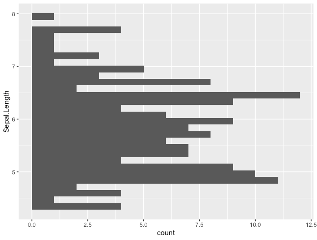
y方向のヒストグラムを作る
xではなくyに、ヒストグラム化対象の変数を指定します。
R
ggplot(iris, aes(y=Sepal.Length)) +
  geom_histogram()